The Museum Dashboard in Power BI tracks 5 headline KPIs across 5 interactive report pages, with 15+ pre-built visuals and slicer-driven filters for visitor type, exhibit, channel, ticket type, and event category. The .pbix file opens in the free Power BI Desktop on Windows — replace the sample dataset with your own ticketing and POS export, click Refresh, and every KPI card and chart rebuilds through the underlying DAX measures in under 10 minutes.
Most museums and cultural centers spend $99 to $499 per month on visitor-management or ticketing analytics SaaS like Tessitura, Altru, or ACME just to see what this single Power BI report covers — visitor flow, ticket revenue, exhibit performance, donations, merchandise, café sales, and satisfaction scores. This Museum Dashboard in Power BI bundles all of those views into one downloadable file at $17.99 (one-time), with every visual unlocked and every measure editable.
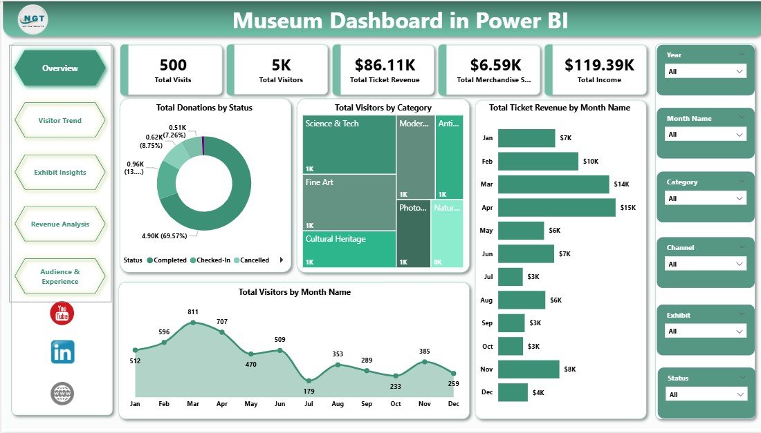
Museum Dashboard in Power BI — Overview page
Key Features of the Museum Dashboard in Power BI
📊 5 KPI cards on the Overview page — Total Visits, Total Visitors, Total Ticket Revenue, Total Merchandise Sales, and Total Income refresh instantly when a slicer is changed or new data is loaded into the underlying tables.
🎨 5 interactive report pages with 15+ visuals — Overview, Visitor Trend, Exhibit Insights, Revenue Analysis, and Audience & Experience pages cover ticket revenue patterns, visitor segmentation, exhibit-level satisfaction, channel performance, and tour-guide analytics across the entire museum operation.
🎟️ Slicer-driven filtering across all pages — Drill into specific exhibits, visitor categories, months, channels, or event types in one click. Slicer selections sync across visuals through Power BI’s native cross-filter behaviour.
📅 Month-over-month and day-of-week trends — The Visitor Trend page exposes seasonality, weekend versus weekday revenue, and exhibit-level traffic so curators can plan staffing, openings, and rotations against real visitor data.
💰 Revenue mix across ticket types, donations, merchandise and café — Track which channels and membership levels actually drive income, and benchmark Average Visit Duration and Average Satisfaction Rating against tour guide and event type.
🌍 Built for museums in 40+ countries — sample data is currency-agnostic and labels can be translated. Join 8,400+ teams using NextGenTemplates to replace paid SaaS dashboards with one-time-purchase Excel, Google Sheets, Power BI, and HTML templates.
Dashboard Pages Explanation
1. Overview Page
The Overview page is the executive summary of the entire museum’s performance. The top strip carries the five KPI cards — Total Visits, Total Visitors, Total Ticket Revenue, Total Merchandise Sales, and Total Income — followed by four analytical visuals and a row of slicers that filter every visual on the page.
Cards on the Overview page:
- Total Visits
- Total Visitors
- Total Ticket Revenue
- Total Merchandise Sales
- Total Income
Charts on the Overview page:
- Total Donations by Status — splits donation amounts by status (Pledged, Received, Cancelled) so the development team can see how much committed funding has actually been collected.
- Total Visitors by Category — breaks total visitors down by category (Adult, Child, Senior, Student, Member, Group), surfacing which audience segments fuel attendance.
- Total Ticket Revenue by Month Name — plots ticket revenue across the 12-month calendar to expose seasonality and identify peak-revenue months for staffing and marketing planning.
- Total Visitors by Month Name — tracks monthly footfall patterns so curators can align exhibit openings and education programs with the busiest periods of the year.
Museum Dashboard in Power BI
2. Visitor Trend
The Visitor Trend page goes deeper into who is visiting, when they are visiting, and which exhibits attract them most. It is the operations team’s go-to view for staffing, scheduling, and exhibit rotation decisions.
Charts on the Visitor Trend page:
- Total Visitors by Visitor Type — separates first-time visitors, returning visitors, members, and tour groups, showing which mix the museum is currently attracting.
- Total Ticket Revenue by Day of Week — exposes weekend versus weekday revenue so the box office and security team can scale staffing accordingly.
- Total Visitors by Exhibit — ranks exhibits by total visitor count, identifying which permanent or rotating exhibits are pulling the most foot traffic.
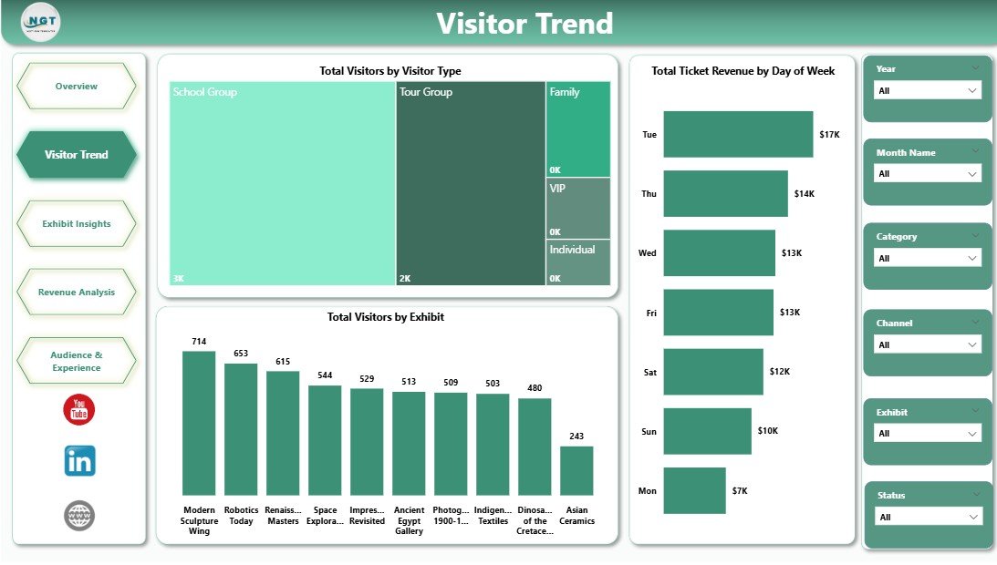
Visitor Trend
3. Exhibit Insights
The Exhibit Insights page combines income contribution with visitor satisfaction. It is the curator’s view for deciding which exhibits to extend, which to retire, and where to invest the next season’s exhibit budget.
Charts on the Exhibit Insights page:
- Total Income by Category — shows the income mix across Tickets, Memberships, Donations, Merchandise, Café, and Events so leadership can see which streams are growing.
- Total Ticket Revenue by Ticket Type — splits ticket revenue across General Admission, Member, Group, Student, Senior, and Special-Event tickets to identify the top-earning ticket category.
- Avg Satisfaction Rating by Exhibit — averages visitor feedback scores per exhibit, surfacing which exhibits delight visitors and which need a refresh.
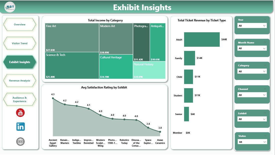
Exhibit Insights
4. Revenue Analysis
The Revenue Analysis page is the development director’s view. It combines donations by membership level with channel performance and a country-level visitor map so fundraising and partnership teams can see exactly where revenue and audiences are coming from.
Charts on the Revenue Analysis page:
- Total Donations by Membership Level — splits donation totals across membership tiers (Friend, Patron, Benefactor, Corporate, Lifetime) to surface which levels generate the most philanthropic income.
- Total Ticket Revenue by Channel — compares ticket revenue across Online, Walk-in, Group Booking, Travel Partner, and Mobile App channels to show where booking investment pays off.
- Total Visitors by Country — visualises the international visitor mix so marketing teams can target inbound tourism partners and international press strategically.
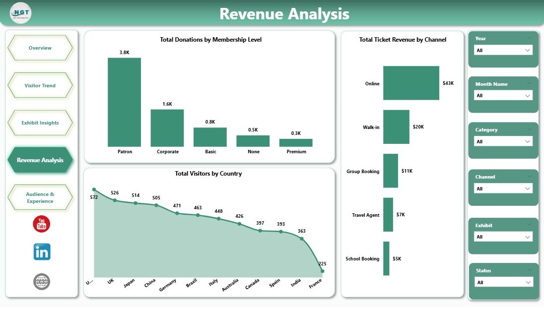
Revenue Analysis
5. Audience & Experience
The Audience & Experience page is the visitor-experience manager’s view. It crosses event types and tour guides with satisfaction and dwell time, plus a café sales channel split that shows how on-site spending breaks down.
Charts on the Audience & Experience page:
- Total Cafe Sales by Channel — splits café revenue across Walk-in, Pre-booked Group, Member-only, and Event-day channels to inform menu, pricing, and staffing decisions.
- Avg Visit Duration by Event Type — measures how long visitors stay across Special Exhibits, Workshops, Lectures, Family Days, and standard visits, identifying high-engagement event formats.
- Avg Satisfaction Rating by Tour Guide — averages visitor scores per tour guide so the education department can recognise top performers and target training where it is needed.
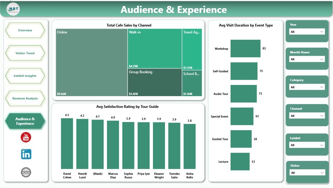
Audience & Experience
Museum Dashboard in Power BI vs. Excel Equivalent vs. Paid Museum SaaS — Feature Comparison
| Feature | Museum Dashboard in Power BI | Excel / Google Sheets Equivalent | Tessitura / Altru / ACME (SaaS) |
|---|---|---|---|
| Cost | $17.99 one-time ✅ | $13–18 one-time | $99–$499 / month |
| Platform | Power BI Desktop (free) ✅ | Excel / Google Sheets | Vendor cloud only |
| Setup time | Under 10 minutes ✅ | 15–30 minutes | 4–12 weeks implementation |
| Number of report pages | 5 pages, 15+ visuals ✅ | 5–7 sheets | Configurable but locked behind tier |
| DAX measures editable | ✅ Yes, fully unlocked | N/A (formula-based) | ❌ No (proprietary) |
| Slicer-based filtering | ✅ Native, every page | Pivot slicers (Excel only) | Filters via vendor UI |
| Mobile / web view | ✅ Power BI mobile + web (with free account) | Excel mobile / Sheets app | ✅ Vendor mobile app |
| Customizable visuals | ✅ Full Power BI library | Limited chart types | ❌ Vendor-controlled |
| Year-1 cost at 5 users | $17.99 total ✅ | $13–18 total | $5,940–$29,940 |
For museums and cultural centers that want a full visitor-and-revenue analytics view without paying $99–$499 per month for Tessitura, Altru, or ACME, the Museum Dashboard in Power BI sits in the sweet spot — pro-grade visuals on a free desktop tool, every measure editable, $17.99 one-time.
Who Should Use This Template
✅ Perfect for:
- Museum directors and operations managers at small-to-mid-sized museums (10K–500K annual visitors) who need a single Power BI report covering visits, revenue, donations, and exhibit performance.
- Visitor-experience managers at art galleries, history museums, science centers, and cultural centers tracking satisfaction by exhibit, tour guide, and event type.
- Development and fundraising teams that need to break donations down by membership level and link them back to ticketing income.
- Heritage sites, historical houses, and archives that have outgrown spreadsheet reporting but cannot justify five-figure SaaS contracts.
❌ Not a fit if:
- You need an integrated point-of-sale, ticketing engine, CRM, and email-marketing platform inside the same tool — that is a SaaS like Tessitura or Altru, not a Power BI dashboard.
- You require SOC 2, HIPAA, or government-grade data hosting bundled with the dashboard.
- Your organisation has zero familiarity with Power BI Desktop and no one to spend a few hours connecting your real ticketing data.
Real-World Use Cases
Helena directs a regional art museum with 180,000 annual visitors. She uses the Museum Dashboard in Power BI to present monthly performance to her board — total visits, ticket revenue by month, donations by membership level, and average satisfaction by exhibit. She replaced a $349/month vendor analytics add-on with one .pbix file refreshed each Monday morning.
Daniel is the visitor-experience manager at a science center. He filters the Audience & Experience page by event type to compare Avg Visit Duration across special exhibits, workshops, and family days. The Avg Satisfaction Rating by Tour Guide visual gives him a quarterly view he uses for tour-guide coaching.
Priya runs development at a children’s museum. She uses the Revenue Analysis page to map donations against membership levels, identifying that her Patron tier delivers 38% of philanthropic income while contributing only 9% of total visitors — a finding she now uses to drive the upgrade campaign.
Advantages of the Museum Dashboard in Power BI
- One-time payment vs. recurring SaaS fees — pay once, use forever, no per-user pricing.
- Free hosting platform — Power BI Desktop is a free Microsoft product; no extra licence required to open and edit the .pbix.
- Fully editable DAX model — rename measures, add new KPIs (member retention, secondary spend per visitor), or change the date table to fit your fiscal year.
- Compatible with any ticketing system export — most ticketing and POS tools (Tessitura, Altru, ACME, Square, Eventbrite, Vivaticket) export CSV/Excel files that drop straight into the data table.
Opportunities for Improvement
- The dashboard does not include a CRM-style donor profile view; for individual donor history you would still need a fundraising tool like Bloomerang, DonorPerfect, or Raiser’s Edge.
- The sample dataset is fictional; first-time users should plan an hour to map their real ticketing, POS, and donation columns to the dashboard’s data table.
- Data refresh is manual unless you publish to the Power BI service and configure a scheduled gateway refresh — that is a Power BI capability, not a dashboard limitation, but worth noting upfront.
Best Practices
- Map ticketing and POS columns to the sample data table before customising visuals — Power BI’s Power Query editor handles renames cleanly.
- Add a “Last refresh” date card on every page so board members trust the numbers they see.
- Publish to the Power BI service and pin the Overview KPI cards for stakeholders who do not need the full report.
- Pair this with our Museum Dashboard in Excel for board members who prefer spreadsheet downloads.
Explore Relevant Templates
- Museum Dashboard in Excel — same KPI structure, built in native Excel for teams that prefer spreadsheets.
- Museums & Cultural Centers Dashboard in Power BI — broader cultural-sector view spanning multiple institution types.
- Arts and Culture Dashboard in Power BI — focuses on arts programming, grants, and audience reach.
- Heritage Tourism KPI Dashboard in Power BI — for heritage sites needing site-level KPIs and visitor flow.
- Browse all Power BI Dashboard Templates on NextGenTemplates.
Frequently Asked Questions
What KPIs does the Museum Dashboard in Power BI track?
The Museum Dashboard in Power BI tracks 5 headline KPIs — Total Visits, Total Visitors, Total Ticket Revenue, Total Merchandise Sales, and Total Income — plus 15+ supporting visuals covering donations by status, visitors by category, monthly trends, exhibit performance, channel mix, and visitor satisfaction.
Do I need a paid Power BI licence to open the dashboard?
No. The Museum Dashboard in Power BI opens in Power BI Desktop, which is a free download from Microsoft for Windows. A paid Power BI Pro or Premium licence is only needed if you want to publish the report to the Power BI service for live web and mobile sharing.
How long does setup take?
Setup of the Museum Dashboard in Power BI takes under 10 minutes. Open the .pbix file, replace the sample data table with your own ticketing, donation, merchandise, and café export, click Refresh, and every KPI card and chart rebuilds automatically through the existing DAX measures.
How does this compare to Tessitura or Altru?
Tessitura and Altru are full ticketing-plus-CRM SaaS platforms running $99 to $499 per month with multi-week implementations. The Museum Dashboard in Power BI is a $17.99 one-time analytics report — it does not sell tickets or store donor records, but it visualises everything those systems export, with every measure editable.
Can I customise the visuals and add my own KPIs?
Yes. Every visual in the Museum Dashboard in Power BI is unlocked. You can rename DAX measures, add new KPIs such as Member Retention Rate or Secondary Spend per Visitor, change colours and fonts to match your museum’s brand, and rebuild any chart using Power BI’s full visual library.
Will the dashboard work with my ticketing system’s export?
Yes, in most cases. Most ticketing and POS systems (Tessitura, Altru, ACME, Square, Eventbrite, Vivaticket, ToTix) export CSV or Excel files. Map their columns to the sample data table inside the Museum Dashboard in Power BI using Power Query, click Refresh, and your data flows through.
Is this dashboard suitable for small museums and historical sites?
Yes. The Museum Dashboard in Power BI is built for museums, art galleries, science centers, children’s museums, heritage sites, and cultural centers handling 10,000 to 500,000 annual visitors — the size range where SaaS like Tessitura or Altru is overkill but spreadsheets have stopped scaling.
About the Author
Built by PK — Microsoft Certified Professional with 15+ years of Excel, Google Sheets, and Power BI experience. Founder of NextGenTemplates, reaching 300K+ subscribers across YouTube channels (@PK-AnExcelExpert, @NextGenTemplates, @NeoTechNavigators). Every template is hand-built in Power BI Desktop and tested against realistic museum operating data before release.
Conclusion
The Museum Dashboard in Power BI gives museum directors, visitor-experience managers, exhibit curators, and development teams a single .pbix file that turns daily ticketing, donation, merchandise, café, and satisfaction data into 5 interactive report pages. It replaces $99–$499/month museum SaaS analytics for a one-time $17.99 — every visual unlocked, every DAX measure editable, every page driven by slicers.
👉 Click here to Purchase the Museum Dashboard in Power BI
✅ Instant download · One-time payment · No subscription · Lifetime access
🎥 For step-by-step Power BI tutorials, visit our YouTube channel: Youtube.com/@PK-AnExcelExpert
📅 Last updated: May 2026