Rental service businesses depend on high asset utilisation, healthy margins, responsive branch operations, and repeat customers. A few percentage points of discounting or idle asset time can change monthly profit quickly, especially when the company operates across multiple regions, customer segments, rental plans, and booking channels. The Rental Services Dashboard in Power BI gives rental managers a visual way to track these moving parts in one report instead of reviewing disconnected spreadsheets and branch summaries.
This Power BI template is built for rental revenue analysis, fleet utilisation review, branch performance comparison, discount monitoring, customer satisfaction review, and channel-level reporting. It includes multiple pages with cards, charts, and slicers so users can move from executive summary to detailed operational analysis.
Click here to purchase Rental Services Dashboard in Power BI
Rental Services Dashboard in Power BI
Key Features of Rental Services Dashboard in Power BI
The dashboard provides a structured reporting experience for revenue, total rentals, gross profit, gross margin percentage, average rating, asset categories, service types, monthly trends, rental plans, regions, branches, customer segments, and booking channels. It is designed for business users who want a ready-made Power BI dashboard that can be adapted to their rental data.
Interactive slicers help users filter the report quickly. Cards show high-level KPIs, while charts explain performance by month, quarter, asset category, region, branch, customer segment, rental plan, and channel. Because it is built in Power BI, users can also edit the report model, update visuals, and publish internally if their organization uses the Power BI service.
For Power BI setup and refresh concepts, Microsoft provides official guidance in Power BI data refresh documentation.
Dashboard Pages Explanation
Overview Page
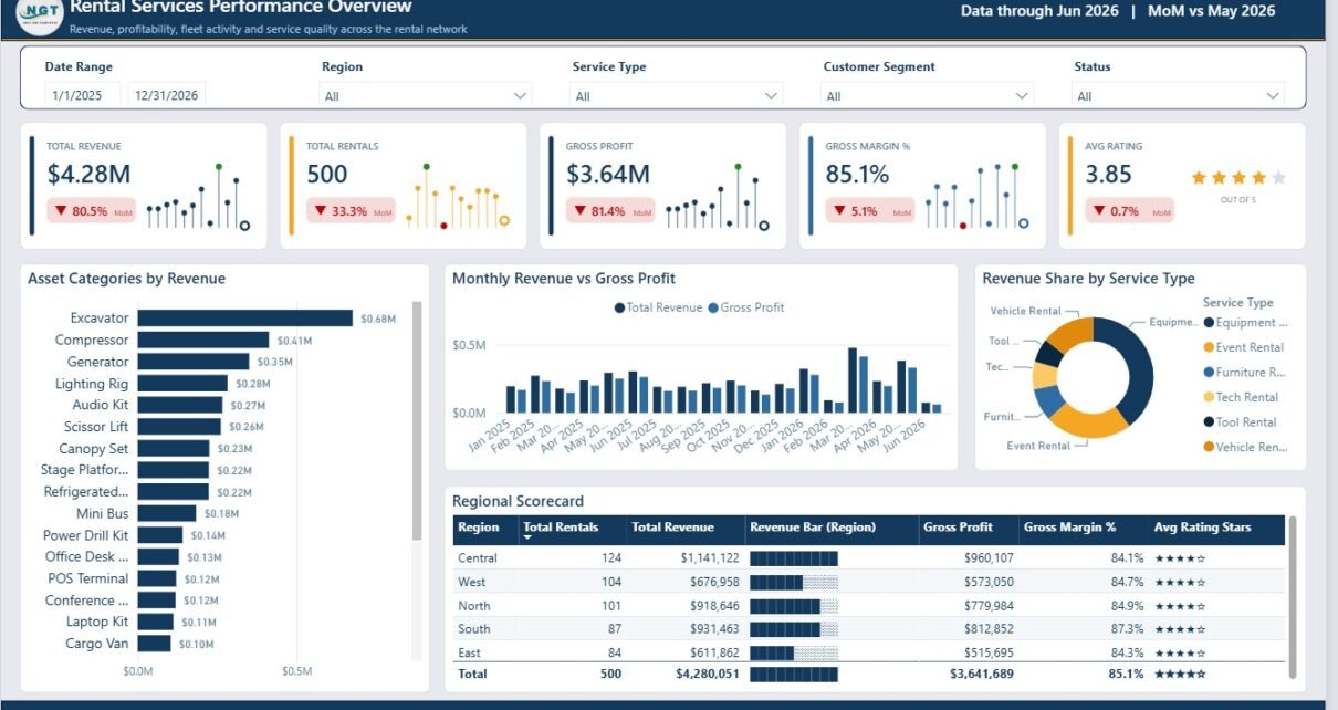
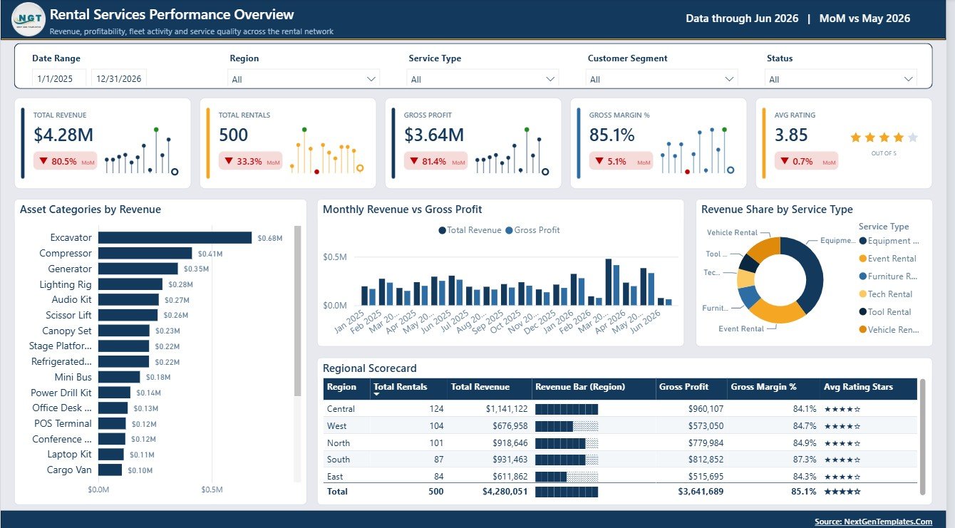
The Overview Page gives managers a high-level snapshot of rental performance. The cards at the top show Total Revenue, Total Rentals, Gross Profit, Gross Margin %, and Avg Rating, making it easy to review financial output and customer sentiment together.
Total Revenue by Asset Category: This chart shows which equipment, vehicle, tool, or rental asset categories are producing the strongest income. It helps managers identify high-value categories and compare them with lower-performing asset groups.
Total Revenue and Gross Profit by Month: This chart compares monthly sales with profit contribution. It helps teams spot whether revenue growth is also improving profit or whether costs are absorbing the gains.
Revenue Share by Service Type: This chart explains how revenue is distributed across service models. It is useful when a rental company offers different service types and wants to see which ones dominate the business mix.
Rental Performance by Region: This chart compares performance across geographic areas. It helps business owners identify strong markets, underperforming regions, and opportunities for branch or marketing focus.
Overview Page
Revenue Trend & Discounting
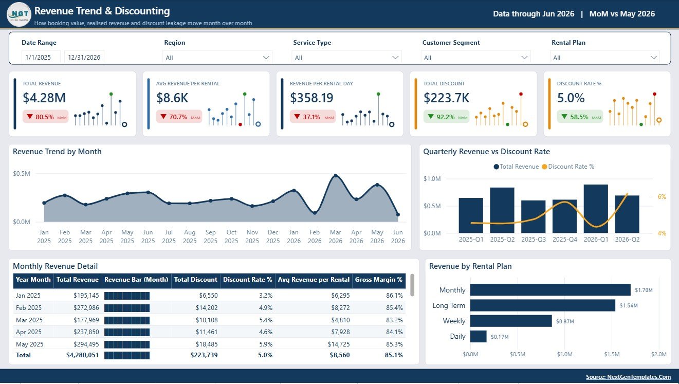
The Revenue Trend & Discounting page focuses on time-based revenue movement and discount behaviour. It includes Total Revenue by Month, Total Revenue and Discount Rate % by Quarter, Revenue Performance by Year Month, and Total Revenue by Rental Plan.
Total Revenue by Month helps users see seasonality and monthly growth patterns. Total Revenue and Discount Rate % by Quarter helps compare revenue performance with discounting pressure. Revenue Performance by Year Month gives a more detailed chronological view, while Total Revenue by Rental Plan shows which rental plans contribute the most income.
Revenue Trend & Discounting
Asset Mix & Fleet Utilisation
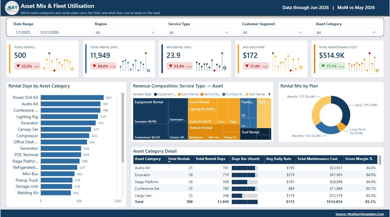
The Asset Mix & Fleet Utilisation page helps rental teams understand how assets are being used and how each category contributes to revenue. It includes Rental Days by Asset Category, Revenue Composition by Service Type and Asset Category, Rental Mix by Rental Plan, and Asset Category Performance by Asset Category.
Rental Days by Asset Category shows which categories are most frequently used. Revenue Composition by Service Type and Asset Category helps connect service models with asset revenue. Rental Mix by Rental Plan shows how customers choose rental options, while Asset Category Performance by Asset Category gives a direct comparison of asset group contribution.
Asset Mix & Fleet Utilisation
Branch Operations & Cost Control
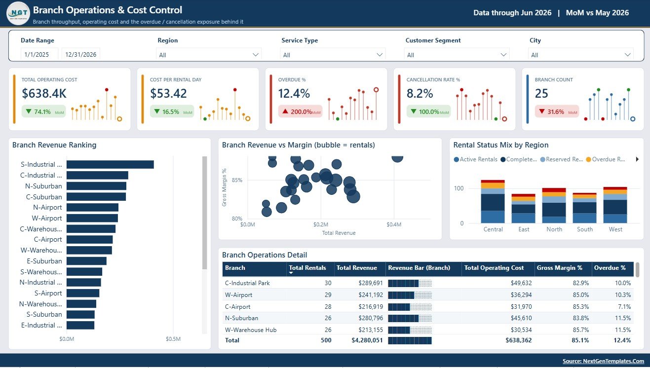
The Branch Operations & Cost Control page is designed for location-level monitoring. It includes Branch Revenue Ranking by Branch, Gross Margin % by Branch Revenue, Rental Status Mix by Region, and Branch Operations Performance by Branch.
Branch Revenue Ranking by Branch helps compare locations by sales contribution. Gross Margin % by Branch Revenue highlights whether branches are producing profitable revenue. Rental Status Mix by Region helps monitor operating status patterns, while Branch Operations Performance by Branch gives a broader view of branch-level results.
Branch Operations & Cost Control
Customer & Channel View
The Customer & Channel View page connects customer behaviour with booking performance. It includes Total Revenue by Customer Segment, Booking Channel Performance by Channel, Satisfaction by Customer Segment, and Customer Segment Performance by Customer Segment.
Total Revenue by Customer Segment shows which customer groups create the most revenue. Booking Channel Performance by Channel helps compare web, phone, partner, direct, or other booking sources. Satisfaction by Customer Segment connects customer sentiment with segment type, and Customer Segment Performance gives a clearer view of which customer groups deserve retention or growth focus.
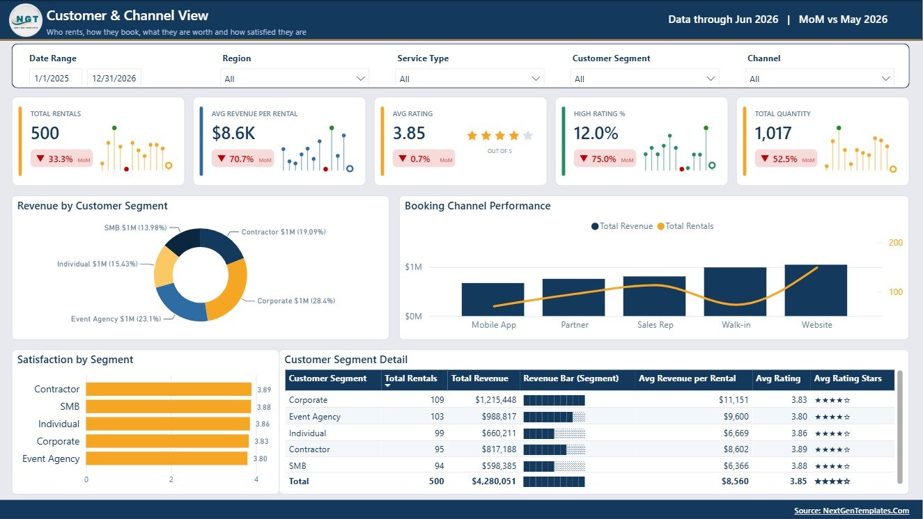
Customer & Channel View
Rental Services Dashboard in Power BI vs. Tableau vs. Paid CRM/SaaS – Feature Comparison
| Feature | This Power BI Template | Tableau Alternative | Paid SaaS Alternative |
|---|---|---|---|
| Cost | One-time template price | Requires Tableau licensing | Recurring subscription |
| Platform | Power BI Desktop | Tableau | Vendor platform |
| Setup time | Quick once data is mapped | Dashboard must be built or customized | Implementation varies |
| Customizable fields | Editable in Power BI | Editable with Tableau skills | Limited by vendor design |
| Rental-specific pages | Included | Must be created | Depends on vendor |
Who Should Use This Template
This dashboard is suitable for rental service companies that want to monitor revenue, rentals, margins, discounts, asset use, branches, regions, customers, and booking channels. It can fit equipment rentals, tool rentals, event rentals, vehicle rentals, construction rental services, and other businesses with asset-based rental transactions.
Real-World Use Cases
Monthly business review: Owners can use the overview and trend pages to discuss revenue, rentals, profit, margin, and customer rating.
Branch performance meeting: Operations teams can review branch revenue ranking, gross margin, and rental status by region.
Fleet planning: Asset managers can use rental days and category performance to identify which assets may need more investment or closer utilisation review.
Advantages of Rental Services Dashboard in Power BI
The main advantage is speed. Instead of designing every page from scratch, users start with a structured rental services report. The template brings together executive KPIs, trend analysis, asset utilisation, branch control, customer segmentation, and channel performance. It also gives users the flexibility of Power BI, including editable visuals, model changes, slicers, and publishing options.
Opportunities for Improvement
The dashboard depends on the quality and structure of the source data. Companies with inconsistent branch names, missing rental plan fields, incomplete customer segments, or unreliable discount values should clean the data before using the dashboard for management decisions.
Best Practices
Keep source data consistent, especially for asset category, service type, region, branch, rental plan, customer segment, booking channel, and rental status fields. Review gross profit and gross margin definitions before using the report in executive meetings. Refresh the dashboard on a regular schedule and validate totals against finance reports.
Explore Relevant Templates
You can explore more dashboard templates on NextGenTemplates Power BI templates and visit the Power BI dashboard category for related reporting products.
Frequently Asked Questions
What is the Rental Services Dashboard in Power BI?
It is a Power BI dashboard template for analysing rental revenue, rentals, profit, margins, discounts, asset mix, branch operations, customer segments, channels, and regions.
Can I use it with my own data?
Yes. Replace the sample data with your own rental service data and refresh the report.
Does it include discount analysis?
Yes. The Revenue Trend & Discounting page includes revenue and discount rate analysis by quarter.
Does it include branch reporting?
Yes. The Branch Operations & Cost Control page includes branch revenue ranking, gross margin analysis, rental status mix, and branch performance.
Is Power BI required?
Yes. The template is designed for Power BI Desktop.
Is this a SaaS system?
No. It is a Power BI dashboard template, not a rental booking, billing, or customer portal system.
About the Author
Built by PK – Microsoft Certified Professional with 15+ years of Excel, Google Sheets, and Power BI experience. Founder of NextGenTemplates, reaching 300K+ subscribers across YouTube channels. Every template is hand-built and tested before release.
Conclusion
The Rental Services Dashboard in Power BI gives rental businesses a practical way to review revenue, profit, utilisation, branch performance, discounting, customer segments, and booking channels in one report. It is a strong fit for teams that already have rental data and want a ready-made Power BI dashboard structure they can adapt. For more tutorials, visit PK An Excel Expert on YouTube.