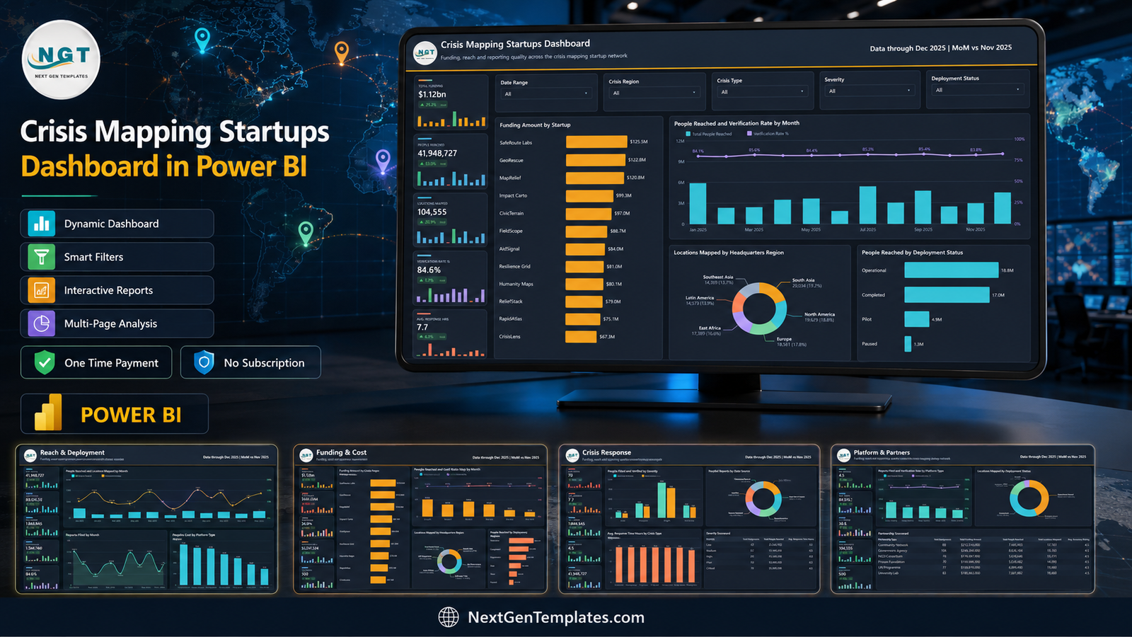
The Crisis Mapping Startups Dashboard in Power BI tracks 14 metrics across 5 interactive report pages, built on 500 sample deployment records that span 12 mapping startups, 40 countries, 8 crisis types and a full year of activity from January to December 2025. Each page carries five KPI cards with month-on-month deltas and 12-month sparklines, five slicers, and four charts or scorecard tables. Behind the visible pages sit a hidden Details drillthrough page and two 280×360 tooltip pages.
Crisis mapping startups sit in an awkward reporting position. Investors want funding efficiency, grant committees want reach and verification quality, and field partners want response times – and those three questions usually live in three different spreadsheets. This dashboard puts them on one data model so that a single 500-row deployment table answers all of them, with no per-seat BI contract in the way.
Key Features of the Crisis Mapping Startups Dashboard in Power BI
- Five analysis pages on one model. Overview, Reach & Deployment, Funding & Cost, Crisis Response and Platform & Partners all read the same table, so switching question does not mean rebuilding a model.
- Fourteen metrics. Total Funding Amount, Total Operating Cost, Cost Ratio %, Avg. Funding per Deployment, Total People Reached, Total Locations Mapped, Total Reports Filed, Total Verified Reports, Verification Rate %, Avg. Response Time Hours, Avg. Accuracy Rating, Avg. Team Size, Critical Deployments and Total Deployments.
- Five slicers per page. Date Range, Crisis Region, Crisis Type and Severity appear on all five pages; the fifth changes with the page – Deployment Status, Startup, Country, Data Source or Partnership Type.
- Hidden drillthrough and tooltip pages. A full-size Details page plus Trend Detail and Category Detail tooltips give record-level context on hover without leaving the report.
- 22-column source table. Record ID, Date, Startup, Headquarters Region, Crisis Region, Country, Crisis Type, Funding Stage, Platform Type, Deployment Status, Severity, Data Source, Partnership Type and nine numeric fields.
- Editable .pbix. Nothing is locked – add pages, edit visuals, write new DAX measures and restyle the theme in Power BI Desktop.
Dashboard Pages Explanation
Page 1: Overview
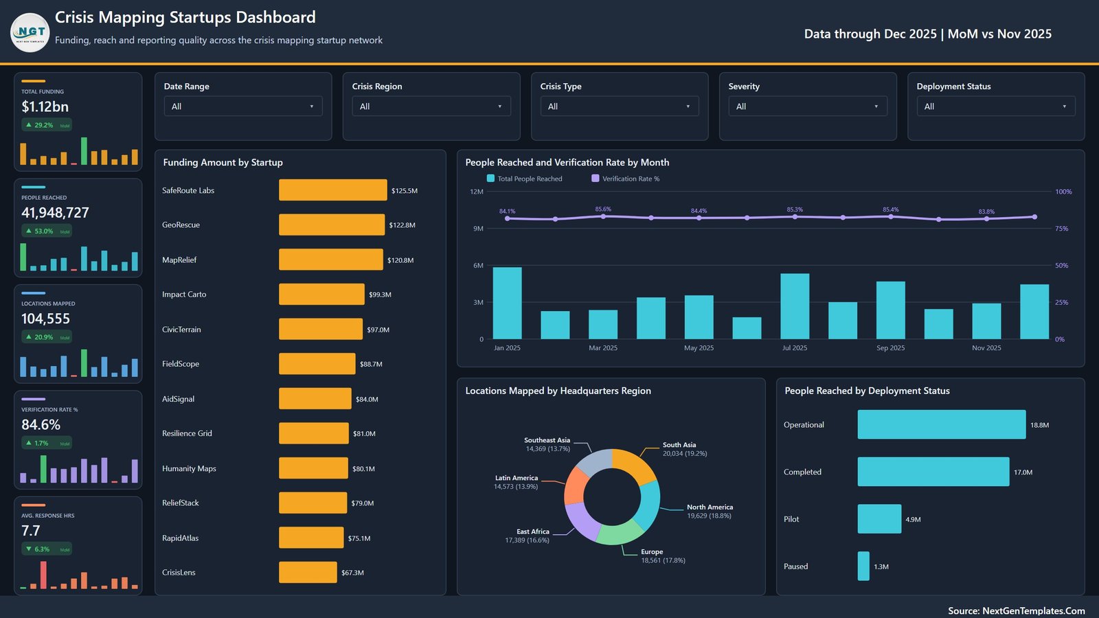
The landing page carries five KPI cards – Total Funding, People Reached, Locations Mapped, Verification Rate % and Avg. Response Hrs – each with a MoM delta and a sparkline. Its four visuals are Funding Amount by Startup, People Reached and Verification Rate by Month, Locations Mapped by Headquarters Region, and People Reached by Deployment Status. Slicers: Date Range, Crisis Region, Crisis Type, Severity and Deployment Status.
Page 2: Reach & Deployment
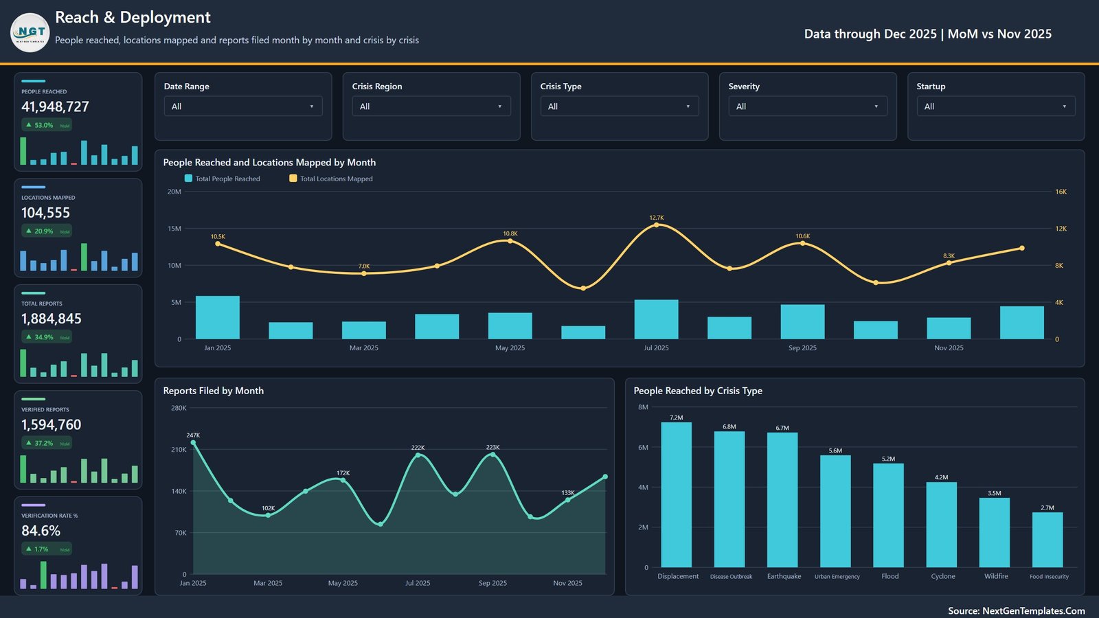
This page answers how far coverage actually goes, month by month and crisis by crisis. Cards show People Reached, Locations Mapped, Total Reports, Verified Reports and Verification Rate %. Charts are People Reached and Locations Mapped by Month, Reports Filed by Month, and People Reached by Crisis Type. The fifth slicer is Startup, so a single company’s reach curve can be isolated in one click.
Page 3: Funding & Cost
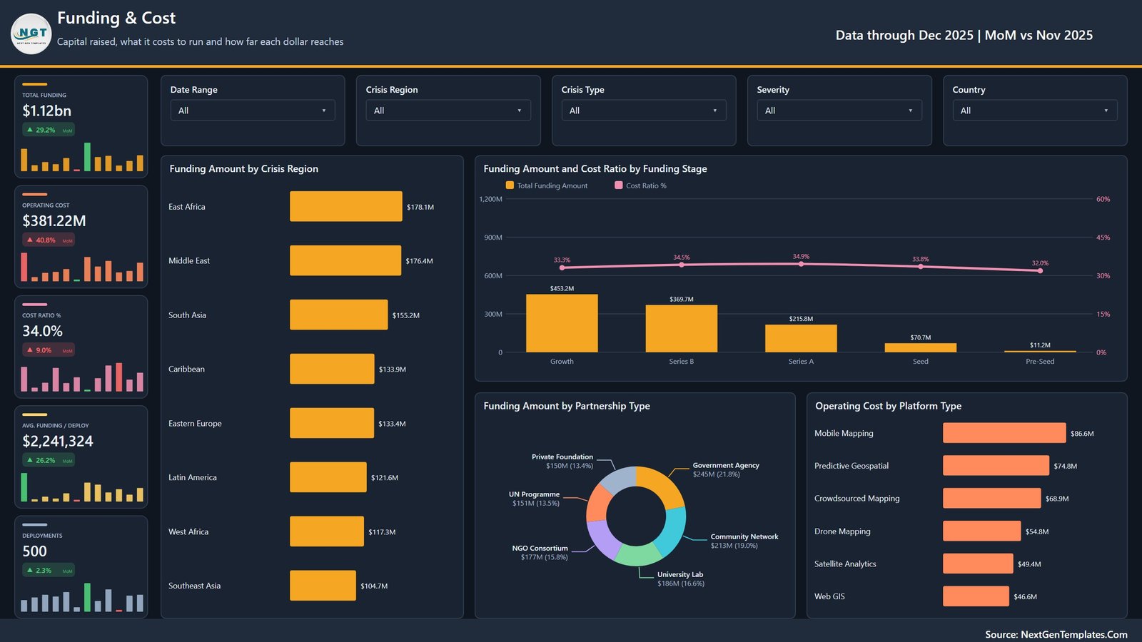
Capital raised, what it costs to run, and how far each dollar reaches. Cards show Total Funding, Operating Cost, Cost Ratio %, Avg. Funding / Deploy and Deployments. Charts are Funding Amount by Crisis Region, Funding Amount and Cost Ratio by Funding Stage, Funding Amount by Partnership Type, and Operating Cost by Platform Type. The fifth slicer is Country.
Page 4: Crisis Response
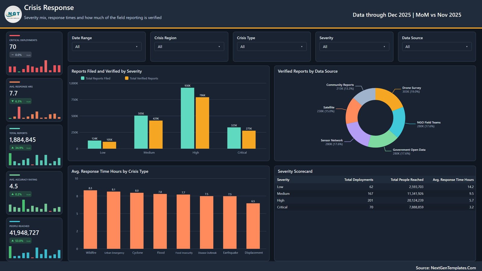
Severity mix, response times and how much of the field reporting is verified. Cards show Critical Deployments, Avg. Response Hrs, Total Reports, Avg. Accuracy Rating and People Reached. Charts are Reports Filed and Verified by Severity, Verified Reports by Data Source, and Avg. Response Time Hours by Crisis Type, alongside a Severity Scorecard table giving deployments, people reached and average response hours for each severity band. The fifth slicer is Data Source.
Page 5: Platform & Partners
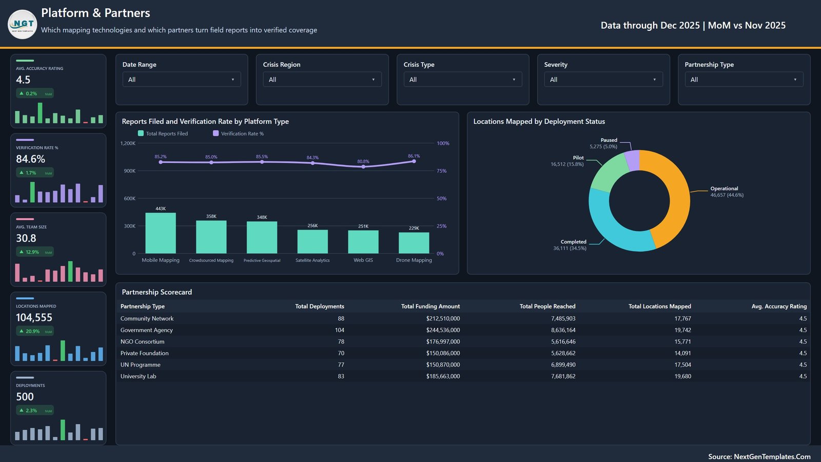
Which mapping technologies and which partners turn field reports into verified coverage. Cards show Avg. Accuracy Rating, Verification Rate %, Avg. Team Size, Locations Mapped and Deployments. Charts are Reports Filed and Verification Rate by Platform Type and Locations Mapped by Deployment Status, plus a Partnership Scorecard table listing deployments, funding, people reached, locations mapped and accuracy rating for each of the six partnership types. The fifth slicer is Partnership Type.
Page 6 and the hidden pages
A sixth visible page, Get More Dashboards, links back to the wider catalogue. Behind it sit the hidden Details drillthrough page and the two tooltip pages. The ZIP also carries the Data.xlsx source workbook and the Power BI Dashboard user manual PDF.
Crisis Mapping Startups Dashboard in Power BI vs. Tableau / Qlik vs. a Paid Enterprise BI Platform – Feature Comparison
| Feature | Crisis Mapping Startups Dashboard in Power BI | Tableau / Qlik build | Palantir Foundry / Tableau Cloud |
|---|---|---|---|
| Cost | $17.99 one-time ✅ | $70+ / user / month for Tableau Creator | $25-150 / user / month, enterprise contracts higher |
| Platform | Power BI Desktop (free download) ✅ | Tableau Desktop or Qlik Sense licence | Vendor cloud only |
| Setup time | Under 10 minutes – swap the source table ✅ | Days to model and lay out from scratch | Weeks, usually with an implementation partner |
| Pages included | 5 analysis pages + drillthrough + 2 tooltips ✅ | You build every sheet yourself | Templated, but configured per contract |
| Real-time team collaboration | Via Power BI Service (needs a Pro licence) | Via Tableau Server / Qlik Cloud | Built in ✅ |
| Mobile access | Power BI mobile app ✅ | Vendor mobile app ✅ | Vendor mobile app ✅ |
| Customisable fields | Full – it is your own .pbix ✅ | Full, once you have built it | Limited to what the vendor exposes |
| Verification-rate tracking out of the box | Yes – by month, severity and platform type ✅ | Build it yourself | Usually a paid module |
| Year-1 cost at 5 users | $17.99 ✅ | $4,200+ | $1,500 – $9,000+ |
For teams that want funding, reach and verification analytics on day one without a per-seat BI contract, the Crisis Mapping Startups Dashboard in Power BI sits in the sweet spot.
Who Should Use This Template
Perfect for:
- Founders and operators at crisis-mapping, geospatial or civic-tech startups reporting monthly to a board or grant committee
- Programme and MEL analysts at NGOs who must show reach, verification quality and response time together
- Impact investors and foundation programme officers reviewing a portfolio of mapping ventures across funding stages
- Power BI analysts who would rather adapt a finished multi-page report than start from a blank canvas
Not a fit if:
- You need a live incident-command console – this is a periodic analysis report, refreshed on demand
- You expect a rendered map layer: geography here is analysed as regions and countries in bars, donuts and tables
- Your team is Mac-only, since Power BI Desktop runs on Windows
- You need row-level security, SSO or audited data residency out of the box
Real-World Use Cases
Amara runs operations at a 30-person crisis-mapping startup in Nairobi. Each month she opens the Funding & Cost page, filters to East Africa, and shows her board that Cost Ratio % is holding near a third of funding while Avg. Funding per Deployment climbs. What used to be a two-day spreadsheet exercise is now a two-minute answer.
Daniel is a programme officer at a private foundation. He uses the Partnership Scorecard on Page 5 to compare six partnership types on the same five columns – deployments, funding, people reached, locations mapped and accuracy rating – before deciding which consortium model to fund again next year.
Priya leads a university geospatial lab. She slices the Crisis Response page by Data Source to show which channels contribute the largest share of verified reports, then uses the Severity Scorecard to explain why critical deployments close far faster than low-severity ones.
Advantages of the Crisis Mapping Startups Dashboard in Power BI
- One purchase instead of a subscription. A five-user Tableau Creator year runs past $4,200; this file is a single payment and the report is yours to keep and edit.
- Funding and cost read together. Cost Ratio % sits beside Total Funding on the same page and is plotted by funding stage, so a large raise is never read without the operating burden attached to it.
- Quality is not buried under volume. Reports Filed and Verified are charted as a pair and Verification Rate % is plotted as a line on a dual-axis combo, which keeps “we filed more” and “we verified more” visibly distinct.
- Consistent filter grammar. Because four of the five slicers repeat on every page, a filter set learned on Page 1 works everywhere – a small thing that saves real training time.
- Board-ready output. Any page exports to PDF or PowerPoint straight from Power BI Desktop for a grant report or investor update.
Opportunities for Improvement
- No map visual. For a product about crisis mapping this is the obvious gap. Country is in the model, so a filled map or Azure Map visual can be added in a few minutes, but it does not ship that way.
- Sample data is generated. The 500 records, 12 startup names and all figures are demonstration data, not observed field data. Treat every number on the shipped pages as an illustration.
- Refresh is manual. The model imports from a workbook, so keeping it current means refreshing in Desktop or scheduling a refresh in the Power BI Service.
- Windows only. Power BI Desktop does not run natively on macOS, which rules out Mac-only teams unless they use a virtual machine.
- Fixed 22-column schema. Adding a new dimension means editing the model rather than just adding a column to the source file.
Best Practices
- Keep the 22 column headers exactly as shipped when you replace the sample rows – the measures and relationships depend on those names.
- Load a full 12 months before judging any sparkline; the MoM deltas on the KPI cards compare the last month in the data to the one before it.
- Set Date Range first, then narrow with Crisis Region or Crisis Type, so the month-on-month figures stay comparable.
- Hover charts rather than clicking through – the two tooltip pages carry the detail that would otherwise need a separate drillthrough.
- Duplicate a page before you restyle it, so you always have the shipped layout to fall back on.
- Read the included user manual PDF once before the first data swap; it covers the Transform data step that trips most first-time users.
Explore Relevant Templates
If Power BI is not where your team works, the same five-page build ships as a workbook: Crisis Mapping Startups Dashboard in Excel.
- Climate Tech Startups Dashboard in Power BI – the same startup-cohort framing applied to climate ventures, and there is a full write-up of it here.
- Community Development Dashboard in Power BI – programme reach and funding for community organisations.
- Emergency Management Dashboard in Power BI – incident volume, response and resourcing for emergency agencies.
- Humanitarian Aid KPI Dashboard in Power BI – a month-picker KPI scorecard rather than an analytical report.
- Relief Distribution Data Entry System in Excel – the data-capture side, covered in this post.
Related reading on this blog: Crisis Management Firms Dashboard in Power BI, Crisis Response KPI Dashboard in Power BI and Nonprofit Grant Dashboard in Power BI.
Frequently Asked Questions
What metrics does the Crisis Mapping Startups Dashboard in Power BI track?
The Crisis Mapping Startups Dashboard in Power BI tracks 14 metrics: Total Funding Amount, Total Operating Cost, Cost Ratio %, Avg. Funding per Deployment, Total People Reached, Total Locations Mapped, Total Reports Filed, Total Verified Reports, Verification Rate %, Avg. Response Time Hours, Avg. Accuracy Rating, Avg. Team Size, Critical Deployments and Total Deployments.
How long does setup take?
Under 10 minutes. Open the .pbix in Power BI Desktop, replace the 500 sample rows in Data.xlsx with your own log using the same 22 headers, repoint the source under Transform data, then refresh. No DAX editing is needed for a standard swap.
Does the Crisis Mapping Startups Dashboard in Power BI include a map visual?
No. Geography is analysed as Crisis Region, Headquarters Region and Country through bar charts, donut charts, slicers and scorecard tables rather than a rendered map. Country is already in the model, so you can add a map visual yourself in Power BI Desktop if you want one.
How does this compare to Tableau or an enterprise BI platform?
The Crisis Mapping Startups Dashboard in Power BI is a $17.99 one-time file that opens in free Power BI Desktop, while Tableau Creator starts around $70 per user per month. You give up hosted collaboration and vendor support, and you keep the model and the full editable report.
Is the data in the dashboard real?
No. The Crisis Mapping Startups Dashboard in Power BI ships with 500 generated sample records covering 12 fictional startups across 40 countries during 2025. Those numbers exist only to demonstrate the visuals and are replaced by your own data on first use.
Can I add my own pages, charts and measures?
Yes. The .pbix is unlocked. You can add report pages, edit or replace visuals, write new DAX measures and restyle the theme in Power BI Desktop. The Crisis Mapping Startups Dashboard in Power BI is delivered as an editable file, not a locked template.
What is in the download?
One ZIP file containing the Crisis Mapping Startups Dashboard in Power BI .pbix report, the Data.xlsx source workbook with all 500 rows and 22 columns, and the Power BI Dashboard user manual PDF. Delivery is instant after checkout, with lifetime access.
About the Author
Built by PK – Microsoft Certified Professional with 15+ years of Excel, Google Sheets and Power BI experience. Founder of NextGenTemplates, reaching 300K+ subscribers across YouTube channels. Every template is hand-built and tested before release.
Conclusion
The Crisis Mapping Startups Dashboard in Power BI turns a single 500-row deployment table into five pages that answer the funding question, the reach question and the verification question without switching tools. Swap in your own log, refresh, and the whole report follows.
👉 Click here to Purchase the Crisis Mapping Startups Dashboard in Power BI
Instant download · One-time payment · No subscription
For step-by-step video tutorials, visit Youtube.com/@PK-AnExcelExpert.
Last updated: August 2026