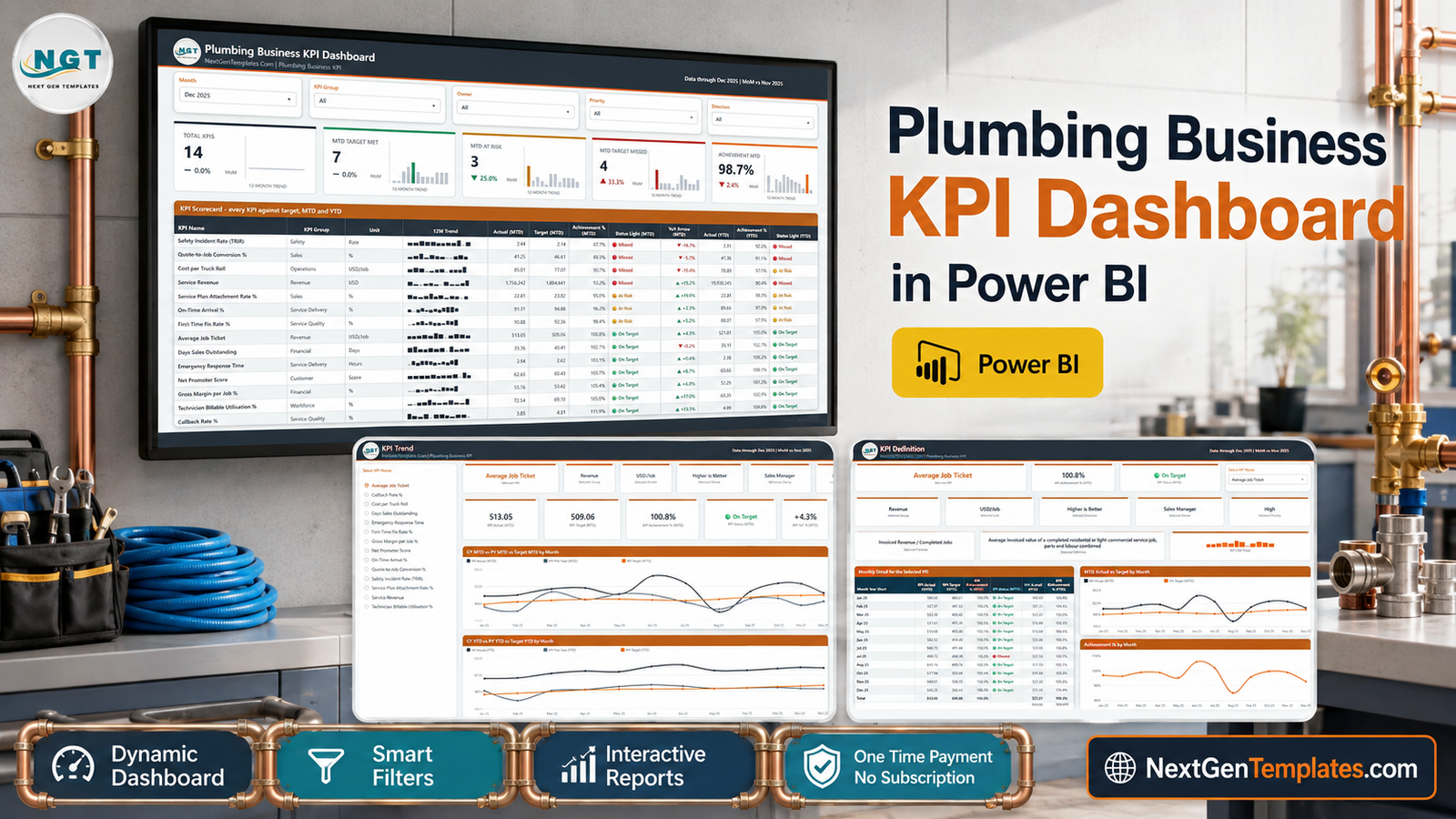
Most plumbing businesses measure plenty and score nothing. Revenue lives in the accounting package, first-time fix rate lives in someone’s head, callbacks live in a spreadsheet nobody opens after the 10th, and the monthly meeting turns into a hunt for numbers rather than a decision about them. The Plumbing Business KPI Dashboard in Power BI is built for the other half of that job: it takes 14 plumbing KPIs you have already agreed on, scores each one against its target for the month, and puts the verdict on a single page.
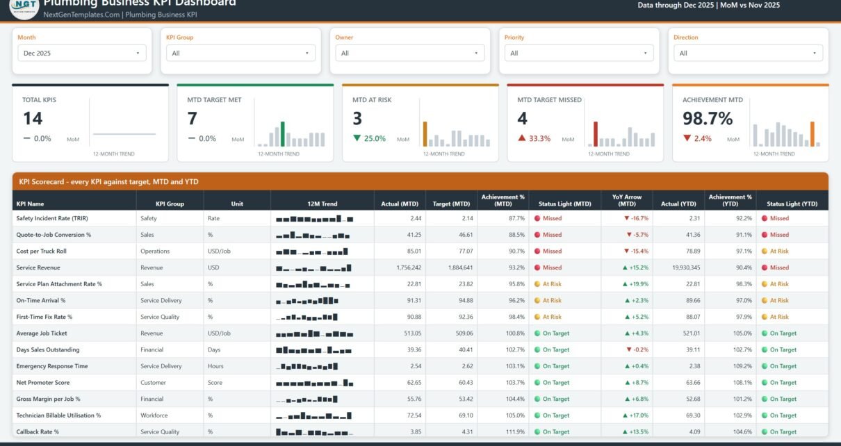
The sample file ships December 2025 data – 14 KPIs, 7 on target, 3 at risk, 4 missed, 98.7% achievement for the month, all measured month-on-month against November. Four report pages, two hover tooltip pages, five synced slicers and 38 DAX measures behind the visuals. It opens in the free Power BI Desktop and reads an Excel data pack you fill in yourself.
One thing to be clear about up front: this is the KPI scorecard line. It answers “did we hit target, and which KPI is furthest off?” It is not the analytical Plumbing Contractor Dashboard in Power BI, which slices jobs, revenue and technicians many ways. Different question, different file, and plenty of shops keep both open.
Plumbing Business KPI Dashboard in Power BI
Key Features of the Plumbing Business KPI Dashboard in Power BI
- 14 KPIs across 9 groups – Service Delivery, Service Quality, Revenue, Sales, Financial, Workforce, Operations, Customer and Safety.
- Five synced slicers – Month, KPI Group, Owner, Priority and Direction, shared across pages through sync groups.
- Five summary cards – Total KPIs, MTD Target Met, MTD At Risk, MTD Target Missed and Achievement MTD, each carrying a month-on-month delta and a 12-month sparkline.
- MTD and YTD on the same row – actual, target, achievement percentage and traffic light for both, plus a year-on-year arrow.
- Worst-first sorting – the scorecard sorts ascending on Achievement % (MTD), so the KPI in trouble is the first line you read, not the last.
- Direction-aware scoring – each KPI is tagged UTB (higher is better) or LTB (lower is better), so coming in under a cost or response-time target scores above 100%.
- Editable thresholds – On Target at 100%+, At Risk 95–100%, Missed below 95%, all of it DAX you can change.
- Nothing hard-coded – add, rename or delete a KPI in the Excel pack and every card, chart and table follows on Refresh.
- Native visuals and a custom theme – cards, tables, line charts, bar charts and slicers. No AppSource visuals, no gateway, no Pro licence to open it. Plumbing Business KPI Dashboard in Power BI
Dashboard Pages Explanation
Page 1 – KPI Scorecard
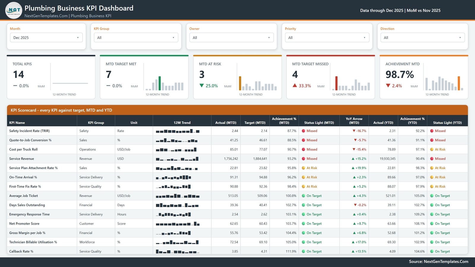
Five slicers across the top, then the five summary cards, then the scorecard itself: KPI Name, KPI Group, Unit, a 12M Trend sparkline, Actual (MTD), Target (MTD), Achievement % (MTD), Status Light (MTD), YoY Arrow (MTD), Actual (YTD), Achievement % (YTD) and Status Light (YTD). In the sample month the top four rows are Safety Incident Rate (TRIR), Quote-to-Job Conversion %, Cost per Truck Roll and Service Revenue – the four misses, sorted to the top by design. Plumbing Business KPI Dashboard in Power BI
Page 2 – KPI Trend
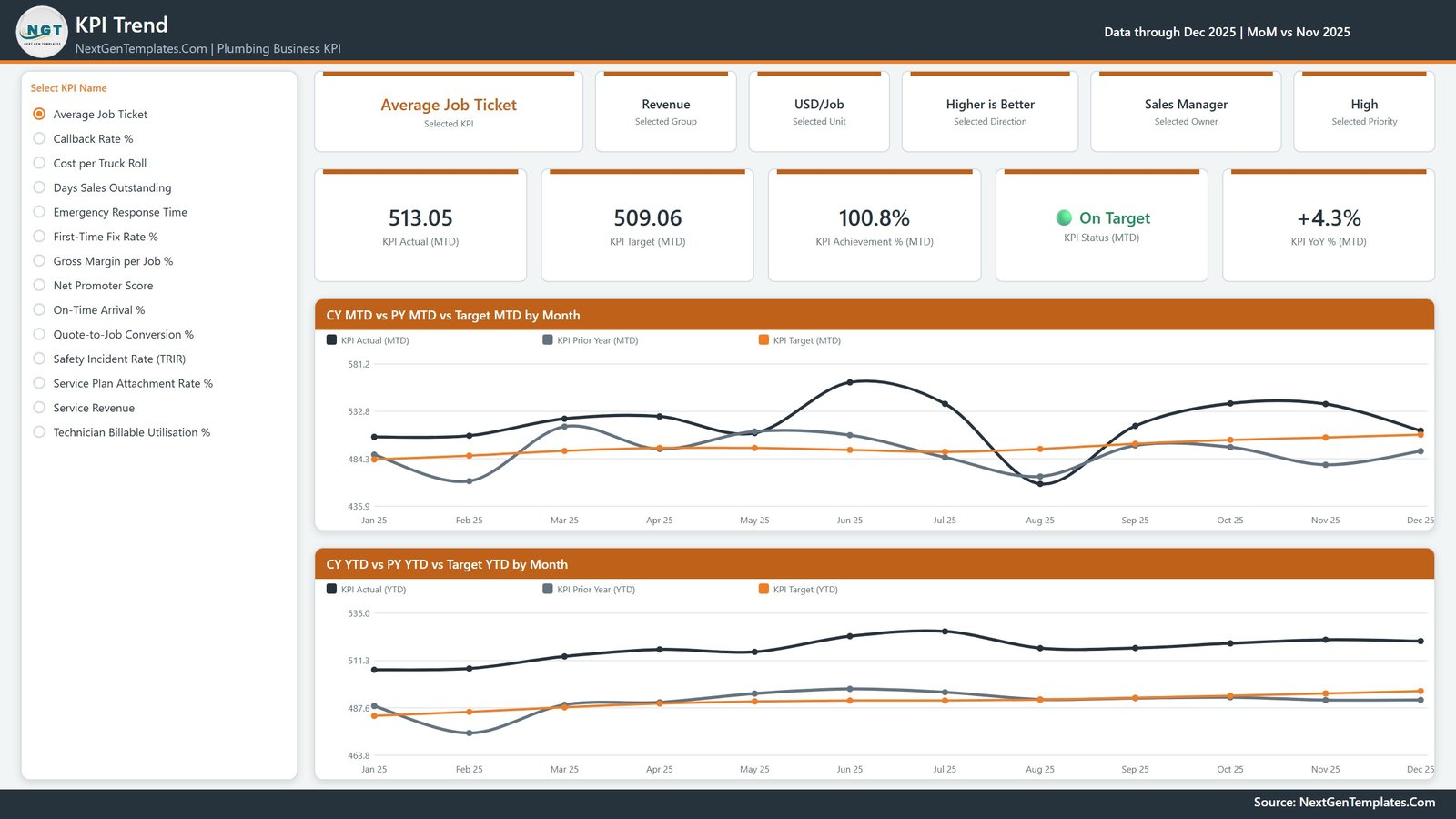
A radio list of all 14 KPI names runs down the left. Pick one – Average Job Ticket in the shipped sample – and six context cards (Group, Unit, Direction, Owner, Priority) and five value cards (Actual MTD, Target MTD, Achievement % MTD, Status, YoY % MTD) redraw above two line charts: CY MTD vs PY MTD vs Target MTD by Month and CY YTD vs PY YTD vs Target YTD by Month. Three lines each: this year, last year, target. Plumbing Business KPI Dashboard in Power BI
Page 3 – KPI Definition
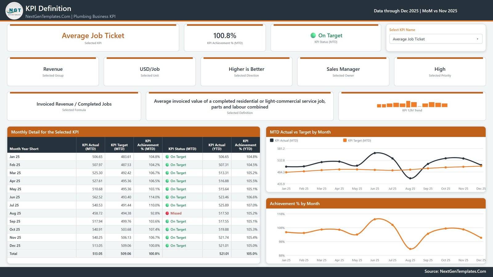
This page is reached by a dropdown that is synced with the KPI Trend page, not by a drillthrough – pick a KPI on either page and both agree. It shows the formula (“Invoiced Revenue / Completed Jobs”), the plain-English definition, the owner, the priority and a 12-month bar trend, then a Monthly Detail table with twelve rows plus a total, and two charts: MTD Actual vs Target by Month and Achievement % by Month. It is the page to open when somebody argues about what a KPI actually means. Plumbing Business KPI Dashboard in Power BI
Page 4 – Get More Templates
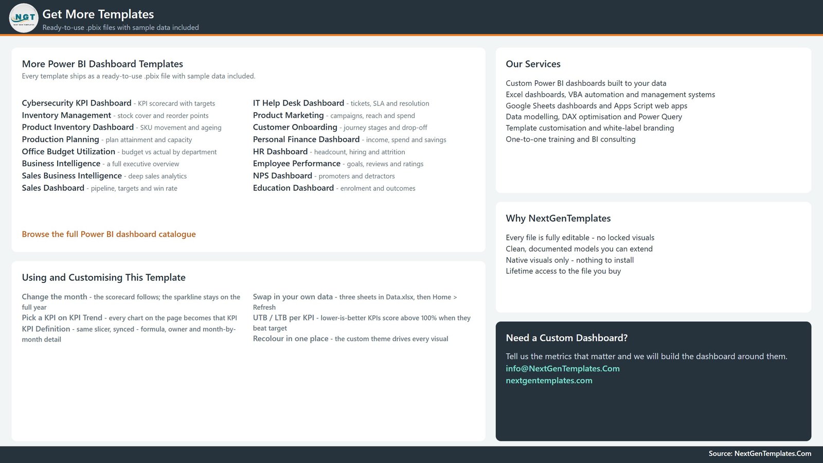
An honest note: page 4 carries no data. It is an in-file catalogue listing other NextGenTemplates Power BI reports, our services, a short customisation crib sheet and contact details. Useful the first time you open the file; delete it in Power BI Desktop before handing the report to a client.
Two further pages are hidden in view mode – KPI Detail and Trend Detail, both 280×360 tooltip pages that appear when you hover a visual. Plumbing Business KPI Dashboard in Power BI
Plumbing Business KPI Dashboard in Power BI vs. a Tableau or Qlik Build vs. Field Service SaaS Reporting – Feature Comparison
| This template (Power BI) | Tableau / Qlik build | ServiceTitan / Housecall Pro reporting | |
|---|---|---|---|
| Cost | $12.99 one time | Licence plus build time | Monthly per user, ongoing |
| Platform | Power BI Desktop (free) | Tableau Desktop / Qlik Sense | Vendor web app |
| Setup time | Under an hour to swap the sample data | Days to weeks | Onboarding project |
| Real-time team collaboration | No – a desktop file unless you publish it | With a paid server | Yes |
| Mobile access | Only if you publish it yourself | With a paid server | Yes |
| Customizable fields | Every KPI, target, owner and threshold | Yes | Vendor’s KPI set |
| Share with link | No – you send the file | With a paid server | Yes |
| Year-1 cost at 5 users | $12.99 | Four figures and up | Four to five figures |
| Connects to your job system | No – it refreshes from Data.xlsx | Only if you build it | Yes, it is the job system |
| You own the model and the DAX | Yes – nothing is locked | Yes | No |
Who Should Use This Template
It suits an owner or operations manager of a residential and light-commercial plumbing firm running roughly 5 to 60 technicians, who already extracts monthly totals from a job system and wants one scored page for the monthly review. It suits a finance controller who wants Days Sales Outstanding and Gross Margin per Job sitting beside first-time fix rate. It suits anyone learning Power BI who wants a readable KPI model to pull apart.
It is a poor fit if you expect the file to fetch numbers on its own. There is no live connector: it reads Data.xlsx and nothing else. It is not accounting or invoicing software – it raises no invoice, posts to no ledger, reconciles nothing. It does no dispatch or scheduling – it never assigns a technician, books an appointment or routes a van. And it does no compliance checking of any kind: no licence or permit tracking, no backflow-prevention certification records, no apprenticeship-hour logging, no plumbing-code validation. The Safety Incident Rate (TRIR) row is a figure you type in; the file performs no OSHA calculation and keeps no records, so that number evidences nothing about your safety programme. Treat every safety-sounding KPI here the same way.
Real-World Use Cases
The Monday operations meeting. A 14-van drainage and plumbing firm closes the month, types the actuals into Data.xlsx, refreshes, and opens page 1 on the screen. Because the table sorts worst-first, the discussion starts on the four missed KPIs instead of the seven comfortable ones.
Owner-by-owner accountability. The Owner slicer carries eight names in the sample – Dispatch, Field Operations, Sales Manager, Finance Controller, Service Manager, Customer Experience, Fleet & Inventory, Safety & Compliance. Filter to one and that person sees only their own KPIs, MTD and YTD.
Settling a definition argument. Someone disputes what “first-time fix” counts as. Open page 3, pick the KPI, and the formula and definition are on screen for everyone, alongside twelve months of detail.
Advantages of the Plumbing Business KPI Dashboard in Power BI
The scoring is the part that earns its keep. Because every KPI is tagged UTB or LTB, a plumbing business can put Emergency Response Time, Cost per Truck Roll and Days Sales Outstanding on the same page as Service Revenue and Net Promoter Score without a single one of them reading backwards. Achievement percentage becomes the common language, which is also why the summary cards can count KPIs met and missed at all.
The second advantage is that the model is genuinely open. The DataModel is compressed, so we quote only what the report visuals actually reference – 38 measures – but every one of them is visible and editable in Power BI Desktop. Change a threshold, add a measure, recolour the whole report from the custom theme in one place. Nothing is hidden, and there is no per-seat cost when you add a second manager.
Opportunities for Improvement
The refresh is manual and file-based. If you want this on a phone or on a shared workspace you have to publish it to the Power BI Service yourself, and that needs a Pro or Premium licence – the template does not provide one. Someone still has to key the monthly actuals into Data.xlsx; if your job system exports monthly totals you can paste them in, but there is no automation in the box. Page 4 is a marketing page and should be deleted before the file goes to a client. And the sample figures are fictional demonstration data built to exercise every visual, so replace them before anyone mistakes them for a benchmark.
Best Practices
Keep the .pbix and Data.xlsx in the same folder – if you move them, repoint the source under Transform data > Data source settings > Change Source. Agree targets once a year rather than adjusting them when a month goes badly. Load the prior year into Input_ Actual, because every PY line and YoY arrow reads from it. For rates, ratios and percentages make YTD the average of the months so far, never a sum – a compliance percentage that adds up to 1,900% by December is the most common way to ruin a KPI pack. And keep the KPI count honest: 14 rows people act on beats 40 rows nobody reads. Microsoft’s own Power BI tooltip documentation is worth a read if you want to extend the two hidden tooltip pages.
Explore Relevant Templates
The same scorecard in other tools: Plumbing Business KPI Dashboard in Excel and Plumbing Business KPI Dashboard in Google Sheets. Lighter, cheaper scorecards for the same trade: Plumbing Business KPI Scorecard in Excel and Plumbing Business KPI Scorecard in Google Sheets. For job-level analysis rather than scoring: Plumbing Contractor Dashboard in Power BI or Plumbing Contractor Dashboard in Excel. Running the vans hard? Fleet Management KPI Dashboard in Power BI. Neighbouring trade: HVAC Service Dashboard in Excel.
Frequently Asked Questions
Does it connect to ServiceTitan, Housecall Pro, Jobber or QuickBooks?
No. There is no connector, no API and no sync of any kind. The report reads Data.xlsx, which you fill in. If your job system exports monthly totals you can paste them in, but nothing updates by itself.
Does it track licences, permits, backflow certification or apprenticeship hours?
No. There is no compliance feature and no plumbing-code logic anywhere in the file. Anything compliance-flavoured you type into a KPI row is displayed exactly as typed and verified by nothing.
Do I need a Power BI Pro licence?
Not to open, edit or use it – Power BI Desktop is free. Pro or Premium is only needed if you want to publish the report to the Power BI Service and share it with colleagues.
Can I use my own KPIs instead of the 14 supplied?
Yes, and that is the point. Nothing in the report hard-codes a KPI name. Add a row to the KPI Definition sheet plus its monthly target and actual rows, then Refresh.
Why does a lower-is-better KPI score above 100%?
Scoring is direction-aware. UTB KPIs score Actual / Target, LTB KPIs score Target / Actual. Beating a cost or response-time target is a win, so it reads above 100% instead of looking like a shortfall.
Is the sample data real plumbing data?
No. The December 2025 figures are fictional sample values created to exercise every visual. They are not a benchmark and should not be compared against your own numbers.
About the Author
Built by PK – Microsoft Certified Professional with 15+ years of Excel, Google Sheets, and Power BI experience. Founder of NextGenTemplates, reaching 300K+ subscribers across YouTube channels. Every template is hand-built and tested before release.
Conclusion
A plumbing business does not usually fail for lack of data. It fails because nobody agreed which fourteen numbers matter, what each one should be, and who owns it. This template does that one job: fourteen KPIs, one target each, one scored page a month, with last year’s line right beside this year’s. No dispatch, no invoicing, no compliance claims – just an honest monthly verdict you can argue with.
Get the Plumbing Business KPI Dashboard in Power BI for $12.99 (regular $19.99) – instant download, lifetime access, fully editable.
For step-by-step Power BI and Excel walkthroughs, subscribe to youtube.com/@PKAnExcelExpert.