Retailers and supply chain teams globally lost an estimated $1.75 trillion in revenue due to out-of-stock events in a single year — and yet most mid-sized operations still track stockout rates manually in spreadsheets, missing trends until they become crises. The Out-of-Stock Rate KPI Dashboard in Power BI solves this by consolidating inventory performance into a 3-page interactive Power BI report with MTD and YTD actuals, targets, LTB/UTB icon logic, year-over-year comparisons, and a hidden drill-through KPI definition page — all powered by a structured Excel data file you can update in minutes.
Whether you manage inventory for a supermarket chain, an e-commerce fulfilment centre, or a manufacturing plant, this dashboard gives procurement managers, supply chain analysts, and operations leaders a single source of truth for out-of-stock rate and related inventory KPIs — without paying $75/user/month for a Tableau license or waiting weeks for an ERP implementation.
Key Features of the Out-of-Stock Rate KPI Dashboard in Power BI
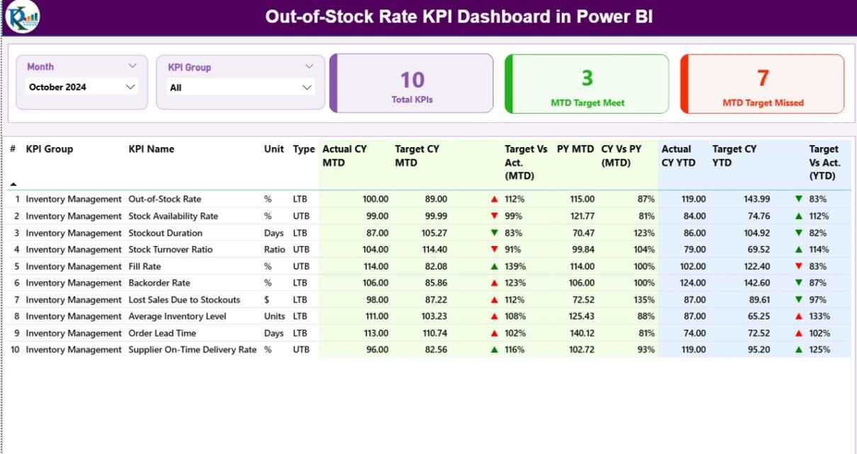
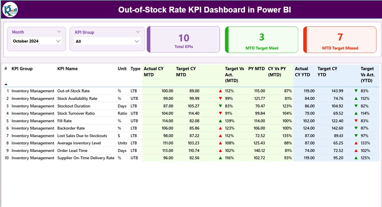
The Out-of-Stock Rate KPI Dashboard in Power BI tracks inventory performance across 3 summary cards on the main page — Total KPIs monitored, MTD Target Met count, and MTD Target Missed count — giving leadership an instant green/red health check the moment they open the report. All KPI types (LTB and UTB) are supported, and the icon direction is assigned automatically based on each KPI’s classification.
LTB / UTB KPI Direction Logic: Each KPI in the dashboard is classified as either Lower the Better (LTB — e.g., out-of-stock rate, stockout frequency) or Upper the Better (UTB — e.g., fill rate, on-shelf availability). The dashboard evaluates performance direction accordingly, coloring the ▲▼ icons green or red without any manual formula changes. This is one of the most time-saving features for teams tracking mixed KPI types across different business units.
17-Column Detail Table on the Summary Page: Every KPI appears as a row showing KPI Number, KPI Group, KPI Name, Unit, Type (LTB/UTB), Actual CY MTD, Target CY MTD, MTD Icon (▲/▼), Target vs Actual MTD%, PY MTD, CY vs PY MTD%, Actual CY YTD, Target CY YTD, YTD Icon, Target vs Actual YTD%, PY YTD, and CY vs PY YTD% — all in a single scrollable table. This eliminates the need to switch between multiple report pages just to compare MTD and YTD data side by side.
KPI Trend Combo Charts: The KPI Trend page contains two combo charts displaying month-by-month Current Year actuals, Previous Year actuals, and Targets for MTD and YTD separately. Selecting any KPI from the left-side slicer instantly updates both charts, making it easy to spot seasonal stockout spikes, deteriorating fill rates, or consistent target gaps across a rolling 12-month window.
Hidden Drill-Through Definition Page: A hidden KPI Definition page is accessible via right-click drill-through from any row in the Summary table. It displays the selected KPI’s full formula, definition, KPI group, unit, and LTB/UTB classification — ideal for onboarding new analysts or presenting KPI methodology to stakeholders. A Back button in the top-left corner returns the user to the Summary without losing filter context.
Structured Excel Data Source: Three worksheets power the entire dashboard — Input_Actual (KPI Name, Month, MTD Actual, YTD Actual), Input_Target (KPI Name, Month, MTD Target, YTD Target), and KPI Definition (KPI Number, KPI Group, KPI Name, Unit, Formula, Definition, Type). Update the Excel file and refresh Power BI — every visual adjusts automatically.
Dashboard Pages Explanation
Page 1 — Summary Page
The Summary page is the main working page of the Out-of-Stock Rate KPI Dashboard in Power BI. Two slicers at the top — Month and KPI Group — enable one-click cross-filtering across all visuals. The three summary cards below show Total KPIs, MTD Target Met, and MTD Target Missed counts at a glance.
Summary Page — 17-column KPI detail table with MTD and YTD columns, directional icons, and CY vs PY comparisons
The detail table below the cards shows every KPI in a row with the full 17-column breakdown. The MTD Icon and YTD Icon columns use ▲ (green = on target for UTB / below target for LTB) and ▼ (red = off target) to give managers an instant read without drilling into percentages. The Target vs Actual percentage columns show how far each KPI is from its monthly and annual target, while the CY vs PY columns show year-over-year movement.
Page 2 — KPI Trend Page
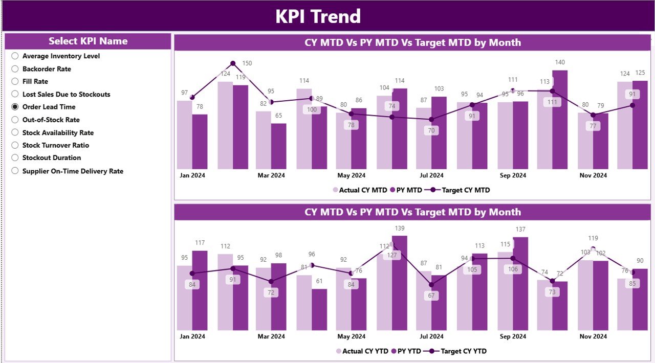 KPI Trend Page — two combo charts showing CY vs PY vs Target for MTD and YTD month-by-month
The KPI Trend page contains two side-by-side combo charts. The left chart tracks MTD actuals vs MTD target vs PY MTD for the selected KPI across all months. The right chart does the same for YTD figures. A KPI name slicer on the left panel lets users isolate any single inventory KPI. This page is particularly powerful for identifying seasonal stockout patterns — e.g., if out-of-stock rate historically spikes in Q4 due to peak demand, the trend chart will show this pattern across multiple years.
Page 3 — KPI Definition Page (Hidden Drill-Through)
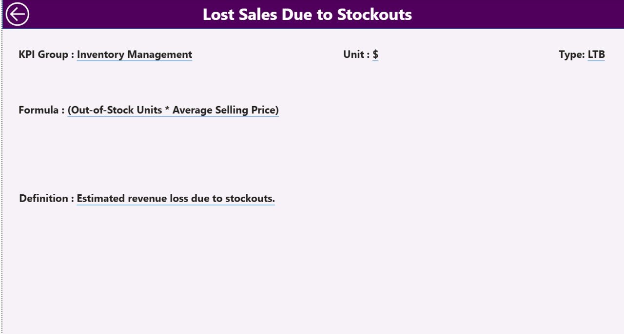 KPI Definition Page — full formula, definition, unit, and LTB/UTB classification for each KPI
The KPI Definition page is a hidden drill-through destination. To access it, right-click any KPI row in the Summary table and select Drill Through from the context menu. The page displays the full KPI formula, definition, KPI group, unit of measurement, and LTB/UTB type classification for the selected KPI. This eliminates the need for separate documentation — all KPI methodology is embedded directly in the dashboard. Clicking the Back button in the top-left corner returns the user to the Summary page instantly.
Out-of-Stock Rate KPI Dashboard in Power BI vs. Tableau vs. Zoho Inventory — Feature Comparison
| Feature | Out-of-Stock Rate KPI Dashboard in Power BI | Tableau | Zoho Inventory / NetSuite ERP |
|---|---|---|---|
| Cost | $11.99 one-time | $75/user/month | $79–$399/user/month |
| Platform required | Power BI Desktop (free) | Tableau Desktop + licence | Cloud SaaS (browser) |
| Setup time | Under 10 minutes | 1–5 days | Weeks (with IT/implementation) |
| LTB/UTB KPI classification built-in | ✅ Yes | ❌ Build from scratch in Tableau Prep | ❌ Not available |
| MTD + YTD dual tracking on one page | ✅ Both on one page | Partial (requires custom layout) | Limited to plan features |
| Drill-through KPI definition | ✅ Built-in hidden page | ❌ Manual tooltip or page action | ❌ Not available |
| CY vs PY year-over-year comparison | ✅ Auto from Excel data | Custom LOD calculation required | Depends on subscription tier |
| Year-1 cost at 5 users | $11.99 total | $4,500+ | $4,700+ |
| Customisable KPI list | ✅ Fully via Excel worksheets | Partial (data source dependent) | Locked to system-defined fields |
For supply chain and retail teams that need MTD/YTD out-of-stock KPI reporting without enterprise BI or ERP costs, the Out-of-Stock Rate KPI Dashboard in Power BI is purpose-built for this gap.
Who Should Use This Template
Perfect for:
- Supply chain analysts who produce monthly inventory KPI reports for leadership and need MTD and YTD tracking in one place
- Retail and FMCG operations teams monitoring out-of-stock rate, fill rate, and on-shelf availability across multiple product categories
- Procurement managers who need a ready-made Power BI report with LTB/UTB KPI logic built in — without writing DAX from scratch
- Warehouse and distribution managers comparing current-year inventory performance against the previous year and annual targets
- Business analysts and BI beginners at companies that use Power BI Desktop but haven’t built a KPI scorecard yet
- ✅ Click here to Purchase the Out-of-Stock Rate KPI Dashboard in Power BI
Not a fit if:
- You need real-time inventory data fed directly from an ERP or WMS system (this dashboard uses a manual Excel data input)
- Your organisation requires Row Level Security (RLS) or Azure Active Directory-based access control across multiple user roles
- You don’t have Power BI Desktop installed (it’s free from Microsoft’s official site, but it is required)
Real-World Use Cases
Riya manages supply chain analytics at a mid-sized FMCG distributor. Her team tracks 12 inventory KPIs across 3 product groups — out-of-stock rate, fill rate, days of supply, and more. Before adopting the Out-of-Stock Rate KPI Dashboard in Power BI, she was stitching together Excel pivot tables manually each month. Now she updates the Input_Actual and Input_Target sheets, refreshes Power BI, and has a complete MTD and YTD scorecard ready for the leadership review in under 10 minutes — with red/green icons, year-over-year percentages, and KPI trend charts all in one report.
A regional supermarket chain’s operations team uses the dashboard to monitor stockout rates across 5 product categories, comparing this year’s fill rate against last year to identify which months historically produce the highest out-of-stock spikes. The KPI Trend page’s combo charts revealed a recurring Q4 dip in on-shelf availability — enabling the team to adjust their pre-holiday reorder quantities proactively rather than reactively.
An e-commerce logistics company uses the drill-through KPI Definition page as part of their analyst onboarding process. New team members can right-click any KPI on the Summary page to view the exact formula and definition the business uses — eliminating confusion over how metrics like “stockout rate” versus “out-of-stock rate” are calculated internally. The KPI documentation is embedded directly in the dashboard, not buried in a separate wiki.
✅ Click here to Purchase the Out-of-Stock Rate KPI Dashboard in Power BI
Advantages of the Out-of-Stock Rate KPI Dashboard in Power BI
- One-time cost of $11.99 replaces recurring BI tool subscriptions that can cost thousands annually for small teams
- No DAX expertise required — all measures are pre-built; users only interact with the Excel data file and Power BI slicers
- Flexible KPI list — add, remove, or rename KPIs by editing the KPI Definition sheet without touching the .pbix file
- LTB/UTB logic eliminates manual icon work — the dashboard handles performance direction automatically for every KPI type
- MTD and YTD in one scrollable view — no switching between tabs to compare monthly vs annual performance
- Built-in KPI documentation via the drill-through definition page reduces reliance on external wikis or tribal knowledge
- Year-over-year comparison included — CY vs PY columns and trend charts are standard, not an add-on
Opportunities for Improvement
- The dashboard uses a static Excel file as its data source — teams needing automated live feeds from SAP, Oracle, or a WMS would need a Power Query connection or a dataflow layer added by a BI developer
- The KPI Trend page supports one KPI at a time via the slicer — teams wanting side-by-side trend comparison of two or more KPIs would need to modify the .pbix layout
- Row-level security is not configured out of the box — if multiple user roles need restricted data visibility, this would require additional setup in Power BI Service
Best Practices
- Use the first date of each month (e.g., 01/01/2026) consistently in the Month column of both Input_Actual and Input_Target sheets to ensure the date slicer works correctly
- Complete the KPI Definition sheet first before entering any actuals or targets — the KPI Name in all three sheets must match exactly for Power BI relationships to resolve correctly
- Review the KPI Group slicer after setup to confirm all KPI groups appear as expected; mismatched group names in the KPI Definition sheet will cause filtering issues
- Refresh Power BI after every Excel update — the dashboard does not auto-refresh unless published to Power BI Service with a scheduled gateway refresh configured
- Add PY data before presenting trend charts — the CY vs PY columns and KPI Trend charts require previous-year actuals in the Input_Actual sheet to show meaningful comparisons
Explore Relevant Templates
✅ Click here to Purchase the Out-of-Stock Rate KPI Dashboard in Power BI
Looking for more Power BI KPI Dashboard templates? These related tools complement the Out-of-Stock Rate KPI Dashboard:
- 📊 Shelf Space Utilization KPI Dashboard in Power BI — monitor retail shelf performance with the same MTD/YTD KPI structure
- 📋 Supply Chain Procurement Dashboard in Google Sheets — Google Sheets alternative for procurement tracking
- 📦 Inventory Tracker in Google Sheets — lightweight stock tracking for teams not on Power BI
- 🏭 Warehouse Efficiency Dashboard in Google Sheets — a Google Sheets option for warehouse operational KPIs
Also explore the full Power BI Dashboard Templates collection at NextGenTemplates.
Frequently Asked Questions
What KPIs does the Out-of-Stock Rate KPI Dashboard in Power BI track?
The Out-of-Stock Rate KPI Dashboard in Power BI tracks any inventory KPIs you define in the KPI Definition sheet — including out-of-stock rate, fill rate, days of supply, and on-shelf availability. KPIs are classified as LTB or UTB, and the dashboard auto-applies directional icon logic for both MTD and YTD periods across all KPI types.
Do I need a paid Power BI license to use this dashboard?
No. The dashboard runs in Power BI Desktop, which is free from Microsoft. A Power BI Pro or Premium license is only needed if you want to publish and share the .pbix report with colleagues via Power BI Service — desktop usage for personal reporting requires no subscription.
How do I add new KPIs to the dashboard?
Add the new KPI’s details (KPI Number, Group, Name, Unit, Formula, Definition, Type) to the KPI Definition sheet, then add the corresponding actuals and targets to the Input_Actual and Input_Target sheets. Refresh Power BI and the new KPI will appear automatically in the Summary table and trend charts.
What is the difference between LTB and UTB KPIs?
LTB (Lower the Better) means the KPI performs better when the actual is below the target — e.g., out-of-stock rate should be minimised. UTB (Upper the Better) means the KPI performs better when the actual exceeds the target — e.g., fill rate should be maximised. The Out-of-Stock Rate KPI Dashboard in Power BI applies opposite icon and colour logic automatically for each type.
Can I track multiple product categories in one dashboard?
Yes. Use the KPI Group field in the KPI Definition sheet to assign each KPI to a product category or business unit. The KPI Group slicer on the Summary page then filters all visuals to the selected group — making this dashboard suitable for operations teams managing multiple SKU categories or regional warehouses simultaneously.
✅ Click here to Purchase the Out-of-Stock Rate KPI Dashboard in Power BI
How does this dashboard compare to building a tracker in Excel?
The Out-of-Stock Rate KPI Dashboard in Power BI provides interactive slicers, drill-through navigation, and dynamic combo trend charts that a flat Excel table cannot offer natively. Power BI handles the visual interactivity while Excel remains the familiar data-entry interface — teams get the ease of Excel input with the analytical power of Power BI reporting.
How long does initial setup take?
Most users complete the initial setup in under 10 minutes — fill the three Excel worksheets with your KPI definitions, actuals, and targets, update the data source path in Power BI Desktop, and click Refresh. The dashboard populates automatically with your data, and slicers are immediately functional.
About the Author
Built by PK — Microsoft Certified Professional with 15+ years of Excel, Google Sheets, and Power BI experience. Founder of NextGenTemplates, reaching 300K+ subscribers across YouTube channels (@PK-AnExcelExpert, @NextGenTemplates, @NeoTechNavigators). Every template is hand-built and tested before release.
Conclusion
The Out-of-Stock Rate KPI Dashboard in Power BI is a production-ready inventory analytics report for supply chain analysts, retail operations managers, and procurement teams who need MTD and YTD KPI visibility with LTB/UTB logic, year-over-year comparisons, and built-in KPI documentation — all in a single Power BI .pbix file powered by Excel.
✅ Click here to Purchase the Out-of-Stock Rate KPI Dashboard in Power BI
Instant download · One-time payment · No subscription
Visit Youtube.com/@PK-AnExcelExpert for free Power BI tutorial videos.
📅 Last updated: May 2026