
Pest control businesses today manage dozens of service calls, multiple technicians, and complex cost structures across regions — yet most still rely on spreadsheets with no unified view of profitability or performance. The Pest Control Dashboard in Power BI solves this by consolidating 5 core KPIs, 12+ DAX-powered charts, and 5 purpose-built analysis pages into a single .pbix file. Teams that switch from ad hoc spreadsheet reporting to this structured dashboard typically cut their reporting prep time by 60% or more. With Power BI Desktop (free from Microsoft), setup takes under 15 minutes — just connect your Excel data and hit Refresh.
Whether you track fumigation services, rodent control contracts, bed bug treatments, or recurring inspection programs, this dashboard gives you a clear, filtered view of what’s profitable, which technicians are performing, and where costs are climbing — without any subscription fees.
Key Features of the Pest Control Dashboard in Power BI
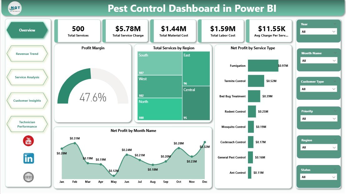
The Pest Control Dashboard in Power BI tracks 5 KPI cards at the top of the Overview page: Total Services, Total Service Charge, Total Material Cost, Total Labor Cost, and Avg Charge Per Service. These cards give service managers and business owners an instant financial health snapshot every time they open the file — no scrolling, no pivot table edits required.
The dashboard includes 12+ DAX-powered charts spanning all 5 pages: Profit Margin, Total Services by Region, Net Profit by Service Type, Net Profit by Month Name, Material Cost by Quarter, Net Profit by Treatment Method, Avg Satisfaction by Warranty Period, Net Profit by Customer Type, Total Service Charge by Priority, Net Profit by Technician, Avg Satisfaction by Customer Type, Profit Margin by Quarter, Total Service Charge by Status, and Avg Satisfaction Score by Technician. Every visual uses Power BI DAX measures — calculations are dynamic and auto-refresh when new data is loaded.
The interactive slicer panel lets you filter any page by region, service type, treatment method, technician, time period, or status — without touching the underlying data. This makes it easy to answer questions like “Which treatment method had the highest profit margin in Q3?” or “Which technician had the lowest satisfaction score last month?” in seconds.
Dashboard Pages Explanation
Page 1 — Overview: The main summary page displays all 5 KPI cards at the top followed by four charts: Profit Margin (overall business health), Total Services by Region (geographic workload distribution), Net Profit by Service Type (which service lines are most lucrative), and Net Profit by Month Name (seasonality trends). Multiple slicers run across the top of the page, enabling instant cross-chart filtering.
Overview Page — Pest Control Dashboard in Power BI
Page 2 — Revenue Trend: Focuses on financial trends over time. Three charts show Total Material Cost by Quarter (helping you spot rising input costs), Profit Margin by Month Name (revealing seasonal profitability cycles), and Total Services by Service Type (tracking volume trends across fumigation, inspection, baiting, and other categories).
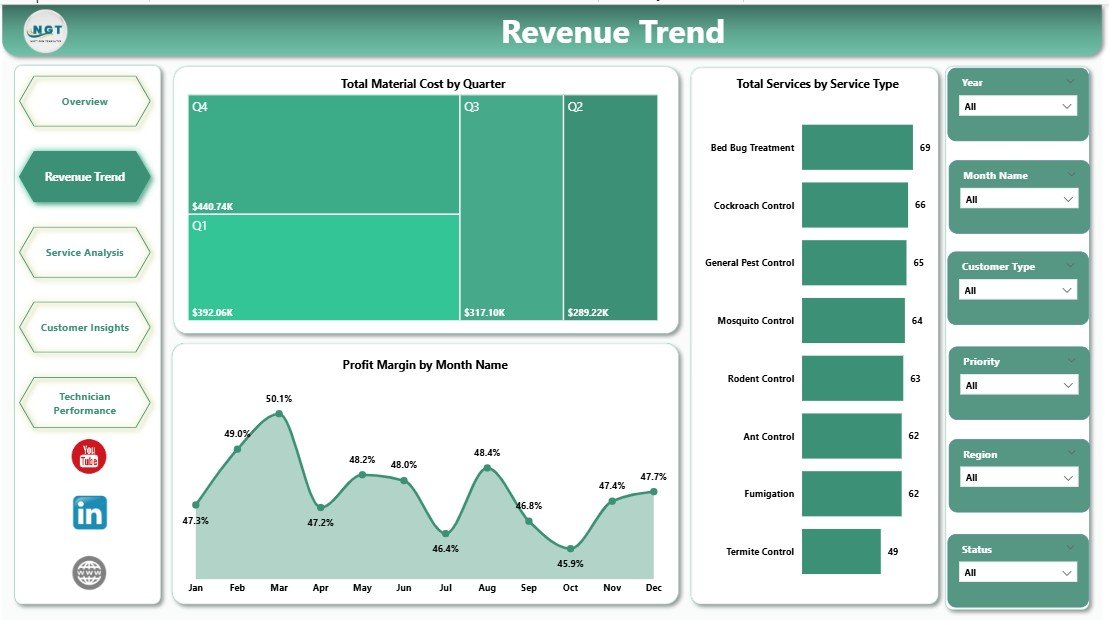
Revenue Trend Page
Page 3 — Service Analysis: Breaks down profitability by what was done and who it was done for. Charts include Net Profit by Treatment Method (chemical spray vs. heat treatment vs. baiting, etc.), Net Profit by Customer Type (residential vs. commercial vs. industrial), and Avg Satisfaction Score by Warranty Period. This page helps service managers identify which treatment methods and customer segments yield the best margins and satisfaction scores.
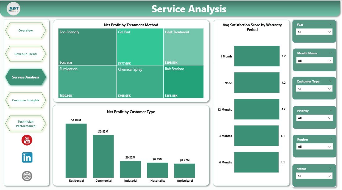
Service Analysis Page
Page 4 — Customer Insights: Surfaces patterns in customer value and satisfaction. Total Service Charge by Priority shows which ticket types generate the most revenue. Net Profit by Technician reveals which field reps are most profitable. Avg Satisfaction Score by Customer Type lets you compare residential vs. commercial satisfaction to guide account management strategy.
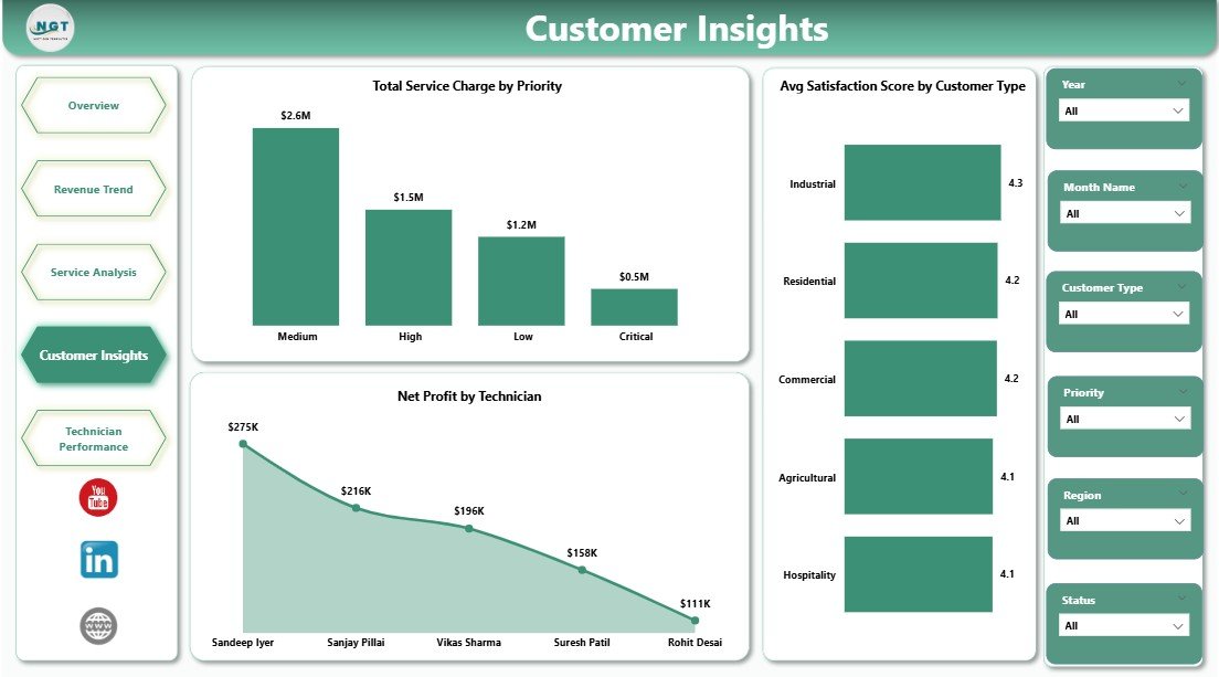
Customer Insights Page
Page 5 — Technician Performance: A dedicated workforce analytics page tracking three dimensions of technician output: Profit Margin by Quarter (which technicians are consistently profitable), Total Service Charge by Status (completed vs. pending vs. revisit rates), and Avg Satisfaction Score by Technician. Service directors can use this page directly in quarterly performance reviews.
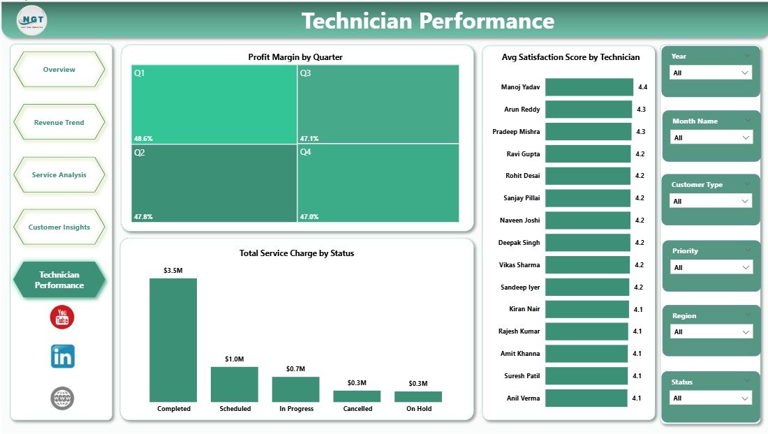
Technician Performance Page
Pest Control Dashboard in Power BI vs. Tableau vs. ServiceTitan — Feature Comparison
| Feature | Pest Control Dashboard in Power BI | Tableau Alternative | ServiceTitan (Paid SaaS) |
|---|---|---|---|
| Cost | $17.99 one-time | $75/user/month | $500+/month (min seats) |
| Platform | Power BI Desktop (free) | Tableau Desktop (paid) | Browser/Mobile SaaS |
| Setup Time | Under 15 minutes ✅ | Hours of configuration | Days of onboarding |
| Subscription Required | No ✅ | Yes | Yes |
| Customizable Fields | Fully editable ✅ | Limited by license tier | Preset fields only |
| Technician Dashboards | Built-in ✅ | Manual build required | ✅ (at extra cost) |
| Year-1 Cost (5 users) | $17.99 total ✅ | $4,500+ | $6,000+ |
| Instant Download | Yes ✅ | No | No |
For pest control businesses that need structured operational visibility without enterprise SaaS pricing, the Pest Control Dashboard in Power BI sits in the sweet spot.
Who Should Use This Template
✅ Perfect for:
- Pest control business owners managing 2–20 field technicians and needing a monthly performance overview
- Operations managers tracking service profitability by region, treatment method, and service type
- Finance teams building quarterly revenue trend and cost analysis reports for ownership
- Service directors running technician performance reviews using satisfaction and profit data
❌ Not a fit if:
- You need real-time live dispatch or IoT integration — this dashboard works from batch-refreshed Excel data, not live APIs
- Your team doesn’t have Power BI Desktop installed — the .pbix file requires the free Power BI Desktop from Microsoft
- You need built-in CRM, invoicing, or automated scheduling — this is a reporting and analytics dashboard, not a workflow tool
Real-World Use Cases
Marco manages operations for a regional pest control chain across 3 cities with 8 technicians. Before this dashboard, he was manually pulling Excel exports from their scheduling software and building ad hoc pivot tables every Monday. Now he connects his weekly service export to the Power BI data file, clicks Refresh, and has a complete profit margin and technician performance view within seconds. He presents Page 5 directly at the quarterly team meeting to recognize top performers and address service quality issues.
Lisa runs a solo pest control business and just completed her first full year of operations. She uses the Pest Control Dashboard in Power BI to analyze which treatment methods generated the highest net profit in year one, which customer types (residential vs. commercial) had better satisfaction scores, and how her material costs varied by quarter. This analysis helped her decide to focus her marketing spend on commercial accounts for year two — where her profit margins were 22% higher.
David is a franchise owner overseeing two pest control locations. He uses the Region filter on the Overview page to compare net profit, service volume, and average charge per service between locations side by side — giving him a clear picture of which franchise is outperforming and what’s driving the gap.
Advantages of the Pest Control Dashboard in Power BI
The biggest advantage of this template over a generic spreadsheet is structured, consistent reporting with zero rebuild effort. Once set up, every reporting cycle is just a data update and a Refresh click. The DAX measures handle all calculations dynamically — profit margin percentages, averages, and aggregations all update without touching a single formula.
The 5-page separation of concerns means different stakeholders can go directly to their relevant page: operations managers use Overview, finance teams use Revenue Trend, customer success uses Customer Insights, and HR or service leadership uses Technician Performance. No one has to scroll through irrelevant data.
At $17.99 one-time with no recurring fees, this dashboard pays for itself within the first use — the time saved on a single monthly report justifies the cost within hours.
Opportunities for Improvement
Like any pre-built template, this dashboard works best when your data follows the required column structure. If your service management software exports data in a different format, you may need to spend 15–30 minutes reformatting column headers or using Power Query to reshape the data before the first Refresh. The sample Excel file included in the download shows the exact format needed.
The dashboard currently covers 5 analysis pages. Teams with highly specialized reporting needs — such as chemical inventory tracking, route optimization, or regulatory compliance logs — may need to add custom pages in Power BI Desktop. The base template is fully editable, so extending it is straightforward for anyone with intermediate Power BI experience.
Best Practices
- Keep column headers consistent — Power BI relationships break if column names in your Excel data don’t match what the template expects. Use the sample file as your data template.
- Refresh weekly, not monthly — the more frequently you update the data, the more useful the trend charts become for spotting early warning signs in costs or satisfaction scores.
- Use the slicer panel first — before drawing conclusions from any chart, apply the relevant region and time-period slicers to ensure you’re looking at the right segment of data.
- Pin key visuals to a Power BI Service dashboard — if you upgrade to Power BI Pro, you can publish the report and pin the Technician Performance page to a team dashboard for always-visible KPIs.
Explore Relevant Templates
If you prefer working in Microsoft Excel, the Pest Control Dashboard in Excel covers the same 5-page analysis with pivot-driven charts and slicers — no Power BI required. Also see the Pest Control Dashboard in Excel blog post for a detailed walkthrough of that version. For a structured field service checklist, the Pest Control Checklist in Google Sheets provides a pre/post-service inspection workflow. Browse all Power BI Dashboard Templates for 600+ industry-specific dashboards available for instant download.
Frequently Asked Questions
What KPIs does the Pest Control Dashboard in Power BI track?
The Pest Control Dashboard in Power BI tracks 5 core KPIs: Total Services, Total Service Charge, Total Material Cost, Total Labor Cost, and Avg Charge Per Service — displayed as interactive cards on the Overview page with breakdowns by region, service type, technician, treatment method, and month across all 5 analysis pages.
Do I need a paid Power BI license to use this dashboard?
No. The dashboard runs fully on Power BI Desktop, which is free to download from Microsoft. You only need a paid Power BI Pro or Premium license if you want to publish and share reports online with your team via the Power BI Service cloud platform.
How long does setup take for the Pest Control Dashboard in Power BI?
Initial setup takes under 15 minutes. Download and unzip the file, open the .pbix in Power BI Desktop, replace the sample Excel data with your own service records using the same column headers, then click Refresh. All 5 pages and 12+ charts update automatically.
Can I add new pages or modify the existing charts?
Yes. The Pest Control Dashboard in Power BI is fully editable in Power BI Desktop. You can add new report pages, modify existing DAX measures, adjust color themes, rename pages, or create new visuals using your own data columns.
How does this compare to ServiceTitan for pest control analytics?
ServiceTitan Analytics is a powerful tool but starts at $500+/month with multi-day onboarding. The Pest Control Dashboard in Power BI provides comparable operational analytics — profit by technician, service volume trends, customer segmentation — as a $17.99 one-time purchase using your own exported data files.
Is there an Excel version of this dashboard available?
Yes. The Pest Control Dashboard in Excel offers the same 5-page analysis structure with Excel-native pivot charts and slicers, requiring no Power BI Desktop. Both templates use the same analysis framework — just choose the platform that fits your workflow.
What data format does this dashboard require?
The dashboard requires an Excel dataset with columns for service date, region, service type, treatment method, technician, service charge, material cost, labor cost, customer type, priority, warranty period, satisfaction score, and status. A sample Excel file with the correct format and 500 rows of sample data is included in the download package.
About the Author
Built by PK — Microsoft Certified Professional with 15+ years of Excel, Google Sheets, and Power BI experience. Founder of NextGenTemplates, reaching 300K+ subscribers across YouTube channels (@PK-AnExcelExpert, @NextGenTemplates). Every template is hand-built and tested before release.
Conclusion
The Pest Control Dashboard in Power BI gives field service businesses a structured, repeatable reporting system for profit margin analysis, service trend tracking, and technician performance management — all from a single .pbix file that refreshes in seconds. No recurring software fees, no complex onboarding, no per-user pricing.
👉 Click here to Purchase the Pest Control Dashboard in Power BI
✅ Instant download · One-time payment · No subscription · Lifetime access
🎥 Watch step-by-step video tutorials on our YouTube channel: Youtube.com/@PK-AnExcelExpert
📅 Last updated: May 2026