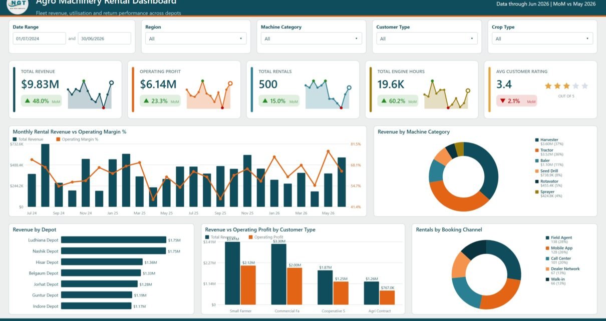
Agro Machinery Rental Dashboard in Power BI is a ready-to-use Power BI report for farm equipment rental companies, machinery depots, agricultural cooperatives, and fleet managers who need one place to track revenue, operating profit, rental volume, engine hours, customer rating, depot performance, downtime, and crop-level demand. Machinery rental data can quickly become difficult to review when bookings are spread across machine categories, models, depots, regions, customer types, booking channels, payment modes, rental statuses, and return dates. This Power BI dashboard brings those details into 5 report pages with KPI cards, slicers, and 21 analysis visuals.
The report is useful for teams that already maintain rental records in Excel, CSV, ERP exports, or operational systems and want a visual reporting layer in Microsoft Power BI. Microsoft explains that Power BI helps users connect to data, model it, and create interactive reports; you can learn more from Microsoft Learn: What is Power BI?. This template is designed to help rental managers review performance faster without building every measure, visual, and page layout from the beginning.
Key Features of Agro Machinery Rental Dashboard in Power BI
- 5 Power BI pages: Overview, Revenue and Profit, Fleet Utilisation, Depot Operations, and Customers and Crops.
- High-level KPI cards: Total Revenue, Operating Profit, Total Rentals, Total Engine Hours, and Avg Customer Rating.
- Revenue analytics: Track monthly revenue, operating cost, operating margin, category mix, model performance, depot margin, and customer type profitability.
- Fleet utilisation reporting: Review engine hours, downtime rate, downtime by category, rental days, and machine model workload.
- Depot operations tracking: Monitor return performance, rental status, on-time returns, overdue returns, and delivery distance by region.
- Customer and crop analysis: Compare revenue by crop, machine category, customer type, rating, crop segment, and payment mode.
- Interactive filtering: Use slicers to narrow the dashboard by time period, depot, machine category, model, customer segment, region, crop, and other available fields.
Dashboard Pages Explanation
1. Overview Page
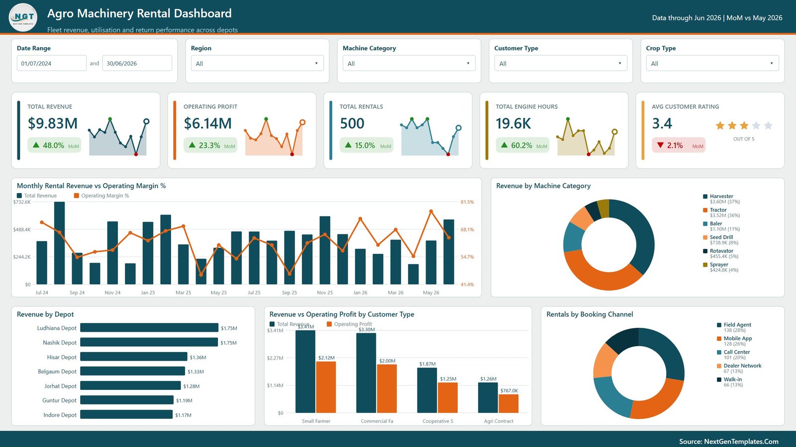
The Overview page gives managers a fast summary of rental performance. The top KPI cards show Total Revenue, Operating Profit, Total Rentals, Total Engine Hours, and Avg Customer Rating so users can quickly understand financial scale, fleet activity, rental demand, and customer satisfaction.
Monthly Rental Revenue vs Operating Margin % by Month: This chart compares monthly revenue with operating margin percentage. It helps managers see whether revenue growth is also producing healthier margins or whether cost pressure is reducing profitability.
Revenue by Machine Category: This visual shows which equipment categories generate the most revenue. It helps fleet planners identify high-demand categories for pricing review, availability planning, maintenance focus, and future purchasing decisions.
Revenue by Depot: This chart compares revenue across depot locations. It helps leadership identify top-performing depots and locations that may need marketing, operational support, or fleet rebalancing.
Revenue vs Operating Profit by Customer Type: This visual compares customer segments by both revenue and profit. It helps teams understand whether high-revenue customer types are also profitable after operating costs are considered.
Rentals by Booking Channel: This chart shows the number of rentals coming from each booking channel. It helps marketing and operations teams compare walk-in, phone, online, partner, and other channels for demand planning.
2. Revenue and Profit
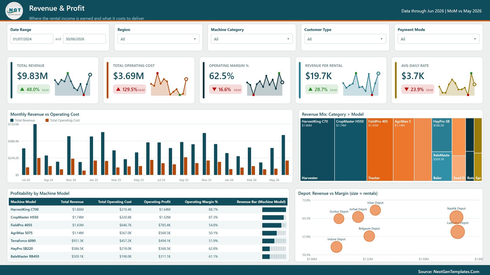
The Revenue and Profit page focuses on financial performance across time, machine categories, models, and depots. It is useful for monthly review meetings, pricing discussions, and profitability analysis.
Monthly Revenue vs Operating Cost by Month: This chart compares revenue and operating cost by month. It helps finance teams spot months where costs rise faster than revenue and need closer operational review.
Revenue Mix by Category and Model: This visual breaks revenue down by machine category and model. It helps users identify which specific models are driving category-level revenue performance.
Profitability by Machine Model: This chart ranks machine models by operating profit or margin contribution. It helps managers decide which models deserve more investment, better maintenance priority, or revised pricing.
Revenue vs Margin by Depot: This visual compares depot revenue with margin performance. It helps avoid judging depots only by sales volume when margin quality may tell a different story.
3. Fleet Utilisation
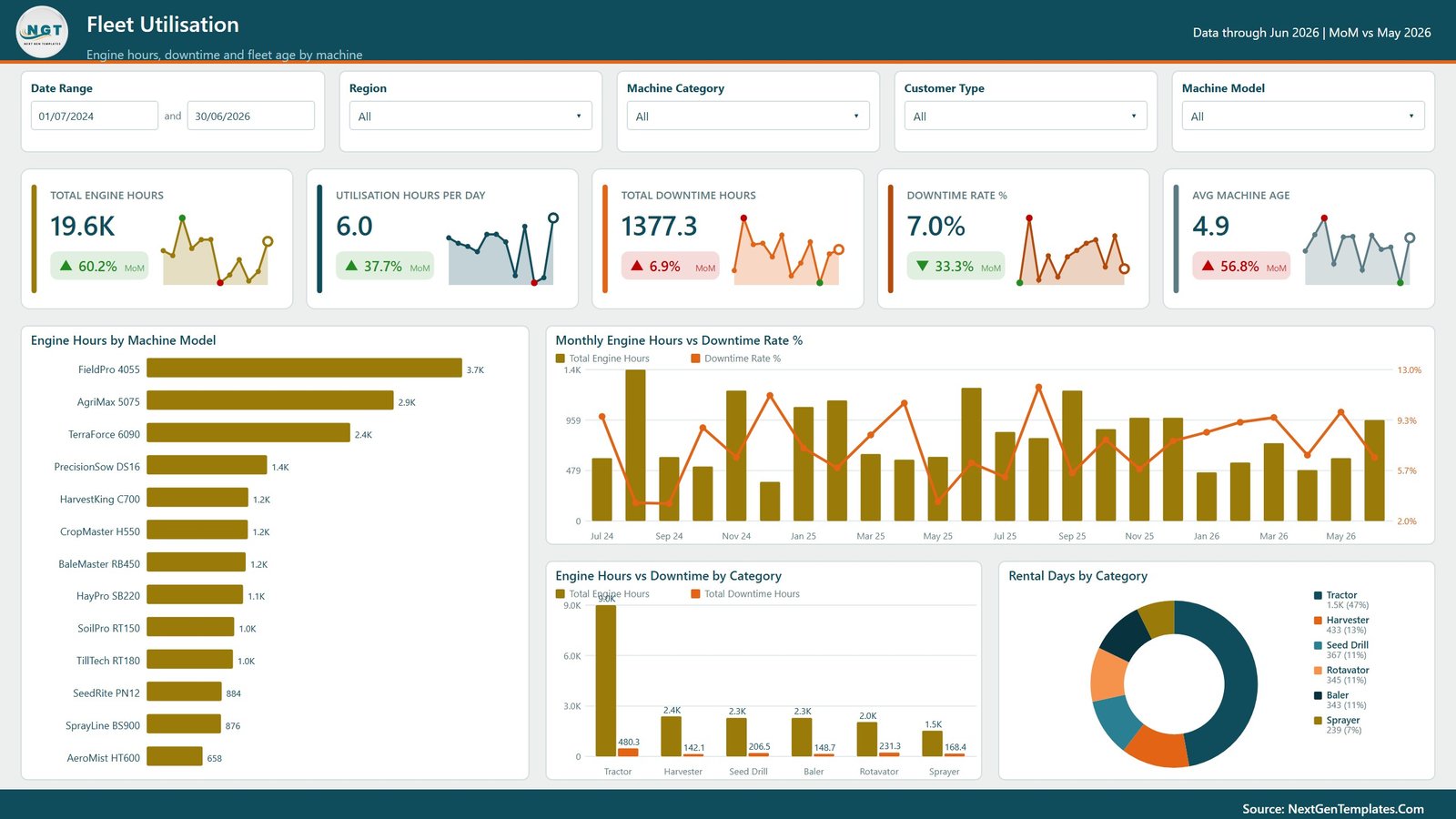
The Fleet Utilisation page helps operations teams understand how machines are being used and where downtime may be affecting rental capacity. It combines engine hours, downtime, rental days, and category-level performance.
Engine Hours by Machine Model: This chart shows machine workload by model. It helps fleet managers identify heavily used models that may need preventive maintenance or capacity planning.
Monthly Engine Hours vs Downtime Rate % by Month: This chart compares monthly engine hours with downtime rate percentage. It helps users see whether increased utilisation is causing reliability pressure.
Engine Hours vs Downtime by Category: This visual compares usage and downtime across machine categories. It helps highlight categories that generate many working hours but also carry maintenance risk.
Rental Days by Category: This chart shows rental days by machine category. It helps managers understand demand intensity and category-level utilisation over the selected period.
4. Depot Operations
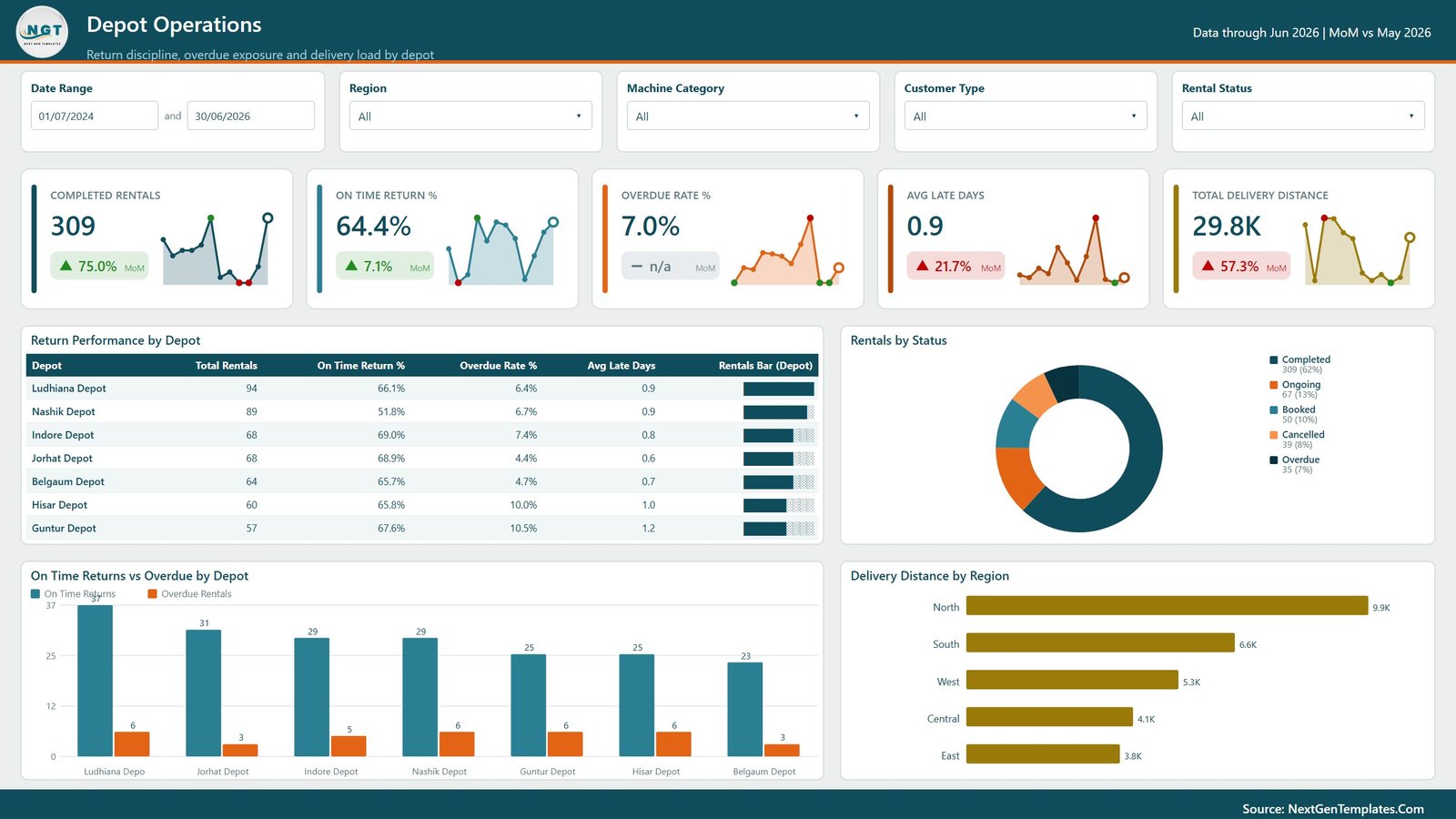
The Depot Operations page focuses on execution quality at the depot and region level. It helps teams review return performance, overdue rentals, active statuses, and delivery distance.
Return Performance by Depot: This chart compares how depots perform on returns. It helps identify depots with strong return discipline and depots where delayed returns may reduce availability.
Rentals by Status: This visual shows rental counts by status, such as completed, active, overdue, cancelled, or pending. It helps operations teams see the current workload and exceptions quickly.
On Time Returns vs Overdue by Depot: This chart compares on-time and overdue returns by depot. It helps managers take action on depot-level follow-up, customer reminders, or dispatch scheduling.
Delivery Distance by Region: This visual shows delivery distance across regions. It helps teams review logistics workload and identify regions where distance may affect cost, timing, or service quality.
5. Customers and Crops
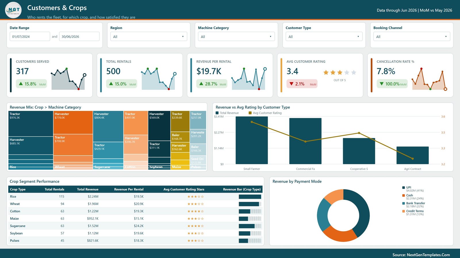
The Customers and Crops page explains demand from the customer and agricultural segment side. It helps sales, account management, and depot teams understand which crop segments, customer types, and payment modes drive rental activity.
Revenue Mix by Crop and Machine Category: This chart shows how revenue is distributed across crop segments and machine categories. It helps teams connect equipment demand with crop-season patterns.
Revenue vs Avg Rating by Customer Type: This visual compares customer type revenue with average rating. It helps managers identify valuable customer groups and service experience gaps.
Crop Segment Performance: This chart ranks crop segments by performance indicators such as revenue, rentals, or profit. It helps rental businesses plan seasonal offers and equipment availability.
Revenue by Payment Mode: This chart shows revenue split by payment method. It helps finance teams understand customer payment behavior and review collection or payment process trends.
Agro Machinery Rental Dashboard in Power BI vs. Tableau vs. Paid CRM/SaaS – Feature Comparison
| Feature | This Power BI dashboard | Tableau alternative | Paid rental SaaS |
|---|---|---|---|
| Cost | One-time template purchase | Requires Tableau licensing and build time | Recurring subscription |
| Platform | Microsoft Power BI Desktop | Tableau Desktop or Cloud | Vendor-hosted rental system |
| Setup time | Open PBIX, replace source data, and refresh | Manual dashboard build and data modeling | Implementation and onboarding required |
| Real-time team collaboration | Available through Power BI Service when published | Available through Tableau Cloud or Server | Usually included by user seat |
| Mobile access | Available after publishing to Power BI Service | Available in Tableau mobile experiences | Usually included |
| Customizable fields | Editable visuals, measures, model, and pages | Editable if you build and own the workbook | Depends on vendor configuration |
| Share with link | Possible through Power BI Service permissions | Possible through Tableau sharing | Login-based access |
| Year-1 cost at 5 users | Low one-time template cost plus Microsoft licensing if published | Higher license and build cost | Often much higher due to subscriptions |
| Machinery rental analytics | Revenue, margin, cost, rentals, engine hours, downtime, depots, crops, customers, channels, and payments | Must be designed manually | Depends on rental module depth |
Who Should Use This Template
This dashboard is suitable for farm machinery rental companies, agricultural equipment dealers, cooperative machinery banks, depot managers, fleet coordinators, operations managers, finance analysts, and Power BI consultants who need a structured rental reporting model.
It is not a full rental management system. It does not create rental contracts, collect payments, track GPS telemetry, dispatch operators, manage service tickets, or replace a transactional ERP. It works best as an analytics layer for prepared rental data.
Real-World Use Cases
Anika, depot manager: uses the Overview and Depot Operations pages before the weekly review to monitor rentals, on-time returns, overdue items, depot revenue, and customer rating.
Rohan, fleet coordinator: uses Fleet Utilisation to compare engine hours and downtime by model so he can plan preventive maintenance before peak rental periods.
Meera, finance analyst: uses Revenue and Profit to explain monthly revenue, operating cost, margin percentage, and depot profitability to the leadership team.
Advantages of Agro Machinery Rental Dashboard in Power BI
- It gives agricultural rental teams a ready Power BI structure for recurring analysis.
- It combines finance, fleet, depot, customer, crop, and payment reporting in one PBIX file.
- It uses interactive slicers so managers can move from overall performance to filtered views quickly.
- It helps identify high-revenue categories, profitable models, overused machines, overdue return patterns, and crop-based demand.
- It can be customized in Power BI Desktop for local measures, branding, terminology, and reporting needs.
Opportunities for Improvement
Advanced rental businesses may want direct database connectors, scheduled refresh in Power BI Service, row-level security, GPS telemetry feeds, online booking integration, invoice automation, or live maintenance system data. Those can be added separately depending on the source systems. This template is strongest when the team can provide clean rental data and wants a ready visual reporting model.
Best Practices
- Keep depot, region, machine category, model, customer type, crop, booking channel, rental status, and payment mode labels consistent.
- Refresh the report after updating the source data.
- Review revenue and operating margin together before making pricing decisions.
- Use engine hours and downtime together when planning maintenance.
- Compare depots by both revenue and margin so low-efficiency depots are not hidden by volume.
- Publish to Power BI Service only after checking data privacy, sharing permissions, and refresh settings.
Explore Relevant Templates
You can explore more Power BI dashboard templates on NextGenTemplates. Related resources include the published Agro Machinery Rental Dashboard in Excel, Agricultural Machinery Dashboard in Power BI, and Remote Crop Monitoring Dashboard in Excel.
Frequently Asked Questions
What is included in the Power BI dashboard?
The PBIX report includes 5 pages: Overview, Revenue and Profit, Fleet Utilisation, Depot Operations, and Customers and Crops. It includes KPI cards, slicers, and visuals for revenue, profit, rentals, engine hours, downtime, depots, customer types, crop segments, and payment modes.
Can I use my own rental data?
Yes. You can replace the sample data source with your own rental data and refresh the Power BI report, provided your fields follow the required structure or are mapped correctly.
Do I need Power BI Desktop?
Yes. The template is intended to be opened and edited in Microsoft Power BI Desktop. Power BI Desktop is available from Microsoft.
Can I customize the report pages?
Yes. You can edit visuals, measures, colors, labels, slicers, pages, and the data model in Power BI Desktop.
Is this suitable for agricultural equipment depots?
Yes. The dashboard includes depot revenue, depot margin, return performance, on-time returns, overdue returns, and regional delivery distance analysis.
Does this replace rental software?
No. It is a reporting dashboard, not a transaction system. It helps analyze prepared data from your rental operations.
About the Author
Built by PK – Microsoft Certified Professional with 15+ years of Excel, Google Sheets, and Power BI experience. Founder of NextGenTemplates, reaching 300K+ subscribers across YouTube channels. Every template is hand-built and tested before release.
Conclusion
The Agro Machinery Rental Dashboard in Power BI gives rental teams a practical way to review revenue, operating profit, rentals, engine hours, depot performance, fleet utilisation, customer ratings, crop segment demand, and payment behavior. It is a useful reporting layer for businesses that need fast visibility into agricultural machinery rentals without starting from a blank Power BI file.
For more tutorials, visit PK: An Excel Expert on YouTube.