Agri Insurance Dashboard in Power BI is a ready-to-use reporting template for agricultural insurers, crop insurance program managers, subsidy teams, brokers, cooperatives, and analysts who need one place to review premium collection, sum insured, policy volume, loss ratio, claims paid, subsidy trends, crop exposure, seasonal risk, district performance, and farmer satisfaction. Agricultural insurance teams often review thousands of policy and claim records across crops, regions, seasons, farmer categories, channels, and claim statuses. This Power BI dashboard organizes that activity into 5 interactive report pages with KPI cards, slicers, trend visuals, operational charts, and regional scorecards.
Microsoft explains that Power BI helps users connect to data, model it, and create reports for business decisions. Learn more from Microsoft Learn’s Power BI overview.
Key Features of Agri Insurance Dashboard in Power BI
- 5 Power BI report pages: Overview, Premium and Subsidy Trend, Crop and Season Analysis, Claims Operations, and Region and Channel Insights.
- 5 overview KPI cards: Premium Collected, Sum Insured, Policies, Loss Ratio, and Farmer Satisfaction.
- Insurance portfolio reporting: Track policy status, premium by crop type, sum insured by policy type, and seasonal exposure.
- Premium and subsidy analytics: Review monthly premium movement, subsidy value, subsidy share, payer trends, and farmer category contribution.
- Claims operations tracking: Monitor claims paid, settlement rate, claim value by peril, average settlement days, and claim pipeline status.
- Crop and region insights: Compare crop exposure, yield loss, insured area, district premium, regional subsidy, and channel performance.
Dashboard Pages Explanation
1. Overview Page
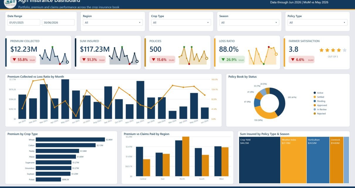
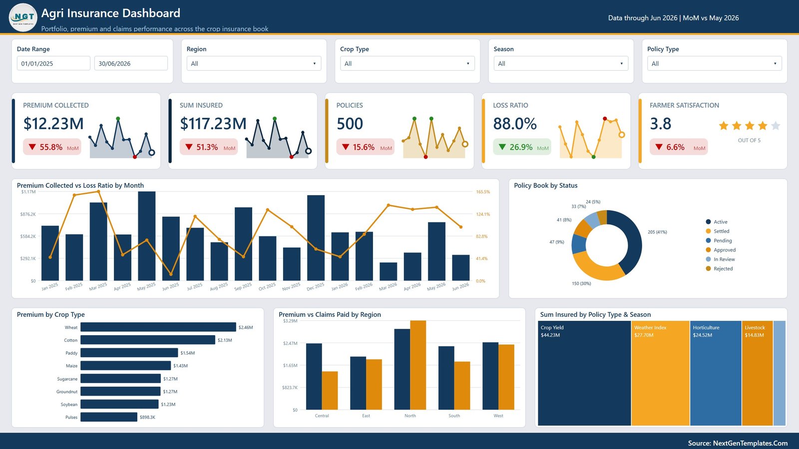
The Overview page is the executive summary of the agri insurance report. At the top, cards show Premium Collected, Sum Insured, Policies, Loss Ratio, and Farmer Satisfaction, giving leaders a quick view of revenue scale, risk exposure, policy volume, claims pressure, and service quality.
Premium Collected and Loss Ratio by Month: This visual compares monthly premium collection with loss ratio movement. It helps managers identify periods where claim cost pressure is rising faster than premium income.
Policy Book by Status: This chart breaks the policy portfolio into its current status groups. It helps teams monitor active, expired, pending, cancelled, or renewed policies and spot portfolio quality issues.
Premium by Crop Type: This chart shows which crops contribute the most premium. It helps insurers understand crop concentration and prioritize underwriting attention for high-value crop segments.
Premium and Claims Paid by Region: This chart compares premium collected against claims paid for each region. It helps management identify territories with strong profitability and regions where losses need closer review.
Sum Insured by Policy Type and Season: This visual shows exposure split by policy type and agricultural season. It helps risk teams understand when and where insured value is concentrated.
2. Premium and Subsidy Trend
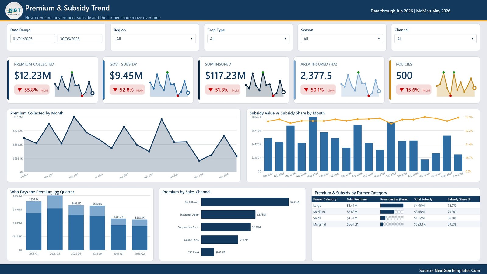
The Premium and Subsidy Trend page focuses on how premium income and subsidy support move over time. It is designed for finance, program management, and subsidy reconciliation teams that need to track funding, payer behavior, and channel contribution.
Premium Collected by Month: This chart tracks monthly premium inflow. It helps teams see seasonality, campaign effects, and slow months that may require follow-up with distribution partners.
Subsidy Value and Subsidy Share by Month: This visual compares the absolute subsidy value with subsidy share. It helps program managers understand whether subsidy support is stable or changing as a proportion of premium.
Premium Payers by Quarter: This chart counts premium payers by quarter. It helps teams evaluate enrollment momentum and detect quarters where farmer participation drops.
Premium by Sales Channel: This chart compares premium collected across sales channels. It helps distribution managers understand which channels bring the most premium and where enablement may be needed.
Premium and Subsidy by Farmer Category: This chart compares farmer-paid premium and subsidy support by farmer category. It helps stakeholders review equity, subsidy targeting, and contribution mix.
3. Crop and Season Analysis
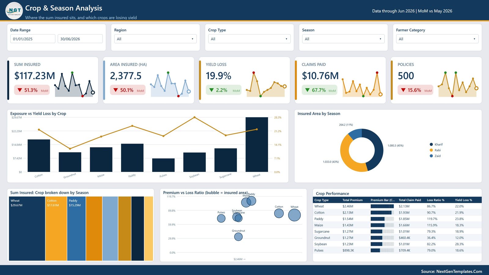
The Crop and Season Analysis page explains where agricultural exposure is concentrated and how crop performance changes by season. This page is useful for underwriting teams, agronomists, product managers, and portfolio analysts.
Exposure and Yield Loss by Crop: This visual compares insured exposure with yield loss by crop. It helps risk teams identify crops where insured value and production loss risk both require attention.
Insured Area by Season: This chart shows insured acreage or area across agricultural seasons. It helps teams understand seasonal participation and exposure distribution.
Sum Insured by Crop and Season: This chart shows insured value by crop across seasons. It helps identify crop-season combinations with high financial exposure.
Premium and Loss Ratio by Crop: This visual compares premium generated with loss ratio for each crop. It helps underwriters evaluate whether pricing and risk outcomes are aligned.
Crop Performance by Crop Type: This chart summarizes performance across crop types. It helps management review which crop groups are stable and which may need pricing, claims, or agronomic review.
4. Claims Operations
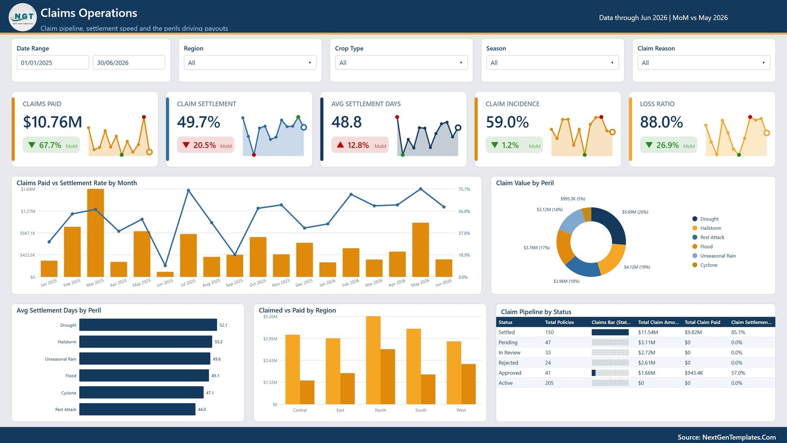
The Claims Operations page tracks claim handling, settlement speed, peril mix, and pipeline status. It gives claims managers a practical view of both claim cost and operational efficiency.
Claims Paid and Settlement Rate by Month: This chart compares monthly paid claims with settlement rate. It helps managers see whether settlement performance remains strong during high-claim periods.
Claim Value by Peril: This visual ranks claim value by peril such as drought, flood, pest, disease, storm, or other causes. It helps risk and claims teams understand the main drivers of claim cost.
Avg Settlement Days by Peril: This chart shows average settlement time by peril. It helps operations teams identify claim types that take longer to verify, approve, or pay.
Claimed and Paid by Region: This chart compares claimed amount with paid amount by region. It helps regional leaders monitor payout patterns and possible gaps between filed and settled amounts.
Claim Pipeline by Status: This visual shows claims by status. It helps teams monitor open, pending, approved, rejected, and settled claims so they can reduce backlog.
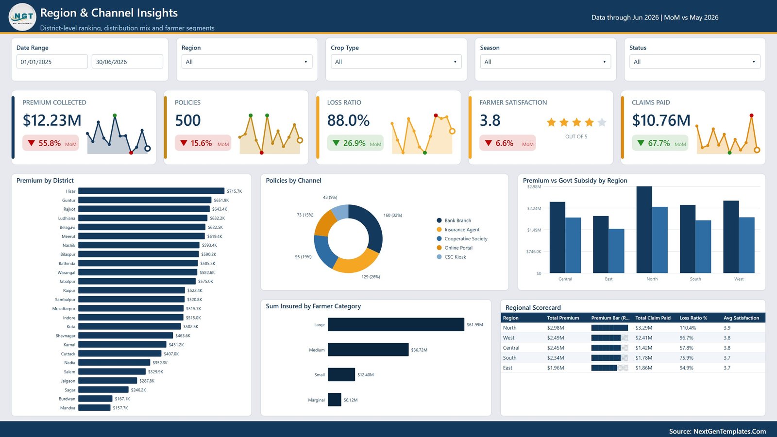
5. Region and Channel Insights
The Region and Channel Insights page brings together district, channel, regional subsidy, farmer category, and scorecard views. It is built for leaders who need to compare geographic and distribution performance quickly.
Premium by District: This chart ranks premium collected by district. It helps field teams see which districts are driving the largest premium contribution.
Policies by Channel: This chart compares policy count across channels. It helps distribution managers understand which acquisition channels create the most policy volume.
Premium and Govt Subsidy by Region: This visual compares premium and government subsidy across regions. It helps program teams understand how public support and premium collection vary geographically.
Sum Insured by Farmer Category: This chart shows exposure by farmer category. It helps analysts review how insured value is distributed across small, marginal, medium, and large farmer segments.
Regional Scorecard by Region: This scorecard summarizes regional performance across key metrics. It helps leadership compare regions using a balanced view rather than relying on one metric alone.
Agri Insurance Dashboard in Power BI vs. Tableau vs. Paid Insurance SaaS – Feature Comparison
| Feature | This Power BI dashboard | Tableau alternative | Paid insurance SaaS |
|---|---|---|---|
| Cost | One-time template purchase | Requires Tableau setup and licensing | Recurring subscription or enterprise contract |
| Platform | Power BI Desktop and Power BI Service | Tableau Desktop or Server | Vendor-hosted insurance platform |
| Setup time | Replace sample data and refresh | Build model and dashboards manually | Implementation, data mapping, and onboarding required |
| Real-time team collaboration | Available through Power BI Service | Available through Tableau Server or Cloud | Usually included by user role |
| Mobile access | Power BI mobile app for published reports | Tableau mobile app for published reports | Usually included |
| Customizable fields | Editable Power BI report and model | Editable if you build or own the workbook | Depends on vendor permissions |
| Year-1 cost at 5 users | Low template cost plus Power BI licensing as needed | Higher software and development cost | Often much higher due to subscription pricing |
| Agricultural insurance analytics | Premium, subsidy, crop, season, claims, peril, farmer category, region, channel, and satisfaction views | Must be designed manually | Depends on product modules and customization |
Who Should Use This Template
This dashboard is suitable for agricultural insurance companies, crop insurance program teams, government-backed insurance schemes, insurance brokers, farmer cooperatives, banks offering crop-linked insurance, NGO program teams, and consultants who prepare agricultural risk and policy performance reports. It is not meant to replace a core insurance administration system. It does not issue policies, calculate statutory premium automatically, connect to claim survey apps, process payments, or manage customer portals. It works best as an analysis and presentation layer for prepared insurance data.
Real-World Use Cases
Anika, crop insurance program manager: uses the Overview and Premium and Subsidy Trend pages to review premium collection, subsidy share, policy volume, and farmer participation before monthly stakeholder meetings.
Rohit, claims operations lead: uses the Claims Operations page to monitor settlement rate, peril-wise claim value, average settlement days, and pending claim pipeline so the team can reduce backlogs.
Meera, regional portfolio analyst: uses the Region and Channel Insights page to compare district premium, regional subsidy, farmer category exposure, and channel productivity.
Advantages of Agri Insurance Dashboard in Power BI
- It gives agricultural insurance teams a structured view of premium, subsidy, policy, claims, crop, season, and regional performance.
- It is built in Power BI, so users can interact with slicers, drill into visuals, and publish the report for stakeholders.
- It combines executive reporting with operational claims and portfolio analysis.
- It supports faster reviews for monthly meetings, subsidy discussions, and regional performance monitoring.
- It can be customized for local crop names, farmer categories, policy types, regions, channels, and seasons.
Opportunities for Improvement
Organizations with live policy administration systems may want to connect the report to a database, API, data warehouse, or scheduled dataflow instead of manually replacing sample data. Teams with advanced actuarial requirements may also add claim frequency modeling, weather index calculations, reserve triangles, or predictive risk scoring. Very large implementations may require formal data governance and row-level security before publishing to wider audiences.
Best Practices
Keep crop names, regions, districts, farmer categories, peril names, policy statuses, and sales channels consistent in the source data. Refresh the report after every data update and validate top-level totals against your source system before presenting. Use slicers to create separate views for senior management, claims teams, subsidy stakeholders, and regional managers. Review loss ratio with premium and claims together so the interpretation remains balanced.
Explore Relevant Templates
Insurance Agency Dashboard in Excel – Track policies, premiums, claims, agent performance, and financial trends in Excel.
Policy Performance and Risk Analysis Dashboard in Google Sheets – Review policy performance, claims, premium, and risk exposure in a collaborative spreadsheet.
Browse Power BI Dashboard Templates – Explore more ready-to-use Power BI dashboards from NextGenTemplates.
Frequently Asked Questions
What does the Agri Insurance Dashboard in Power BI track?
It tracks premium collected, sum insured, policies, loss ratio, farmer satisfaction, subsidy value, subsidy share, crop exposure, yield loss, claims paid, settlement rate, peril value, regional performance, and channel insights.
Can I use this dashboard with my own insurance data?
Yes. The dashboard is designed so you can replace the sample data with your own agricultural insurance records and refresh the Power BI report.
Does this dashboard include subsidy analysis?
Yes. The Premium and Subsidy Trend page includes subsidy value, subsidy share by month, and premium and subsidy analysis by farmer category.
Can this be used for crop insurance programs?
Yes. It is especially useful for crop insurance reporting because it includes crop type, season, insured area, yield loss, policy type, farmer category, and regional analysis.
Is Power BI Desktop required?
Yes. To edit the PBIX file, refresh the model, and customize the report, you should use Power BI Desktop.
Can I customize the pages and visuals?
Yes. You can edit visuals, rename fields, adjust measures, add new pages, or connect the report to your own source model if you are comfortable working in Power BI.
About the Author
Built by PK – Microsoft Certified Professional with 15+ years of Excel, Google Sheets, and Power BI experience. Founder of NextGenTemplates, reaching 300K+ subscribers across YouTube channels. Every template is hand-built and tested before release.
Conclusion
The Agri Insurance Dashboard in Power BI gives insurance and agriculture teams a practical way to monitor premium collection, subsidy movement, crop exposure, seasonal risk, claims operations, and regional performance in one interactive report. With 5 report pages, 5 executive KPI cards, and focused analysis across premium, subsidy, crop, claims, region, and channel views, it can reduce manual reporting time and make monthly reviews easier to explain.
Visit Youtube.com/@PK-AnExcelExpert for step-by-step tutorials.