The SaaS Onboarding Dashboard in Power BI tracks 5 high-level KPIs, 12+ analytical visuals across 5 interactive report pages, and connects directly to your CRM, billing, and support data — built for SaaS founders, customer success leads, and onboarding managers who need to know why customers activate, who churns during onboarding, and how MRR ties back to onboarding cost. Setup takes under 10 minutes — open the .pbix file in Power BI Desktop, point it at your data, and every visual updates automatically.
🌍 Join 8,400+ teams in 50+ countries using NextGenTemplates to replace expensive customer success SaaS platforms with one-time-purchase Excel, Google Sheets, Power BI, and HTML templates.
✅ Instant download · One-time payment · No subscription · No per-user fees · Lifetime access
Most SaaS teams don’t have a churn problem — they have an onboarding problem. According to customer success research, customers who fail to activate within their first 30 days are 4× more likely to churn than activated users. Yet 73% of early-stage SaaS companies still track onboarding in spreadsheets without visibility into health scores, manager performance, or revenue at risk. The SaaS Onboarding Dashboard in Power BI closes that gap with one .pbix file you can update in minutes — no Tableau license, no Gainsight contract, no engineering tickets.

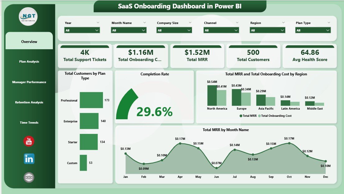
SaaS Onboarding Dashboard in Power BI — Overview Page
Key Features of the SaaS Onboarding Dashboard in Power BI
This dashboard is built on five report pages that map directly to the questions a customer success team asks every Monday morning. Every visual is tied to a slicer panel — filter by region, plan type, manager, or industry, and every chart on the page recalculates instantly thanks to Power BI’s native cross-filtering engine.
- 📊 5 KPI Cards on the Overview page: Total Support Tickets, Total Onboarding Cost, Total MRR, Total Customers, and Avg Health Score — the five numbers your CEO will ask about first.
- 🎯 12+ analytical visuals across 5 pages covering plan-level revenue, manager performance, retention by channel, and monthly trend lines.
- 🧩 Multi-page slicer panel for Region, Plan Type, Industry, Onboarding Manager, and Channel — applied consistently across every page.
- ⚡ Native Power BI Desktop file (.pbix) — opens in the free Power BI Desktop application from Microsoft. No subscription needed to view or edit.
- 🔄 Replace sample data, refresh once — every chart, KPI, and slicer updates automatically.
- 📱 Publish to Power BI Service to share interactive reports with your team via web and mobile.
Dashboard Pages Explanation
1. Overview Page
The Overview page sits at the top of the report and gives executives a one-screen snapshot of the customer success engine. Five KPI cards anchor the top row, followed by four analytical visuals.
Cards:
- Total Support Tickets
- Total Onboarding Cost
- Total MRR
- Total Customers
- Avg Health Score
Charts:
- Total Customers by Plan Type — shows customer distribution across Starter, Pro, and Enterprise plans, helping you see where your installed base concentrates.
- Completion Rate — a single visual that summarizes the percentage of customers completing the onboarding journey vs. those stuck in progress.
- Total MRR and Total Onboarding Cost by Region — a side-by-side regional breakdown that exposes whether you’re spending more to onboard customers in some regions than they return in MRR.
- Total MRR by Month Name — the monthly revenue trend line that shows seasonality, expansion patterns, and the impact of pricing or onboarding changes.
2. Plan Analysis Page
This page drills into how different plan tiers and customer sizes behave during onboarding. It answers the classic “are our enterprise customers actually healthier?” question.
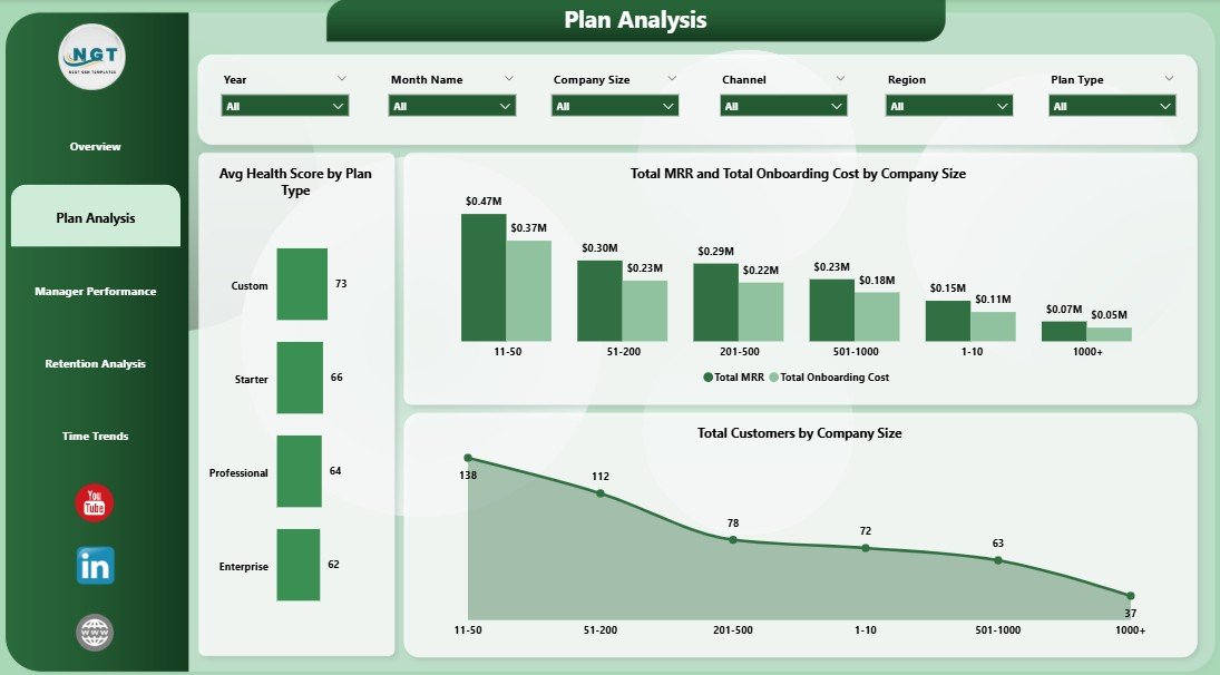
Plan Analysis
- Avg Health Score by Plan Type — surfaces which plan tier produces the healthiest customers post-onboarding.
- Total MRR and Total Onboarding Cost by Company Size — compares revenue against the cost-to-onboard for SMB, mid-market, and enterprise segments.
- Total Customers by Company Size — distribution of your customer base across employee bands.
3. Manager Performance Page
The Manager Performance page is where you have the hard conversations. It compares onboarding managers across three concrete metrics — number of customers handled, average time to activation, and average post-onboarding health score.
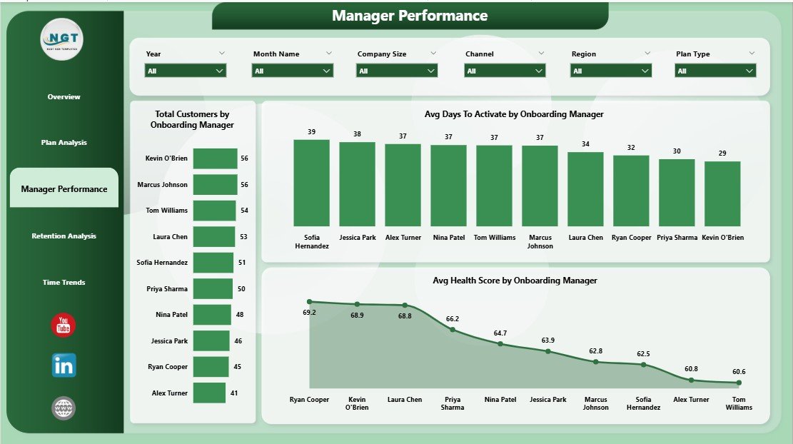
Manager Performance
- Total Customers by Onboarding Manager — the workload view; spot under- and over-loaded reps instantly.
- Avg Days To Activate by Onboarding Manager — the speed-to-value metric per manager.
- Avg Health Score by Onboarding Manager — the quality metric; managers who activate fast but leave customers unhealthy show up here.
4. Retention Analysis Page
This page traces the customer journey backward — from acquisition channel to industry vertical to current onboarding status — so you can see where retention risk concentrates.
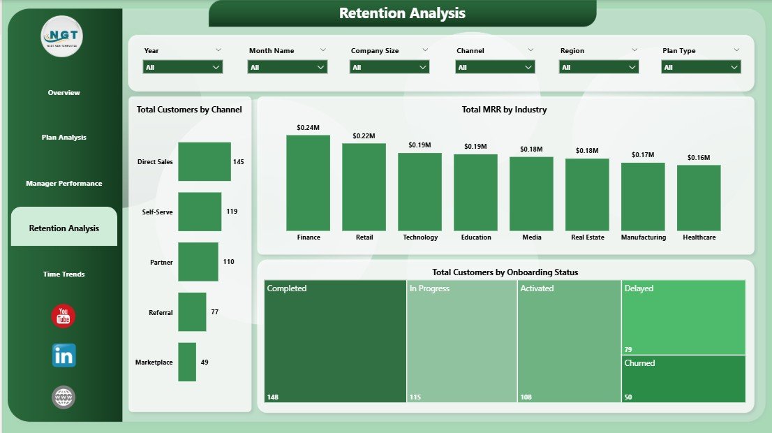
Retention Analysis
- Total Customers by Channel — sales, partner, paid, organic — see which channel pulls in customers who actually stick.
- Total MRR by Industry — the vertical revenue map; reveals where your product fits best.
- Total Customers by Onboarding Status — Active, In Progress, Stalled, Churned — the at-a-glance health funnel.
5. Time Trends Page
The Time Trends page connects everything to the calendar. It’s the page you screenshot for board decks.
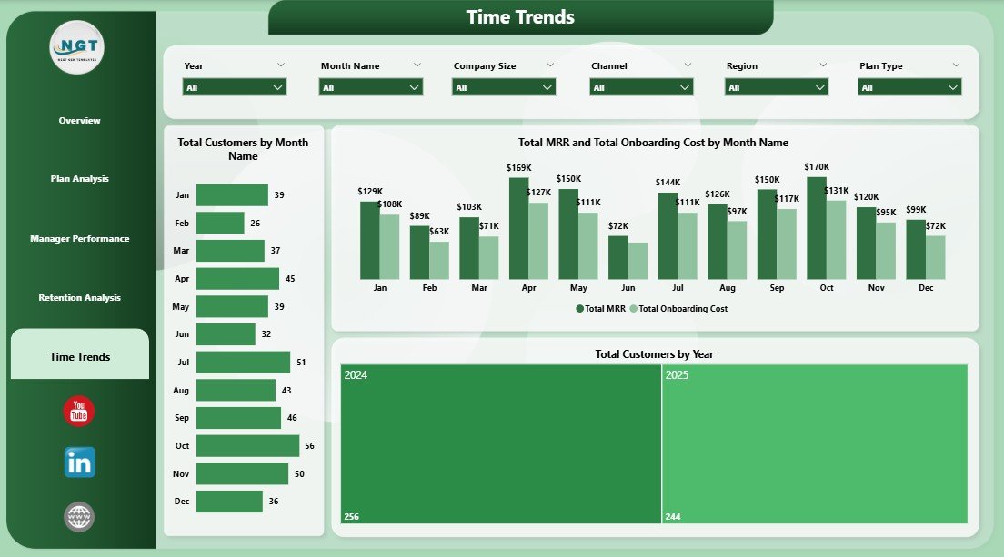
Time Trends
- Total Customers by Month Name — month-over-month new customer acquisition.
- Total MRR and Total Onboarding Cost by Month Name — the dual-line trend that exposes whether unit economics are improving.
- Total Customers by Year — the long-arc growth view across full calendar years.
SaaS Onboarding Dashboard in Power BI vs. Tableau vs. Paid Customer Success SaaS — Feature Comparison
| Feature | SaaS Onboarding Dashboard (Power BI) | Tableau / Qlik Custom Build | Totango / ChurnZero / Gainsight |
|---|---|---|---|
| Cost | $17.99 one-time | $70/user/month + build hours | $200–$500 per user / month |
| Platform | Power BI Desktop (free) | Tableau Cloud or Server | Web SaaS |
| Setup time | Under 10 minutes | 2–6 weeks of dev work | 4–12 weeks implementation |
| Tracks Avg Health Score | ✅ Yes, by plan + manager | Custom build needed | ✅ Yes |
| Manager performance view | ✅ Built-in dedicated page | Custom build needed | ✅ Yes |
| MRR vs. onboarding cost analysis | ✅ Native, by region + month | Custom build needed | Limited (extra modules) |
| Customizable measures (DAX) | ✅ Full edit access | ✅ Full edit access | Limited to vendor schema |
| Year-1 cost at 5 users | $17.99 (one-time) | ~$4,200+ | $12,000–$30,000+ |
| Lifetime access | ✅ Yes | Subscription | Subscription |
For teams that want a working customer success dashboard without paying $12K+ per year for Gainsight or building one from scratch in Tableau, the SaaS Onboarding Dashboard in Power BI sits in the sweet spot.
Who Should Use This Template
✅ Perfect for:
- SaaS founders at seed-to-Series-B companies tracking onboarding manually in spreadsheets
- Customer Success leads at 10–500 person SaaS companies who need a board-ready dashboard fast
- Onboarding managers who own a book of accounts and need to prove their impact on health and time-to-activate
- Operations analysts replacing legacy customer success reporting with a Power BI workflow
- RevOps teams that already pipe billing and CRM data into Power BI
❌ Not a fit if:
- You need a fully managed customer success platform with playbooks, automated emails, and in-app guides — buy Gainsight or ChurnZero instead
- Your team has zero familiarity with Power BI Desktop and no appetite to learn
- You require SOC 2 / HIPAA-certified hosted reporting (this is a desktop file)
Real-World Use Cases
Marcus runs Customer Success at a 60-person B2B SaaS startup. Before this template, he tracked 140 onboarding accounts in a 47-tab Excel file that took 2 hours to update for the weekly leadership meeting. He now drops his CRM export into the Power BI file, hits Refresh, and walks into the meeting with a live Manager Performance view that shows exactly which of his 4 onboarding managers is closing accounts fastest — and whose customers are healthiest 30 days in.
Priya is the founder of a 12-person early-stage SaaS raising a Series A. Investors keep asking for “your activation curve” and “your CAC payback by plan tier.” She used to dump CSVs into Tableau Public and rebuild the same charts every two weeks. The SaaS Onboarding Dashboard in Power BI gave her a permanent, refreshable artifact — the Plan Analysis page is now slide 14 in her data room.
Daniel leads RevOps at a mid-market SaaS with 380 customers. He pipes Salesforce, Stripe, and Zendesk data into a Power BI workspace. This template was the missing presentation layer — instead of building five custom report pages from scratch, he plugged the data in, mapped the column names once, and shipped the dashboard internally in a single afternoon.
Advantages of the SaaS Onboarding Dashboard in Power BI
- 💰 One-time $17.99 cost replaces $12,000+ per year in customer success SaaS subscriptions for small teams.
- ⚡ 10-minute setup — no engineering tickets, no implementation consultants, no 6-week onboarding for a tool that tracks onboarding.
- 🔧 Fully editable DAX measures — change the health score formula, add a new KPI, or build custom slicers without vendor lock-in.
- 📊 Native Power BI experience — leverages cross-filtering, drill-through, and conditional formatting your team already knows.
- 🌐 Publish anywhere — keep it on Desktop, share via Power BI Service, or embed in SharePoint and Teams.
Opportunities for Improvement
This is a desktop dashboard, not a customer success platform. It does not send onboarding emails, trigger Slack alerts when a health score drops, or run NPS surveys. If you need any of that, layer this dashboard on top of your existing CS tooling — or use it as a stepping stone before committing to a paid platform. It’s also limited by your data: if your CRM doesn’t track Onboarding Manager or Health Score today, you’ll need to add those columns to your source data before the relevant pages light up.
Best Practices
- 🗓️ Refresh weekly — Monday morning is the natural cadence so you walk into customer success standups with fresh numbers.
- 🎯 Define Health Score upstream — keep the formula in your data warehouse or CRM, not inside the .pbix file. That way every team uses the same definition.
- 🔍 Use slicers in combination — the real insights come from filtering Region + Plan Type + Manager simultaneously, not from any single chart.
- 📤 Publish to Power BI Service for the team — desktop is for editors, the Service is for stakeholders.
- 🧪 Compare quarter-over-quarter on the Time Trends page rather than month-over-month — onboarding cohorts are seasonal.
Explore Relevant Templates
- 📗 Cross-platform sibling: SaaS Onboarding Dashboard in Excel — same five pages, native Excel format, $17.99.
- 🏗️ Plumbing Contractor Dashboard in Power BI — operations-focused Power BI dashboard with similar slicer structure.
- 🏭 Contract Manufacturing Dashboard in Power BI — production analytics with multi-page filter design.
- 🏋️ Gym Retention Dashboard in Google Sheets — different vertical, same retention-analytics pattern.
- 📂 Browse all Power BI Dashboard Templates on NextGenTemplates.
Frequently Asked Questions
What KPIs does the SaaS Onboarding Dashboard in Power BI track?
The SaaS Onboarding Dashboard in Power BI tracks 5 high-level KPIs — Total Support Tickets, Total Onboarding Cost, Total MRR, Total Customers, and Average Health Score — plus 12+ analytical visuals across Plan Analysis, Manager Performance, Retention Analysis, and Time Trends pages.
How long does setup take?
Setup takes under 10 minutes. Open the .pbix file in Power BI Desktop, replace the sample data with your CRM and billing exports, map the column names once, and click Refresh. Every chart, KPI card, and slicer updates automatically.
How does this compare to Gainsight or ChurnZero?
The SaaS Onboarding Dashboard in Power BI is a one-time $17.99 reporting layer; Gainsight and ChurnZero are full customer success platforms costing $200–$500 per user per month. Use this dashboard for analytics; use Gainsight for in-app workflows, automated emails, and playbooks.
Do I need a Power BI Pro license?
No. Power BI Desktop is free from Microsoft and runs the entire SaaS Onboarding Dashboard in Power BI locally. You only need a Pro license if you want to publish the report to the Power BI Service for cloud sharing.
Can I add my own KPIs and DAX measures?
Yes. The SaaS Onboarding Dashboard in Power BI ships with full edit access — every measure, calculated column, and visual is unlocked. Add new KPIs, modify the health score formula, or build custom drill-through pages without restrictions.
Is the data in the file real customer data?
No. The SaaS Onboarding Dashboard in Power BI ships with realistic but fully synthetic sample data so you can see every chart populated. Replace it with your own CRM and billing exports — the visual layer is independent of the data source.
What if I’m an Excel user and not familiar with Power BI?
Start with the SaaS Onboarding Dashboard in Excel instead — same five pages and KPIs, native Excel format. You can always upgrade to the Power BI version later when your data volumes outgrow Excel.
About the Author
Built by PK — Microsoft Certified Professional with 15+ years of Excel, Google Sheets, and Power BI experience. Founder of NextGenTemplates, reaching 300K+ subscribers across YouTube channels (@PK-AnExcelExpert, @NextGenTemplates, @NeoTechNavigators). Every template is hand-built and tested before release.
Conclusion
If your team is still managing onboarding in a 47-tab spreadsheet — or paying enterprise SaaS prices for analytics you’d rather own — the SaaS Onboarding Dashboard in Power BI gives you a board-ready, refreshable, fully editable dashboard for less than the cost of a single user-month of Gainsight. Five pages, 12+ visuals, native Power BI, no subscription.
👉 Click here to Purchase the SaaS Onboarding Dashboard in Power BI
✅ Instant download · One-time payment · No subscription · Lifetime access
🎥 Visit our YouTube channel for step-by-step tutorials: Youtube.com/@PK-AnExcelExpert
📅 Last updated: April 2026