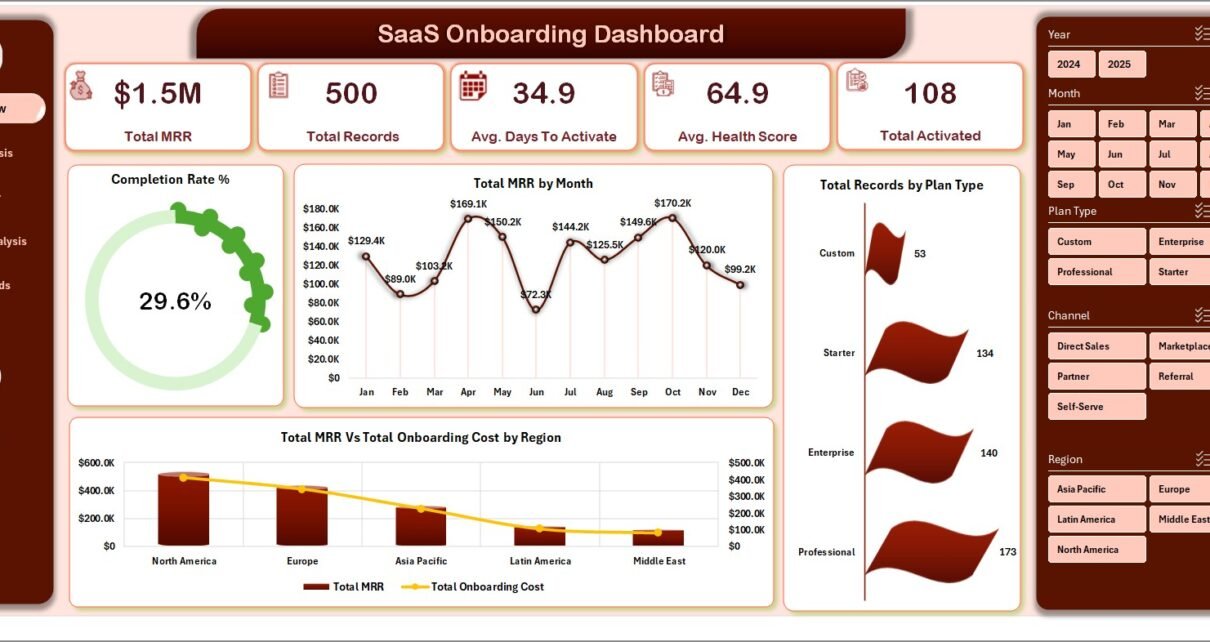
The SaaS Onboarding Dashboard in Excel turns a single customer onboarding export into 5 interactive pages, 5 headline KPIs, and 20 ready-to-read charts — covering MRR, activation speed, health score, churn, and Onboarding Manager performance. Customer Success leaders use it to replace $1,200+/month tools like ChurnZero and Gainsight with a one-time-purchase Excel workbook.
If your CSMs are still pasting numbers into PowerPoint every Monday, this dashboard converts that 4-hour ritual into a 10-minute Refresh All. The SaaS Onboarding Dashboard in Excel is built around the questions that actually move SaaS retention: which Plan Type activates fastest, which Onboarding Manager is closing the most accounts, which Channel is delivering customers who churn, and how MRR is tracking against onboarding cost month-over-month.
Key Features of SaaS Onboarding Dashboard in Excel
This dashboard tracks 5 high-level KPIs — Total MRR, Total Records, Avg. Days To Activate, Avg. Health Score, and Total Activated — and surfaces 20 analytical charts across 5 dedicated pages. Every visual is driven by Excel pivot tables stored in a hidden Support sheet, which means the dashboard updates automatically when you click Data → Refresh All.
Slicers above each page filter every visual at once: pick a Plan Type, a Region, an Industry, a Channel, or an Onboarding Manager, and all 4 charts on that page repaint instantly. There are no macros, no VBA, no Power Query refreshes — just native Excel functionality, which is why the workbook runs identically on Excel for Windows, Mac, and Excel for the web.
- 5 Interactive Pages — Overview, Plan Analysis, Manager Performance, Retention Analysis, Time Trends
- 5 Headline KPIs — Total MRR, Total Records, Avg. Days To Activate, Avg. Health Score, Total Activated
- 20 Pivot-Driven Charts — 4 charts per page, all auto-refreshing
- Multi-Slicer Filtering — Plan Type, Region, Industry, Company Size, Channel, Onboarding Manager
- Manager Scorecard — Total Records, Avg. Days to Activate, Avg. Health Score, and Completed vs. Churned by CSM
- Hidden Support Sheet — Pivot tables tucked away so stakeholders see only the dashboard
- Refresh-All Workflow — Update Data sheet → click Refresh → every page updates
- Excel Native Only — No add-ins, no macros, no VBA
Dashboard Pages Explanation
The workbook has 7 sheets in total: 5 dashboard pages, 1 Data sheet for raw onboarding records, and 1 Support sheet that hosts every pivot table feeding the visuals.
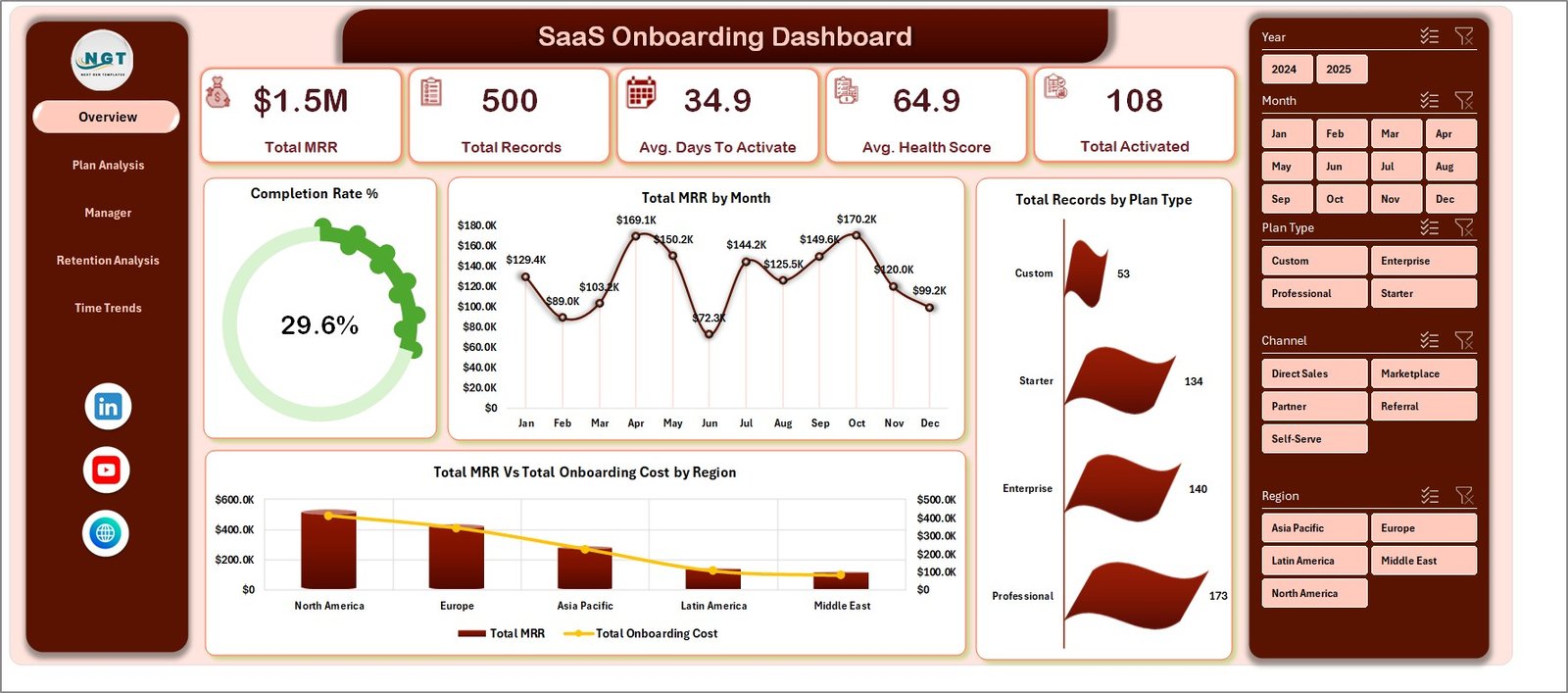
1 — Overview Page
The Overview is your daily pulse check. Five KPI cards at the top show Total MRR, Total Records, Avg. Days To Activate, Avg. Health Score, and Total Activated. Below them, four charts give an instant read on activation health.
- Completion Rate % — What percentage of onboarding records have crossed the finish line
- Total MRR by Month — Revenue trajectory month over month
- Total MRR Vs Total Onboarding Cost by Region — Which regions are profitable to onboard
- Total Records by Plan Type — Where your volume is concentrated
Slicers at the top let you filter all five KPIs and all four charts simultaneously — ideal for week-over-week reviews and stand-ups.
SaaS Onboarding Dashboard in Excel
2 — Plan Analysis
This sheet answers the pricing-tier ROI question. Total MRR by Plan Type and Avg. Health Score by Plan Type tell you which tier is generating the most revenue and which tier customers actually use successfully. Total MRR Vs Total Onboarding Cost by Company Size and Total Records by Company Size reveal whether your higher-MRR segments justify their onboarding investment.
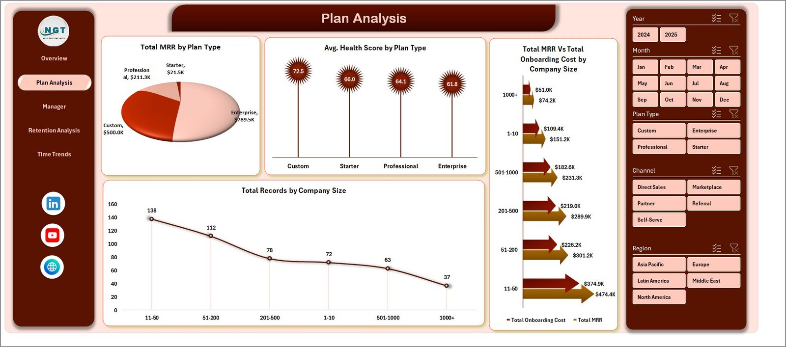
Plan Analysis
3 — Manager Performance
Built-in coaching scorecard. Total Records by Onboarding Manager shows workload distribution. Avg. Days To Activate by Onboarding Manager surfaces who’s moving customers through fastest. Avg. Health Score by Onboarding Manager indicates who’s setting customers up for long-term success. Total Completed Vs Total Churned by Onboarding Manager exposes who’s losing accounts before activation.
Use this page to drive 1:1 conversations grounded in numbers, not impressions.
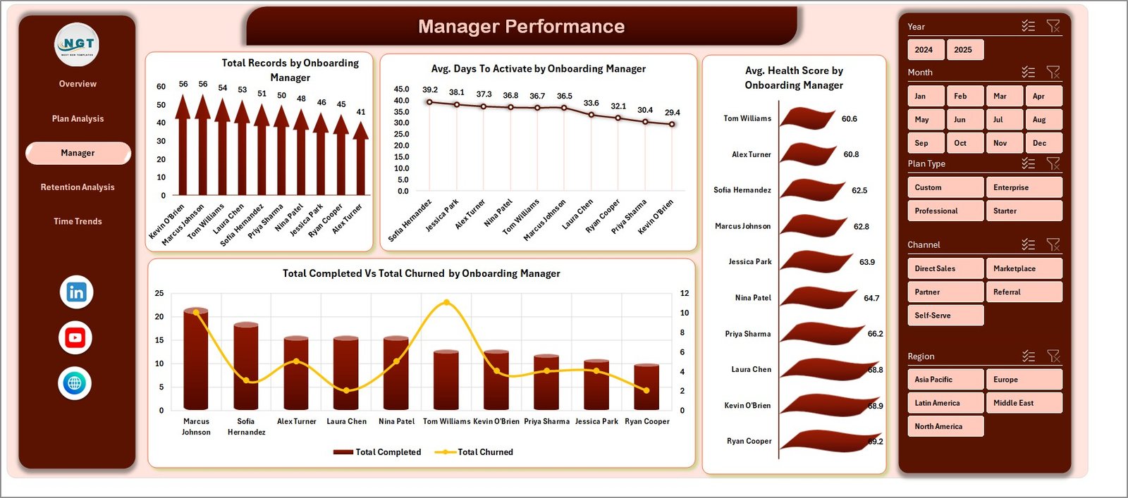
Manager Performance
4 — Retention Analysis
Where the leak is. Total Records by Onboarding Status breaks the funnel into stages. Total MRR by Industry and Total Records by Industry show vertical-by-vertical performance. Total Records by Channel reveals which acquisition source delivers customers who actually stick.
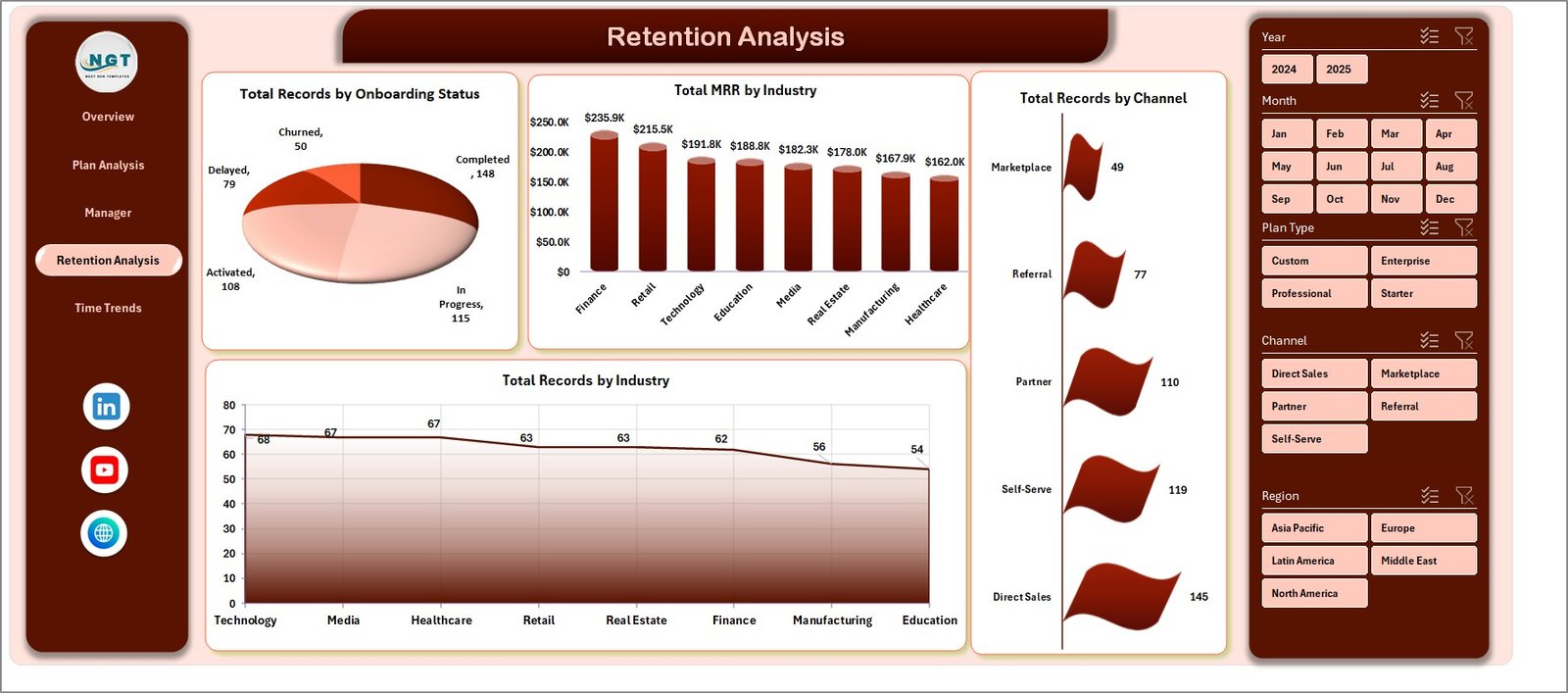
Retention Analysis
5 — Time Trends
Your monthly board-deck view. Total MRR Vs Total Onboarding Cost by Year tracks unit economics over time. Total Completed Vs Total Churned by Month is your monthly retention story. Total Records by Year and Total Records by Month show momentum.
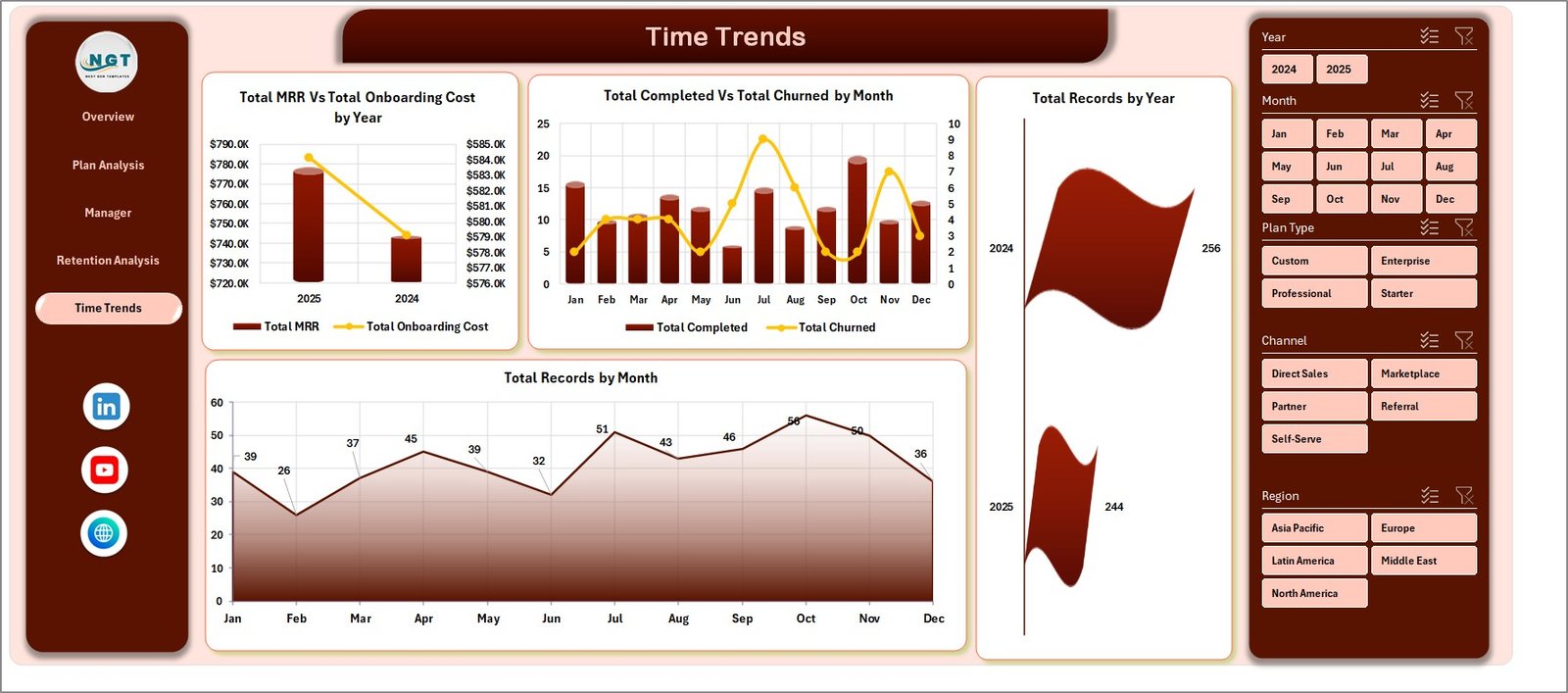
Time Trends
6 — Data Sheet
This is the single source of truth. Paste your onboarding records here in the same column format — every cell on every dashboard page is downstream of this one tab.

Data Sheet tab
7 — Support Sheet
Multiple pivot tables drive the entire dashboard. After you update the Data sheet, click Data → Refresh All in the Excel ribbon and every chart, KPI, and slicer reflects the new data. Right-click the Support tab and choose Hide in production so stakeholders see only the polished pages. To learn more about how pivot tables and slicers connect, the official Microsoft documentation on Slicers is a great primer.
Support sheet tab
SaaS Onboarding Dashboard in Excel vs. Google Sheets vs. ChurnZero / Gainsight — Feature Comparison
| Feature | SaaS Onboarding Dashboard in Excel | Google Sheets equivalent | ChurnZero / Gainsight |
|---|---|---|---|
| Cost | $17.99 one-time | $9.99 one-time | $1,200–$3,500 / month minimum |
| Platform | Microsoft Excel (offline) | Google Sheets (cloud) | Web SaaS only |
| Setup time | Under 10 minutes | Under 10 minutes | 4–8 weeks implementation |
| MRR / Health Score / Activation | ✅ | ✅ | ✅ |
| Onboarding Manager scorecard | ✅ Built in | ❌ Manual build required | ✅ |
| Customizable charts and fields | ✅ Full pivot control | ✅ Full pivot control | ⚠️ Vendor-locked schema |
| Real-time team collaboration | ⚠️ OneDrive/SharePoint | ✅ Native | ✅ Native |
| Per-user pricing | ❌ None | ❌ None | $50–$150 / user / month |
| Year-1 cost at 5 users | $17.99 | $9.99 | $15,000–$42,000 |
For SaaS teams that want MRR, churn, and activation visibility without paying $15K/year for Customer Success software, the SaaS Onboarding Dashboard in Excel sits in the sweet spot.
Who Should Use This Template
Perfect for:
- Customer Success Managers at SaaS startups (5–500 employees) tracking MRR, activation, and health scores in spreadsheets today
- SaaS Operations and RevOps analysts who report onboarding KPIs in board decks every month
- Founders running early-stage SaaS who can’t yet justify ChurnZero or Gainsight pricing
- Customer Success consultants delivering onboarding playbooks to multiple SaaS clients
Not a fit if:
- You’re an enterprise SaaS team needing SOC 2 audit logs, SSO, and live API ingestion from product event data
- You need automated email playbooks triggered by health-score thresholds
- Your workflow demands sub-hourly real-time refreshes (this dashboard is manual-refresh by design)
Real-World Use Cases
Priya leads Customer Success at a 40-person B2B SaaS company. Every Friday she pastes a fresh export from Stripe into the Data sheet, refreshes, and sends the Manager Performance page to her three CSMs. Coaching conversations now sit on Avg. Days To Activate and Health Score deltas instead of opinions — her quarterly NRR has climbed 6 points since adopting the dashboard.
Marco is a fractional RevOps consultant working with four early-stage SaaS startups. He delivers each client a copy of this dashboard pre-configured with their pricing tiers and channel taxonomy. The Plan Analysis and Retention Analysis pages give founders a clear answer to “which plan and which channel is actually retaining?” within their first board meeting.
Lena is a SaaS founder pre-Series A. She uses the Time Trends page in every investor update to show MRR-versus-Onboarding-Cost trajectory and month-over-month Completed vs. Churned ratios — without paying $1,200/month for Gainsight before she has the budget.
Advantages of SaaS Onboarding Dashboard in Excel
One-time cost replaces years of subscription. $17.99 against a typical $15,000–$42,000 first-year ChurnZero or Gainsight bill. Even if you only use this template for six months before graduating to a SaaS platform, the savings are real.
You own the schema. Customer Success software vendors lock you into their data model. With this Excel workbook you can add a column for any custom dimension — NPS, ICP fit score, expansion potential — and the pivots adapt without engineering tickets.
Native Excel performance. No add-ins, no macros, no VBA — the workbook opens identically on Excel for Windows, Mac, and the web. No security warnings, no IT approvals.
Audit-friendly. Because every number traces back to the Data sheet, finance and compliance teams can verify any metric in minutes.
Opportunities for Improvement
Honest limitations worth knowing:
- Manual refresh. The dashboard doesn’t pull live from Stripe, HubSpot, or Salesforce — you paste exports. For most CS teams this is a weekly or twice-weekly cadence, not a blocker, but worth knowing.
- No automated playbooks. If a customer’s health score drops below threshold, no email fires. That’s still a job for Gainsight or a low-code tool like Zapier.
- Co-authoring works but isn’t as fluid as Google Sheets. OneDrive collaboration is solid; just expect Google-Sheets-grade simultaneous editing only on the cloud version of Excel.
Best Practices
Standardize the export schedule. Pick a day (Monday morning works well) and have one CSM own the Data sheet refresh. Inconsistent updates erode dashboard trust faster than anything else.
Hide the Support sheet before sharing. Right-click the tab, click Hide, and your stakeholders see only the polished dashboard.
Save monthly snapshots. Use OneDrive’s version history or duplicate the file each month-end. Year-over-year SaaS health trends are where the storytelling power lives.
Pair with a CRM-side health score. The Avg. Health Score KPI is only as good as the score you feed it. Build a simple weighted formula (login frequency + feature adoption + support ticket volume) in your CRM and pipe the number into the Data sheet.
Explore Relevant Templates
If your team is on a different platform or wants adjacent SaaS analytics, NextGenTemplates has cross-platform companions:
- SaaS Customer Success Dashboard in Google Sheets — cloud-native sibling for teams that live in Google Workspace
- SaaS Metrics Dashboard in Power BI — Power BI version with richer DAX measures and a publishable Power BI Service report
- Subscription Business Dashboard in Google Sheets — broader subscription revenue, churn, and renewal tracking
- SaaS Financial Model Dashboard in HTML — forward-looking SaaS financial model
- Startup Growth KPI Scorecard in Google Sheets — broader startup KPI view including burn and runway
Browse the full Excel Dashboard Templates library for more options.
Frequently Asked Questions
What KPIs does the SaaS Onboarding Dashboard in Excel track?
The SaaS Onboarding Dashboard in Excel tracks 5 headline KPIs — Total MRR, Total Records, Avg. Days To Activate, Avg. Health Score, and Total Activated — plus 20 analytical charts covering Plan Type, Company Size, Onboarding Manager, Industry, Channel, and monthly time trends across 5 interactive pages.
How is this different from ChurnZero or Gainsight?
ChurnZero and Gainsight are real-time SaaS platforms starting at $1,200 per month with multi-week implementations. The SaaS Onboarding Dashboard in Excel is a one-time $17.99 purchase that runs offline in Excel, gives you the same MRR, health-score, and activation views, and lets you customize every chart by editing the underlying pivots.
How long does setup take?
Setup takes under 10 minutes. Replace the sample data in the Data sheet with your own onboarding records, click Data → Refresh All, and every chart, KPI card, and pivot table on the SaaS Onboarding Dashboard in Excel updates automatically. No formulas to rewrite, no slicer reconnection needed.
Do I need any add-ins or macros to use this template?
No. The SaaS Onboarding Dashboard in Excel uses only native Excel pivot tables, pivot charts, and slicers. There are no macros or VBA, so it works on Excel for Windows, Excel for Mac, and Excel on the web with the same fidelity.
Can multiple Customer Success Managers edit it at the same time?
Yes — store the file on OneDrive or SharePoint and enable co-authoring. Multiple CSMs can update the Data sheet simultaneously while the SaaS Onboarding Dashboard in Excel keeps a single source of truth for the team.
Will this work for non-SaaS subscription businesses?
Yes. Although built around SaaS metrics like MRR and Activation, the SaaS Onboarding Dashboard in Excel works equally well for any subscription business — fitness memberships, B2B services retainers, online courses — by relabeling the Plan Type and Onboarding Status columns to match your model.
About the Author
Built by PK — Microsoft Certified Professional with 15+ years of Excel, Google Sheets, and Power BI experience. Founder of NextGenTemplates, reaching 300K+ subscribers across YouTube channels. Every template is hand-built and tested before release.
Conclusion
The SaaS Onboarding Dashboard in Excel turns customer onboarding from an opinion-driven conversation into a numbers-driven coaching tool. With 5 pages, 5 KPIs, 20 charts, and slicers across every dimension SaaS leaders care about, it replaces $15,000+/year in Customer Success software for a single $17.99 download.
🛍️ Click here to Purchase the SaaS Onboarding Dashboard in Excel
✅ Instant download · One-time payment · No subscription · No per-user fees
🎥 For step-by-step Excel and Power BI tutorials, visit YouTube.com/@PK-AnExcelExpert.
📅 Last updated: April 2026