Recycling programs create value only when teams can see the full operating picture: waste collected, tonnage recycled, recycling rate, cost per tonne, facility performance, project status, and avoided emissions. Many recycling teams still manage this information through separate monthly files, manual summaries, and facility-level reports. That makes it harder to compare regions, operators, municipalities, funding sources, and material streams with confidence.
The Recycling Infrastructure Dashboard in Excel solves that reporting problem with 7 workbook tabs, 5 high-level KPI cards, 20 chart views, and multiple slicers. You can update the Data sheet, refresh all pivots, and review overview, material flow, cost analysis, project status, and facility operations from a single Excel file.
Click here to purchase Recycling Infrastructure Dashboard in Excel
Recycling Infrastructure Dashboard in Excel
Key Features of Recycling Infrastructure Dashboard in Excel
- 7 workbook tabs – Overview, Material Flow, Cost Analysis, Project Status, Facility Ops, Data, and Support.
- 5 executive cards – Total Waste Tonnage, Total Recycled Tonnage, Total Collection Cost, Total Emissions Avoided, and Avg. Facility Rating.
- 20 chart views – Analyze regions, infrastructure types, months, material streams, operators, funding sources, municipalities, facilities, and status.
- Multiple slicers – Filter the dashboard quickly without rebuilding charts.
- Refreshable pivot logic – Update the Data sheet and use Refresh All from the Excel Data ribbon.
- Editable Excel file – Change source data, formulas, pivots, visuals, colors, and layout if needed.
Dashboard Pages Explanation
1. Overview Page
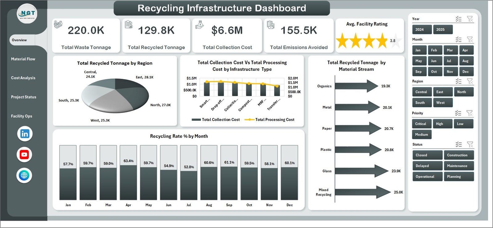
The Overview page is built for quick management review. The top cards show Total Waste Tonnage, Total Recycled Tonnage, Total Collection Cost, Total Emissions Avoided, and Avg. Facility Rating. These cards help leaders understand recycling volume, environmental impact, cost pressure, and facility quality before reviewing detailed pages.
Total Recycled Tonnage by Region compares recycled tonnage across regions. It helps identify which regions are driving recovery volume and which may require program attention.
Total Collection Cost vs Total Processing Cost by Infrastructure Type compares the two major cost groups by infrastructure type. It helps teams see whether collection or processing is creating higher cost pressure.
Recycling Rate % by Month shows monthly recycling efficiency. It helps managers spot improving, declining, or seasonal recycling performance.
Total Recycled Tonnage by Material Stream compares recycled volume by material stream. It helps show whether paper, plastic, metal, glass, organics, or other streams are contributing the most recycled tonnage.
Overview Page
2. Material Flow
The Material Flow sheet focuses on recycling rate, waste tonnage, regional cost, and emissions avoided. It is useful for sustainability analysts, facility teams, and municipal recycling managers who need to understand how materials move through the system.
Recycling Rate % by Material Stream compares recycling efficiency by stream. It helps identify strong and weak material streams for sorting, processing, or collection improvement.
Total Waste Tonnage by Facility compares workload across facilities. It helps reveal which sites handle the highest volume and may need capacity review.
Total Processing Cost vs Total Collection Cost by Region compares operating costs by region. It helps regional managers separate collection-route cost pressure from processing cost pressure.
Total Emissions Avoided by Region compares environmental benefit by geography. It helps sustainability teams communicate avoided emissions alongside cost and volume.
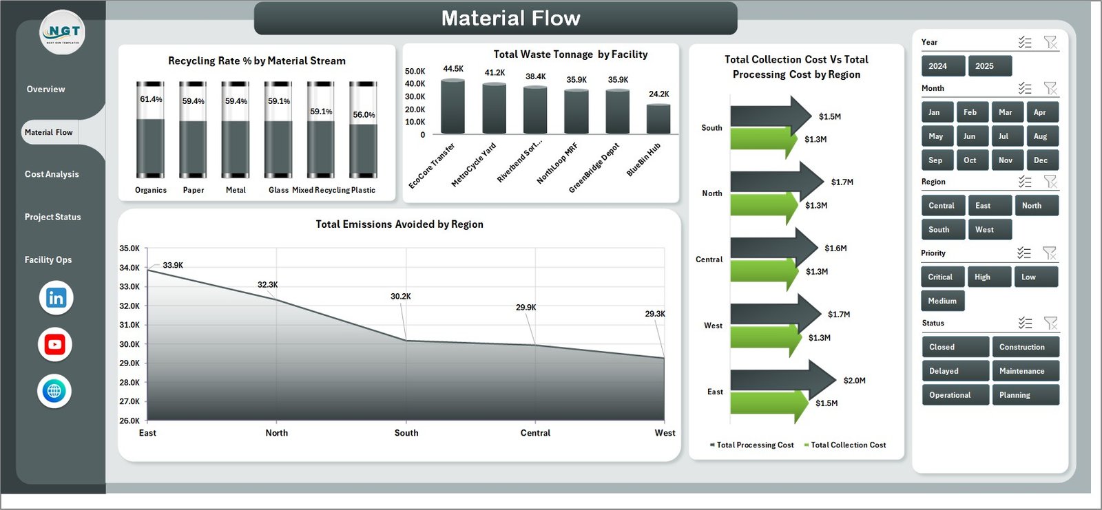
Material Flow
3. Cost Analysis
The Cost Analysis tab gives finance and operations teams a focused cost view. It helps users compare operators, funding sources, status records, and cost per tonne across infrastructure types.
Total Processing Cost by Operator shows which operators drive processing cost. It supports contract review, vendor discussion, and operator comparison.
Total Collection Cost by Funding Source shows how collection cost is distributed by funding source. It helps finance teams understand how recycling activities are funded.
Total Records by Status shows record counts by operational status. It gives a quick view of active, completed, delayed, planned, or other status groups.
Cost Per Tonne by Infrastructure Type compares unit cost by infrastructure type. It helps reveal which infrastructure categories are more expensive to operate per tonne.
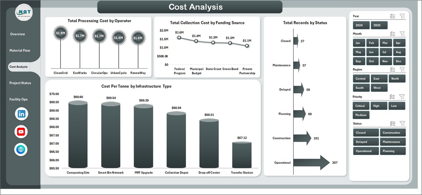
Cost Analysis
4. Project Status
The Project Status sheet helps infrastructure teams track project readiness and delays. It combines project phase, priority, facility rating, and municipality operational rate.
Operational Projects by Project Phase shows operational projects grouped by phase. It helps teams understand where live assets sit in the project lifecycle.
Delayed Projects by Priority groups delayed projects by priority. It helps managers focus first on delays with the greatest operational importance.
Avg. Facility Rating by Facility compares facility-level ratings. It helps highlight facilities with stronger or weaker performance.
Operational Rate % by Municipality compares operational readiness across municipalities. It helps local teams identify where recycling infrastructure is performing well or lagging.
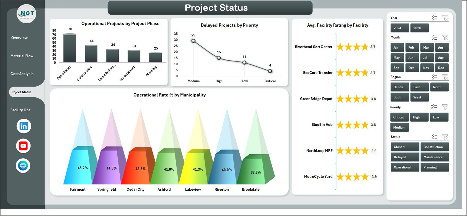
Project Status
5. Facility Ops
The Facility Ops sheet supports recurring facility and operator reviews. It combines recycling rate by operator, recycled tonnage by year, monthly collection cost, and funding source distribution.
Recycling Rate % by Operator compares operator recycling performance. It helps managers see which operators are delivering better diversion results.
Total Recycled Tonnage by Year shows long-term recycled volume. It helps teams review growth, decline, or year-over-year changes.
Total Collection Cost by Month tracks monthly collection cost. It helps identify cost spikes, seasonal changes, and operational pressure.
Total Records by Funding Source shows record distribution by funding source. It helps teams understand the funding mix behind facility operations.
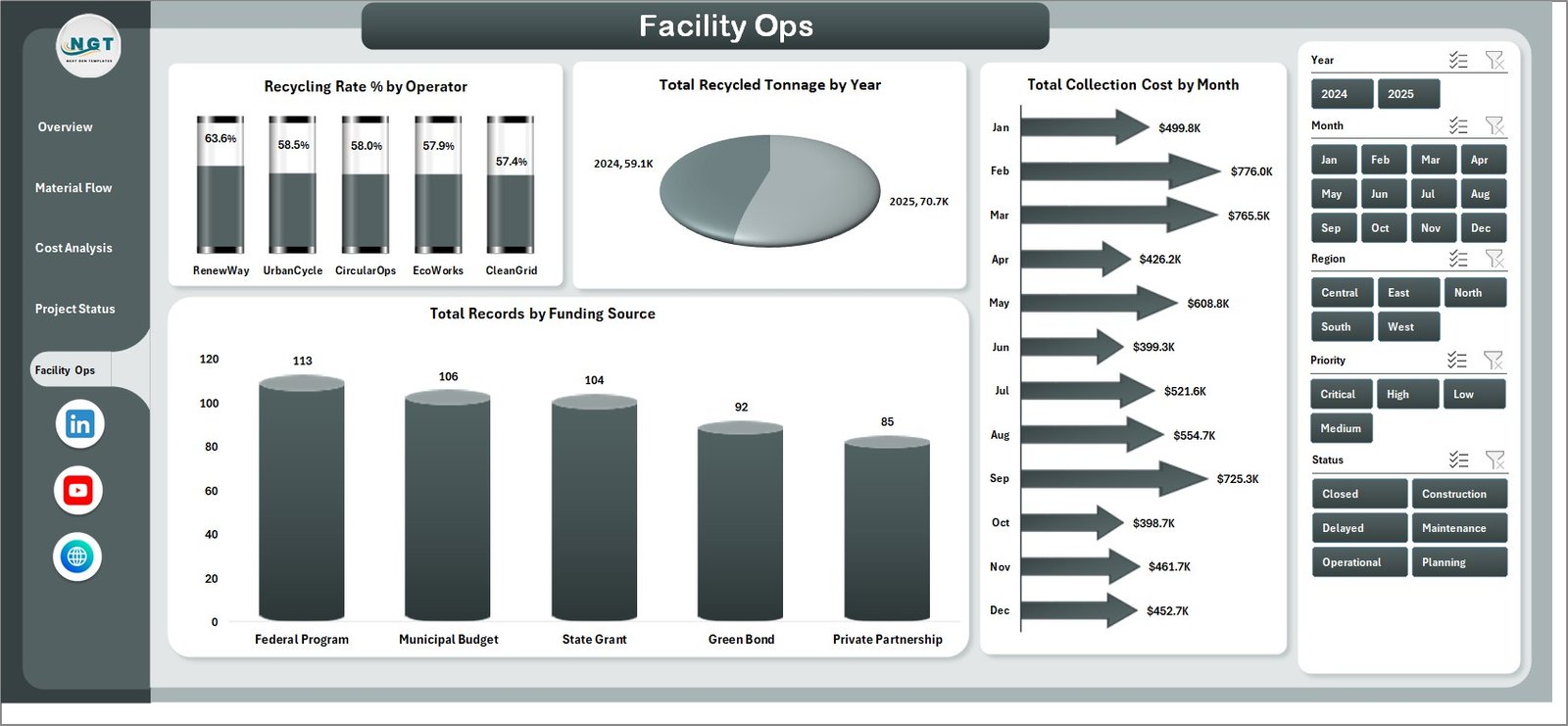
Facility Ops
6. Data Sheet Tab
The Data sheet is where users enter recycling infrastructure records in the same format as the template. After updating this sheet, the dashboard can be refreshed so pivots, cards, charts, and slicers use the latest data.

Data Sheet tab
7. Support Sheet
The Support sheet contains the pivot tables that power the dashboard. After updating the Data sheet, go to the Excel Data ribbon and click Refresh All. You can keep the Support sheet hidden during regular use.

Support sheet tab
Recycling Infrastructure Dashboard in Excel vs. Google Sheets vs. Paid CRM/SaaS – Feature Comparison
| Feature | This Excel Dashboard | Google Sheets Alternative | Paid SaaS Alternative |
|---|---|---|---|
| Cost | $17.99 one-time sale price | Low software cost but manual build required | Recurring subscription |
| Platform | Microsoft Excel | Google Sheets | Vendor cloud platform |
| Setup time | Download, update data, refresh | Build structure, formulas, charts, and filters | Configure account, users, workflows, and fields |
| Real-time team collaboration | Available through shared Excel/OneDrive workflows | Strong browser collaboration | Usually included |
| Customizable fields | Fully editable workbook | Editable when built manually | Limited by plan and admin settings |
| Year-1 cost at 5 users | Template cost plus Excel access | Internal build time plus Workspace access | Often hundreds or thousands per year |
| Recycling reporting fit | Best for repeatable dashboard reporting | Best for lightweight shared tracking | Best for live operational workflow |
Who Should Use This Template
This template is useful for municipal recycling departments, waste management teams, sustainability offices, recycling facility operators, infrastructure planners, environmental consultants, finance teams, and analysts who need a clean Excel reporting file for recycling infrastructure performance.
It may not be enough if you need live sensor feeds, truck routing, citizen requests, work orders, regulatory submissions, or automated approval workflows. In those cases, use this workbook as a reporting layer connected to exported operational data.
Real-World Use Cases
Monthly recycling review: A recycling manager uses the Overview page to explain tonnage, cost, emissions avoided, and facility rating in a leadership meeting.
Material stream improvement: A sustainability analyst uses Material Flow to identify streams with lower recycling rates and higher tonnage opportunity.
Cost control: A finance lead uses Cost Analysis to compare operator processing cost, collection cost by funding source, and cost per tonne.
Advantages of Recycling Infrastructure Dashboard in Excel
- It centralizes recycling volume, cost, emissions, facility, operator, project, and funding data.
- It gives both executive-level cards and detailed page-level analysis.
- It reduces manual report preparation time for monthly recycling reviews.
- It works inside Excel, so teams can adjust formulas, pivots, and visuals.
- It uses slicers for quick filtering without chart rebuilding.
Opportunities for Improvement
The dashboard depends on clean source data. Facility names, operator names, material streams, status values, dates, and funding sources should be standardized before refresh. Teams that need live operational control should connect exports from route, facility, or ERP systems instead of treating this workbook as a real-time system.
Best Practices
- Keep the Data sheet column structure unchanged.
- Standardize material stream, region, facility, operator, municipality, status, and funding source names.
- Refresh all pivots after every data update.
- Review slicer selections before presenting numbers.
- Keep the Support sheet hidden if end users only need dashboard pages.
- Save a backup before changing pivot tables or formulas.
For official Excel guidance, see Microsoft Support: Create a PivotTable to analyze worksheet data.
Explore Relevant Templates
- Recycling Infrastructure Dashboard in Excel
- Recycling Infrastructure KPI Dashboard in Excel
- Recycling Infrastructure KPI Dashboard in Power BI
- MS Excel templates
Frequently Asked Questions
What is the Recycling Infrastructure Dashboard in Excel?
It is a ready-to-use Excel dashboard for tracking recycling infrastructure performance, including waste tonnage, recycled tonnage, recycling rate, costs, emissions avoided, facility rating, project status, and operator performance.
How many sheets are included?
The workbook includes 7 tabs: Overview, Material Flow, Cost Analysis, Project Status, Facility Ops, Data, and Support.
Can I use my own data?
Yes. Replace the sample records in the Data sheet with your own recycling infrastructure data in the same format.
How do I refresh the dashboard?
Go to the Excel Data ribbon and click Refresh All after updating the Data sheet. This refreshes the pivots and charts.
Can I hide the Support sheet?
Yes. The Support sheet contains pivot tables and can be hidden during regular dashboard use.
Does this replace recycling management software?
No. It is a reporting dashboard, not a live operational, routing, work-order, or compliance filing system.
About the Author
Built by PK – Microsoft Certified Professional with 15+ years of Excel, Google Sheets, and Power BI experience. Founder of NextGenTemplates, reaching 300K+ subscribers across YouTube channels. Every template is hand-built and tested before release.
Conclusion
The Recycling Infrastructure Dashboard in Excel gives recycling and sustainability teams a practical way to review waste tonnage, recycled tonnage, cost, emissions avoided, facility rating, project status, operator performance, and funding source data. With 7 tabs, 5 KPI cards, 20 chart views, slicers, and refreshable pivot logic, it is built for teams that want repeatable recycling infrastructure reporting without starting from a blank workbook.
Click here to purchase Recycling Infrastructure Dashboard in Excel
Visit our YouTube channel to learn step-by-step Excel dashboard tutorials.