AI Chatbot Providers Dashboard in Excel is a ready-to-use Excel dashboard for AI product teams, SaaS analysts, customer support leaders, and technology consultants who need one place to monitor chatbot provider performance. Instead of reviewing revenue, support cost, conversations, active users, resolution rate, escalations, CSAT, deployment status, industry demand, region, channel, model type, support level, and plan tier in separate files, this template brings the reporting view into 5 dashboard pages with KPI cards, slicers, and focused analysis charts.
AI chatbot programs often expand quickly across providers, industries, channels, and regions. That growth creates a reporting challenge: finance wants revenue and support cost, support teams want resolution and escalation metrics, and leadership wants adoption trends. Excel remains a practical reporting layer for many teams because it is familiar, flexible, and easy to update from structured tables. Microsoft also provides guidance on using Excel charts to visualize worksheet data: Microsoft Support: create charts in Excel.
Key Features of AI Chatbot Providers Dashboard in Excel
- 5 Excel dashboard pages: Overview, Conversations, Provider Analysis, Revenue Insights, and Engagement Trend.
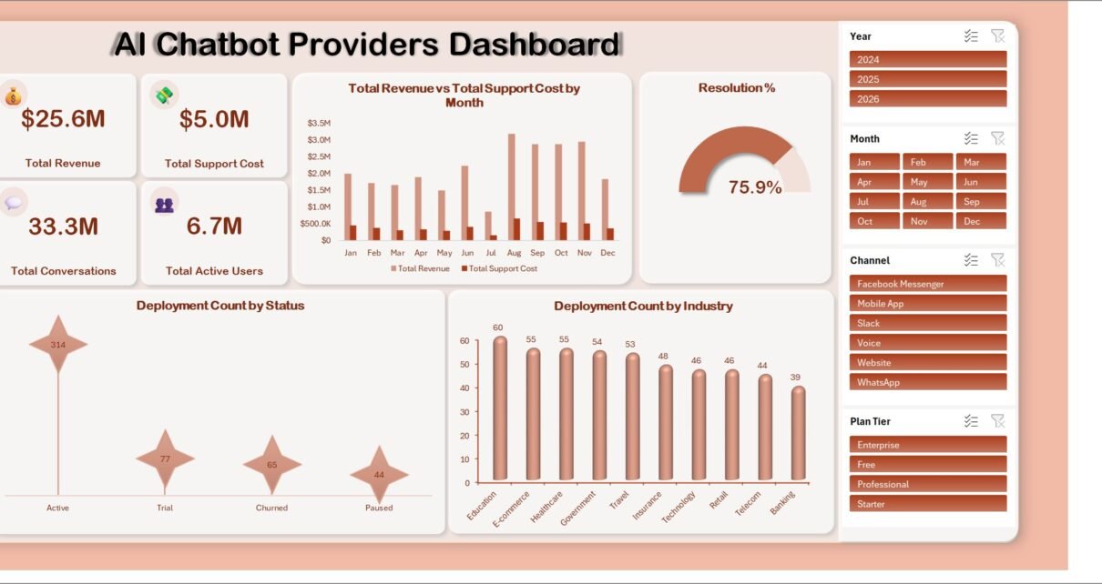
- Executive KPI cards: Track Total Revenue, Total Support Cost, Total Conversations, and Total Active Users from one summary view.
- Provider-level analysis: Compare revenue, support cost, active users, average CSAT, and escalation percentage across chatbot providers.
- Conversation analytics: Review conversations, resolved conversations, channel performance, provider resolution rate, model type usage, and monthly escalation movement.
- Revenue insight pages: Analyze revenue by industry, region, plan tier, support cost, and net revenue after support.
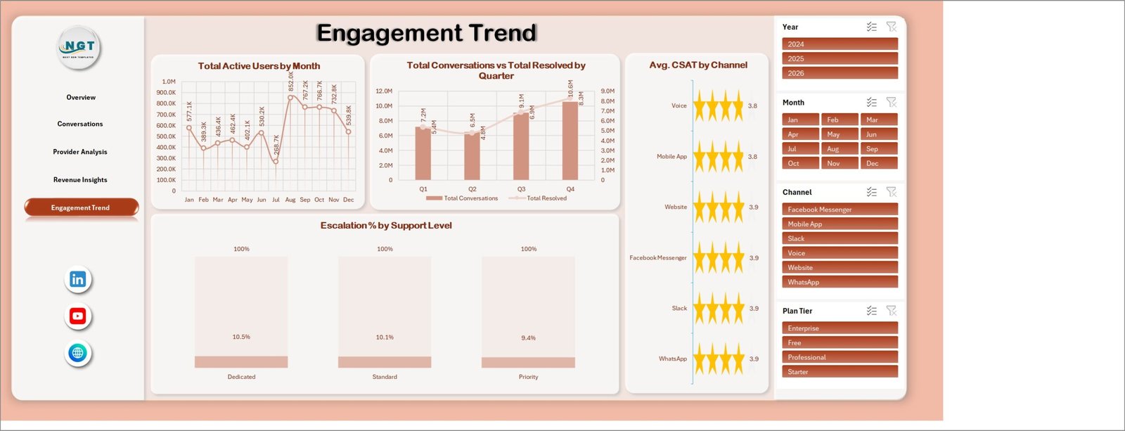
- Engagement trend reporting: Monitor active users by month, quarterly resolved volume, CSAT by channel, and escalation by support level.
- Interactive slicers: Use slicers to filter the dashboard quickly by selected fields and review filtered results without rebuilding charts.
Dashboard Pages Explanation
1. Overview Page
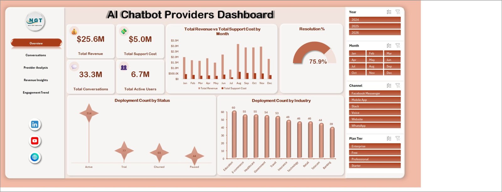
The Overview page gives a high-level view of chatbot business performance. At the top, the KPI cards show Total Revenue, Total Support Cost, Total Conversations, and Total Active Users so managers can review adoption, service load, and financial scale at a glance.
Total Revenue vs Total Support Cost by Month: This chart compares monthly revenue with support cost. It helps teams see whether chatbot growth is profitable or whether support effort is rising faster than revenue.
Resolution %: This visual shows the percentage of conversations resolved successfully. It helps support and product teams measure the effectiveness of chatbot automation.
Deployment Count by Status: This chart breaks deployments into statuses such as active, pending, paused, or completed. It helps implementation teams review rollout health and identify deployment bottlenecks.
Deployment Count by Industry: This chart shows where chatbot deployments are concentrated by industry. It helps sales and strategy teams understand which sectors are adopting chatbot solutions fastest.
2. Conversations
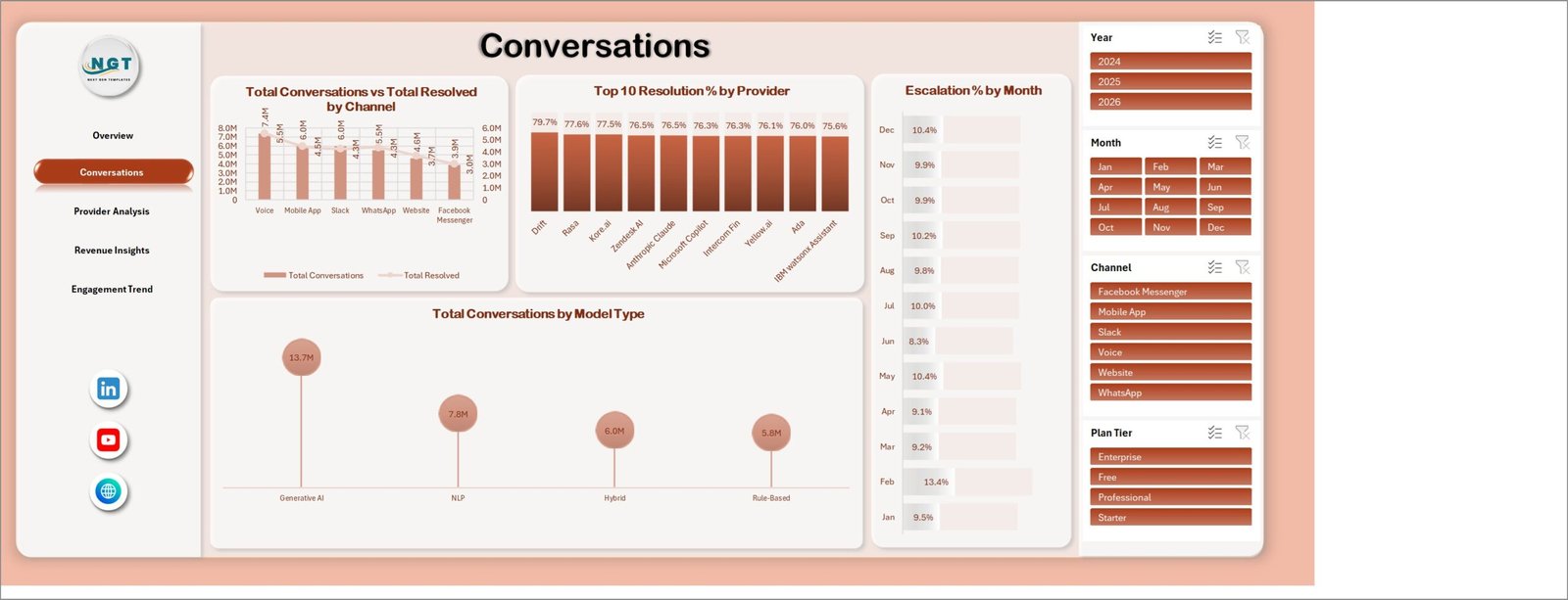
The Conversations page focuses on service volume, resolution, escalation, provider performance, and model type usage. It is useful for support leaders who need to know whether chatbot conversations are being resolved efficiently across channels.
Total Conversations vs Total Resolved by Channel: This chart compares total conversations with resolved conversations by channel. It helps identify channels where customers receive fast answers and channels where more tuning may be needed.
Resolution % by Provider: This chart compares the resolution rate for each chatbot provider. It helps teams evaluate provider quality beyond volume alone.
Escalation % by Month: This trend shows how often conversations are escalated to human support over time. It helps product teams spot months where bot performance declined or customer issues became more complex.
Total Conversations by Model Type: This chart shows conversation volume by model type. It helps technical teams compare adoption and workload across different chatbot models.
3. Provider Analysis
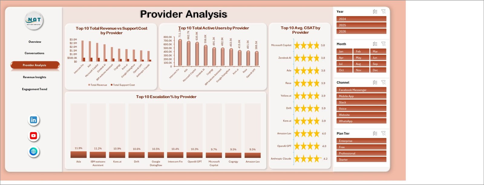
The Provider Analysis page compares performance across chatbot providers. It helps teams answer a practical question: which providers deliver strong revenue, user adoption, satisfaction, and low escalation pressure?
Total Revenue vs Support Cost by Provider: This chart compares provider revenue with support cost. It helps leadership see which providers produce stronger financial return after service effort is considered.
Total Active Users by Provider: This chart ranks providers by active users. It helps product and customer success teams understand adoption across the provider portfolio.
Avg. CSAT by Provider: This chart compares customer satisfaction across providers. It helps teams identify provider experiences that customers rate highly and providers that may need improvement.
Escalation % by Provider: This chart shows the share of conversations that require human escalation by provider. It helps teams evaluate automation quality and support dependency.
4. Revenue Insights
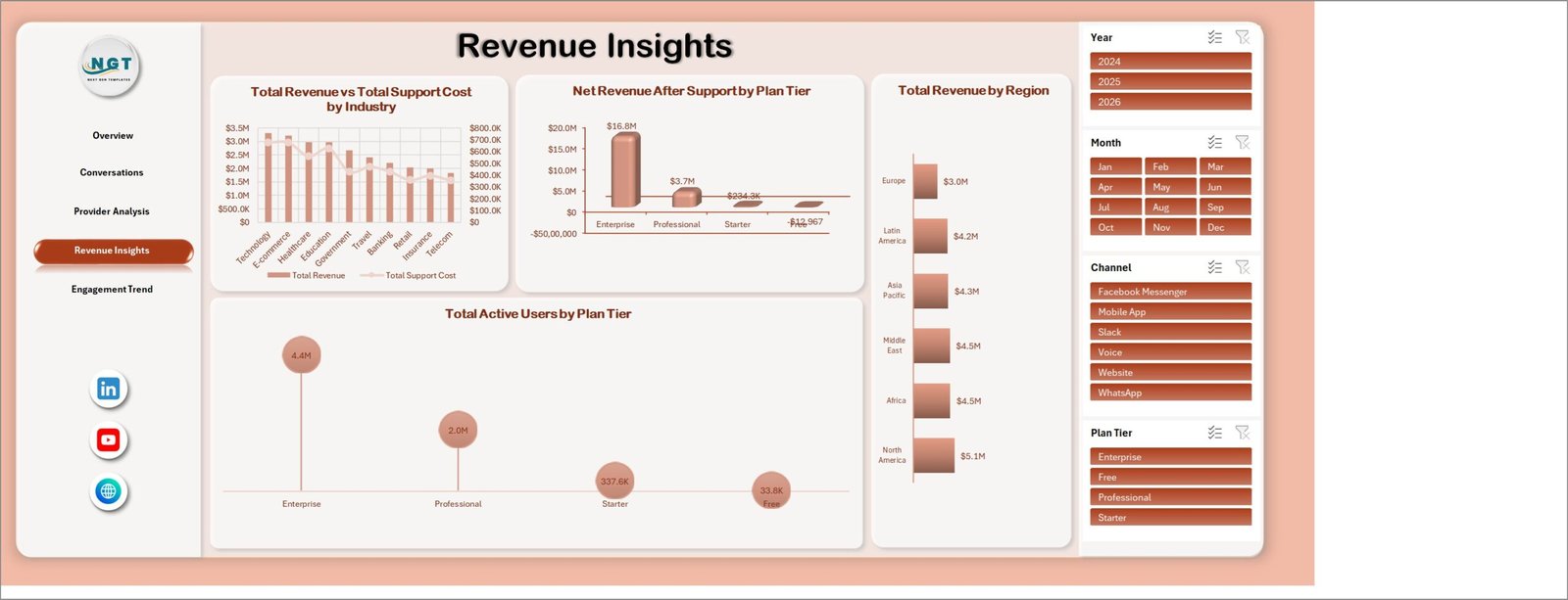
The Revenue Insights page is designed for commercial and finance review. It connects provider performance with industries, plan tiers, regions, support cost, and active user distribution.
Total Revenue vs Total Support Cost by Industry: This chart compares income and service cost across industries. It helps identify industries where chatbot usage is financially attractive and industries where support intensity may be high.
Net Revenue After Support by Plan Tier: This visual shows revenue after support cost by plan tier. It helps pricing teams understand which subscription tiers produce stronger net value.
Total Revenue by Region: This chart compares revenue across regions. It helps leaders see geographic demand patterns and prioritize growth markets.
Total Active Users by Plan Tier: This chart shows user adoption by plan tier. It helps customer success and sales teams understand which plans are driving usage.
5. Engagement Trend
The Engagement Trend page tracks activity and service quality over time. It is useful for monthly reviews, quarterly business updates, and support performance discussions.
Total Active Users by Month: This chart shows the monthly trend of active users. It helps teams understand whether chatbot adoption is growing, flattening, or dropping.
Total Conversations vs Total Resolved by Quarter: This chart compares quarterly conversation volume with resolved volume. It helps users see whether resolution capacity is keeping pace with demand.
Avg. CSAT by Channel: This chart compares customer satisfaction across channels. It helps support leaders find channels where the user experience is strong or needs adjustment.
Escalation % by Support Level: This chart shows escalation percentage by support level. It helps teams understand where human support involvement is concentrated.
AI Chatbot Providers Dashboard in Excel vs. Google Sheets vs. Paid CRM/SaaS – Feature Comparison
| Feature | This Excel dashboard | Google Sheets alternative | Paid CRM/SaaS alternative |
|---|---|---|---|
| Cost | One-time template purchase | Low cost or free, depending on setup | Recurring subscription or per-seat pricing |
| Platform | Microsoft Excel | Browser-based spreadsheet | Vendor-hosted SaaS platform |
| Setup time | Replace sample data and refresh | Requires sheet setup and chart design | Requires onboarding and configuration |
| Real-time team collaboration | Available through OneDrive or SharePoint workflows | Strong live collaboration | Usually included with licensed users |
| Mobile access | Possible through Excel mobile or shared files | Strong mobile/browser access | Usually included |
| Customizable fields | Editable workbook, charts, formulas, and source tables | Editable but may need manual structure | Depends on vendor limits |
| Share with link | Possible through Microsoft 365 sharing | Easy link sharing | Usually login-based |
| Year-1 cost at 5 users | Low one-time template cost plus Microsoft licensing if needed | Low if already using Google Workspace | Often much higher due to subscription seats |
| AI chatbot metrics | Revenue, support cost, conversations, resolution, escalation, CSAT, users, providers, industries, channels, regions, and plan tiers | Must be built manually | Depends on platform reporting depth |
Who Should Use This Template
This template is useful for AI chatbot providers, SaaS companies, customer support teams, product managers, implementation consultants, RevOps analysts, and leadership teams that want a clear Excel reporting layer for chatbot performance.
It is not a replacement for a help desk, CRM, billing system, model monitoring tool, or live chatbot platform. It will not run chatbot conversations, manage tickets, connect automatically to every provider API, or train a model. It works best when you already have structured data and need a clean dashboard to review it.
Real-World Use Cases
Ananya, SaaS operations manager. She exports monthly chatbot usage data from the support platform and uses the dashboard to compare conversation volume, resolution rate, escalation percentage, and support cost by provider. In one monthly review, the team can see which provider is improving and which one needs attention.
Michael, customer support director. He tracks active users, channel-level conversations, CSAT, and escalation patterns for a chatbot rollout across web chat, mobile app, and customer portal channels. The dashboard helps him see whether automation is reducing human workload or simply moving it to another support level.
Priya, AI consulting analyst. She prepares a client-facing performance review using provider, industry, region, and plan-tier views. Instead of building charts from scratch, she updates the data table and uses the slicers to tailor the story for each stakeholder group.
Advantages of AI Chatbot Providers Dashboard in Excel
The main advantage is speed. Teams can move from raw chatbot performance data to a management-ready view without designing every KPI card, slicer, chart, and dashboard page manually.
The second advantage is flexibility. Since the template is built in Excel, users can adjust fields, add calculations, rename providers, update model types, and extend the source data structure to fit their business.
The third advantage is practical cost control. A one-time Excel template can be enough for teams that need reporting, not a full enterprise platform. It is especially useful for internal analysis, client reporting, pilot reviews, and recurring performance meetings.
Opportunities for Improvement
This workbook depends on the quality of the input data. If conversation status, revenue, support cost, provider name, or channel values are inconsistent, the dashboard will reflect those issues. Standardized data entry is important.
It is also not a live API dashboard by default. Users who need automated refresh from chatbot platforms may need Power Query, VBA, connector exports, or a separate automation process. For many teams, a monthly or weekly export is enough; for real-time monitoring, a live BI or SaaS solution may be better.
Best Practices
- Keep provider names consistent. Small spelling differences can split one provider into multiple dashboard items.
- Use a fixed month and quarter format. Consistent date fields make trend charts easier to refresh and audit.
- Review support cost definitions. Decide whether support cost includes human agents, platform cost, infrastructure, implementation work, or only direct service cost.
- Refresh the dashboard before every review. After replacing sample data, refresh pivots, charts, and slicers so the output reflects the latest records.
- Keep one clean backup copy. Preserve an untouched original file before making custom layout or formula changes.
Explore Relevant Templates
You can browse more ready-to-use Excel dashboard templates on NextGenTemplates Excel Dashboard templates. For broader Excel, Power BI, and Google Sheets template resources, visit Excel Templates, Power BI and Google Sheets templates by NextGenTemplates.
For this specific workbook, use the product page when it is ready: AI Chatbot Providers Dashboard in Excel.
Frequently Asked Questions
What does the AI Chatbot Providers Dashboard in Excel track?
It tracks revenue, support cost, conversations, resolved conversations, active users, resolution percentage, escalation percentage, CSAT, deployment status, industry, provider, region, channel, model type, plan tier, and support level.
How many dashboard pages are included?
The workbook includes 5 dashboard pages: Overview, Conversations, Provider Analysis, Revenue Insights, and Engagement Trend.
Can I use my own chatbot provider data?
Yes. Replace the sample records with your own structured data, refresh the workbook, and the KPI cards, slicers, and charts will update based on your data fields.
Does this dashboard work without a paid SaaS tool?
Yes. The dashboard is built in Microsoft Excel, so it can be used as a standalone reporting workbook. You only need reliable source data exported or entered into the workbook.
Can I customize the charts and slicers?
Yes. Because it is an Excel file, you can edit chart titles, add fields, adjust formulas, change slicers, and modify the layout according to your reporting needs.
Is this template suitable for customer support teams?
Yes. Support teams can use it to monitor resolved conversations, escalation percentage, CSAT by channel, and provider-level service performance.
About the Author
Built by PK – Microsoft Certified Professional with 15+ years of Excel, Google Sheets, and Power BI experience. Founder of NextGenTemplates, reaching 300K+ subscribers across YouTube channels. Every template is hand-built and tested before release.
Conclusion
The AI Chatbot Providers Dashboard in Excel gives teams a practical way to monitor chatbot growth, revenue, support cost, resolution quality, provider performance, and engagement trends in one workbook. It is best suited for teams that want a flexible Excel reporting layer without starting from a blank sheet.
Click here to purchase the AI Chatbot Providers Dashboard in Excel
Instant download. One-time payment. No subscription.
For step-by-step Excel, dashboard, and automation tutorials, visit Youtube.com/@PK-AnExcelExpert.
Last updated: August 2026