Precision medicine programs need clear analytics because each case can involve genomic testing, therapy matching, reimbursement review, treatment cost monitoring, adverse event tracking, and provider performance analysis. The Precision Medicine Dashboard in Power BI brings these moving parts into one ready-to-use report. In this template, users get 5 Power BI report pages, 5 high-level KPI cards, and 12 chart views designed for clinical, financial, testing, and provider review.
Precision medicine is built around tailoring treatment and prevention to differences in genes, environments, and lifestyles. That creates a reporting challenge: leaders need to see therapy match rates, treatment cost, reimbursement, funding gaps, clinical benefit, and turnaround performance together. This Power BI dashboard helps healthcare teams start that analysis without building a report from scratch.
Click here to buy Precision Medicine Dashboard in Power BI.
Key Features of Precision Medicine Dashboard in Power BI
Five report pages. The dashboard includes Overview, Clinical Outcomes, Financial View, Testing Trends, and Provider Analysis pages, so each decision area has its own focused view.
Executive KPI cards. The Overview page uses cards for Total Treatment Cost, Total Reimbursement, Total Cases, Net Funding Gap, and Adverse Events. These cards are useful for quick leadership updates and monthly performance reviews.
Interactive slicers. Users can apply slicers to filter the report quickly and see filtered dashboard results without rebuilding visuals.
Healthcare-focused metrics. The report covers therapy match rate, clinical benefit, adverse events, reimbursement coverage, testing trends, treatment cost, care center performance, clinician activity, and regional funding gaps.
Editable Power BI file. You can open the PBIX file in Power BI Desktop, connect or replace the sample data source, refresh the model, and customize the visuals if needed.
Dashboard Pages Explanation
Overview Page
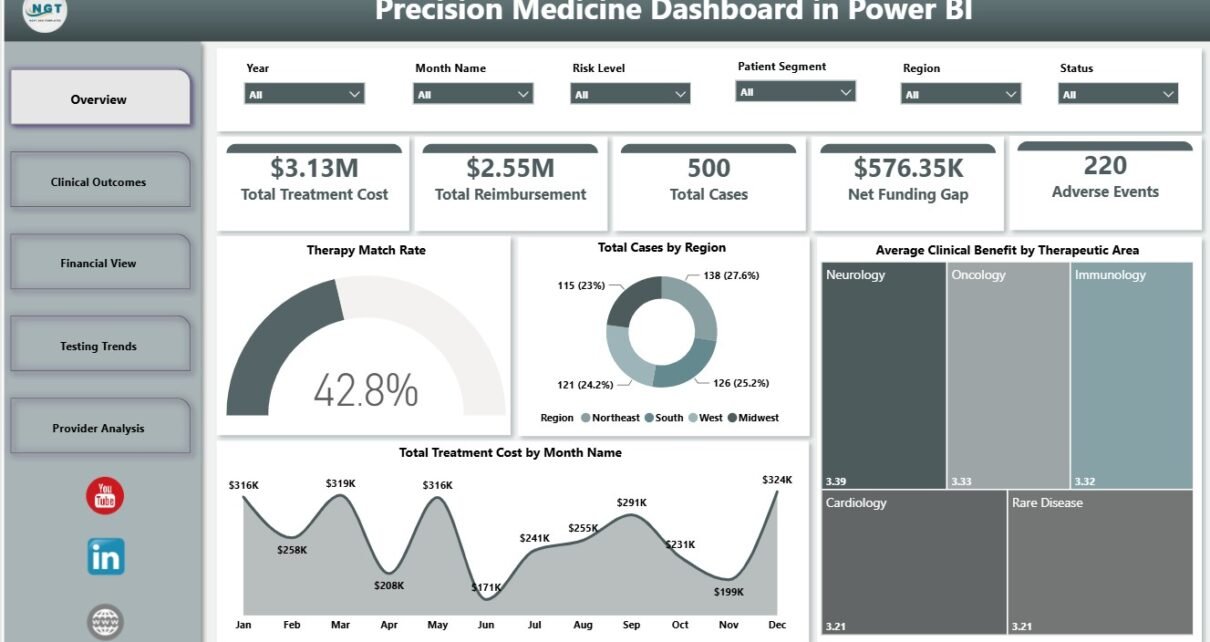
The Overview page provides the high-level program snapshot. At the top of the page, cards show Total Treatment Cost, Total Reimbursement, Total Cases, Net Funding Gap, and Adverse Events. These cards help users understand financial scale, payer recovery, case volume, remaining funding pressure, and safety signals in one glance.
Therapy Match Rate by Overall Cases shows what percentage of total cases received a matched therapy. This helps clinical leaders understand whether testing and case review are producing actionable treatment options.
Total Cases by Region compares regional case volume. It helps teams see where precision medicine demand is highest and where operational support may need to increase.
Average Clinical Benefit by Therapeutic Area compares clinical benefit across therapeutic areas. This visual supports service-line review and helps identify where personalized care is showing stronger reported value.
Total Treatment Cost by Month Name shows treatment cost movement by month. Finance and program teams can use it to identify cost spikes, budget pressure, and seasonal patterns.
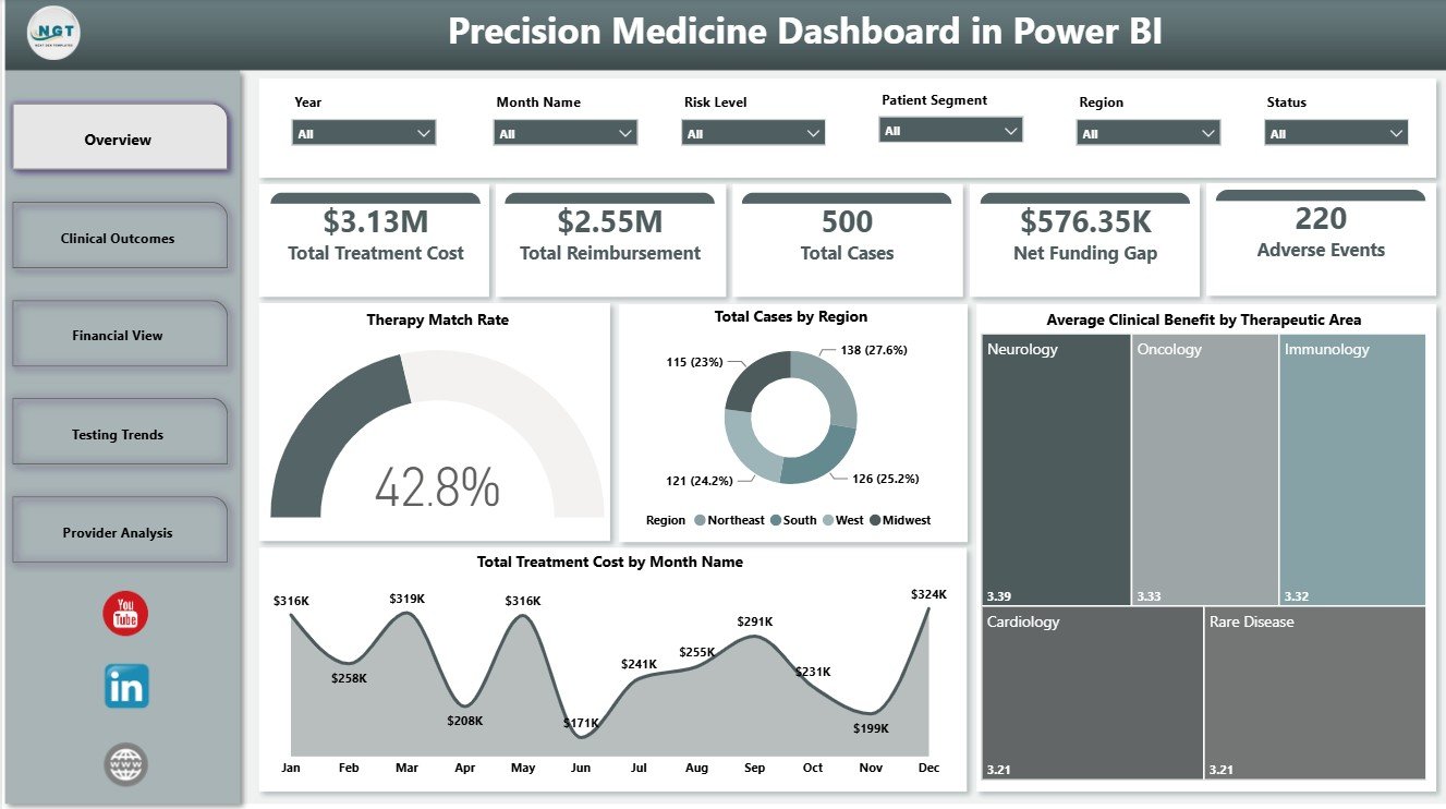
Precision Medicine Dashboard in Power BI
Clinical Outcomes
The Clinical Outcomes page focuses on patient and treatment effectiveness. It is useful for teams that want to understand match rates, patient segment performance, and cost variation by care center.
Therapy Match Rate by Risk Level compares match rate across risk groups. Clinical teams can use this to see whether high-risk patients are receiving matched therapy opportunities at an acceptable rate.
Therapy Matched Cases by Patient Segment shows which patient segments have the highest number of matched cases. This supports equity review, segment analysis, and targeted improvement planning.
Total Treatment Cost by Care Center compares treatment cost across care centers. Leaders can use this visual to understand location-level cost differences and discuss operational variation.
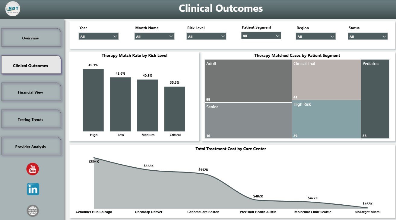
Clinical Outcomes
Financial View
The Financial View page helps users review the money side of precision medicine. It connects case volume, reimbursement coverage, and funding gaps so finance and access teams can make better decisions.
Total Cases by Year shows yearly case volume. This helps teams understand whether the precision medicine program is growing, stable, or declining over time.
Net Funding Gap by Region highlights where treatment cost is not fully covered by reimbursement or funding. This helps identify regions where financial navigation may be most urgent.
Reimbursement Coverage by Patient Segment compares reimbursement coverage across patient groups. This helps teams find segments that may need better payer engagement, grant support, or affordability planning.
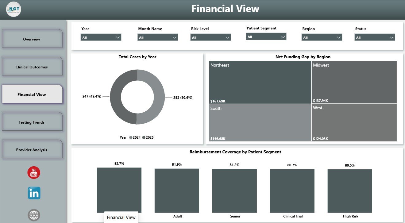
Financial View
Testing Trends
The Testing Trends page tracks testing-related cost, clinician activity, and monthly therapy match performance. It helps teams understand whether testing workflows are improving over time.
Total Treatment Cost by Test Type compares cost across testing categories. This helps analysts see which test types are linked with higher treatment investment.
Total Cases by Clinician shows case volume by clinician. Managers can use it to review adoption, workload, referral patterns, and training needs.
Therapy Match Rate by Month Name tracks month-by-month movement in match rate. This helps teams monitor whether process changes are improving therapy matching.
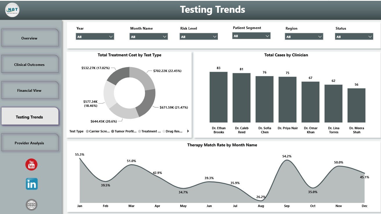
Testing Trends
Provider Analysis
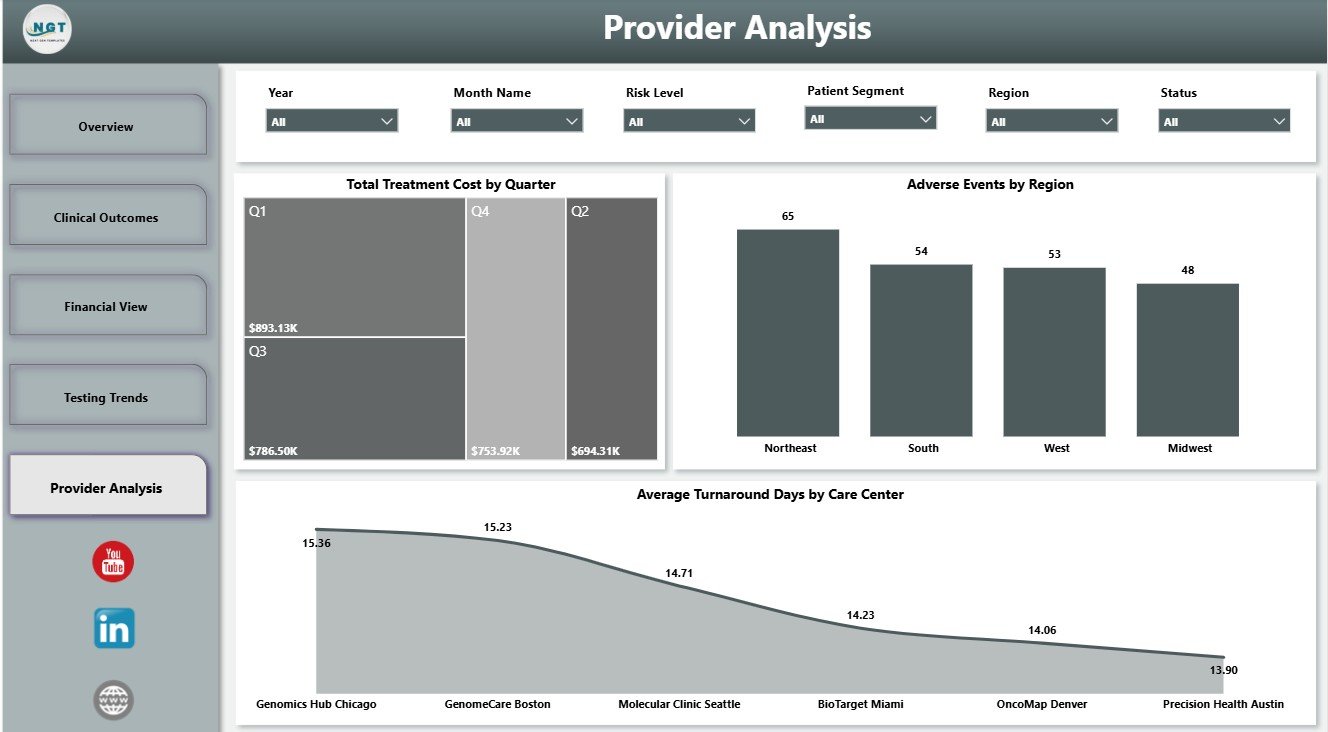
The Provider Analysis page is designed for reviewing delivery patterns across quarters, regions, and care centers. It helps operational leaders identify variation and ask better follow-up questions.
Total Treatment Cost by Quarter shows quarterly cost movement. This supports budget review and helps leaders see when treatment spend is rising or falling.
Adverse Events by Region compares adverse event counts geographically. Quality and safety teams can use this view to identify regions that may need closer investigation.
Average Turnaround Days by Care Center compares how long each care center takes to complete key precision medicine workflows. This helps managers spot delays and learn from faster-performing centers.
Provider Analysis
Precision Medicine Dashboard in Power BI vs. Tableau vs. Paid Healthcare SaaS – Feature Comparison
| Feature | Precision Medicine Dashboard in Power BI | Tableau Alternative | Paid Healthcare SaaS |
|---|---|---|---|
| Cost | One-time template purchase | License and dashboard build cost | Usually monthly or annual subscription |
| Platform | Power BI Desktop and Power BI Service | Tableau Desktop or Tableau Cloud | Vendor-hosted system |
| Setup time | Replace sample data and refresh | Requires report design and modeling | Implementation and onboarding required |
| Collaboration | Available through Power BI Service | Available through Tableau Cloud/Server | Usually included by role |
| Customization | Editable PBIX file | Editable if you own the workbook | Depends on vendor controls |
| Year-1 cost at 5 users | Template cost plus existing Microsoft licensing | License and build effort | Can become expensive quickly |
| Healthcare analytics views | Prebuilt clinical, financial, testing, and provider pages | Must be configured | May require custom reporting |
Who Should Use This Template
This template is ideal for healthcare analysts, genomics teams, precision medicine program managers, oncology administrators, reimbursement analysts, clinical operations leaders, care center managers, and consultants who need a fast Power BI reporting layer.
It is not intended to diagnose patients, recommend treatment, replace an EHR, or act as regulated clinical decision support software. It is a reporting dashboard for operational and analytical review.
Real-World Use Cases
Clinical program review: A precision medicine manager reviews total cases, therapy match rate, clinical benefit, and adverse events before a monthly leadership meeting.
Financial navigation planning: A reimbursement analyst checks net funding gap by region and reimbursement coverage by patient segment to prioritize support.
Testing workflow improvement: A genomics operations lead compares match rate by month, cases by clinician, and cost by test type to identify process opportunities.
Advantages of Precision Medicine Dashboard in Power BI
The main advantage is speed. Instead of starting with a blank Power BI report, users get a prebuilt structure with relevant healthcare measures, slicers, and pages. The template also separates clinical, financial, testing, and provider analysis, which makes review meetings easier to run.
Power BI also gives users flexibility. Experienced users can change visuals, add measures, connect data sources, publish to Power BI Service, and build additional pages for their own organization.
Opportunities for Improvement
This dashboard does not automatically connect to live EHR, LIMS, billing, claims, or payer systems. Teams that need live refresh will need to connect the PBIX file to approved internal data sources. Users should also review data privacy rules before loading real patient or operational data.
Best Practices
Keep field names consistent, validate definitions before replacing sample data, and maintain a separate backup copy of the original PBIX file. Use approved data sources, apply row-level security if publishing sensitive reports, and test every slicer after refreshing the model.
For Power BI setup and publishing guidance, review Microsoft Learn’s Power BI Desktop documentation. For precision medicine background, see the FDA precision medicine overview.
Explore Relevant Templates
Explore related templates from NextGenTemplates:
- Precision Medicine Dashboard in Power BI
- Precision Medicine Dashboard in Excel
- Healthcare Administrator Toolkit
- Home Healthcare KPI Dashboard in Excel
Frequently Asked Questions
What is the Precision Medicine Dashboard in Power BI?
It is a ready-to-use PBIX dashboard for tracking treatment cost, reimbursement, total cases, funding gaps, adverse events, therapy match rates, clinical benefit, testing trends, and provider performance.
Can I update it with my own data?
Yes. Replace the sample data source with your own approved data and refresh the Power BI model.
Does it include clinical outcomes analysis?
Yes. The Clinical Outcomes page includes therapy match rate by risk level, therapy matched cases by patient segment, and total treatment cost by care center.
Does it include financial analysis?
Yes. The Financial View page includes total cases by year, net funding gap by region, and reimbursement coverage by patient segment.
Is this dashboard a medical decision tool?
No. It is an analytics and reporting template. It does not diagnose patients or recommend treatment.
Can I publish this report to Power BI Service?
Yes, if your organization uses Power BI Service and your licensing allows publishing and sharing.
About the Author
Built by PK – Microsoft Certified Professional with 15+ years of Excel, Google Sheets, and Power BI experience. Founder of NextGenTemplates, reaching 300K+ subscribers across YouTube channels. Every template is hand-built and tested before release.
Conclusion
The Precision Medicine Dashboard in Power BI gives healthcare teams a clear way to review therapy matching, treatment cost, reimbursement, adverse events, testing trends, funding gaps, and provider performance in one report. It is best suited for analysts and managers who want a practical Power BI starting point for precision medicine program reporting.
Click here to download the Precision Medicine Dashboard in Power BI.
Visit our YouTube channel to learn step-by-step Power BI, Excel, and dashboard tutorials.