IVF Centers Dashboard in Power BI is a ready-to-use Power BI report for fertility clinics that want a clear view of revenue, medication cost, lab cost, operating cost, cases, treatment mix, outcomes, doctors, centers, and regions. IVF centers handle sensitive cycle and outcome data, and even small reporting delays can make monthly reviews harder. This dashboard brings the key clinic metrics into one PBIX file with 5 report pages, 5 headline cards, multiple slicers, and page-level visuals.
Built for Power BI Desktop, this template gives IVF center owners, healthcare analysts, finance teams, and operations managers a practical reporting layer without building every visual from scratch. You can learn more about Power BI Desktop from Microsoft Learn.
Click here to buy IVF Centers Dashboard in Power BI
IVF Centers Dashboard in Power BI
Key Features of IVF Centers Dashboard in Power BI
- 5 report pages covering Overview, Center Analysis, Treatment Mix, Outcomes, and Cost Tracking.
- High-level cards for Total Revenue, Total Medication Cost, Total Lab Cost, Total Cases, and Total Operating Cost.
- Interactive slicers so users can quickly filter the report by available clinic dimensions.
- Financial analysis across revenue, medication cost, lab cost, and operating cost.
- Operational analysis by center, doctor, region, treatment type, patient age group, and cycle stage.
- Outcome analysis using success rate views by overall performance and treatment type.
- Editable PBIX structure for teams that want to customize visuals, measures, fields, and formatting.
Dashboard Pages Explanation
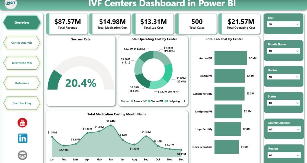
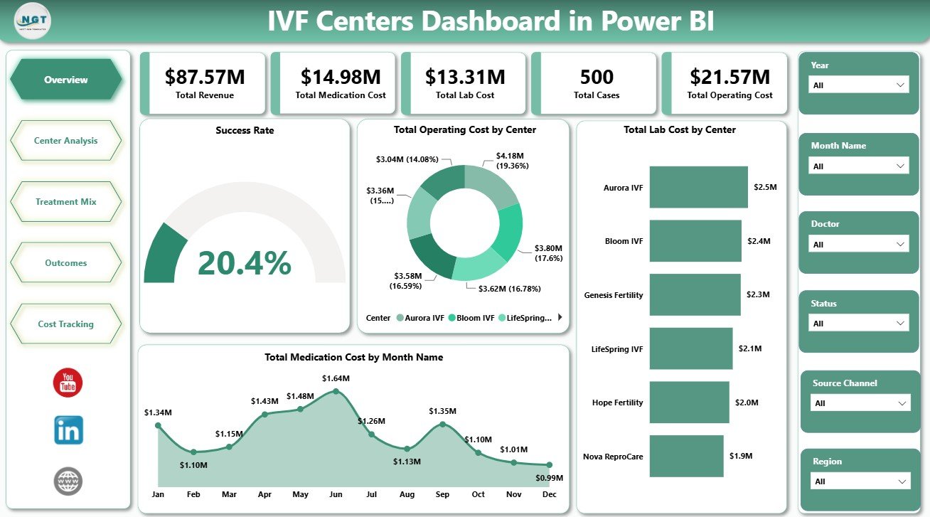
1. Overview Page
The Overview Page gives a high-level snapshot of IVF center performance. At the top, KPI cards summarize Total Revenue, Total Medication Cost, Total Lab Cost, Total Cases, and Total Operating Cost.
Success Rate by Overall Performance: This visual shows how success rate changes across performance groups. It helps leadership quickly understand whether overall outcomes are strong, average, or need attention.
Total Operating Cost by Center: This chart compares operating cost across IVF centers. It helps finance teams identify which centers are driving the largest share of operational spending.
Total Lab Cost by Center: This visual shows lab cost by center. It helps lab managers and administrators compare center-level cost patterns and spot unusual differences.
Total Medication Cost by Month Name: This trend shows medication cost month by month. It helps teams monitor seasonality, spikes, and budget pressure over time.
2. Center Analysis
The Center Analysis page focuses on clinic, doctor, and regional performance. It is useful for reviewing where case volume, procedures, and revenue are concentrated.
Total Cases by Center: This chart compares case volume across centers. It helps identify high-volume centers and locations that may need operational support.
Total Procedures by Doctor: This visual compares procedures by doctor. It can support workload review, staffing discussions, and provider-level reporting.
Total Revenue by Region: This chart compares revenue by region. It helps leadership understand geographic performance and regional revenue contribution.
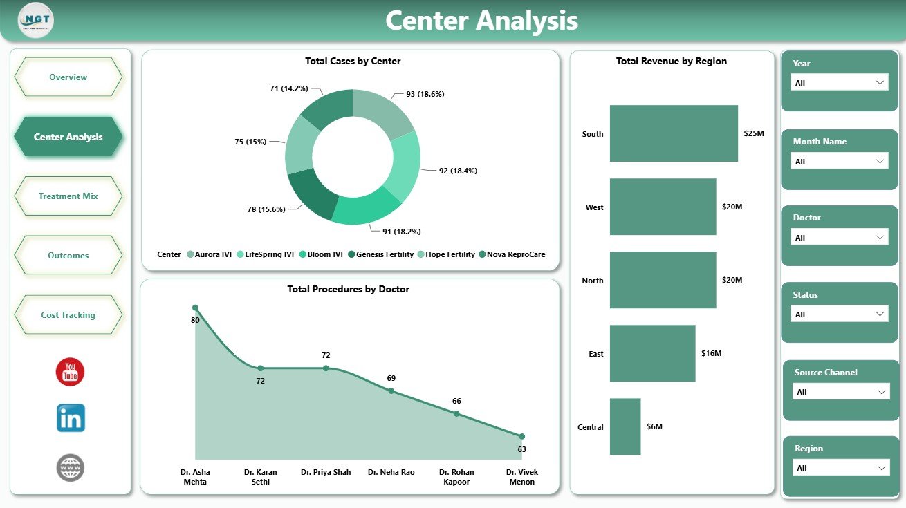
Center Analysis
3. Treatment Mix
The Treatment Mix page explains how treatment activity is distributed by patient age group, cycle stage, and treatment type. It helps teams understand which areas of the treatment journey are driving workload and cost.
Total Procedures by Patient Age Group: This visual compares procedure volume across age groups. It helps clinics understand patient demographic patterns in treatment activity.
Total Cases by Cycle Stage: This chart groups cases by cycle stage. It helps teams monitor patient movement across the IVF treatment process.
Total Operating Cost by Treatment Type: This chart compares operating cost by treatment type. It helps managers understand which treatments carry higher operational cost.
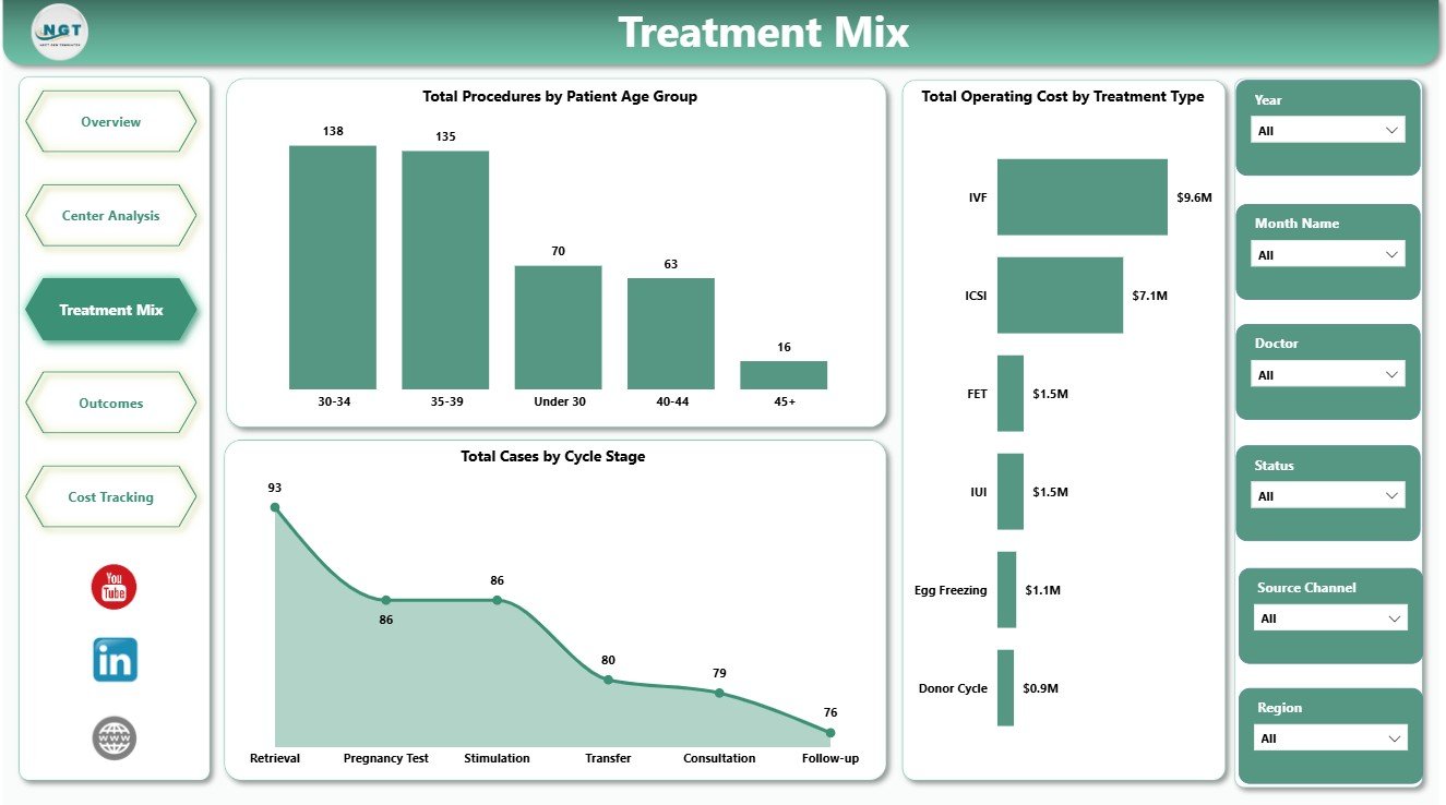
Treatment Mix
4. Outcomes
The Outcomes page brings together regional case volume, monthly revenue, and doctor-level operating cost. It gives a practical view of performance movement without requiring users to open separate reports.
Total Cases by Region: This chart compares cases by region. It helps teams understand regional demand and clinic activity.
Total Revenue by Month Name: This visual tracks revenue month by month. It helps finance teams review growth, dips, and seasonality.
Total Operating Cost by Doctor: This chart compares operating cost by doctor. It supports internal cost review and resource planning.
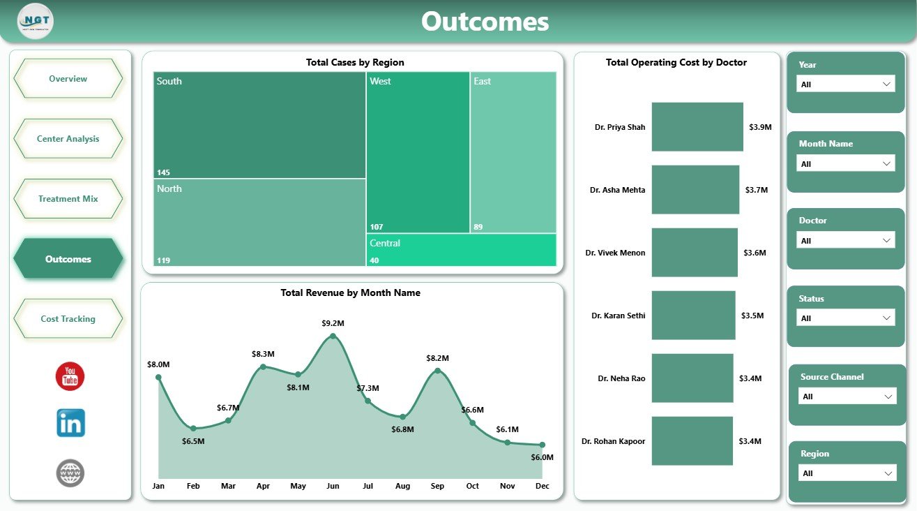
Outcomes
5. Cost Tracking
The Cost Tracking page is designed for cost monitoring and success-rate review. It helps users compare medication cost, lab cost, and treatment performance in one place.
Total Medication Cost by Region: This visual compares medication cost across regions. It helps finance and procurement teams review regional cost variation.
Total Lab Cost by Center: This chart compares lab cost by center. It helps teams identify centers with higher lab spending.
Success Rate by Treatment Type: This visual compares success rate by treatment type. It helps analysts review outcome patterns for internal reporting.
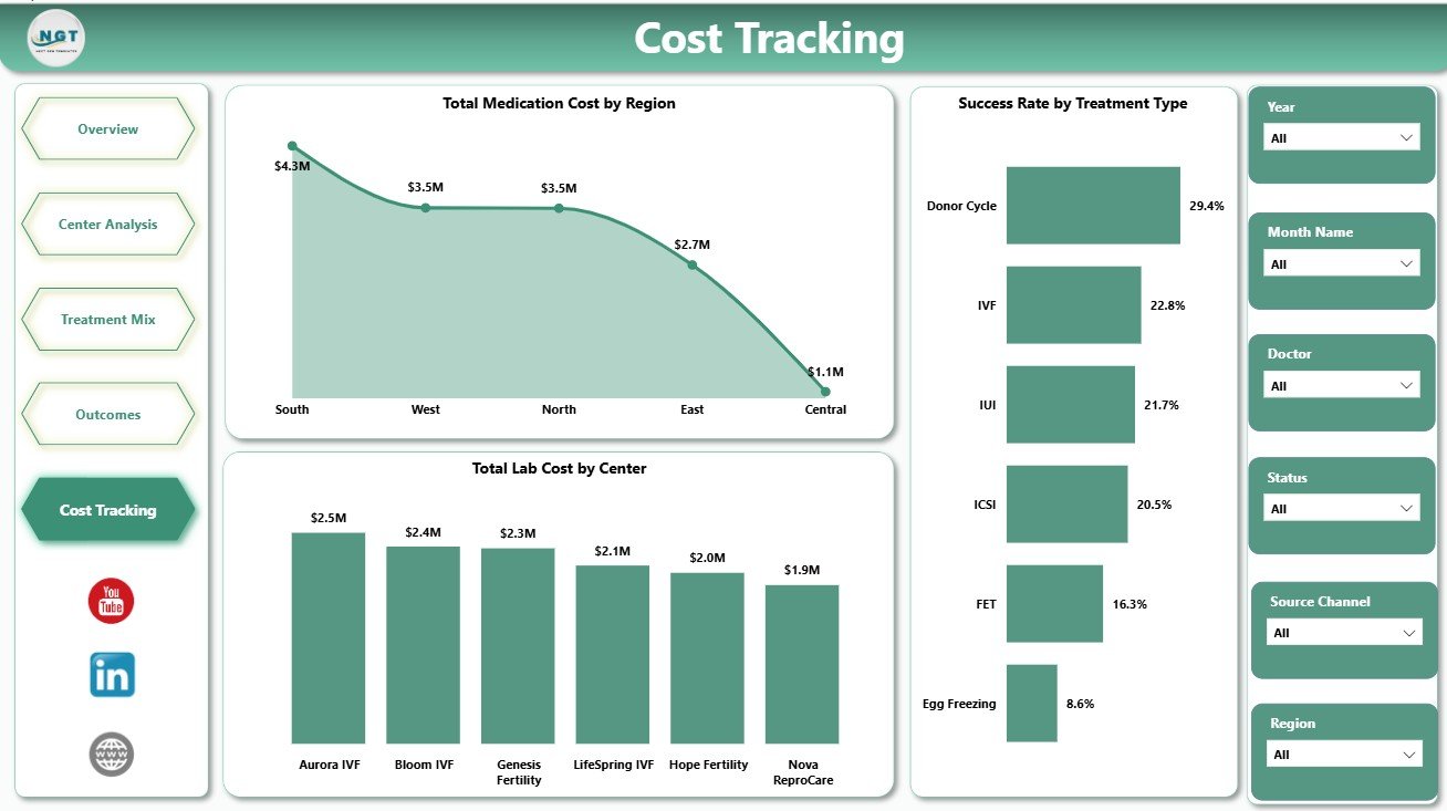
Cost Tracking
IVF Centers Dashboard in Power BI vs. Tableau vs. Paid Healthcare SaaS – Feature Comparison
| Feature | This Power BI dashboard | Tableau alternative | Paid healthcare SaaS |
|---|---|---|---|
| Cost | One-time template purchase | License plus dashboard build time | Subscription and implementation cost |
| Platform | Power BI Desktop | Tableau Desktop or Cloud | Vendor-hosted system |
| Setup time | Open PBIX, connect data, refresh | Build data model and visuals | Longer configuration project |
| Customizable fields | Editable visuals, fields, and measures | Editable with Tableau skills | Limited by vendor options |
| IVF-specific pages | Center, treatment, outcome, and cost pages included | Must be designed | Depends on plan and module |
| Year-1 cost at 5 users | Low template cost plus any Microsoft licensing | Usually higher license or development cost | Often significantly higher |
Who Should Use This Template
This dashboard is ideal for IVF clinic directors, fertility center owners, healthcare analysts, finance managers, operations teams, and consultants preparing clinic performance reports. It is also useful for teams moving from manual spreadsheets into Power BI reporting.
It is not designed to replace an EMR, patient management system, billing platform, laboratory information system, clinical workflow tool, or regulated medical reporting process.
Real-World Use Cases
Clinic Director: Reviews Total Cases, Total Revenue, and success rate trends before monthly performance meetings.
Finance Manager: Uses Cost Tracking to compare medication cost, lab cost, and operating cost by center and region.
Healthcare Analyst: Uses Center Analysis and Treatment Mix pages to prepare a management report for leadership.
Advantages of IVF Centers Dashboard in Power BI
- Reduces manual reporting effort by centralizing key IVF operations metrics.
- Creates a clear view of revenue, cases, medication cost, lab cost, and operating cost.
- Helps teams compare centers, doctors, regions, treatment types, and cycle stages.
- Supports faster internal review through interactive slicers and visual pages.
- Can be customized in Power BI Desktop based on your reporting structure.
Opportunities for Improvement
Teams can extend the dashboard by adding their own DAX measures, connecting directly to approved data sources, adding row-level security in Power BI Service, creating drill-through pages, or adding forecast measures for revenue and cost planning.
Best Practices
- Keep the source data structure consistent before refreshing the PBIX file.
- Validate KPI cards after every major data update.
- Use slicers to review one region, center, doctor, or treatment group at a time.
- Do not use the dashboard as a clinical decision system.
- Protect sensitive patient data and follow your organization’s privacy rules before sharing reports.
Explore Relevant Templates
You may also like the IVF Centers Dashboard in Excel, IVF Centers KPI Dashboard in Power BI, and Home Healthcare KPI Dashboard in Excel. You can also browse more Power BI dashboard templates.
Frequently Asked Questions
What does this dashboard track?
It tracks revenue, cases, medication cost, lab cost, operating cost, procedures, success rate, centers, doctors, regions, treatment types, patient age groups, and cycle stages.
Do I need Power BI Desktop?
Yes. You need Power BI Desktop to open, edit, and refresh the PBIX file.
Can I customize the visuals?
Yes. You can customize visuals, fields, slicers, measures, report pages, colors, and labels.
Can I use this for multiple IVF centers?
Yes, if your source data includes center and region fields in a consistent structure.
Is this a medical system?
No. It is a reporting dashboard for business and operations analysis, not a clinical system or medical decision tool.
Where can I buy the template?
You can buy it from NextGenTemplates here: IVF Centers Dashboard in Power BI.
About the Author
Built by PK – Microsoft Certified Professional with 15+ years of Excel, Google Sheets, and Power BI experience. Founder of NextGenTemplates, reaching 300K+ subscribers across YouTube channels. Every template is hand-built and tested before release.
Conclusion
The IVF Centers Dashboard in Power BI gives fertility clinics a practical way to review center performance, treatment mix, outcomes, cost, and revenue in one interactive report. With five focused pages and editable Power BI structure, it helps teams move from scattered reporting to a cleaner monthly dashboard workflow.
Visit our YouTube channel to learn step-by-step video tutorials.
Click to Buy IVF Centers Dashboard in Power BI