Introduction
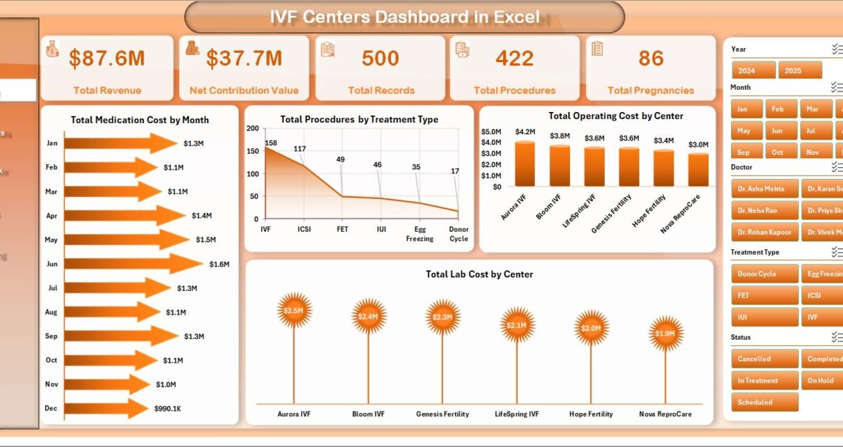
IVF Centers Dashboard in Excel is a ready-to-use reporting template for fertility clinics, IVF centers, healthcare analysts, and operations teams that need clean visibility into revenue, procedures, pregnancies, treatment mix, cost, and outcomes. Assisted reproductive technology is a high-volume, data-heavy operating environment. CDC ART surveillance reported 435,426 ART cycles across 457 reporting U.S. clinics in 2022, which makes structured reporting essential for clinic planning, cost control, and management review.
This Excel dashboard gives you multiple analysis pages, high-level KPI cards, chart visuals, slicers, a source data sheet, and a support sheet with pivot tables. After updating the Data Sheet, you can use Excel’s Refresh All option to update the pivots and charts.
Click here to view the IVF Centers Dashboard in Excel product page.
Key Features of IVF Centers Dashboard in Excel
- Overview cards for Total Revenue, Net Contribution Value, Total Records, Total Procedures, and Total Pregnancies.
- Five analytical dashboard pages: Overview, Center Analysis, Treatment Mix, Outcomes, and Cost Tracking.
- Multiple slicers to filter the dashboard quickly by clinic dimensions such as month, center, region, doctor, treatment type, patient age group, cycle stage, and source channel.
- Charts for medication cost, operating cost, lab cost, procedures, revenue, records, positive outcome percentage, and net contribution.
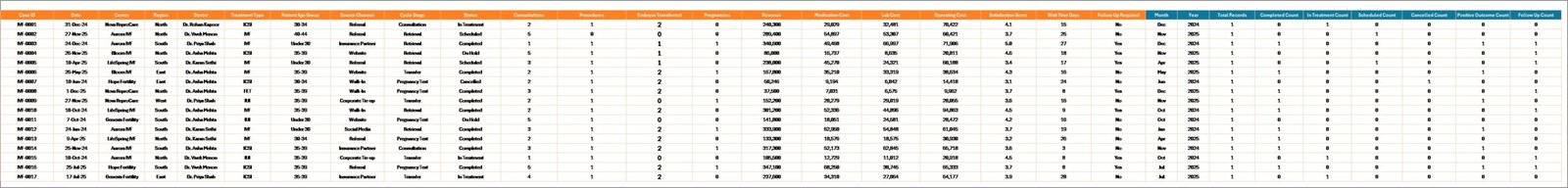
- Editable Data Sheet where users can add clinic records in the same structure.
- Support Sheet with pivot tables that can be refreshed after data updates and hidden during normal use.
- Excel-based workflow, ideal for teams that want a one-time file instead of a recurring SaaS subscription.
Dashboard Pages Explanation
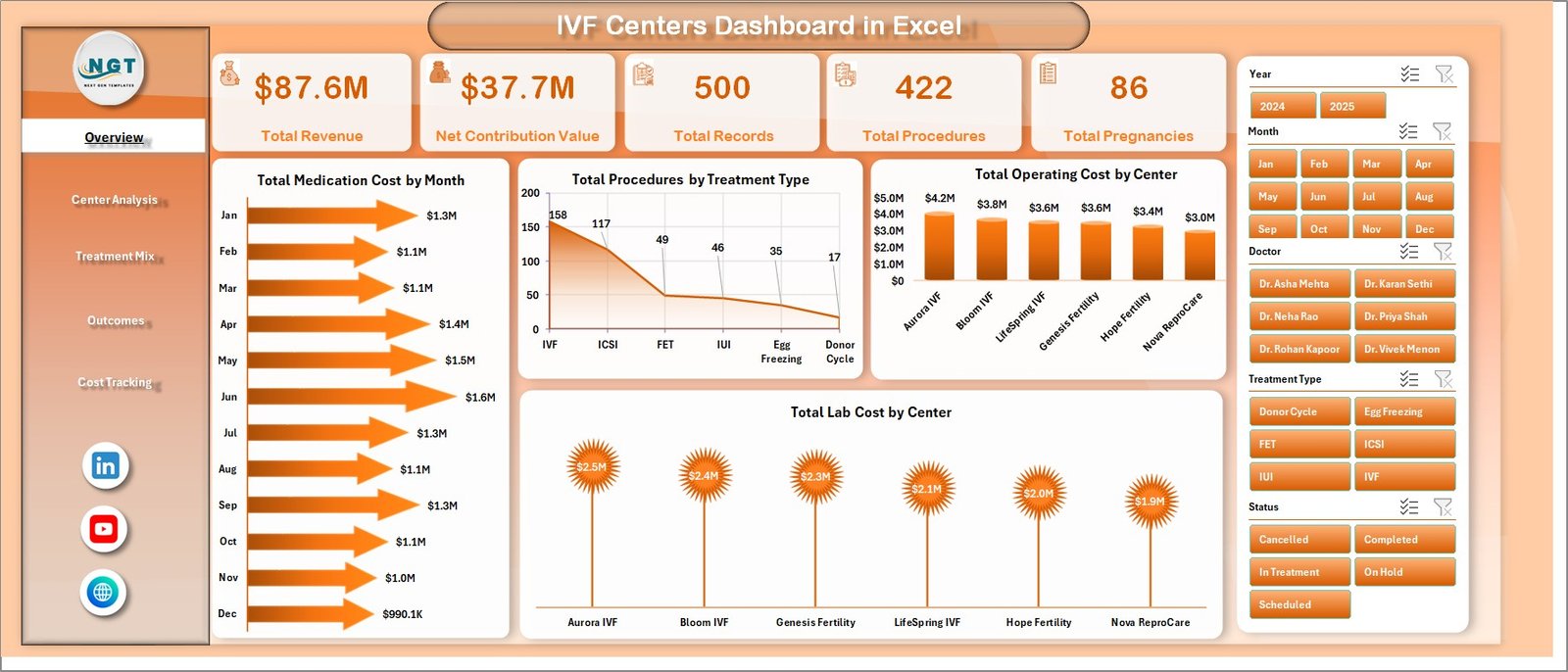
1. Overview Page
The Overview Page is the executive summary of the workbook. At the top, it displays five high-level cards: Total Revenue, Net Contribution Value, Total Records, Total Procedures, and Total Pregnancies.
The page also includes slicers for quick filtering. This helps clinic managers isolate a specific region, treatment type, center, doctor, or reporting period without rebuilding the dashboard.
Total Medication Cost by Month: This chart shows how medication costs change across months. It helps finance and clinical operations teams identify seasonal spikes or cost patterns that need review.
Total Procedures by Treatment Type: This chart compares procedure volume across treatment types. It helps clinics understand which treatments are driving activity and where capacity planning may be needed.
Total Operating Cost by Center: This chart compares operating cost by IVF center. It highlights which centers carry higher cost loads and where managers may need deeper cost analysis.
Total Lab Cost by Center: This chart tracks lab cost across centers. It is useful for comparing laboratory usage, cost distribution, and possible efficiency gaps.
IVF Centers Dashboard in Excel
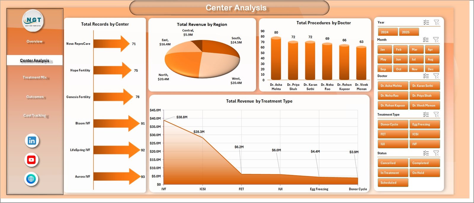
2. Center Analysis
The Center Analysis sheet focuses on the performance of centers, regions, doctors, and treatment categories. It is useful when the clinic group needs to compare locations and identify where volume, revenue, or doctor-level output is strongest.
Total Records by Center: This chart shows the number of records handled by each center. It gives a quick view of workload distribution and patient activity volume.
Total Revenue by Region: This chart compares revenue across regions. It helps leadership understand which geographic areas are contributing the most to total revenue.
Total Procedures by Doctor: This chart shows procedure count by doctor. It supports workload review, doctor-level productivity analysis, and resource planning.
Total Revenue by Treatment Type: This chart compares revenue across treatment categories. It helps managers see which treatments contribute most to financial performance.
Center Analysis
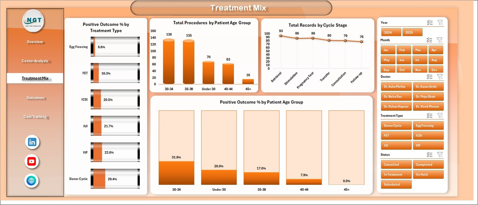
3. Treatment Mix
The Treatment Mix tab helps teams understand outcomes and activity patterns by treatment type, age group, and cycle stage. This page is especially useful for reviewing the balance of procedures and outcome percentages.
Positive Outcome % by Treatment Type: This chart compares positive outcome percentage across treatment types. It helps users see where outcomes are stronger and where more investigation may be useful.
Total Procedures by Patient Age Group: This chart shows procedure volume across age groups. It helps clinics understand patient mix and how demand varies by age segment.
Total Records by Cycle Stage: This chart summarizes records by cycle stage. It gives operational teams a clear picture of where patients are in the IVF cycle workflow.
Positive Outcome % by Patient Age Group: This chart compares outcome percentage across patient age groups. It helps management review outcome trends without manually calculating each segment.
Treatment Mix
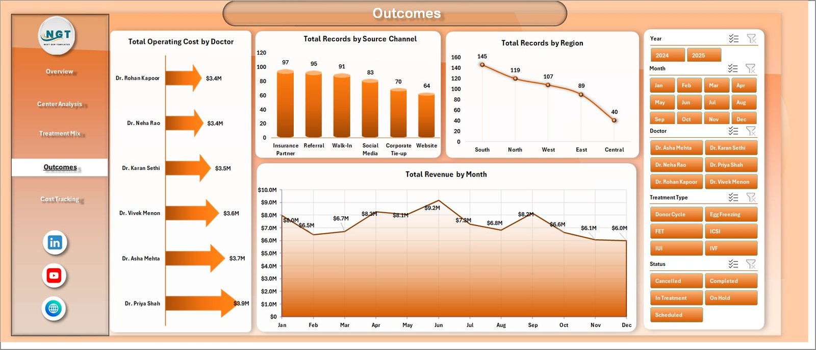
4. Outcomes
The Outcomes page combines operational cost, acquisition source, regional record distribution, and revenue trend analysis. It is designed for monthly review meetings where leaders want both activity and financial context.
Total Operating Cost by Doctor: This chart compares operating cost by doctor. It helps identify cost concentration and supports discussion around resource use.
Total Records by Source Channel: This chart shows where patient or case records originate. It is helpful for understanding which marketing or referral channels are creating activity.
Total Records by Region: This chart compares record count by region. It helps leadership see where demand is concentrated across the clinic network.
Total Revenue by Month: This chart displays monthly revenue movement. It supports trend review, performance monitoring, and management forecasting.
Outcomes
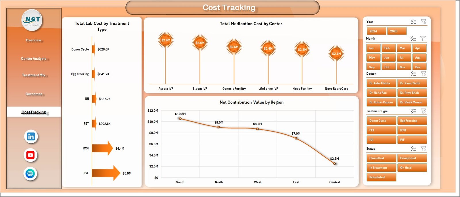
5. Cost Tracking
The Cost Tracking sheet gives a focused view of lab cost, medication cost, and contribution analysis. It is designed for clinics that want to understand cost pressure beyond top-line revenue.
Total Lab Cost by Treatment Type: This chart compares lab cost across treatment types. It helps teams see which treatment categories require higher laboratory expense.
Total Medication Cost by Center: This chart shows medication cost by center. It supports location-level review and helps highlight centers with higher medication expense.
Net Contribution Value by Region: This chart compares contribution value by region. It helps leadership understand which regions are contributing more after key costs are considered.
Cost Tracking
6. Data Sheet Tab
The Data Sheet is where the source records are stored. Users should add or paste new data in the same format so that all dashboard calculations, pivot tables, and charts continue to work correctly.
Data Sheet tab
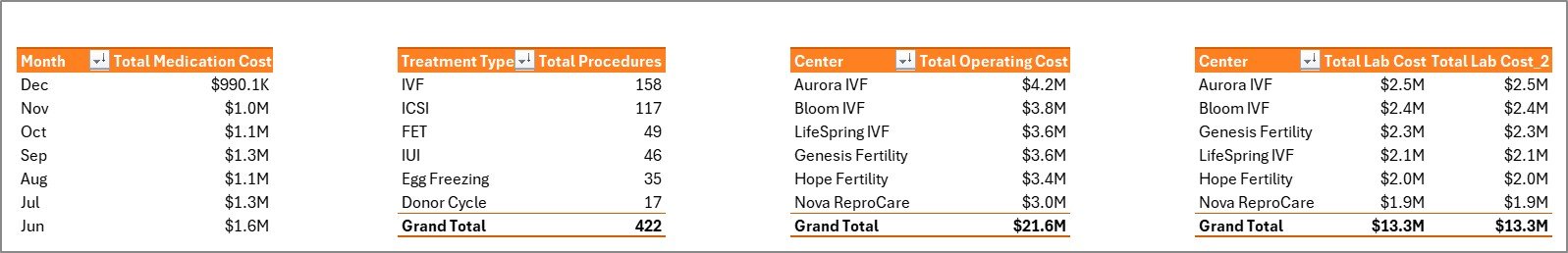
7. Support Sheet
The Support Sheet contains the pivot tables used to create the dashboard visuals. After updating the Data Sheet, go to the Data tab in the Excel Ribbon and click Refresh All. The pivots and charts will refresh, and you can keep this sheet hidden during normal use.
Support sheet tab
IVF Centers Dashboard in Excel vs. Google Sheets vs. Paid Healthcare SaaS – Feature Comparison
| Feature | IVF Centers Dashboard in Excel | Google Sheets Alternative | Paid Healthcare SaaS |
|---|---|---|---|
| Cost | One-time template purchase | Low cost, may need manual build | Recurring subscription |
| Platform | Microsoft Excel | Browser-based spreadsheet | Vendor application |
| Setup time | Replace sample data and refresh | Build reports or adapt formulas | Implementation and onboarding |
| Customizable fields | Editable workbook structure | Editable, but formula control varies | Depends on vendor permissions |
| Share with link | Requires file sharing or cloud storage | Native link sharing | Usually user-account based |
| Year-1 cost at 5 users | One-time file price | Low if using existing workspace | Often hundreds or thousands yearly |
| IVF treatment analytics | Built around treatment, outcome, center, and cost views | Requires custom setup | Can be deep, but less flexible |
Who Should Use This Template
This dashboard is useful for IVF center owners, fertility clinic administrators, finance managers, operations heads, healthcare analysts, and consultants who prepare clinic performance reviews. It is best for teams that already use Excel and want a clean reporting file without starting from a blank workbook.
Real-World Use Cases
Clinic Director Ananya uses the Overview page before monthly meetings to review procedure volume, pregnancies, revenue, and contribution. Finance Manager David uses Cost Tracking to compare medication and lab cost by center and treatment type. Operations Analyst Meera uses Treatment Mix and Outcomes to compare positive outcome percentage, source channels, regions, and cycle stages.
Advantages of IVF Centers Dashboard in Excel
- It combines revenue, cost, procedure, pregnancy, and outcome analysis in one workbook.
- It uses familiar Excel functionality, so teams do not need to learn a new reporting platform.
- It gives both leadership summary views and deeper analysis pages.
- It supports quick filtering with slicers and refreshable pivot tables.
- It can be adapted to different IVF center reporting structures.
Opportunities for Improvement
This is an Excel dashboard, so it does not automatically connect to EMR, billing, laboratory, or appointment systems unless you add your own data connection. It also does not replace clinical governance, medical audit, or regulated reporting. For larger enterprise teams, a database-backed reporting system may be needed later.
Best Practices
- Keep the Data Sheet column structure unchanged when pasting new rows.
- Refresh all pivot tables after every data update.
- Validate revenue, cost, procedure, and pregnancy data before sharing dashboard results.
- Keep the Support Sheet hidden if end users only need dashboard pages.
- Use the same naming convention for centers, regions, doctors, and treatment types to avoid duplicate slicer values.
Explore Relevant Templates
You may also like the IVF Centers KPI Dashboard in Excel, Home Healthcare KPI Dashboard in Excel, and Healthcare Project Timeline KPI Dashboard in Excel. You can also browse more Excel dashboard templates.
Frequently Asked Questions
What is the IVF Centers Dashboard in Excel?
It is a Microsoft Excel dashboard template for tracking IVF center revenue, procedures, pregnancies, treatment mix, outcomes, costs, centers, doctors, and regions.
Can I add my own IVF clinic data?
Yes. Replace the sample rows in the Data Sheet while keeping the same format, then refresh the workbook.
Does the dashboard include slicers?
Yes. The dashboard includes slicers so you can filter analysis quickly across the available reporting dimensions.
Can I hide the Support Sheet?
Yes. The Support Sheet contains pivot tables used by the dashboard and can be hidden after setup.
Is this dashboard suitable for clinical decision-making?
No. It is intended for business, operations, and management reporting. It is not a clinical diagnosis, treatment, or regulated medical reporting system.
Do I need advanced Excel skills?
No advanced skills are required for routine use. You should be comfortable replacing data, using slicers, and refreshing pivots.
About the Author
Built by PK – Microsoft Certified Professional with 15+ years of Excel, Google Sheets, and Power BI experience. Founder of NextGenTemplates, reaching 300K+ subscribers across YouTube channels. Every template is hand-built and tested before release.
Conclusion
The IVF Centers Dashboard in Excel gives fertility clinics a structured way to review performance across centers, doctors, regions, treatment types, patient groups, outcomes, and costs. Instead of building charts manually every month, you can update the Data Sheet, refresh the workbook, and use the dashboard pages for faster management review.
Click here to download the IVF Centers Dashboard in Excel.
For more Excel tutorials, visit YouTube.com/@PKAnExcelExpert.