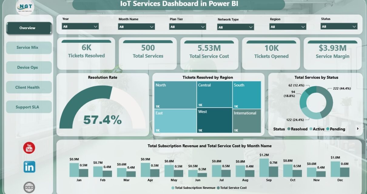
IoT Services Dashboard in Power BI is a ready-to-use reporting template for IoT service providers, telecom support teams, managed device operators, SLA managers, and client success teams. It helps users review tickets opened, tickets resolved, total services, total service cost, service margin, subscription revenue, uptime rate, resolution rate, response time, service status, regions, device categories, network types, plan tiers, priorities, and technician performance. The report includes 5 Power BI pages, 5 headline KPI cards, multiple slicers, and a clear structure for reviewing support, service, device, client, and SLA performance.
Power BI is useful for IoT services reporting because it can combine operational and commercial metrics in one interactive report. Microsoft describes Power BI Desktop as a tool for connecting to data, transforming it, and building reports. Reference: Microsoft Learn: What is Power BI Desktop?
Click here to purchase IoT Services Dashboard in Power BI
Key Features of IoT Services Dashboard in Power BI
- 5 Power BI pages: Overview, Service Mix, Device Ops, Client Health, and Support SLA.
- 5 headline KPI cards: Tickets Resolved, Total Services, Total Service Cost, Tickets Opened, and Service Margin.
- Interactive slicers: Filter the dashboard quickly across available fields for focused analysis.
- Service financial tracking: Compare subscription revenue, service cost, and service margin.
- Ticket operations: Review tickets opened, tickets resolved, resolution rate, priority, technician, service type, and region.
- Device performance: Analyze uptime rate, response time, device category, and network type.
- Editable Power BI file: Customize visuals, fields, pages, measures, labels, colors, filters, and data connections in Power BI Desktop.
Dashboard Pages Explanation
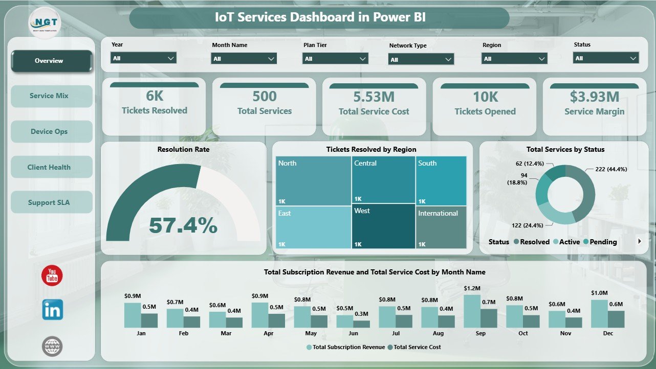
1. Overview Page
The Overview Page gives a top-level view of IoT service performance. At the top of the page, the cards show Tickets Resolved, Total Services, Total Service Cost, Tickets Opened, and Service Margin. These KPIs help managers understand support closure, portfolio size, service cost, demand volume, and profitability in one place.
Resolution Rate by Overall Tickets: This chart measures how effectively tickets are being resolved against overall ticket activity. It helps support teams see whether closure performance is healthy or slipping.
Tickets Resolved by Region: This visual compares resolved ticket volume by region. It helps managers identify regions with high support activity and possible capacity pressure.
Total Services by Status: This chart shows how services are distributed by status. It helps teams understand the balance of active, pending, completed, paused, or problem service records.
Total Subscription Revenue and Total Service Cost by Month Name: This monthly chart compares recurring revenue with delivery cost. It helps leaders see whether service costs are rising faster than revenue and whether margin needs attention.
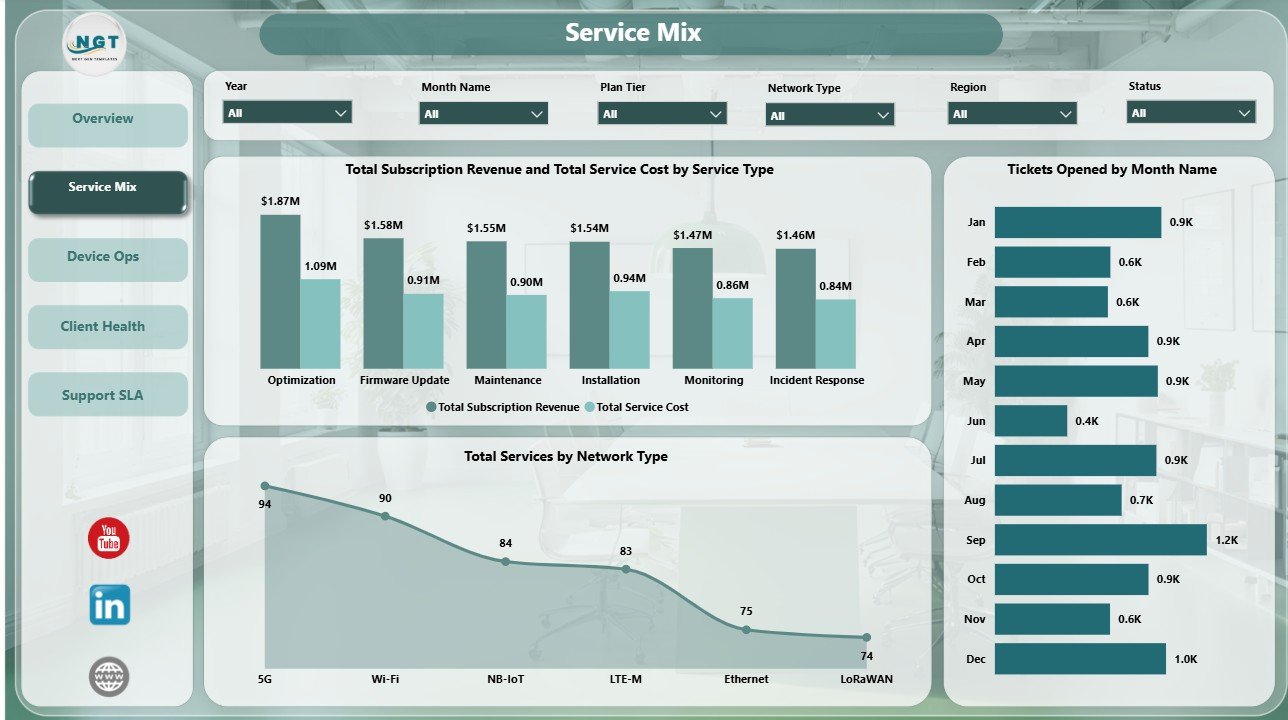
2. Service Mix
The Service Mix page focuses on how IoT services are distributed across service type, network type, and time. It is useful for understanding which service lines create revenue, cost, and support workload.
Total Subscription Revenue and Total Service Cost by Service Type: This chart places revenue and cost side by side for each service type. It helps identify strong-margin service lines and service types that may need process or pricing review.
Tickets Opened by Month Name: This chart tracks ticket demand across months. It helps teams spot seasonal patterns, unusual spikes, and months where support staffing may need adjustment.
Total Services by Network Type: This visual shows how services are distributed across different network types. It helps technical teams understand the infrastructure mix behind monitoring and support demand.
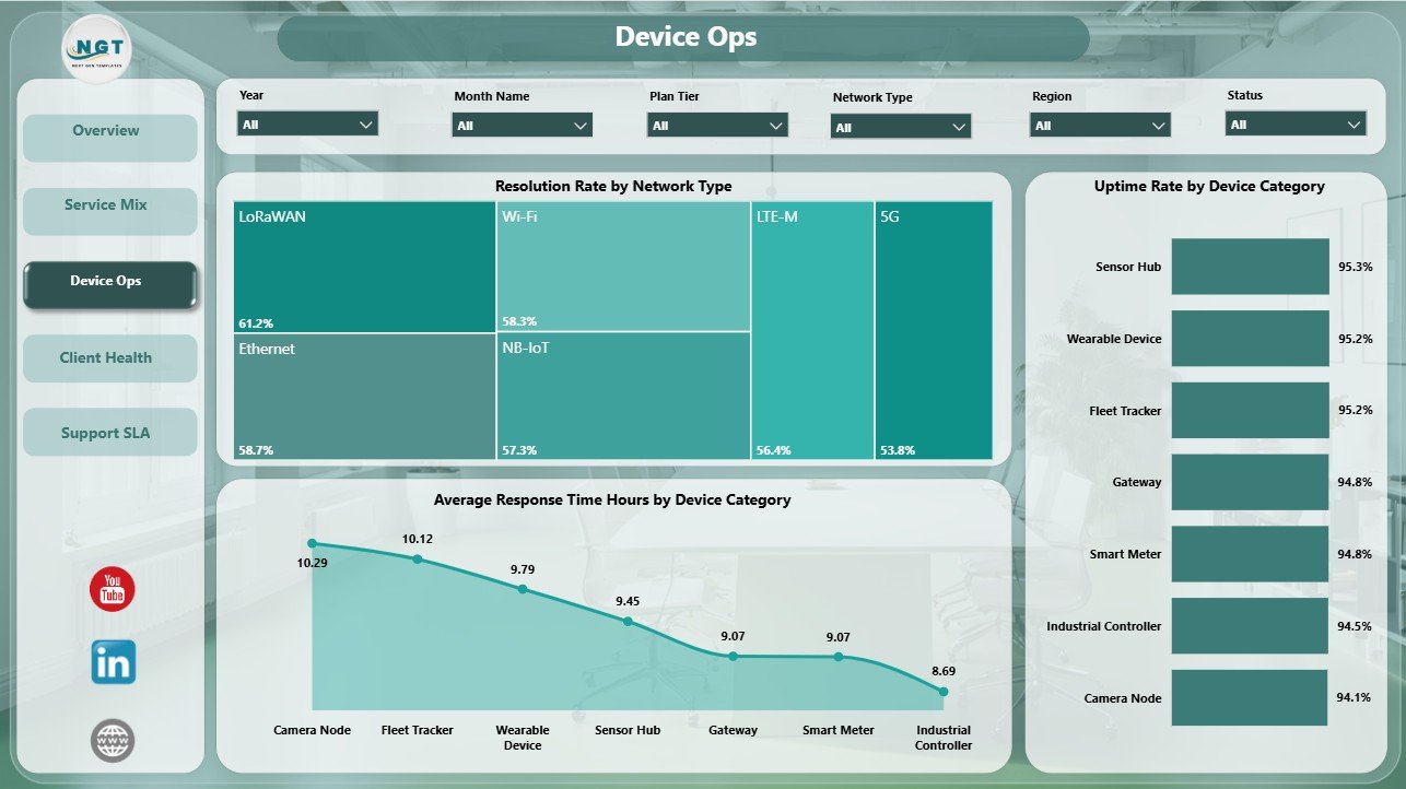
3. Device Ops
The Device Ops page is built for operational reliability analysis. It helps users compare network resolution performance, device uptime, and response time by device category.
Resolution Rate by Network Type: This chart compares ticket resolution rate across network types. It helps identify network environments where support issues are resolved quickly and where cases may be more difficult.
Uptime Rate by Device Category: This visual compares device reliability by category. It helps operations teams see which devices are stable and which categories need maintenance, replacement, or closer monitoring.
Average Response Time Hours by Device Category: This chart shows average support response time by device group. It helps managers find categories where response is slow and where SLA expectations may need improvement.
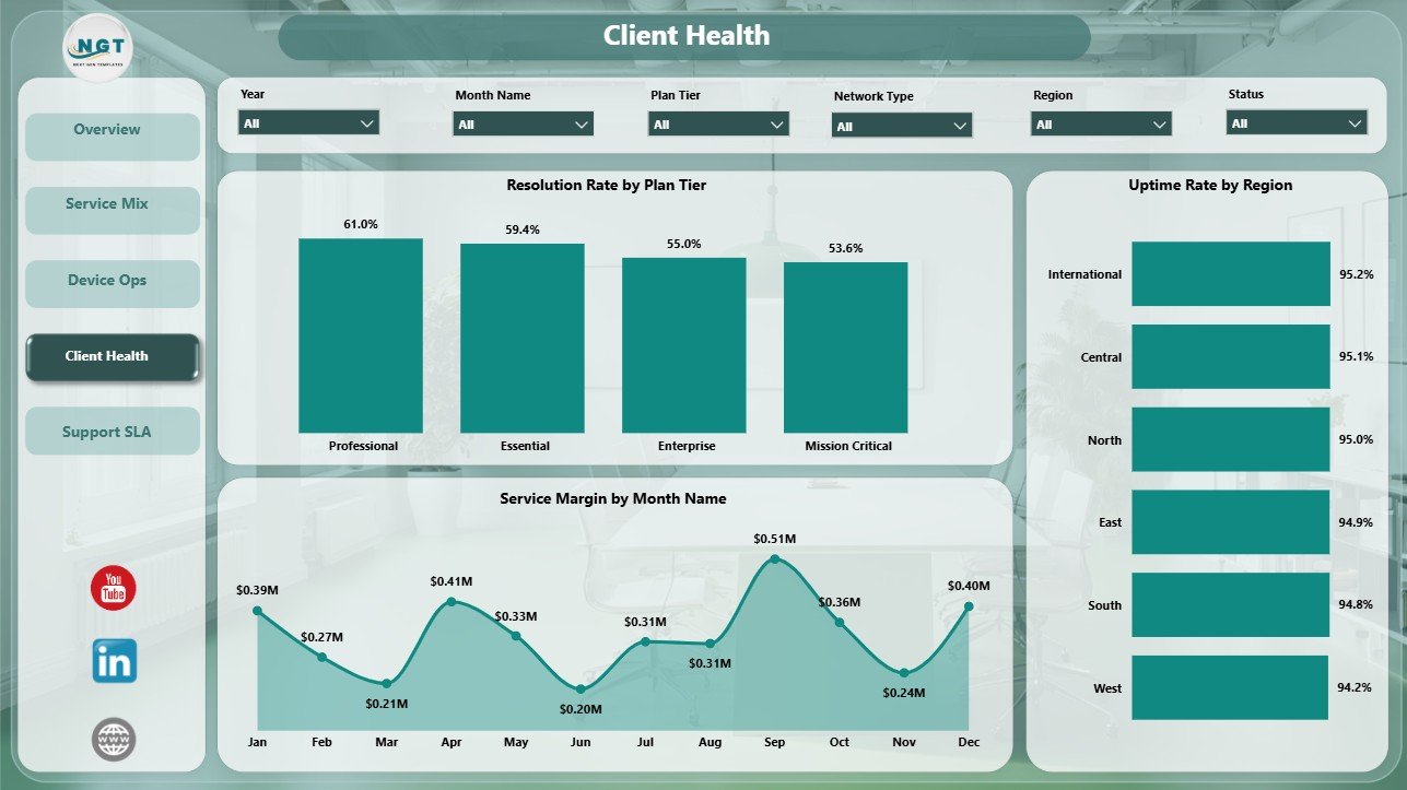
4. Client Health
The Client Health page connects support quality with account-level and regional performance. It helps client success teams prepare renewal reviews and identify where service experience needs attention.
Resolution Rate by Plan Tier: This chart compares resolution performance across plan tiers. It helps managers check whether premium tiers receive stronger service outcomes and whether lower tiers need process support.
Uptime Rate by Region: This visual compares reliability across regions. It helps operations teams identify regions with strong uptime and regions where infrastructure or service delivery may need review.
Service Margin by Month Name: This monthly trend shows whether profitability is improving or declining. It helps leaders connect support effort, delivery cost, and commercial performance over time.
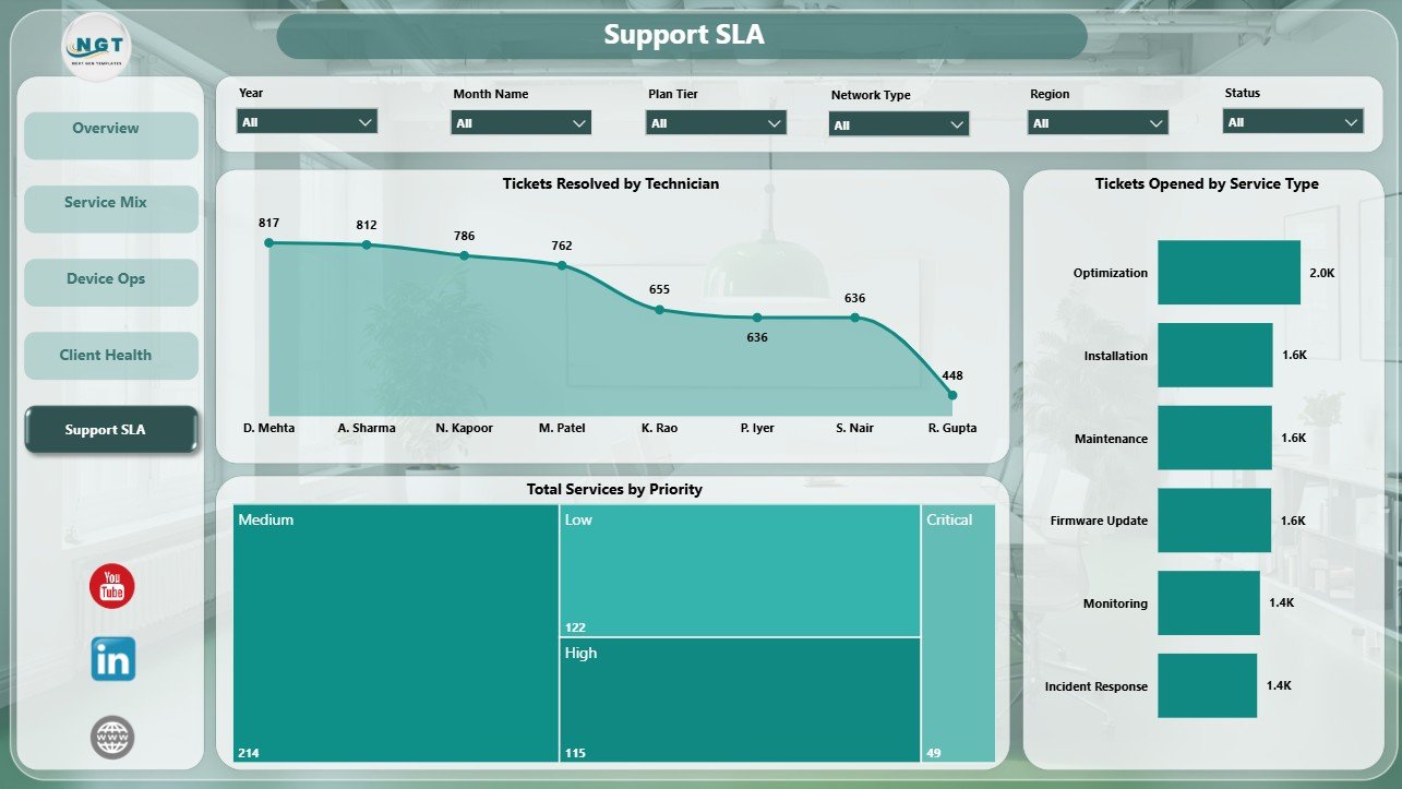
5. Support SLA
The Support SLA page is made for support managers who need to review technician output, service type demand, and priority distribution. It gives a practical view of the support workload behind IoT services.
Tickets Resolved by Technician: This chart compares ticket closure volume across technicians. It supports workload balancing, coaching, recognition, and performance review.
Tickets Opened by Service Type: This visual shows which service types create the most incoming ticket demand. It helps teams identify services that need better documentation, preventive maintenance, or process changes.
Total Services by Priority: This chart groups services by priority. It helps managers understand whether the portfolio is dominated by urgent work or routine service activity.
IoT Services Dashboard in Power BI vs. Tableau vs. Paid IoT Service SaaS – Feature Comparison
| Feature | IoT Services Dashboard in Power BI | Tableau alternative | Paid IoT service SaaS |
|---|---|---|---|
| Cost | $17.99 one-time | License plus dashboard build time | Monthly or annual subscription |
| Platform | Power BI Desktop | Tableau Desktop or Cloud | Vendor-hosted platform |
| Setup time | Open PBIX and replace or connect data | Build or adapt workbook and data source | Implementation and configuration project |
| Real-time team collaboration | Available through Power BI Service after publishing | Available through Tableau Cloud or Server | Usually included by plan |
| Mobile access | Available through Power BI mobile after publishing | Available through Tableau mobile | Usually vendor dependent |
| Customizable fields | Editable report pages, visuals, fields, and measures | Editable with Tableau skills | Often limited by vendor settings |
| Year-1 cost at 5 users | $17.99 plus Microsoft licensing if sharing is needed | Often higher licensing or development cost | Often hundreds or thousands |
| IoT service analytics | Built for service mix, device ops, client health, and SLA review | Must be designed | Depends on vendor module and plan |
Who Should Use This Template
This template is useful for IoT service providers, managed service providers, telecom support groups, connected device operations teams, smart building service teams, operations analysts, SLA managers, and client success teams. It is best when the team already has structured service data and wants a clean reporting layer in Power BI.
It is not a live IoT monitoring platform, sensor gateway, ticketing system, CRM, billing system, or automated SLA engine. Use it for reporting and analysis after your service data has been exported or connected.
Real-World Use Cases
Arjun, IoT operations manager: reviews ticket volume, resolved tickets, service cost, margin, and regional activity before weekly operations meetings.
Maya, support lead: uses the Support SLA page to compare technician closure output, priority mix, and ticket demand by service type.
Daniel, client success manager: uses the Client Health page to review uptime, plan tier resolution, and monthly service margin before renewal discussions.
Advantages of IoT Services Dashboard in Power BI
- Faster reporting: Managers can review service, ticket, client, device, and SLA metrics in one file.
- Better operational visibility: Device Ops and Support SLA pages reveal where response and resolution performance need attention.
- Commercial clarity: Revenue, cost, and service margin views help teams connect operations with profitability.
- Flexible analysis: Power BI slicers make it easier to filter pages without rebuilding charts.
- Editable structure: Users can customize visuals and data connections for their own reporting workflow.
Opportunities for Improvement
Teams can extend this dashboard by connecting live ticketing exports, adding device failure codes, including customer satisfaction trends, adding SLA breach percentage, or creating drill-through pages for individual clients and technicians. These improvements can make the report more detailed as the IoT service operation matures.
Best Practices
- Use consistent names for service type, network type, device category, region, technician, and priority.
- Validate ticket counts and service cost totals against the source system after every refresh.
- Review service margin monthly so rising delivery cost is not missed.
- Use filters and slicers during review meetings instead of creating duplicate report pages.
- Publish to Power BI Service only after checking data privacy and access permissions.
Explore Relevant Templates
You may also like IoT Services Dashboard in Excel, Digital Twin Services Dashboard in Power BI, and IT Asset Management Dashboard in Power BI.
Frequently Asked Questions
What does the IoT Services Dashboard in Power BI track?
It tracks tickets opened, tickets resolved, total services, total service cost, service margin, subscription revenue, resolution rate, uptime rate, response time, service status, regions, service types, network types, device categories, plan tiers, priorities, and technicians.
How many report pages are included?
The dashboard includes 5 Power BI pages: Overview, Service Mix, Device Ops, Client Health, and Support SLA.
Do I need Power BI Desktop?
Yes. The PBIX file should be opened and edited in Power BI Desktop.
Can I use my own IoT service data?
Yes. Replace or connect your own structured service data, refresh the report, and validate the visuals against your source totals.
Is this dashboard a live IoT monitoring system?
No. It is a Power BI reporting dashboard template, not a live sensor monitoring platform or ticketing system.
Can I customize the dashboard?
Yes. You can edit visuals, measures, fields, filters, colors, labels, and data connections in Power BI Desktop.
About the Author
Built by PK – Microsoft Certified Professional with 15+ years of Excel, Google Sheets, and Power BI experience. Founder of NextGenTemplates, reaching 300K+ subscribers across YouTube channels. Every template is hand-built and tested before release.
Conclusion
The IoT Services Dashboard in Power BI gives service teams a practical way to review tickets, costs, margins, uptime, response time, technician output, network performance, client health, and SLA workload. It is useful when teams want a focused reporting layer without building every Power BI page from scratch.
Click here to purchase IoT Services Dashboard in Power BI
Visit our YouTube channel for step-by-step tutorials: Youtube.com/@PKAnExcelExpert