Knowledge Hubs Dashboard in Power BI is a ready-to-use Power BI report for content, learning, support, documentation, and knowledge-management teams that need a clearer view of hub performance. Knowledge bases often collect many activity signals, including visitors, searches, page views, downloads, helpful votes, answer rates, content cost, revenue, and quality ratings. When those signals stay in separate exports, teams spend too much time preparing reports and not enough time improving content.
This dashboard brings the main knowledge hub metrics into one editable PBIX file with 5 report pages, 5 headline cards, slicers, and focused analysis visuals. You can open it in Power BI Desktop, replace the sample source with your own structured data, refresh the report, and start reviewing content performance faster. You can learn more about Power BI Desktop from Microsoft Learn.
Click here to buy Knowledge Hubs Dashboard in Power BI
Knowledge Hubs Dashboard in Power BI
Key Features of Knowledge Hubs Dashboard in Power BI
- 5 report pages: Overview Page, Hub Performance, Content Mix, Engagement, and Cost Value.
- High-level cards: Total Visitors, Total Searches, Total Revenue, Total Downloads, and Net Content Value.
- Interactive slicers: Filter the dashboard by available hub, content, topic, author, audience, channel, and month fields.
- Performance analysis: Compare revenue, answer rate, downloads, content cost, quality rating, page views, and helpful votes.
- Content value review: Track revenue, downloads, and net content value by hub and content type.
- Editable PBIX file: Customize report pages, visuals, measures, labels, and data connections in Power BI Desktop.
Dashboard Pages Explanation
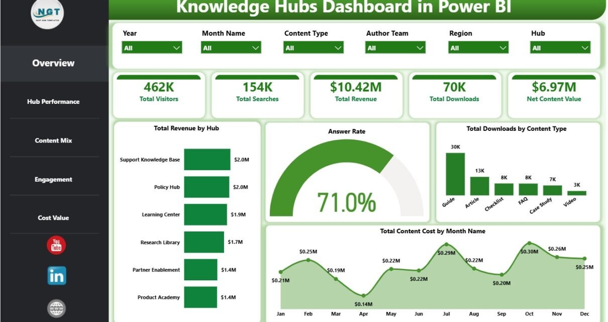
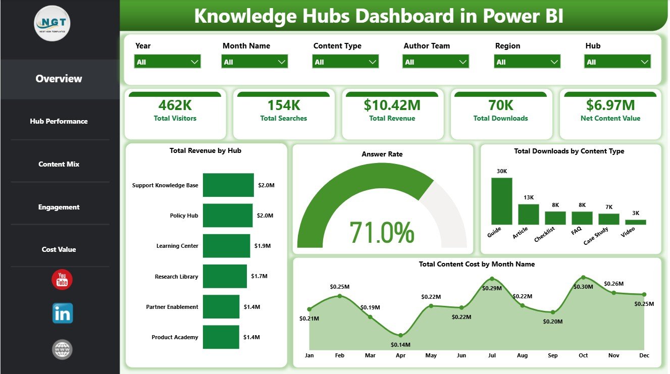
1. Overview Page
The Overview Page provides the executive summary of knowledge hub performance. The top cards show Total Visitors, Total Searches, Total Revenue, Total Downloads, and Net Content Value so leaders can quickly understand traffic, demand, revenue, usage, and overall value.
Total Revenue by Hub: This chart compares revenue contribution across hubs. It helps teams identify which knowledge hubs are driving the strongest value and which hubs may need attention.
Answer Rate by Overall Content Responses: This visual connects content response volume with answer-rate performance. It helps managers understand whether users are finding useful answers from the available content.
Total Downloads by Content Type: This chart compares downloads by content type. It helps content owners see whether guides, templates, reports, articles, or other resources are getting the most engagement.
Total Content Cost by Month Name: This monthly trend tracks content cost over time. It helps teams spot budget spikes and review whether spending aligns with output and value.
2. Hub Performance
The Hub Performance page focuses on cost and quality. It is useful for comparing where content investment is going and how author teams are performing from a quality perspective.
Total Content Cost by Content Type: This chart shows which content formats require the most investment. It helps teams compare production effort across content types and decide where standardization may help.
Total Content Cost by Hub: This visual compares spending across knowledge hubs. It helps managers identify high-cost hubs and review whether those hubs are producing enough business value.
Average Quality Rating by Author Team: This chart compares quality ratings by author team. It helps leaders recognize strong content teams and identify teams that may need review, training, or editorial support.
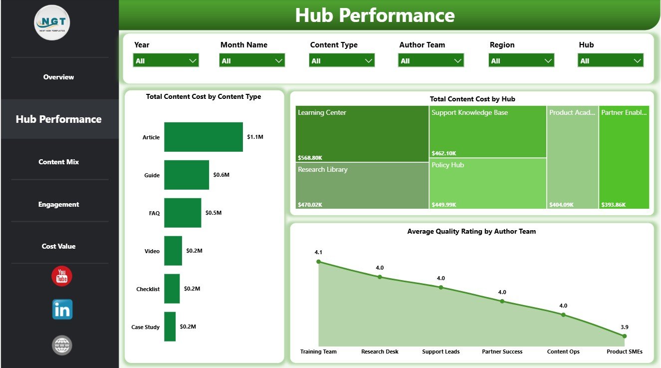
Hub Performance
3. Content Mix
The Content Mix page explains how audiences, topics, and access channels contribute to hub usage. It gives content strategists a clearer view of who is using the hub and what they are viewing.
Total Visitors by Audience Segment: This chart compares visitors across audience segments. It helps teams see which user groups rely most on the hub and where adoption may be low.
Total Page Views by Topic Category: This visual ranks page views by topic category. It helps content owners identify the topics that attract the most attention and topics that may need better promotion.
Total Visitors by Access Channel: This chart shows visitors by access channel. It helps teams compare discovery paths such as internal navigation, search, referrals, or direct traffic.
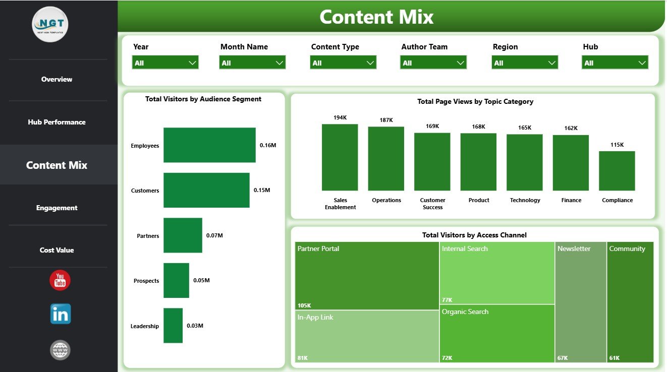
Content Mix
4. Engagement
The Engagement page connects financial movement with content usefulness. It helps teams review whether content is attracting users, answering questions, and receiving helpful feedback.
Total Revenue by Month Name: This trend tracks revenue month by month. It helps managers review growth patterns, seasonal movement, and periods where content value changes.
Questions Answered by Topic Category: This chart compares answered questions by topic. It helps teams identify which knowledge areas are solving the most user questions.
Helpful Votes by Hub: This visual compares helpful votes across hubs. It helps teams understand which hubs users find most useful and which hubs may need content improvements.

Engagement
5. Cost Value
The Cost Value page is designed for content investment review. It combines downloads, revenue, and net value so teams can compare content performance against cost.
Total Downloads by Month Name: This monthly chart tracks download activity over time. It helps content teams review demand patterns and identify strong release periods.
Total Revenue by Content Type: This chart compares revenue by content type. It helps teams understand which content formats are contributing the most financial value.
Net Content Value by Hub: This visual compares net value by hub. It helps leadership identify hubs that create strong value after accounting for content cost.
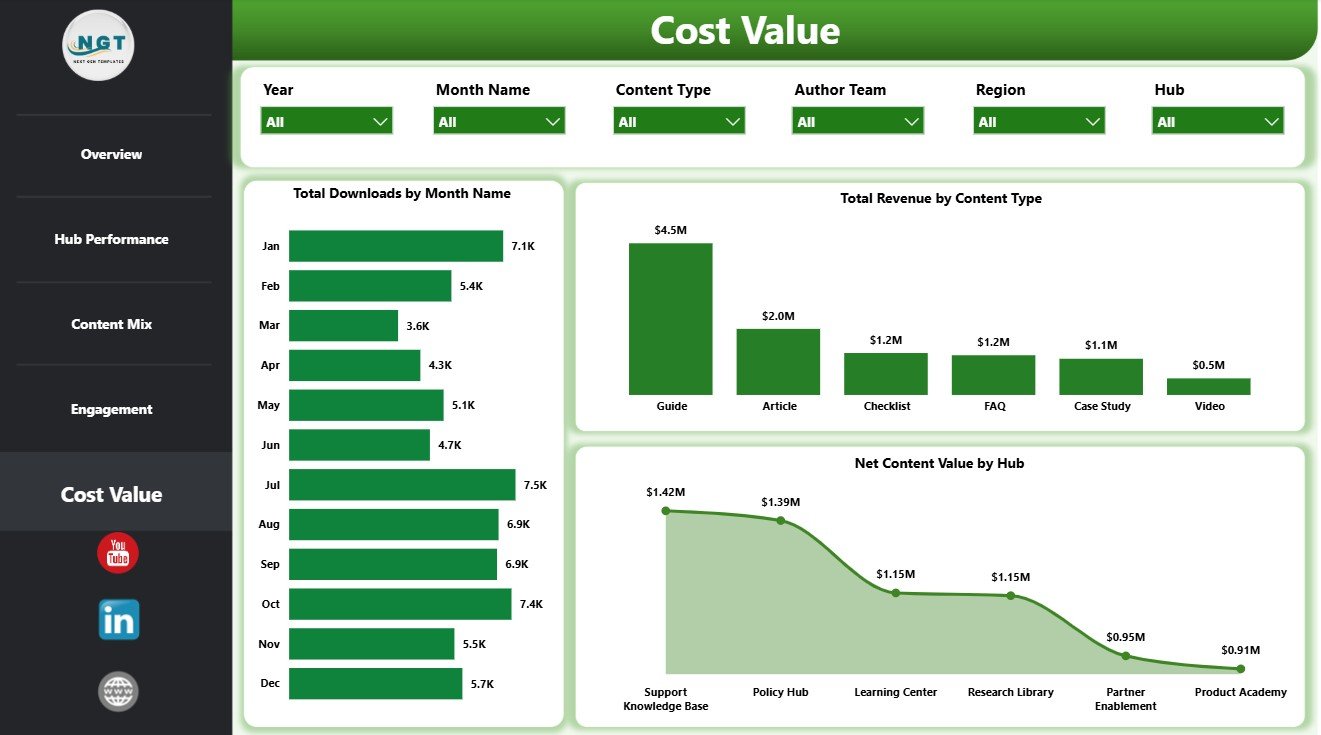
Cost Value
Knowledge Hubs Dashboard in Power BI vs. Tableau vs. Paid CRM/SaaS – Feature Comparison
| Feature | Knowledge Hubs Dashboard in Power BI | Tableau alternative | Paid knowledge-base SaaS |
|---|---|---|---|
| Cost | $17.99 one-time template price | License plus development time | Monthly or annual subscription |
| Platform | Power BI Desktop / Power BI Service | Tableau Desktop or Cloud | Vendor cloud platform |
| Setup time | Open PBIX, replace data, refresh | Build workbook and model | Configuration and onboarding |
| Real-time team collaboration | Available through Power BI Service | Available through Tableau Cloud | Usually included |
| Mobile access | Power BI mobile app | Tableau mobile app | Vendor app or browser |
| Customizable fields | Editable fields, visuals, measures, and slicers | Editable with Tableau skills | Depends on admin rights and plan |
| Share with link | Possible through Power BI publishing | Possible through Tableau sharing | Usually login-controlled |
| Year-1 cost at 5 users | $17.99 plus Microsoft licensing if needed | Usually higher license or build cost | Often hundreds or thousands |
| Knowledge hub analytics | Visitors, searches, answers, downloads, revenue, cost, and value included | Requires custom design | Depends on analytics module |
Who Should Use This Template
This template is ideal for knowledge managers, documentation teams, learning and development teams, customer support analysts, content operations teams, intranet owners, and consultants who need a Power BI reporting layer for knowledge hub performance. It is also useful for teams moving from spreadsheet-based reporting into visual dashboard reviews.
It is not a help desk platform, content management system, search engine, learning management system, CRM, or automated content scoring product. It is a reporting dashboard template for analysis and presentation.
Real-World Use Cases
Monthly knowledge review: A knowledge manager uses the Overview and Engagement pages to review searches, answer rate, helpful votes, revenue, and downloads before prioritizing updates.
Content cost review: A content operations lead uses Hub Performance and Cost Value pages to compare content cost by hub, content type, and net content value.
Topic planning: A support analyst uses Content Mix and Engagement pages to identify high-traffic topic categories and areas where users ask many questions.
Advantages of Knowledge Hubs Dashboard in Power BI
- Centralizes hub traffic, search, download, revenue, and value metrics.
- Reduces manual reporting effort by keeping key visuals in one PBIX file.
- Helps teams compare content cost against engagement and value.
- Makes it easier to review performance by hub, topic, audience, and channel.
- Can be customized in Power BI Desktop to match internal reporting needs.
Opportunities for Improvement
Advanced teams can extend the dashboard by connecting live knowledge-base exports, adding DAX measures for self-service rate, building drill-through pages for individual articles, adding row-level security, or publishing the report to Power BI Service for scheduled refresh and controlled sharing.
Best Practices
- Keep source fields consistent before refreshing the PBIX file.
- Validate Total Visitors, Total Searches, Total Revenue, Total Downloads, and Net Content Value after each update.
- Use slicers during review meetings to compare one hub, audience segment, topic, or access channel at a time.
- Review cost and value together so publishing volume does not hide weak performance.
- Protect sensitive user or internal content data before sharing reports.
Explore Relevant Templates
You may also like Knowledge Hubs KPI Dashboard in Power BI, IVF Centers Dashboard in Power BI, and Insurance Tech Startups Dashboard in Power BI. You can also browse more Power BI templates and Power BI dashboard templates.
Frequently Asked Questions
What is included in the Knowledge Hubs Dashboard in Power BI?
The template includes 5 report pages: Overview Page, Hub Performance, Content Mix, Engagement, and Cost Value. It also includes KPI cards, slicers, and charts for hub activity, content cost, downloads, revenue, helpful votes, and net content value.
Do I need Power BI Desktop?
Yes. The downloadable PBIX file is designed to open in Power BI Desktop.
Can I replace the sample data with my own data?
Yes. You can replace the sample source with your own knowledge hub data and refresh the report.
Can I customize the dashboard?
Yes. You can edit visuals, fields, measures, slicers, colors, and report pages inside Power BI.
Is this a full knowledge-base system?
No. This is a dashboard template for reporting and analysis, not a content management or help desk system.
Can I publish this dashboard to Power BI Service?
Yes, if you have the right Microsoft account, Power BI license, and sharing permissions.
About the Author
Built by PK – Microsoft Certified Professional with 15+ years of Excel, Google Sheets, and Power BI experience. Founder of NextGenTemplates, reaching 300K+ subscribers across YouTube channels. Every template is hand-built and tested before release.
Conclusion
Knowledge Hubs Dashboard in Power BI gives teams a practical way to monitor knowledge hub traffic, searches, downloads, engagement, content cost, revenue, and net content value. It is especially useful when your team wants a ready visual report instead of building every Power BI page from a blank file.
Click here to purchase Knowledge Hubs Dashboard in Power BI
Visit our YouTube channel for step-by-step tutorials: Youtube.com/@PKAnExcelExpert