Footwear manufacturing teams manage revenue, product categories, shifts, factories, materials, production lines, rework, defects, completed batches, delayed batches, quality scores, and manufacturing cost at the same time. When those numbers live in separate exports or spreadsheets, weekly review meetings can become slow and reactive.
The Footwear Manufacturing Dashboard in Power BI turns those records into a 5-page interactive report for Overview, Production Trend, Quality Analysis, Cost Analysis, and Line Performance. It tracks Total Revenue, Total Rework Units, Total Profit, Total Manufacturing Cost, and Defect Rate, then supports deeper analysis through 25 focused visuals and slicers.
Click here to get the Footwear Manufacturing Dashboard in Power BI.
Footwear Manufacturing Dashboard in Power BI
Key Features of Footwear Manufacturing Dashboard in Power BI
- 5 Power BI report pages covering Overview, Production Trend, Quality Analysis, Cost Analysis, and Line Performance.
- 5 executive KPI cards for Total Revenue, Total Rework Units, Total Profit, Total Manufacturing Cost, and Defect Rate.
- 25 analysis visuals for production, cost, quality, factory, shift, material, region, brand tier, and line performance reporting.
- Multiple slicers to filter the report quickly by available fields such as factory, shift, month, region, product category, production line, material, and brand tier.
- Editable PBIX format so Power BI users can update fields, measures, visuals, relationships, and formatting.
Dashboard Pages Explanation
1. Overview Page
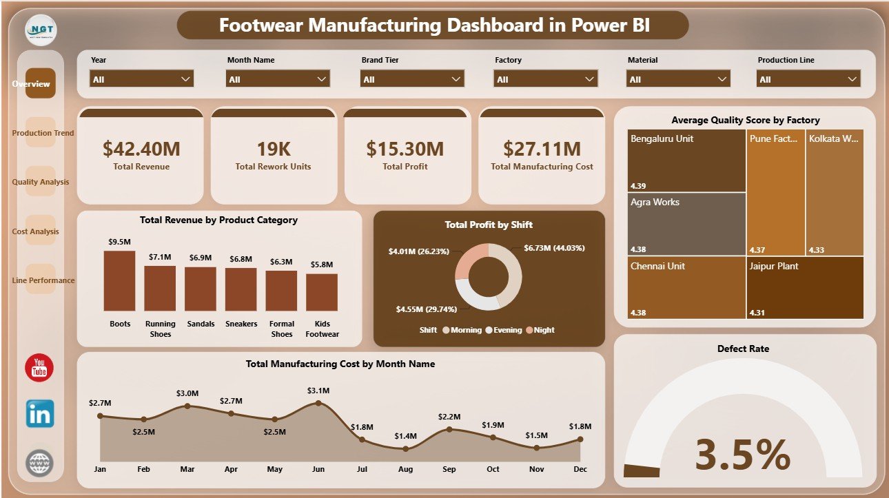
The Overview Page gives decision-makers a high-level view of factory performance. At the top, cards show Total Revenue, Total Rework Units, Total Profit, Total Manufacturing Cost, and Defect Rate. These cards help leaders review sales value, quality risk, profit, cost pressure, and rework before opening the detailed pages.
Total Revenue by Product Category: This chart compares revenue across footwear product categories. It helps teams identify which styles or categories are creating the strongest sales contribution.
Total Profit by Shift: This chart compares profit across shifts. It helps production leaders see whether shift-level output, labor use, rework, or cost patterns are affecting profitability.
Average Quality Score by Factory: This chart compares quality performance across factories. It helps quality teams identify plants that are performing well and plants that may need process review.
Total Manufacturing Cost by Month Name: This chart tracks cost movement across months. It helps finance and operations teams spot cost spikes and investigate unusual changes.
Defect Rate by Overall Production: This chart connects defect rate with overall production. It helps teams discuss quality problems alongside production volume instead of reviewing defects in isolation.
Overview Page
2. Production Trend
The Production Trend page focuses on shift output, regional profit, brand tier quality, monthly defect movement, and production completion. It is useful for supervisors and managers who need to understand how production performance changes by time, shift, and business dimension.
Total Quantity Produced by Shift: This visual compares output across shifts and helps identify capacity gaps or strong work periods. It can support staffing, scheduling, and supervisor review.
Total Profit by Region: This chart compares profit by region and helps connect operational output with regional business contribution. Managers can use it to see where manufacturing and demand mix create better returns.
Average Quality Score by Brand Tier: This visual compares quality score across brand tiers. It helps teams review premium, mid-range, and value products separately instead of treating all footwear lines as one group.
Defect Rate by Month Name: This chart shows monthly defect-rate movement. It helps quality teams detect months where defects increased and investigate process, material, or staffing changes.
Completion Rate by Overall Production: This visual connects completion rate with production volume. It helps leaders understand whether higher output is also leading to completed batches.

Production Trend
3. Quality Analysis
The Quality Analysis page brings together defect rate, manufacturing cost, material defects, completed batches, factories, shifts, and product categories. It helps quality teams review issues with enough business context to prioritize action.
Defect Rate by Factory: This chart compares defect rate across factories. It helps identify locations where process control, training, equipment, or supplier quality may need attention.
Total Manufacturing Cost by Shift: This chart compares cost by shift. It helps managers review whether cost pressure is concentrated in certain operating windows.
Total Manufacturing Cost by Product Category: This chart compares manufacturing cost across product categories. It supports margin review and category-level cost control.
Total Defects by Material: This visual highlights materials linked to defect counts. It helps procurement and quality teams discuss supplier performance, material specifications, and inspection focus.
Completed Batches by Shift: This chart compares completed batches across shifts. It helps supervisors review whether shift productivity is translating into finished output.

Quality Analysis
4. Cost Analysis
The Cost Analysis page is built for factory cost control, production line profit review, material spend, completed batch comparison, and brand tier revenue analysis. It gives finance and operations teams a shared view of where cost and profit are moving.
Total Manufacturing Cost by Factory: This chart compares cost across factories. It helps leaders spot factories with higher spend and decide whether volume, efficiency, material use, or process conditions are driving the difference.
Total Profit by Production Line: This visual compares profit by production line. It helps identify which lines are contributing stronger financial results and which need review.
Completed Batches by Factory: This chart compares completed batches across factories. It supports throughput review and helps teams discuss execution by location.
Total Manufacturing Cost by Material: This chart shows material-level cost contribution. It supports procurement review, material substitution analysis, and cost-reduction discussions.
Total Revenue by Brand Tier: This visual compares revenue by brand tier. It helps teams understand how premium, mid-range, and value tiers contribute to total sales.

Cost Analysis
5. Line Performance
The Line Performance page connects regional revenue, production line batch volume, factory quality score, monthly quantity produced, and delayed batches by shift. It is useful for daily production meetings and line-level accountability.
Total Revenue by Region: This chart compares revenue across regions. It helps connect production planning with market performance and sales contribution.
Total Batches by Production Line: This chart compares batch volume across lines. It helps identify where production activity is concentrated and where line utilization may need review.
Average Quality Score by Factory: This visual compares quality score by factory. It supports factory-level quality improvement and performance benchmarking.
Total Quantity Produced by Month Name: This chart tracks monthly quantity produced. It helps teams see seasonality, output surges, and slow months.
Delayed Batches by Shift: This chart shows delayed batches by shift. It helps identify where scheduling, maintenance, staffing, or process issues may be delaying completion.

Line Performance
Footwear Manufacturing Dashboard in Power BI vs. Tableau vs. Paid Manufacturing SaaS – Feature Comparison
| Feature | This Power BI Dashboard | Tableau Alternative | Paid Manufacturing SaaS |
|---|---|---|---|
| Cost | $17.99 one-time template purchase | License cost plus dashboard build time | Monthly or annual subscription |
| Platform | Power BI Desktop / Power BI Service | Tableau Desktop / Tableau Cloud | Vendor cloud or ERP module |
| Setup time | Open PBIX, replace or connect data, refresh | Build model and visuals manually | Implementation and onboarding |
| Real-time team collaboration | Available through Power BI Service with licensing | Available through Tableau Cloud | Usually included by user role |
| Mobile access | Power BI mobile app after publishing | Tableau mobile app after publishing | Vendor app or browser |
| Customizable fields | Editable visuals, relationships, fields, and measures | Editable with Tableau skills | Limited by plan and configuration |
| Share with link | Possible through Power BI permissions | Possible through Tableau permissions | Usually login controlled |
| Year-1 cost at 5 users | $17.99 plus any Microsoft licensing | Usually much higher | Often hundreds or thousands of dollars |
| Footwear manufacturing analytics | Built for production, cost, quality, line, material, and shift analysis | Requires custom setup | Depends on module and configuration |
Who Should Use This Template
This dashboard is useful for footwear manufacturers, factory managers, production supervisors, quality control teams, finance analysts, operations heads, supply chain managers, and Power BI consultants who need a ready reporting structure for factory data.
It is not designed to replace ERP, MRP, live machine monitoring, barcode scanning, purchase order workflows, payroll, or inventory control. It works best as an analytics layer when you already have structured production, quality, cost, and batch data.
Real-World Use Cases
Weekly factory review: A factory manager opens the Overview and Production Trend pages to discuss output, revenue, profit, completion rate, and delays with supervisors.
Quality improvement meeting: A quality lead uses Quality Analysis to compare defect rate by factory, defects by material, completed batches by shift, and quality score.
Cost-control review: A finance analyst reviews factory cost, material cost, production line profit, and brand tier revenue before preparing monthly commentary.
Advantages of Footwear Manufacturing Dashboard in Power BI
- It reduces the time needed to build manufacturing visuals from scratch.
- It gives leaders a fast executive view plus detailed production, quality, cost, and line pages.
- It supports slicer-based exploration during review meetings.
- It is editable in Power BI Desktop for teams that want to adjust measures, visuals, and formatting.
- It pairs naturally with Excel exports, CSV files, database tables, and structured manufacturing data sources.
Microsoft provides official guidance for report building, modeling, publishing, and sharing in the Microsoft Learn Power BI documentation.
Opportunities for Improvement
Advanced teams may extend the dashboard with production targets, forecasted demand, machine downtime categories, worker productivity, supplier performance, on-time delivery, scrap cost, or SKU-level analysis. Teams using Power BI Service can also publish the report to a workspace and manage permissions for decision makers.
Best Practices
- Keep factory, shift, material, product category, region, month, and production line names consistent.
- Validate Total Revenue, Total Profit, Manufacturing Cost, and Defect Rate after every refresh.
- Review quality and cost together so cost reduction does not hide defect risk.
- Use slicers during meetings to answer follow-up questions quickly.
- Save a backup before changing Power Query steps, relationships, or DAX measures.
Explore Relevant Templates
You can download this product from Footwear Manufacturing Dashboard in Power BI. You may also compare it with the Footwear Manufacturing Dashboard in Excel, Footwear Manufacturing KPI Dashboard in Power BI, and Contract Manufacturing Dashboard in Google Sheets. Browse more Power BI Dashboard Templates on NextGenTemplates.
Frequently Asked Questions
What is the Footwear Manufacturing Dashboard in Power BI?
It is an editable PBIX dashboard template for analyzing footwear manufacturing revenue, profit, cost, rework, defects, production trends, quality, and line performance.
What pages are included?
The report includes Overview, Production Trend, Quality Analysis, Cost Analysis, and Line Performance pages.
Do I need Power BI Desktop?
Yes. You need Power BI Desktop to open, edit, and refresh the PBIX file. Publishing through Power BI Service may require Microsoft licensing.
Can I use my own data?
Yes. Replace or connect the sample source with your own structured footwear manufacturing data, then refresh the model.
Does this replace ERP or MRP software?
No. It is a reporting dashboard for analysis, not a live manufacturing execution or planning system.
Can I customize the dashboard?
Yes. You can edit visuals, slicers, fields, relationships, Power Query steps, DAX measures, colors, and report pages in Power BI Desktop.
About the Author
Built by PK – Microsoft Certified Professional with 15+ years of Excel, Google Sheets, and Power BI experience. Founder of NextGenTemplates, reaching 300K+ subscribers across YouTube channels. Every template is hand-built and tested before release.
Conclusion
The Footwear Manufacturing Dashboard in Power BI gives manufacturing teams a practical way to review production, revenue, profit, cost, quality, materials, shifts, factories, production lines, and batch performance in one report. It is useful for teams that want a ready analytics structure without starting every Power BI page from a blank canvas.
Visit YouTube.com/@PKAnExcelExpert for more Power BI and Excel dashboard tutorials.