Footwear manufacturing teams manage production volume, labor hours, material usage, defects, factory performance, regional sales, product categories, brand tiers, shifts, and manufacturing cost. When those numbers sit in separate sheets, weekly review meetings become slow and reactive.
The Footwear Manufacturing Dashboard in Excel solves that reporting problem with a ready-to-use 7-sheet workbook. It includes 4 headline KPI cards, 18 analysis charts, slicers, a structured Data sheet, and a pivot-backed Support sheet. You can replace the sample data, refresh the workbook, and review production, quality, cost, revenue, profit, defects, downtime, and line performance in one place.
Click here to get the Footwear Manufacturing Dashboard in Excel.
Footwear Manufacturing Dashboard in Excel
Key Features of Footwear Manufacturing Dashboard in Excel
This Excel dashboard is designed for footwear factories, production teams, quality teams, and cost analysts who need practical reporting without building pivot tables and charts from scratch.
- 7 worksheet tabs covering Overview, Production Trend, Quality Analysis, Cost Analysis, Line Performance, Data, and Support.
- 4 KPI cards for Total Quantity Produced, Total Revenue, Total Profit, and Total Manufacturing Cost.
- 18 ready-made charts for production, cost, quality, shift, region, brand tier, material, and production line analysis.
- Slicer-based filtering so users can move from total factory view to a filtered view quickly.
- Editable data sheet where sample records can be replaced with your own footwear manufacturing data.
- Pivot-backed support sheet that can be refreshed from the Excel Data tab after updating records.
- Microsoft Excel format for local control, easy customization, and one-time ownership.
Dashboard Pages Explanation
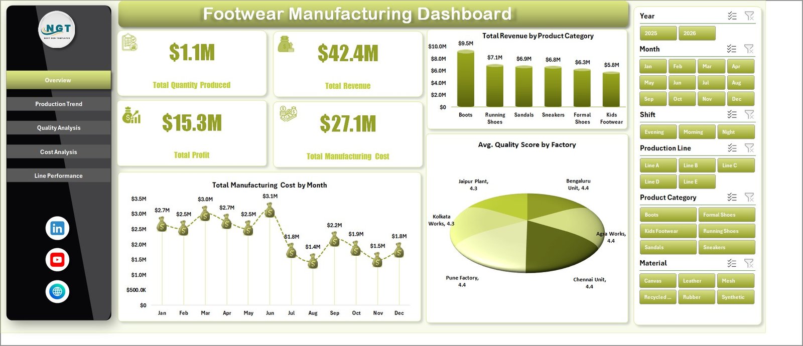
1. Overview Page
The Overview Page gives a senior-level snapshot of footwear manufacturing performance. At the top, the dashboard shows Total Quantity Produced, Total Revenue, Total Profit, and Total Manufacturing Cost. These cards help leaders see production volume, sales value, profitability, and cost exposure before reviewing the detailed charts.
The Overview Page also includes slicers so you can filter the dashboard quickly by available workbook fields such as month, region, product category, factory, shift, material, production line, or brand tier.
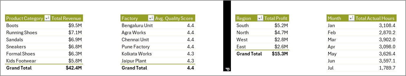
Total Revenue by Product Category: This chart compares revenue across footwear product categories. It helps managers identify which product groups are driving sales and which categories may need pricing, promotion, or production review.
Total Manufacturing Cost by Month: This chart shows manufacturing cost movement across months. It helps finance and production teams spot cost spikes, seasonal changes, and months that require deeper cost investigation.
Avg. Quality Score by Factory: This chart compares quality performance across factories. It helps quality leaders identify high-performing plants and locations that may need corrective action, training, or process review.
Overview Page
2. Production Trend
The Production Trend sheet focuses on profit, actual labor or machine hours, shift output, and production line completion. It is useful for supervisors who need to compare capacity, regional profitability, and line execution over time.
Total Profit by Region: This chart compares profit across regions. It helps leaders understand where footwear operations or sales channels are creating the strongest contribution.
Total Actual Hours by Month: This chart tracks actual hours month by month. It helps operations teams see workload movement, capacity pressure, and periods where hours increase faster than output or profit.
Total Quantity Produced by Shift: This analysis compares output across shifts. It helps supervisors identify whether day, evening, or night shifts are producing consistently or need additional support.
Completion % by Production Line: This chart shows how each production line performs against expected completion. It supports line-level accountability and helps identify bottlenecks.
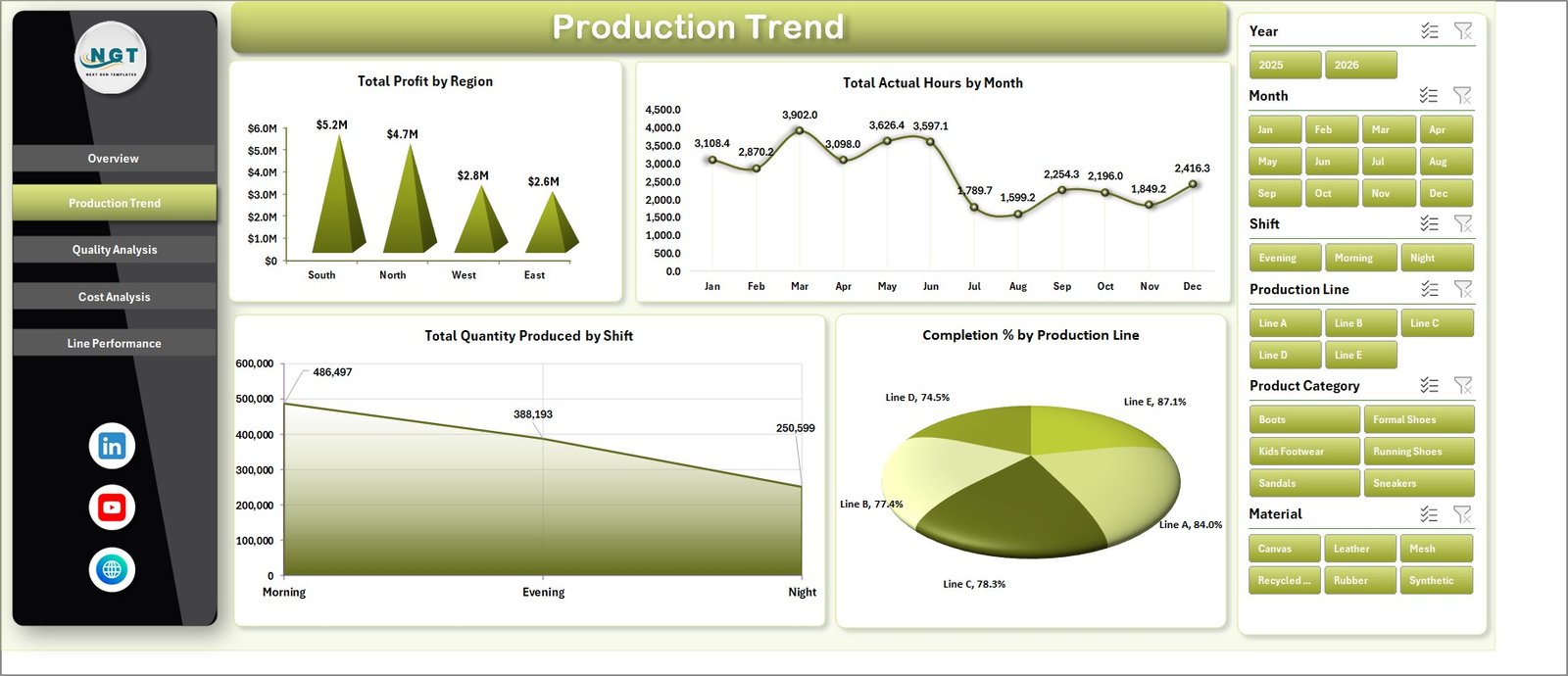
Production Trend
3. Quality Analysis
The Quality Analysis sheet brings together defect count, product category cost, material-level defects, and shift-level manufacturing cost. It helps quality and production teams discuss defects together with cost impact.
Total Defects by Factory: This chart shows which factories report the highest defect counts. It helps quality teams prioritize root-cause analysis and targeted process improvement.
Total Manufacturing Cost by Product Category: This chart compares cost by product category. It helps teams understand which footwear categories require more manufacturing spend.
Total Defects by Material: This analysis highlights which materials are linked to more defects. It supports supplier review, material testing, and process-control conversations.
Total Manufacturing Cost by Shift: This chart compares manufacturing cost by shift. It helps managers review whether shift-level labor, output, scrap, or rework patterns are affecting cost.
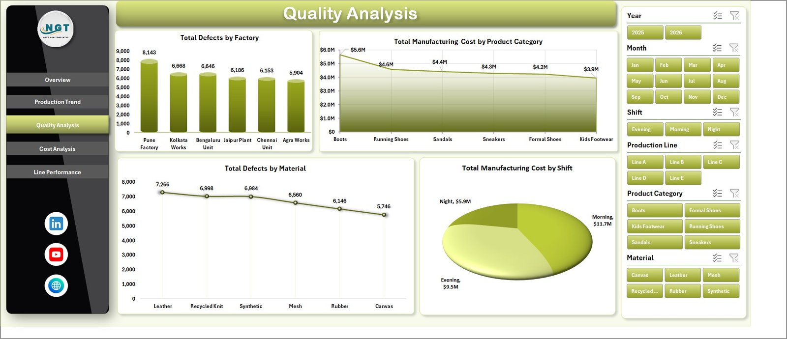
Quality Analysis
4. Cost Analysis
The Cost Analysis sheet is built for cost control, margin review, and product mix discussions. It connects factory cost, product category profit, brand tier revenue, and material cost.
Total Manufacturing Cost by Factory: This chart compares manufacturing cost across factories. It helps leaders identify plants with higher cost exposure and investigate whether volume, efficiency, or material usage is driving the difference.
Total Profit by Product Category: This chart shows which product categories contribute the most profit. It helps teams balance production planning with commercial profitability.
Total Revenue by Brand Tier: This chart compares revenue across brand tiers. It supports pricing, product mix, and premium-versus-value segment decisions.
Total Manufacturing Cost by Material: This chart highlights material-level cost contribution. It helps procurement and production teams review cost-heavy materials and supplier options.
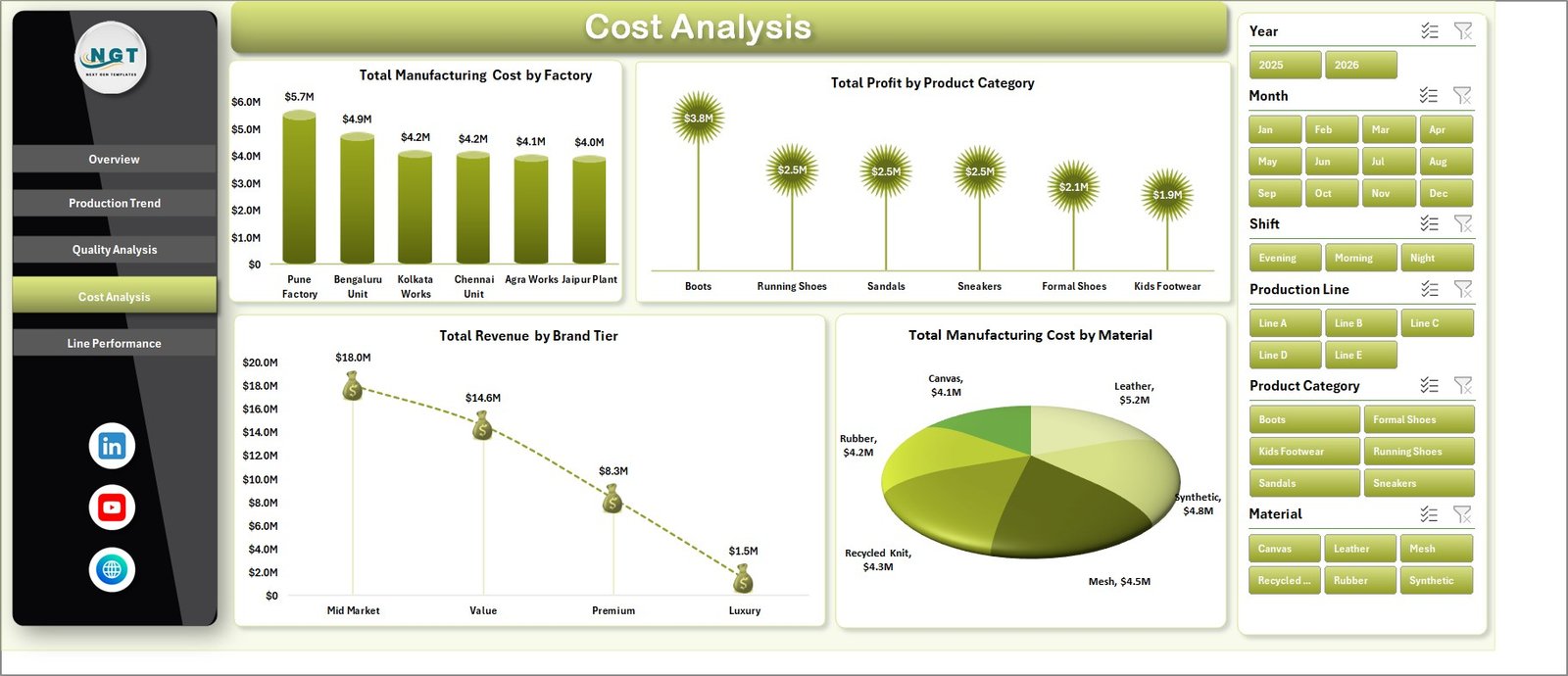
Cost Analysis
5. Line Performance
The Line Performance sheet connects line output, shift downtime, and regional revenue. It is especially useful for production managers who want to understand whether line-level performance is supporting business results.
Total Quantity Produced by Production Line: This chart compares output by production line. It helps supervisors identify high-output lines and lines that may need capacity, maintenance, or staffing review.
Total Downtime Hours by Shift: This chart shows downtime by shift. It helps teams understand when downtime is concentrated and whether a shift needs additional maintenance or process support.
Total Revenue by Region: This chart compares revenue across regions. It helps connect production decisions with market demand and sales performance.
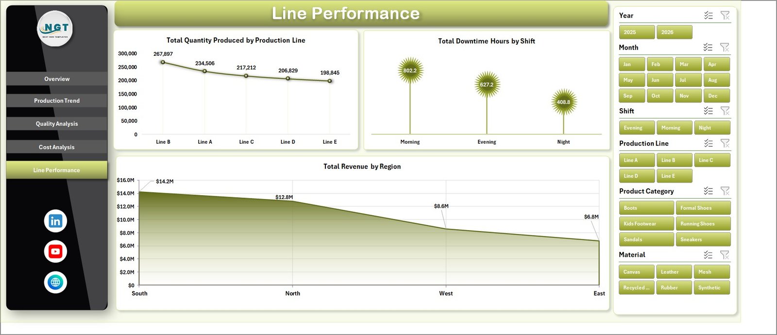
Line Performance
6. Data Sheet Tab
The Data Sheet is where you add or paste your own records in the same format. This is the input layer of the workbook. After you update the records, the dashboard can refresh based on the new data.
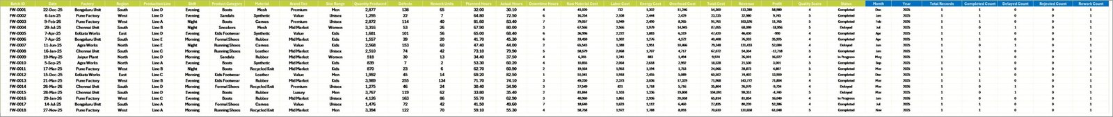
Data Sheet tab
7. Support Sheet Tab
The Support Sheet contains the pivot tables used to create the entire dashboard dynamically. After updating the Data Sheet, go to the Data tab in the Excel Ribbon and click Refresh All. All pivots and related charts will refresh. You can keep this sheet hidden after setup.
Support sheet tab
Footwear Manufacturing Dashboard in Excel vs. Google Sheets vs. Paid CRM/SaaS – Feature Comparison
| Feature | Footwear Manufacturing Dashboard in Excel | Google Sheets Alternative | Paid Manufacturing SaaS |
|---|---|---|---|
| Cost | One-time purchase | Usually one-time or free file copy | Monthly subscription |
| Platform | Microsoft Excel | Browser-based Google Sheets | Cloud system |
| Setup time | Replace data and refresh | Copy file and replace data | Implementation and configuration |
| Real-time team collaboration | Possible through OneDrive or SharePoint | Native Google Drive sharing | Built in |
| Mobile access | Excel app or browser | Google Sheets app or browser | Vendor app |
| Customizable fields | High for Excel users | High for spreadsheet users | Limited by plan and permissions |
| Share with link | Possible with OneDrive | Native sharing | Usually role-based |
| Year-1 cost at 5 users | Template cost only | Low template cost | Often hundreds or thousands of dollars |
| Best use case | Footwear production, cost, quality, and line reporting | Collaborative spreadsheet reporting | Full ERP, MRP, or shop-floor workflow |
Who Should Use This Template
This template is best for footwear factories, production heads, line supervisors, quality teams, costing analysts, operations managers, and business owners who need Excel-based visibility without starting a large software project.
It is not meant to replace a full ERP, MRP, warehouse, or shop-floor execution system. If a company needs live machine integration, inventory planning, purchase order automation, or role-based approvals, dedicated software will be more suitable.
Real-World Use Cases
Daily production meeting: A factory manager filters the Overview and Line Performance pages by month and reviews production quantity, downtime, and completion before assigning improvement actions.
Quality investigation: A quality lead checks Total Defects by Factory and Total Defects by Material to identify where root-cause analysis should begin.
Cost control: A finance analyst reviews manufacturing cost by factory, product category, material, and shift to prepare monthly cost commentary.
Advantages of Footwear Manufacturing Dashboard in Excel
The biggest advantage is speed. Teams can start using the dashboard quickly because Excel is already familiar to most manufacturing staff. The structure is transparent: users can inspect the Data sheet, Support sheet, charts, slicers, and pivot tables.
The dashboard also encourages consistent review habits. Instead of preparing a new report every week or month, users can update the data, refresh the workbook, and review the same dashboard pages repeatedly. That makes trend review easier and reduces manual reporting work.
Opportunities for Improvement
Teams can extend the dashboard by adding more product families, material groups, supplier fields, order types, production stages, or customer segments. Advanced Excel users may also add conditional formatting, Power Query imports, or additional pivot charts.
For larger factories, the next improvement step may be connecting Excel to a controlled data source instead of manual copy-paste. Microsoft provides guidance on refreshing Excel connections and pivot-backed reports in its official Excel refresh documentation.
Best Practices
- Keep the Data sheet column structure consistent.
- Refresh all pivots after every data update.
- Hide the Support sheet to protect pivot logic from accidental edits.
- Review production quantity, cost, defects, and profit together.
- Use slicers during review meetings to answer follow-up questions quickly.
- Save a backup copy before making major layout changes.
Explore Relevant Templates
You may also like the Footwear Manufacturing KPI Dashboard in Excel, Fertilizer Manufacturing Dashboard in Excel, Packaging Machine Downtime Dashboard in Excel, and Contract Manufacturing Dashboard in Google Sheets. You can also browse more Excel Dashboard templates and Manufacturing templates.
Frequently Asked Questions
What is the Footwear Manufacturing Dashboard in Excel?
It is a ready-to-use Excel dashboard for analyzing footwear production, revenue, profit, cost, quality, defects, downtime, factories, shifts, regions, and production lines.
How many worksheets are included?
The workbook includes 7 tabs: Overview, Production Trend, Quality Analysis, Cost Analysis, Line Performance, Data, and Support.
Can I update the data myself?
Yes. Add your records in the Data sheet using the same format, then click Refresh All from the Excel Data tab.
Why is there a Support sheet?
The Support sheet contains pivot tables that power the dashboard charts and cards. You can hide it, but it should remain in the workbook.
Does this dashboard use slicers?
Yes. Slicers help users filter the dashboard quickly and review specific views without editing formulas.
Is this suitable for non-footwear manufacturing?
The structure may be adapted for similar manufacturing environments, but the chart names and examples are designed for footwear production reporting.
About the Author
Built by PK – Microsoft Certified Professional with 15+ years of Excel, Google Sheets, and Power BI experience. Founder of NextGenTemplates, reaching 300K+ subscribers across YouTube channels. Every template is hand-built and tested before release.
Conclusion
The Footwear Manufacturing Dashboard in Excel is a practical reporting workbook for teams that want production, quality, cost, profit, and line-performance insights in one place. With KPI cards, charts, slicers, a clean data sheet, and pivot-backed support tables, it helps managers move from scattered spreadsheets to structured manufacturing analysis.
Visit our YouTube channel for step-by-step Excel dashboard tutorials.