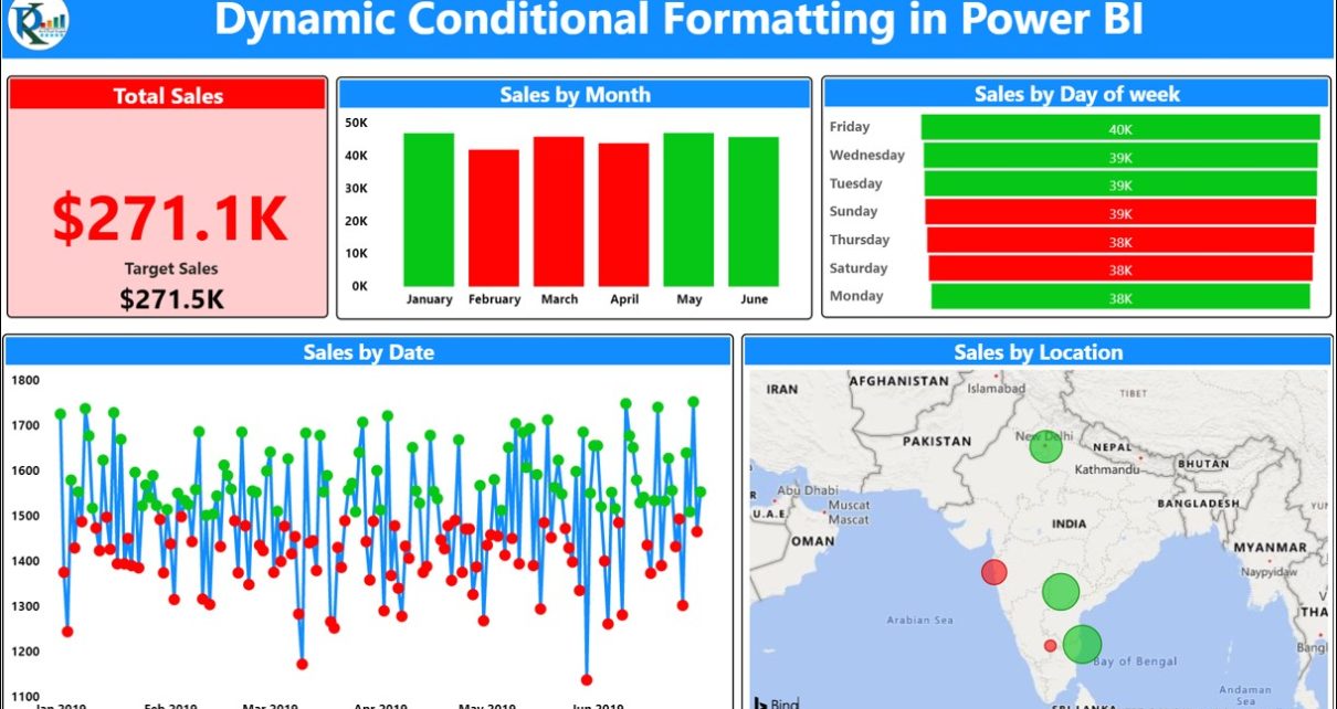
Dynamic Conditional Formatting in Power BI uses DAX measures to change a visual’s appearance with the reported data. This example applies conditional formatting to card backgrounds, titles, font colours and chart data colours. The embedded report, video and practice file show the original implementation.
What Changes in This Example?
- Card background: the visual’s background colour.
- Title and font: text presentation used to explain or highlight the current result.
- Chart data colours: the colours applied to plotted data.
The tutorial uses DAX measures to drive these formatting choices. Review the original measures in the practice file rather than substituting a formula based only on the dashboard’s appearance.
Why use a measure for formatting?
A formatting measure can return a value used by the visual’s conditional-formatting setting. Available properties vary by visual. Microsoft’s conditional-formatting documentation explains the current options; the video below shows the original report interface.
Dynamic Conditional Formatting
Watch the step by step video tutorial:
Below is the embedded Power BI Dashboard-
Click here to download this practice file.
Visit our YouTube channel to learn step-by-step video tutorials