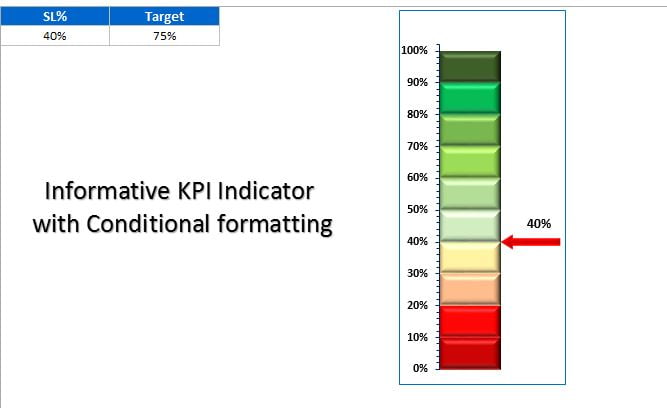
This is the 2nd version of Informative KPI Indicator Chart. In this chart I have used a RAG color pallet in 10 slices (10% each). Here I have taken Service Level metrics, you can take your own metrics. As soon as you will change the Service Level%, Indicator will be moved accordingly.
Informative KPI Indicator Chart Version-2
I also have taken the Target of service level. Whenever actual value will be less than the target then Indicator arrow’s color will be red otherwise it will be green.
Click to buy Informative KPI Indicator Chart Version-2)
Visit our YouTube channel to learn step-by-step video tutorials
Watch the step by step tutorial:
Click to buy Informative KPI Indicator Chart Version-2)