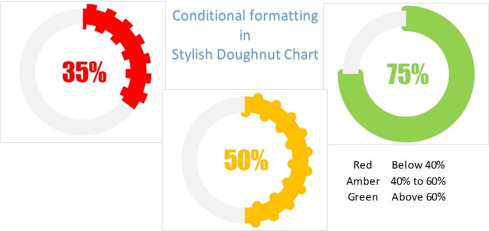
In my last post I have explained how to create stylish doughnut chart in Excel. I hope you has enjoyed that chart. Now in this article, you will learn how to put Conditional Formatting in Stylish Doughnut Chart. When we will change our KPI value, Color and stylish of the doughnut chart will be changed automatically.
Conditional Formatting in Stylish Doughnut Chart
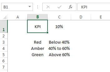
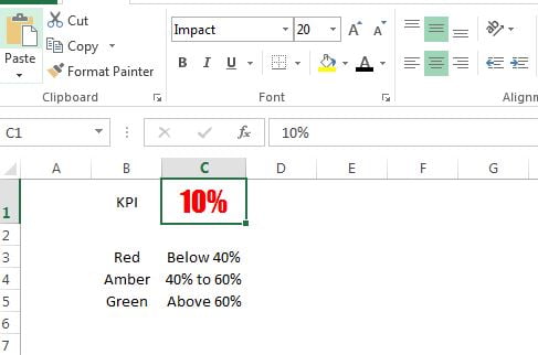
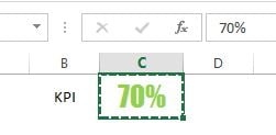
Let’s say we have below data to put the conditional formatting in stylish doughnut chart. KPI metric value is on cell C1.
Below are the steps to create this chart-
- First of all we will put the normal conditional formatting on cell C1 (on KPI metric value)
- Select the cell C1.
- Go to Home tab>>Conditional Formatting>>New Rule
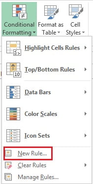
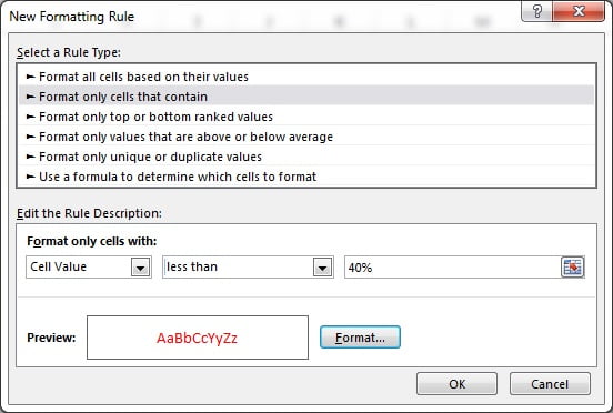
- Select the Format only cell that contain in New Formatting Rule window.
- Choose the less than and put 40%.
- Select font color as Red in Format.
- Click on OK.
- Similarly put the second rule for Amber color.
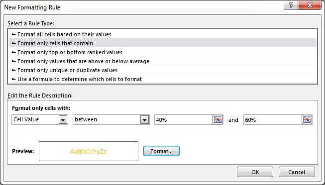
- Select the Format only cell that contain in New Formatting Rule window.
- Choose the between and put 40% and 60%
- Select font color as Orange in Format.
- Click on OK.
- Similarly put the third rule for Green color.
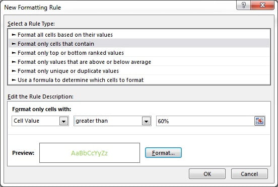
- Select the Format only cell that contain in New Formatting Rule window.
- Choose the greater than and put 60%
- Select font color as light green in Format.
- Click on OK.
Now format the cell C1-
- Choose font name as Impact.
- Choose font size 20.
- Text alignment as center.
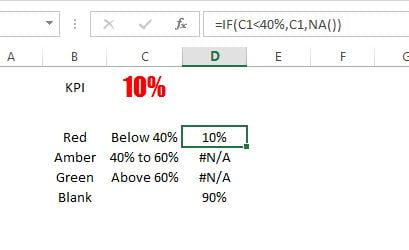
To create the chart we will require a support column. We will take it on column D.
- Put the formula “=IF(C1<40%,C1,NA())” on cell D3 (for red color)
- Put the formula “=IF(AND(C1>=40%,C1<=60%),C1,NA())” on cell D4 (for amber color)
- Put the formula “=IF(C1>60%,C1,NA())” on cell D5 (for green color)
- Take another field as “Blank” and put formula “=100%-C1” on cell D6.
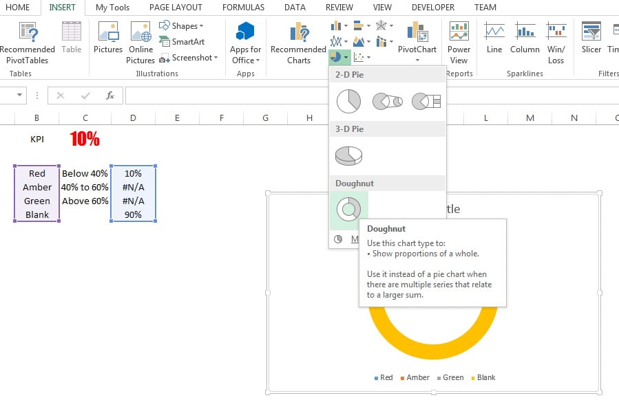
- Now select the range “B3:B6” and “D3:D6” (by pressing control key)
- Go to Insert tab>>Charts>>Insert Doughnut Chart.
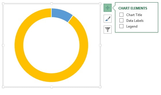
- Remove the chart title and legend.
- First of all we will put the conditional formatting for red color. Put the value on cell C1 as 10% (or any value below 40%)
- Double click on blue slice (KPI metric slice)
- Go to Format Data Point window and select Solid fill.
- Choose the Red color.
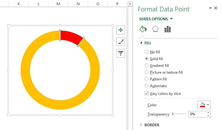
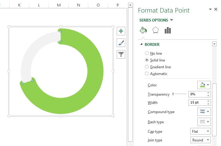
- Now go to Border and choose Solid line.
- Choose Red color.
- Width as 15pt.
- Dash type as Round dot (Second one)
- Choose Cap type as Flat.

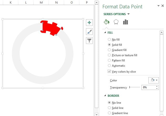
- Select the 2nd slice (Blank part)
- Fill the light gray color.
- Choose No line in Border.
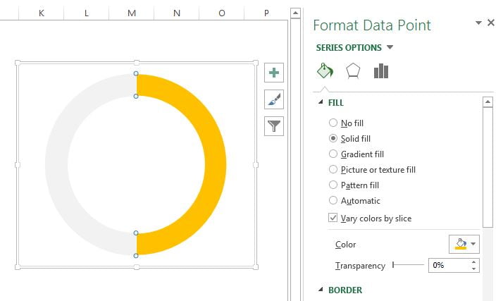
- Now put to 50%( or any other value between 40% and 60% for amber color) on cell C1.
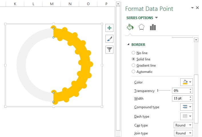
- Select the KPI metric slice (1st slice) and fill the orange color.
- Now go to Border and choose Solid line.
- Choose Orange color.
- Width as 15pt.
- Dash type as Round dot (Second one)
- Choose Cap type as Round.
- Put to 70% (or any other value above 60% for green color) on cell C1.
- Select the KPI metric slice (1st slice) and fill the light green color.
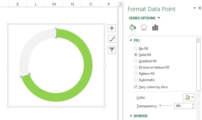
- Now go to Border and choose Solid line.
- Choose light green color.
- Width as 15pt.
- Choose Join type as Round.
Our chart is ready, now we will create data label. To create the data we will copy the cell C1 and will paste it as linked picture.
- Copy the cell C1.
- Paste as linked picture.
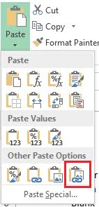
- Keep and linked picture in the middle of chart.
- Resize as per the requirements.

Our chart is ready. Now if will change the value on C1, then color and style will be changed automatically.
Click to buy Conditional Formatting in Stylish Doughnut Chart
Visit our YouTube channel to learn step-by-step video tutorials
Watch the video tutorial:
Click to buy Conditional Formatting in Stylish Doughnut Chart