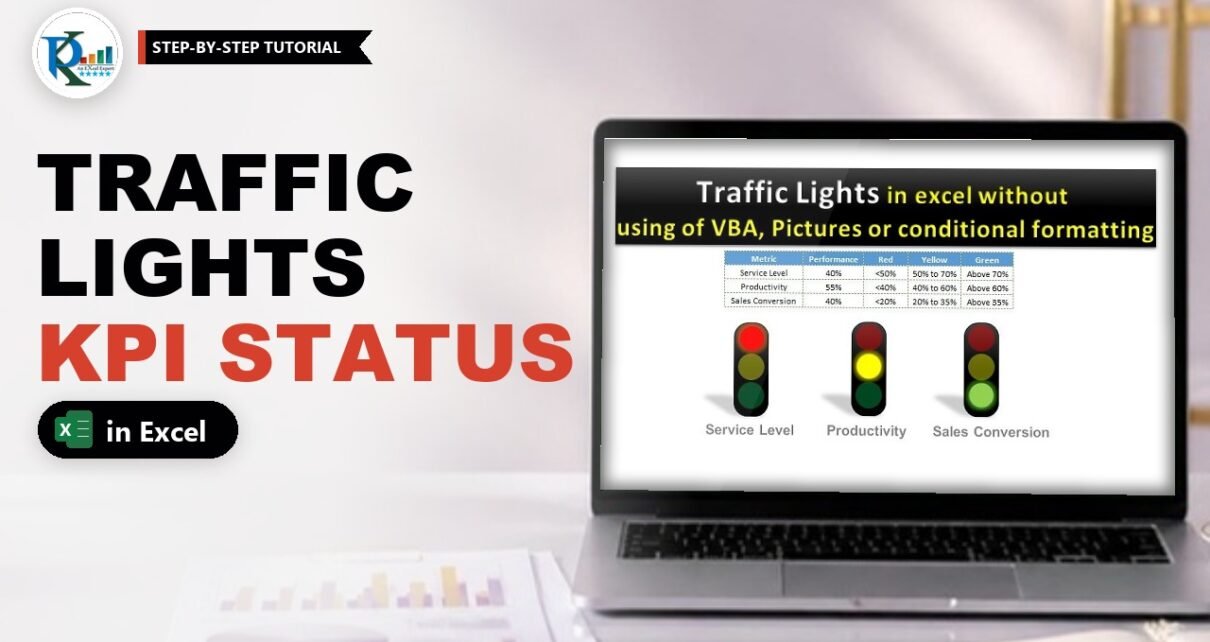
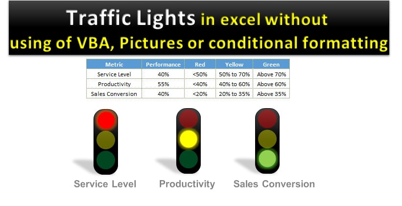
Traffic lights in Excel are one of the quickest ways to show KPI performance: red when a metric is below target, yellow when it is in the warning band and green when it is on track. In this tutorial you build three live traffic lights for Service Level, Productivity and Sales Conversion using only shapes, text boxes and a few IF formulas. There is no VBA, no pictures, no camera tool and no conditional formatting. Change a performance value and the right light switches on by itself.
Watch the Video Tutorial
In the video, PK builds the whole thing from a blank sheet: the threshold table, the IF and AND formulas, the Wingdings trick, the traffic light shapes and the glowing linked text boxes.
What You Will Build
- A KPI threshold table with a performance value and separate red, yellow and green bands for each metric.
- Three helper columns of IF formulas that return a single character only for the light that should be on.
- The Wingdings trick that turns a lowercase letter l into a solid round dot.
- Traffic light bodies made of a rounded rectangle and three 60% transparent ovals.
- Glowing linked text boxes that sit on top of the ovals and light up when their cell has a value.
Part 1 – Set Up the KPI Data
Step 1: Enter the metrics and their thresholds
Start with a small table in A1:E4. Column B holds the actual performance and columns C to E simply document the rules, so anyone reading the sheet knows what each colour means:
Metric             Performance   Red     Yellow        Green
Service Level      40%           <50%    50% to 70%    Above 70%
Productivity       55%           <40%    40% to 60%    Above 60%
Sales Conversion   18%           <20%    20% to 35%    Above 35%
Each metric has its own bands. Service Level is red under 50%, yellow from 50% to 70% and green above 70%. Productivity and Sales Conversion use lower limits. Later you can link column B to your real report so the lights update with your data.
Part 2 – Formulas That Switch the Traffic Lights in Excel
Step 2: Add the helper headers
Type Red in F1, Yellow in G1 and Green in H1. Each of these columns will decide whether its light is on (the cell contains a lowercase l) or off (the cell is blank).
Step 3: The red light formula
In F2 enter:
F2 =IF(B2<50%,"l","")If Service Level is below 50% the cell returns a lowercase letter l, otherwise an empty text string. Why an l? Hold that thought until Step 6.
Step 4: The yellow light formula
Yellow needs two conditions at the same time, so wrap them in AND:
G2 =IF(AND(B2>=50%,B2<=70%),"l","")Watch the brackets: AND needs its own closing bracket before the ,"l","" part. In the video Excel shows the Your formula is missing a parenthesis message when it is left out.
Step 5: The green light formula and the other metrics
H2 =IF(B2>70%,"l","")Select F2:H4 and press Ctrl+D to fill the formulas down, then edit the limits for each row so they match that metric’s bands:
Row 3 (Productivity)
F3  =IF(B3<40%,"l","")
G3  =IF(AND(B3>=40%,B3<=60%),"l","")
H3  =IF(B3>60%,"l","")

Row 4 (Sales Conversion)
F4  =IF(B4<20%,"l","")
G4  =IF(AND(B4>=20%,B4<=35%),"l","")
H4  =IF(B4>35%,"l","")
How the formula works
B2<50%is the red test. Excel stores 50% as 0.5, so the comparison works on any percentage-formatted value.AND(B2>=50%,B2<=70%)is TRUE only when both limits are met, which is exactly the yellow band. Because it uses >= and <=, a value of exactly 50% or 70% is yellow.B2>70%is the green test. It uses a strict greater-than, so 70% itself never turns green.- Because the three tests do not overlap, exactly one of F, G and H holds an
lfor every metric. That is what guarantees only one light is on.
Step 6: Apply the Wingdings font
Select F2:H4 and change the font to Wingdings. In Wingdings the lowercase l is drawn as a solid round dot. That dot is what will become the glowing light. Your helper cells now show a black dot in the column of the active colour.
Part 3 – Draw the Traffic Light Shapes
Step 7: The black body
Go to Insert > Shapes and draw a Rounded Rectangle. On the Format tab set the height to 1.4″ and the width to 0.5″. Set Shape Outline to No Outline and Shape Fill to Black. Add depth with Shape Effects > Shadow and pick the first option under Perspective. Drag the small yellow handle to make the corners a little rounder.
Step 8: The three dim lamps
- Insert an Oval and size it to 0.4″ x 0.4″, with no outline.
- Right-click > Format Shape > Fill > Solid fill, colour red, Transparency 60%.
- Copy it twice and place the copies below. Make the middle one yellow and the bottom one green, keeping 60% transparency on all three.
The transparency is the secret: on the black body the ovals look like switched-off lamps. Select the body and the three ovals and Group them. Copy the group twice for the other two metrics, then use Align Middle and Distribute to line them up.
Step 9: Add the metric names
Insert a WordArt (PK uses the Fill – Gray 50%, Accent 3 style), type Service Level, and set the font to Arial, size 15. Copy it under the other two lights and change the text to Productivity and Sales Conversion. Turn off Gridlines and Headings on the View tab for a clean canvas.
Part 4 – Connect the Lights to the Data
Step 10: Create the red glowing light
- Insert a Text Box and, with it selected, type
=in the formula bar and click F2. The formula bar shows=$F$2. - Set Shape Fill to No Fill and Shape Outline to No Outline.
- Change the font to Wingdings, size 45, font colour red.
- On the Format tab choose Text Effects > Glow and pick a red glow.
- Move the text box so the dot sits exactly over the red lamp of the Service Level light.
Copy the text box to the other two lights and change their links to =$F$3 and =$F$4. Use Format Painter to keep the formatting identical. A text box linked to a blank cell shows nothing, so a lamp only glows when its cell contains the l.
Step 11: Yellow and green lights
Repeat the same idea for the other colours:
- Yellow: link the three text boxes to G2, G3 and G4. Font colour yellow and a yellow glow.
- Green: link them to H2, H3 and H4. Font colour green and a green glow.
Tip from the video: while building, temporarily type a value that turns the target light on (for example 60% for yellow), so you can see the dot and place it precisely. Then put your real value back.
Step 12: Hide the helper cells
Select F1:H4, press Ctrl+1, choose Number > Custom and replace General with three semicolons:
;;;The empty format hides positive, negative, zero and text values, so the dots disappear from the sheet but the formulas keep working. Finally link the Performance column to your real figures. Type 40% for Sales Conversion and it jumps to green; type 30% for Productivity and it turns red.
Modern Excel Alternative
This section is an addition, not shown in the video. If you prefer one status column instead of three IF columns, add a helper in I2 and let each light test it:
I2  =IF(B2<50%,"Red",IF(B2<=70%,"Yellow","Green"))
F2  =IF($I2="Red","l","")
G2  =IF($I2="Yellow","l","")
H2  =IF($I2="Green","l","")
Keep the limits for each metric in their own cells and refer to them instead of typing 50% and 70%, so changing a target never means editing formulas. For a quick in-cell version, Conditional Formatting > Icon Sets > 3 Traffic Lights also works, but you lose the large, glowing dashboard look of the shapes.
Common Errors and Fixes
These fixes are additions based on general Excel behaviour.
The light shows a letter l instead of a dot
The text box font is not Wingdings. The font of the linked cell does not carry over, so set Wingdings on the text box itself.
Two lights are on at once, or none
The bands overlap or leave a gap. Check that red uses <, yellow uses >= and <= with the same limits, and green uses >.
Every metric shows green
The performance was entered as 40 instead of 40% in a General formatted cell, so 40 is greater than 0.7. Format column B as a percentage or enter values with the % sign.
The light does not change
The text box was typed into instead of being linked. Select it and check the formula bar shows =$F$2 (or the correct cell).
Tips
- Use the same technique for any RAG status: project health, budget variance or SLA compliance.
- For metrics where lower is better (such as escalations), swap the red and green tests.
- Group each finished light with its text boxes so you can move it onto a dashboard in one piece.
- Keep the helper cells next to the data so they are easy to audit, even when hidden with
;;;. - Microsoft explains the IF function and custom number formats in more detail.
Want It Ready-Made?
If you want the finished workbook with the lights already built and linked, get the Traffic Lights in MS Excel template, or the more decorative Stylish Traffic Lights in Excel. You can browse more Excel chart templates on NextGenTemplates.com. To build KPI visuals, infographics and dashboards like this with confidence, join the course Excel Pivot Tables and Dashboards on NextGenTemplates Academy.
Related Tutorials
- Stylish Traffic Lights in Excel
- Informative KPI Indicator Chart (Version 1)
- RYG Dial Gauge Meter in Excel
- 3D KPI Indicator in Excel
- Conditional Formatting in a Multiple Batteries Chart
Frequently Asked Questions
How do I make traffic lights in Excel without conditional formatting?
Use IF formulas that return a lowercase l only for the active colour, then link glowing Wingdings text boxes to those cells and place them over transparent oval shapes. The linked text box shows a dot when its cell has a value and nothing when it is blank.
Why does the formula return a lowercase l?
In the Wingdings font the lowercase l is drawn as a solid round dot. Formatted in Wingdings with a coloured glow, that dot looks like a lit lamp.
Do these traffic lights need VBA or macros?
No. Everything updates through formulas and linked text boxes, so the file can be saved as a normal xlsx workbook.
Can each KPI have different thresholds?
Yes. Each row has its own formulas, so Service Level can use 50% and 70% while Productivity uses 40% and 60%. Storing the limits in cells makes them easier to change.
How do I hide the helper formulas?
Select the helper cells, open Format Cells, choose Custom and enter three semicolons. The values disappear from view but the text boxes still read them.
About the Author
PK is a Microsoft Excel expert and trainer and the founder of PK: An Excel Expert and NextGenTemplates.com. He has been teaching Excel, Power Query and Power BI since 2016 on his YouTube channel.
Conclusion
Traffic lights in Excel need nothing more than a threshold table, three IF formulas per metric, the Wingdings dot and a few shapes with linked, glowing text boxes. Once built, they react instantly to every change in your data and turn a plain KPI table into a status board anyone can read at a glance. Build one light, copy it for each metric, and drop the set onto your next dashboard.