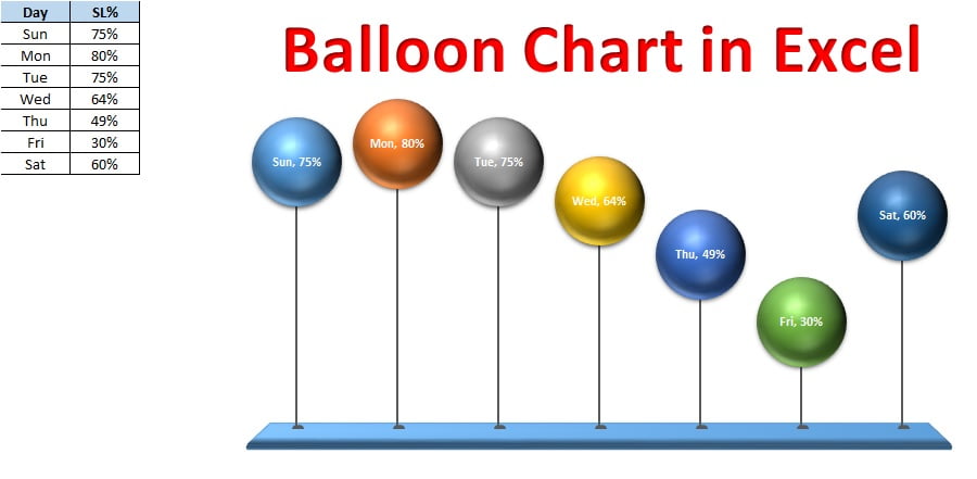
Home>Blogs>Charts and Visualization>Balloon chart in MS Excel
Balloon Chart in Excel
Charts and Visualization

Balloon chart in MS Excel

Balloon chart is very attractive and innovative visual in excel created by my team. This visual can be used in place of a column chart. Height of the balloons will be changed according to your data. Highest balloon means highest number. This chart has been created by using 3-D Bubble Chart and auto shapes in Excel.


Balloon Chart in Excel


Click here to download this excel file.


Watch step by step video tutorial to learn how to create Balloon chart in MS Excel


PK
Meet PK, the founder of PK-AnExcelExpert.com! With over 15 years of experience in Data Visualization, Excel Automation, and dashboard creation. PK is a Microsoft Certified Professional who has a passion for all things in Excel. PK loves to explore new and innovative ways to use Excel and is always eager to share his knowledge with others. With an eye for detail and a commitment to excellence, PK has become a go-to expert in the world of Excel. Whether you're looking to create stunning visualizations or streamline your workflow with automation, PK has the skills and expertise to help you succeed. Join the many satisfied clients who have benefited from PK's services and see how he can take your Excel skills to the next level!
https://www.pk-anexcelexpert.com

Leave a Reply