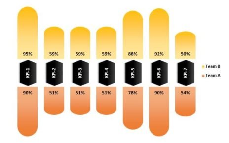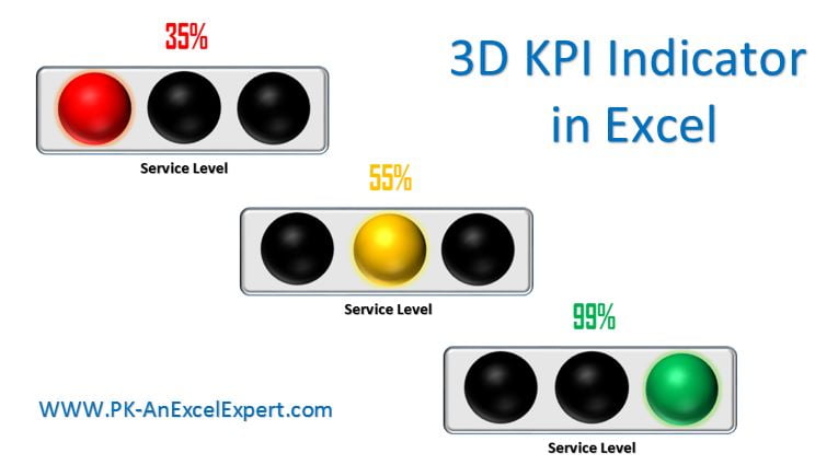
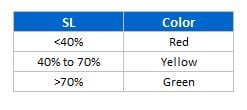
Several times we have to show the some indicator of our KPI metrics to indicate that particular metrics is in Red, Yellow or Green.
3D KPI Indicator in Excel
Here we have created a 3D indicator with 3 solid balls. Below is the logic to change balls color-
Click to buy 3D KPI Indicator in Excel
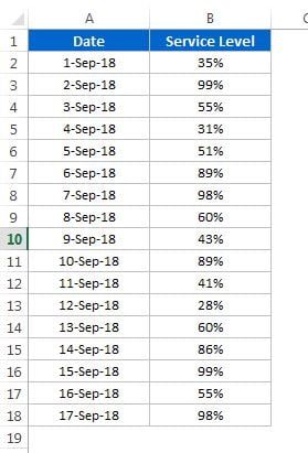
Data of KPI metrics (Service Level) is coming from another worksheet.
Click to buy 3D KPI Indicator in Excel
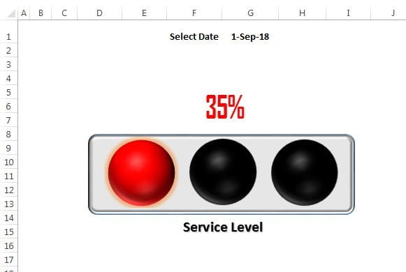
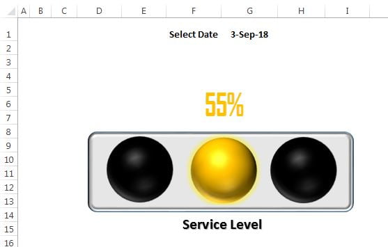
If we will change the date, Service Value will be updated automatically and color of text and indicator will be changed.
For Red color indicator will look like below color-
Click to buy 3D KPI Indicator in Excel
For Yellow color indicator will look like below color-
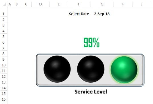
For Green color indicator will look like below color-
Click to buy 3D KPI Indicator in Excel
Visit our YouTube channel to learn step-by-step video tutorials
Watch the step by step Video tutorial:
Click to buy 3D KPI Indicator in Excel