Excel is a powerful tool which can be used for a wide range of business applications, for analyzing data, creating charts and graphs etc. One useful feature in Excel is the ability to create dynamic chart with slicer, which can be used to quickly analyze sales data by location, employee, or other factors. In this article, we will walk through the process of creating a Quick Dynamic Sales by Employees chart with Slicer in Excel.
Dataset
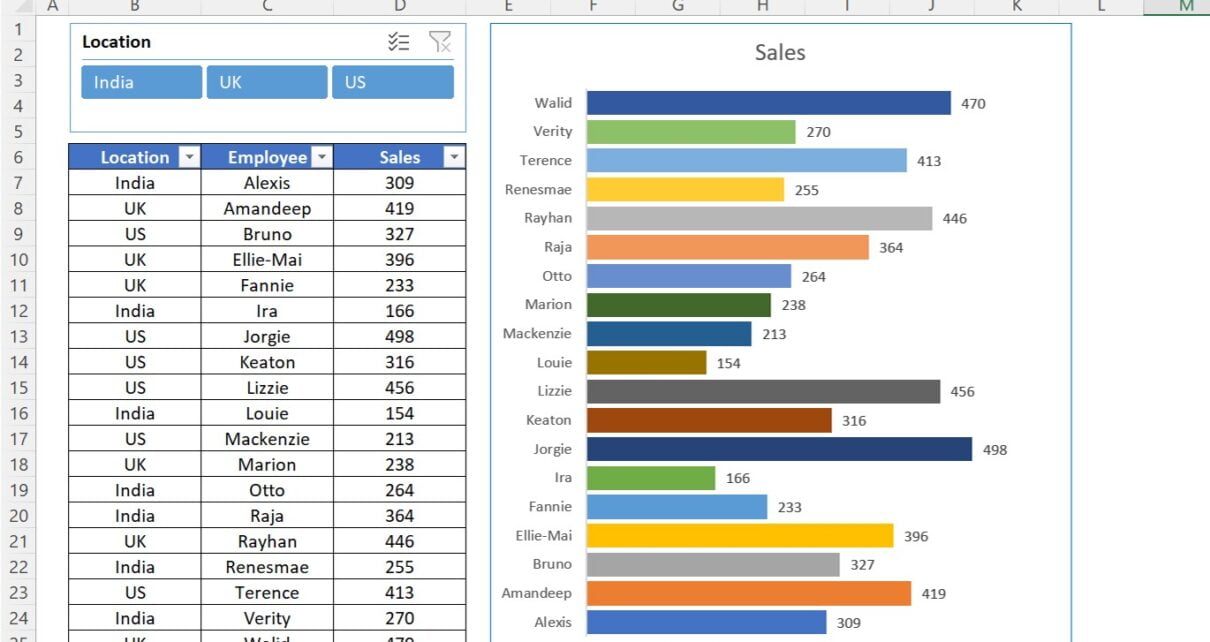
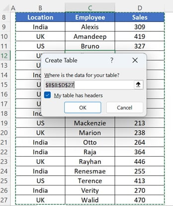
To start, we will need a dataset to work with. For this example, we will use a simple dataset of sales data by location and employee, with the below headers-
- Location
- Employee
- Sales
To convert this data range into an Excel table, we can select the data and use the shortcut key Ctrl+T. This will open the Create Table dialog box, wherein It will auto select the range of data we want to convert into a table. We can also choose whether the table has headers or not and select a table style if desired. Once we have created the table, we can remove the banded rows if we prefer from Table design tab in Excel Ribbon.
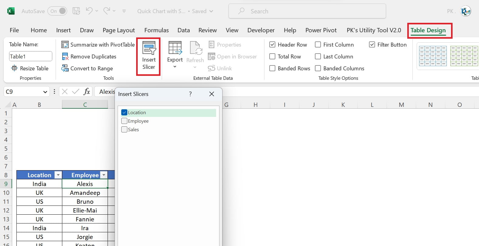
Add a Location slicer
Next, we will add a slicer for the Location column. This slicer will filter the data by location. To add a slicer, we can click anywhere on the table and go to the Table Design tab in the ribbon. From there, we can select the Insert Slicer option and choose the columns we want to use for the slicer. In this case, we will choose the Location column.
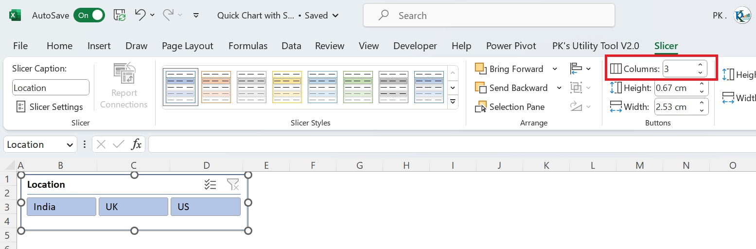
After inserting the slicer, take the 3 columns in the slicer tab on Excel Ribbon. It is just because we have 3 locations. Now, Resize the slicer and keep it above the Excel table.
Add the Bar Chart
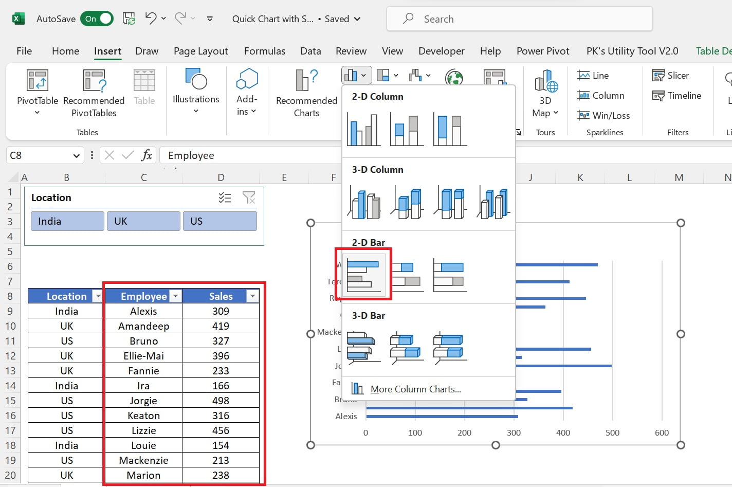
Now, we have our dataset and slicer set up. So, it is time to create the chart. For this example, we will create a 2D bar chart showing sales by employee for each location.
- To create the chart, follow the below steps-
- Select the Employee and Sales columns in the table and go to the Insert tab in the ribbon.
- Click on the 2D Bar Chart option.
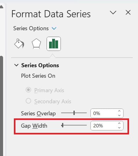
- Right-click on chart and click on the Format Data Series.
- Take the gap width as 20%.
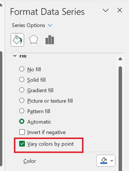
- Go to the Fill and Line. Under fill just select vary the colors by point, which will give us a more visually appealing chart.
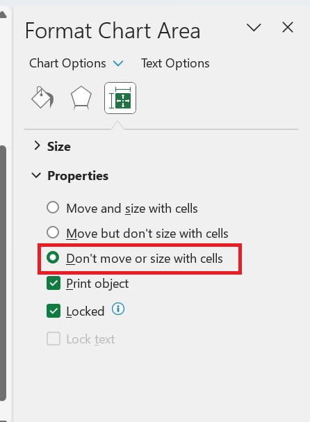
- Right-click on the chart area and click on Format Chart Area.
- Go to the Size and Properties tab and select the option “Don’t move or size with cells”. This will ensure that the chart stays in the same position even if we resize or move the table.
Finally, we can position the chart above the table so that only the chart is visible, and the table is hidden behind it. This will give us a cleaner and more focused view of the data.
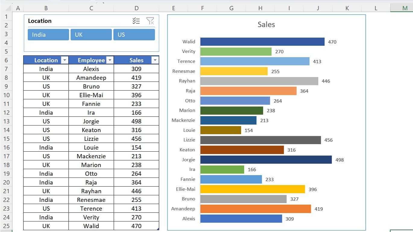
Quick Dynamic Sales by Employees chart with Slicers in Excel Use the Location slicer
Click to buy Quick Dynamic Sales by Employees chart with Slicer in Excel
Now we have our chart set up, we can use the Location slicer to filter the data by location. By selecting a specific location from the slicer, we can see the sales data for that location only, making it easier to analyze the data by location and identify any patterns or trends.
Advantages of Quick Dynamic Sales by Employees chart with Slicers in Excel
The Quick Dynamic Sales by Employees chart with Slicers in Excel has several advantages for businesses and organizations looking to visualize their sales data in a meaningful and efficient way.
Below are the few key advantages of this chart-
Easy to create:
In few clicks, you can convert their sales data into an Excel table and add a location slicer and bar chart. This makes it a quick and straightforward way to create a dynamic sales chart without the need for technical expertise.
Dynamic and interactive:
The location slicer allows you to filter the data by location. It makes the chart dynamic and interactive. This means you can quickly see how employees are performing in different locations.
User-friendly:
The chart is very user-friendly, with clear visual cues which make it easy to interpret the data. The use of a bar chart allows you to compare sales figures between employees for selected location.
Customizable:
While the chart is set up to display sales data by employee and location, it can be customized to display other data sets or include additional features such as trend lines or data labels. This allows users to tailor the chart to their specific needs and preferences.
Customizable:
We have set up this chart to display sales data by employee, however, you can customize it to display other data sets also.
Conclusion
In conclusion, the Quick Dynamic Sales by Employees chart with Slicers in Excel is a very useful tool for everyone who is looking to visualize their sales data in a dynamic and interactive way. By using a location slicer and a bar chart, you can quickly filter and display their sales data by employee for selected location. The chart is easy to create, customizable, and user-friendly, making it a valuable asset for businesses and organizations of all sizes. Overall, the Quick Dynamic Sales by Employees chart with Slicers in Excel is an effective way to support data-driven decision making and improve sales strategies.
Visit our YouTube channel to learn step-by-step video tutorials
Watch the step-by-step video tutorial:
Click to buy Quick Dynamic Sales by Employees chart with Slicer in Excel