Excel is not just a tool for crunching numbers; it’s a powerful instrument for visual storytelling. In this guide, we’ll explore how to Convert your boring bar chart into Stylish charts using Excel. Say goodbye to mundane bar charts and hello to dynamic, informative infographics.
Understanding the Basics: Types of Charts
Stacked Bar and Column Charts
Before diving into creating stylish and good looking charts, it’s essential to understand the foundational elements. Stacked bar and column charts are excellent for showcasing different segments of data in a single bar or column. They provide a clear visual representation of individual team members’ attendance in relation to the whole team.
The Power of a Bar Chart
A bar chart in Excel is a versatile tool. It can effectively communicate data trends and comparisons. When used creatively, bar charts can turn dull numbers into compelling stories.
Steps to Create a Graph in Excel
Follow the below steps to create the stylish Attendance chart:
- Select Your Data: Highlight the attendance data you want to visualize.
- Insert Chart: Navigate to the ‘Insert’ tab and choose either a stacked bar chart or column chart.
- Customize Your Chart: Add titles, adjust colors, and tweak settings to make your chart informative and visually appealing.
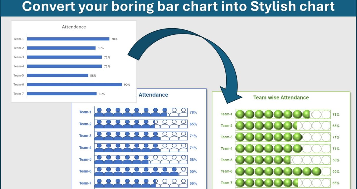
Convert your boring bar chart into Stylish charts
we have create below given 2 chart in excel to show the Team wise attendance:
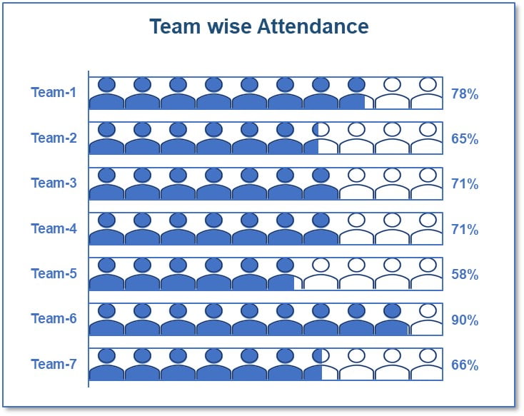
1- Team wise attendance with User icon
Click to buy Convert your boring bar chart into Stylish charts
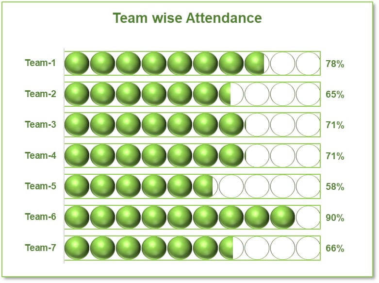
2-Team wise attendance with Solid Circle icon
Click to buy Convert your boring bar chart into Stylish charts
Need this ready made chart click on below purchase button-
Click to buy Convert your boring bar chart into Stylish charts
Visit our YouTube channel to learn step-by-step video tutorials
Watch the below given video to learn more how to create these charts:
Advantages of Stylish Attendance Charts
- Enhanced Data Comprehension: Visually appealing charts make understanding data easier and more intuitive.
- Increased Engagement: A well-designed chart can capture attention and convey information effectively.
- Better Decision Making: Clear visual representations of data aid in making informed decisions.
Opportunities for Improvement in Chart Design
While Excel offers a range of default chart designs, there’s always room for improvement:
- Incorporate Icons and Shapes: As mentioned in the provided content, using icons and shapes can elevate the visual impact of your charts.
- Experiment with Colors: Choose a color scheme that aligns with your branding or the theme of your presentation.
Best Practices for Building Charts in Excel
- Keep It Simple: Avoid cluttering your chart with too much information.
- Consistency in Design: Use a consistent color scheme and style for a professional look.
- Use Data Labels Wisely: Labels should enhance, not overwhelm, your chart.
Conclusion
You can use these charts in your business dashboard or in daily report. You can use these charts in place the boring bar charts.
Click to buy Convert your boring bar chart into Stylish charts