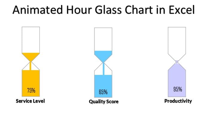
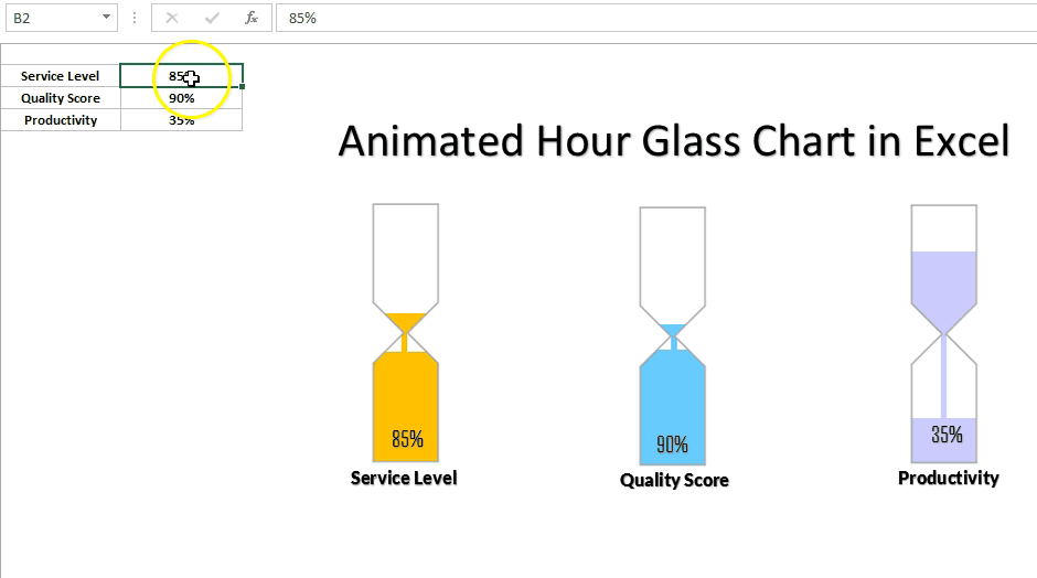
Animated Hour Glass Chart in Excel has been designed to display the KPI metrics like – Service Level, Quality Score, and Productivity etc. Whenever the value of metric will be changes it will show an animation like below given image.
Animated Hour Glass Chart in Excel
We have put the below given code on Worksheet Change event to show the animation
Option Explicit

Private Sub Worksheet_Change(ByVal Target As Range)

Dim i As Integer

If Target.Address = "$B$2" Then

       For i = 0 To Int(Target.Value * 100)

       VBA.DoEvents

        ActiveSheet.Range("N1").Value = i / 100

    Next i

       ActiveSheet.Range("N1").Value = Target.Value

   End If

If Target.Address = "$B$3" Then

       For i = 0 To Int(Target.Value * 100)

    VBA.DoEvents

        ActiveSheet.Range("N2").Value = i / 100

    Next i

    ActiveSheet.Range("N2").Value = Target.Value

   End If

If Target.Address = "$B$4" Then

       For i = 0 To Int(Target.Value * 100)

    VBA.DoEvents

        ActiveSheet.Range("N3").Value = i / 100

    Next i

    ActiveSheet.Range("N3").Value = Target.Value

   End If

End Sub
Visit our YouTube channel to learn step-by-step video tutorials
Watch the Video tutorial of Animated Hour Glass Chart
Click to buy Info-graphics Animated Hour Glass Chart in Excel