Excel is a widely used tool for businesses and individuals for data analysis, tracking, and visualization. Excel Dashboard is an effective way to present complex data in a simplified manner, providing quick and easy insights. It helps businesses to make data-driven decisions. It provides a snapshot of key performance indicators (KPIs) in one place. In this article, we will discuss the One Pager KPI dashboard in Excel, its advantages, and its features.
Click to buy One Pager KPI dashboard in Excel
Advantages of Excel Dashboard
Excel Dashboard has several advantages as given below:
- It provides a consolidated view of multiple metrics, making it easy to analyze and track key business KPIs.
- Excel Dashboard allows users to quickly identify trends, patterns, and anomalies, saving time and resources.
- It is highly customizable, allowing users to change the data range, format, and layout of the dashboard as per the requirements.
- Excel Dashboard can be easily shared, updated, and accessed across multiple platforms, making it a highly versatile tool.
Key features of “One Pager KPI Dashboard in Excel”
The One Pager KPI Dashboard in Excel is an excellent tool for businesses to track their key performance indicators on a single page. There are three sheet tabs in this dashboard – Data Sheet, Support Sheet, and Dashboard Sheet.
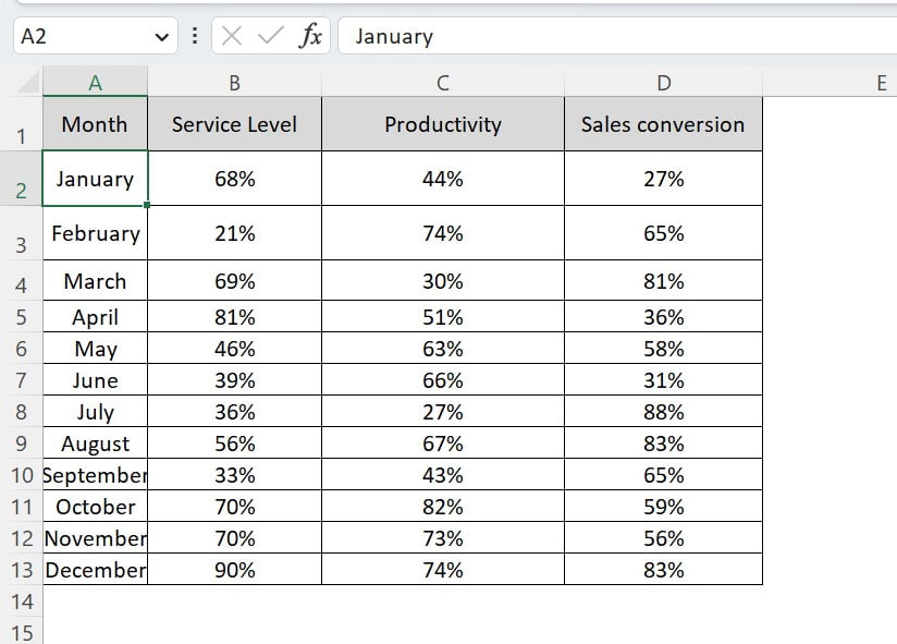
Data Sheet Tab:
Click to buy One Pager KPI dashboard in Excel
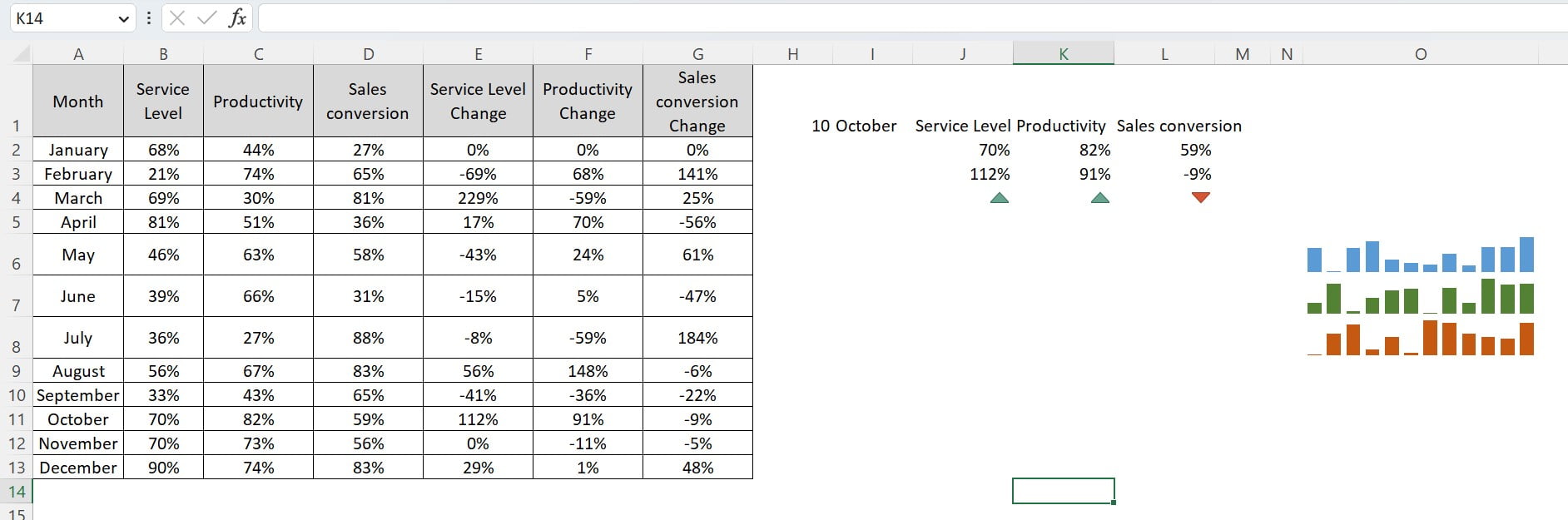
The Data Sheet Tab contains three key KPIs – Service Level%, Productivity%, and Sales Conversion%. It displays the trend of these KPIs, along with the percentage changes from the previous month. This tab is the foundation of the dashboard, and all the data required for the dashboard is a in this tab.
Support Sheet Tab:
The Support Sheet Tab calculates the Month on Month Service Level Change%, Productivity Change%, and Sales Conversion Change%. We will use it to link the KPI values in the textbox and percentage change visuals in the dashboard sheet.
Click to buy One Pager KPI dashboard in Excel
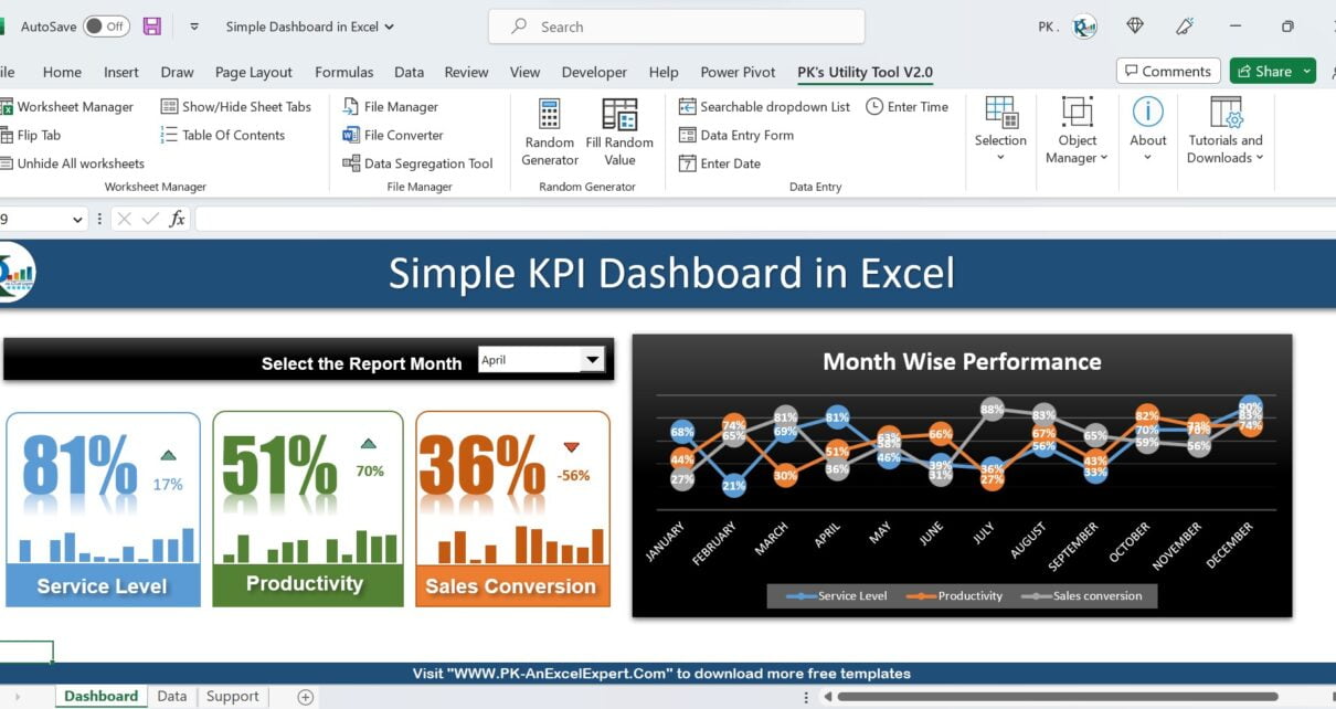
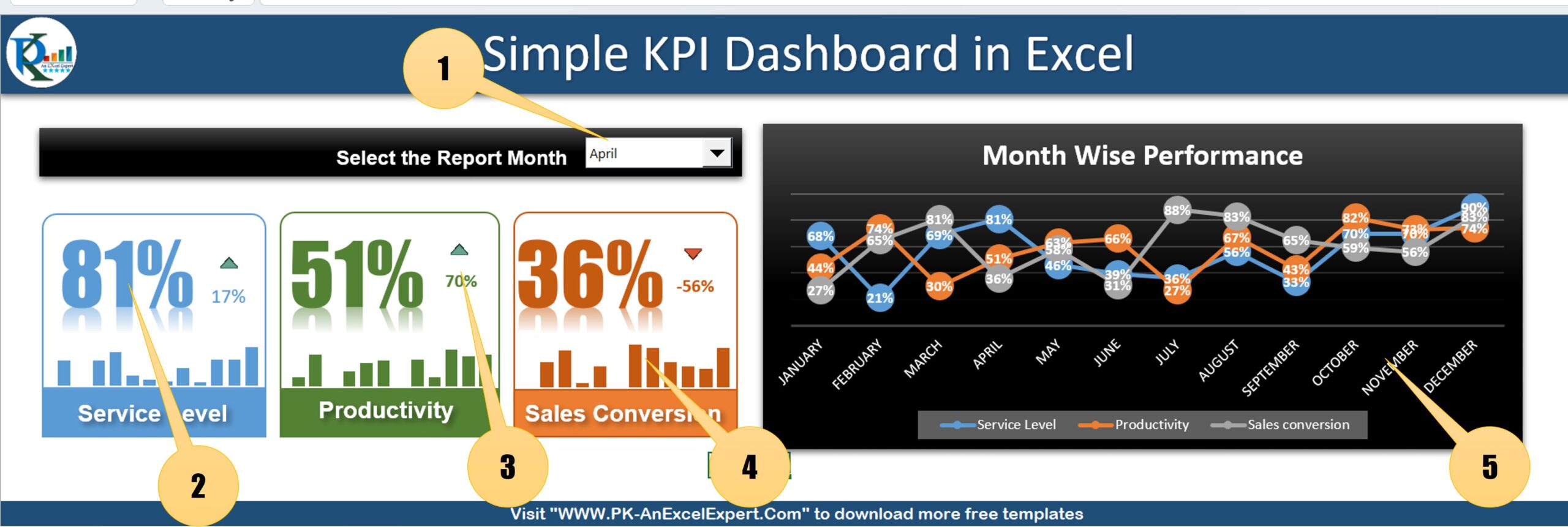
Dashboard Sheet Tab:
The Dashboard Sheet Tab is the final and most important tab of the One Pager KPI Dashboard in Excel. It consists of multiple small visuals that display the KPIs in an attractive and informative way.
Click to buy One Pager KPI dashboard in Excel
The Dashboard Sheet Tab contains:
Click to buy One Pager KPI dashboard in Excel
1- Combo box for Report Month:
On the top, there is a form control combobox that allows the user to select the report month. As the user selects the month, all related visuals will change accordingly.
2- Textbox with Linking text:
The textbox displays the Service Level, Productivity, and Sales Conversion values. We have linked them from the Support Sheet Tab. we have formatted values beautifully.
3- Percentage change with up/down arrow:
The small textbox displays the percentage change from the previous month, along with an up arrow in green color for a positive change and a down arrow in red color for a negative change.
4- Sparklines:
For each KPI, we are using the sparklines to show the 12-month trend. It provides a quick insight into the KPI’s monthly performance.
5- Monthly trend chart:
A separate line chart is used to show the monthly trend for Service Level%, Productivity%, and Sales Conversion%. The chart is beautifully formatted, making it easy to read and understand.
Conclusion
Excel Dashboard is an excellent tool for businesses to track their KPIs and make data-driven decisions. The One Pager KPI Dashboard in Excel is an attractive and informative dashboard that provides quick insights into key business metrics. We have created detailed tutorial videos for this dashboard in two parts, which can be easily accessed on YouTube. By following these videos, anyone can create this beautiful dashboard in Microsoft Excel and enhance their data analysis capabilities.
Visit our YouTube channel to learn step-by-step video tutorials
Watch the step-by-step video tutorial serios to learn this dashboard:
Click to buy One Pager KPI dashboard in Excel