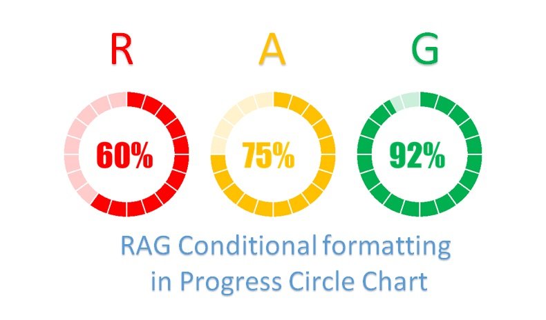
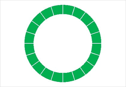
In this article you will learn how to put RAG (Red, Amber and Green) conditional formatting in Progress Circle Chart in Excel. Progress Circle Chart is a beautiful circle chart which can be used to display KPI metrics. Color of the Progress Circle chart will be changed as Red, Amber and Green according to the value of metric.
RAG Conditional Formatting in Progress Circle Chart
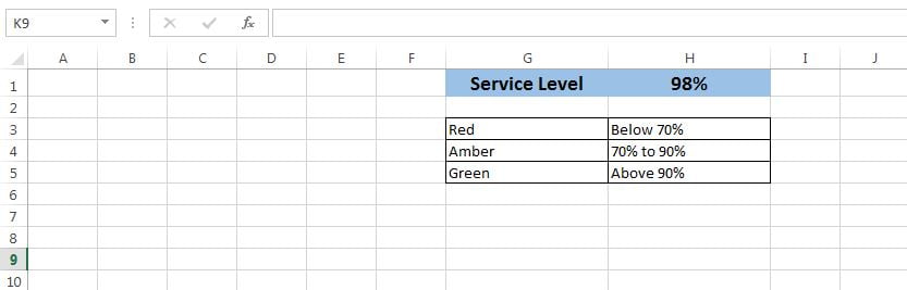
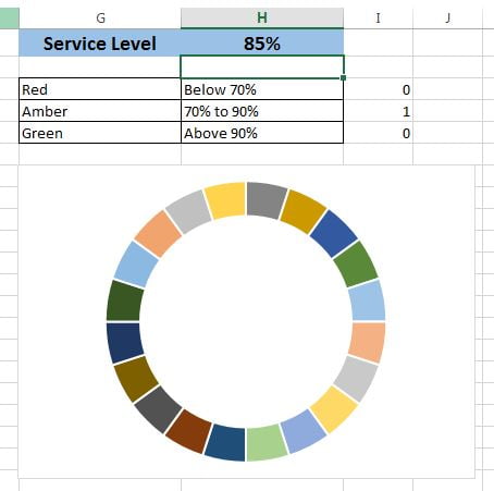
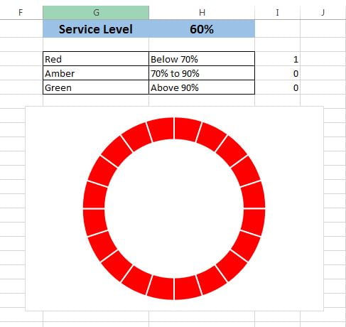
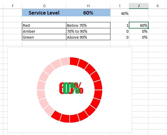
Below is the screenshot of Service Level value and color range for Progress Circle Chart.
Steps for create a RAG Progress Circle Chart for above given data:
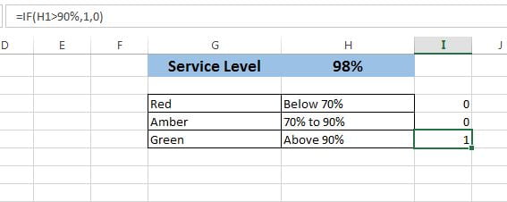
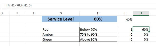
- Put the formula “=IF(H1<70%,1,0)” in cell “I3“.
- Put the formula “=IF(AND(H1>=70%,H1<=90%),1,0)” in cell “I4“.
- Put the formula “=IF(H1>90%,1,0)” in “I5“.
Click to buy RAG Conditional Formatting in Progress Circle Chart
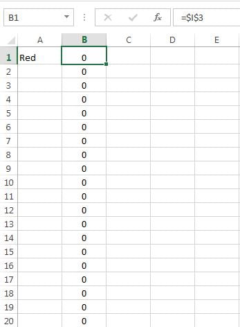
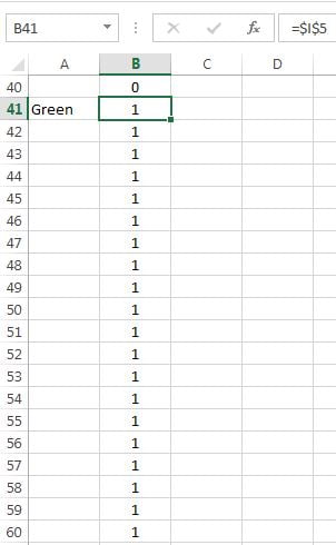
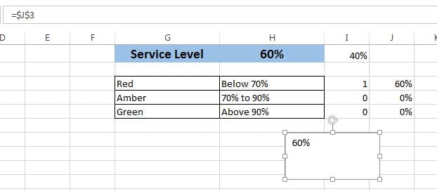
- Put the formula “=$I$3” in cell “B1“.
- Fill this formula down till “B20“.
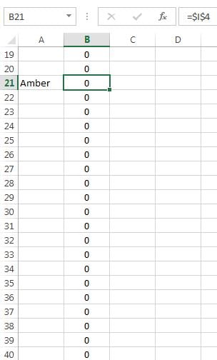
- Put the formula “=$I$4” in cell “B21“.
- Fill this formula down till “B40“.
- Put the formula “=$I$5” in cell “B41“.
- Fill this formula down till “B60“.
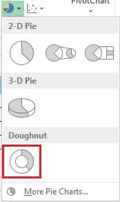
- Select the Range “B1:B60“.
- Go to Insert tab>>Charts>>Insert Doughnut Chart.
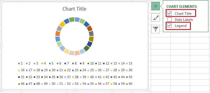
- After inserting the Doughnut Chart successfully, remove Chart Title and Legend.
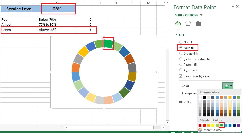
- Double click on any of the slice of doughnut, so that it could be selected.
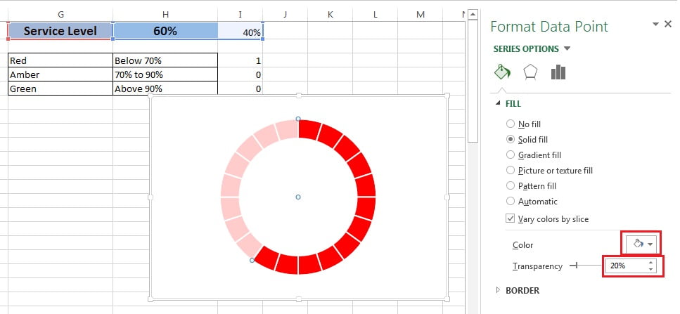
- Go to the Format Data Points window take the solid fill.
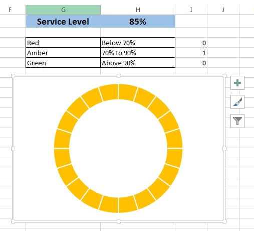
- In the below Image filling the Green color because actual Service Level is above 90%.
- Select the another slice and press F4 to repeat the action. Another slice color will be green. Fill all the slices as Green.
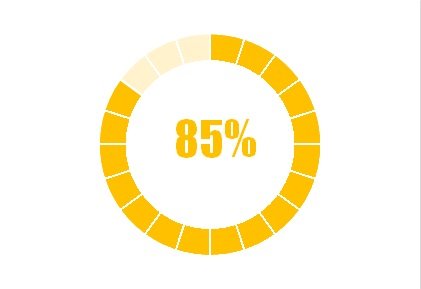
- Now change the Service Level Value as 85% so that it will be in Amber color range.
- Double click on any of the slice of doughnut, so that it could be selected.
- Go to the Format Data Points window take the solid fill and fill the Amber color.
- Repeat this action for all the slices.
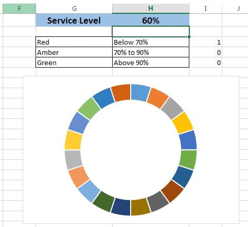
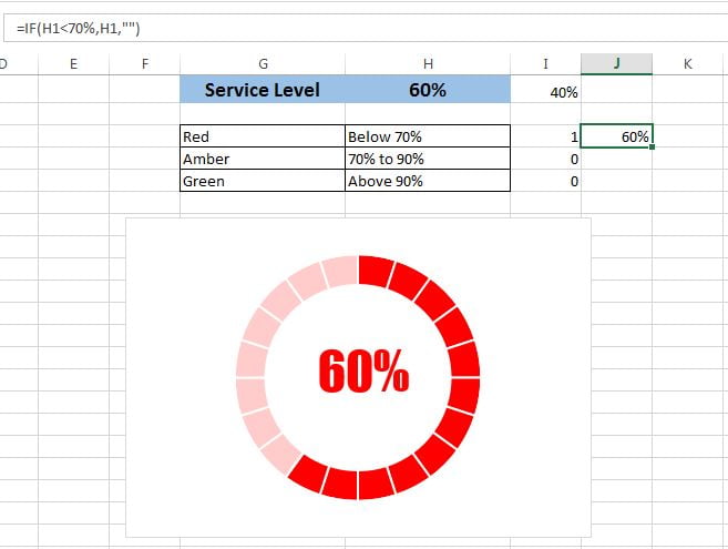
- Now change the Service Level Value as 60% so that it will be in Red color range.
- Double click on any of the slice of doughnut, so that it could be selected.
- Go to the Format Data Points window take the solid fill and fill the Red color.
- Repeat this action for all the slices.
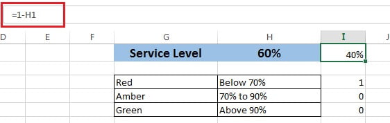
- Put the formula “=1-H1” on cell “I1“.
- Right click on the doughnut can click on Select Data.
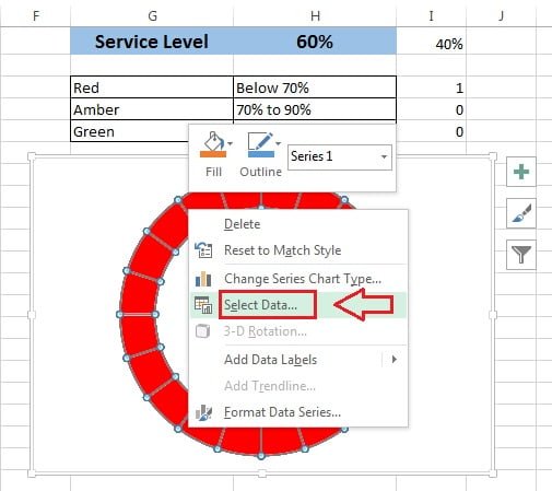
- In Select Data Source window click on Add button to add a new series.
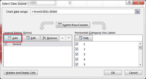
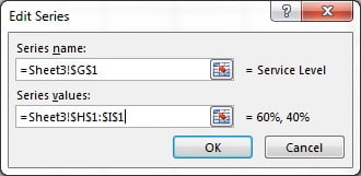
- Edit Series window will be opened.
- Give Series name “=Sheet3!$G$1“
- Give Series value “=Sheet3!$H$1:$I$1“
- Click on OK.
- A new doughnut (outside of previous doughnut) will be created.
- Right click on new doughnut and click on Change Series Chart Type.
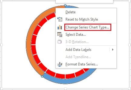
- Change Series Chart Type window will be opened.
- Change the Service Level series chart type as Pie.
- Tick the Service Level series Secondary Axis check box.
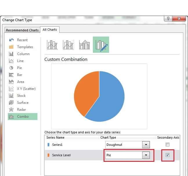
- Now there will be a Pie Chart over the doughnut chart.
- Select the blue slice of Pie chart and fill it as No fill.
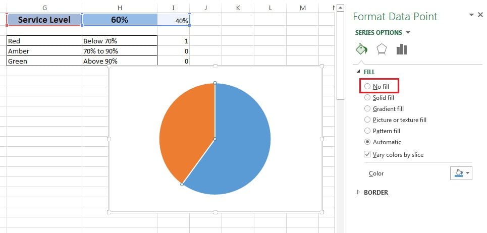
- Select the orange slice and fill it as Solid fill with White color.
- Give the Transparency as 20%.
Click to buy RAG Conditional Formatting in Progress Circle Chart
- Put the formula “=IF(H1<70%,H1,0)” in cell “J3“.
- Put the formula “=IF(AND(H1>=70%,H1<=90%),H1,0)” in cell “J4“.
- Put the formula “=IF(H1>90%,H1,0)” in “J5“.
- Go to the Insert tab and insert a Text Box.
- Select the text box.
- Go to formula bar and click on cell “J3“
- Text box will be linked with cell “J3“.
Format the Text box
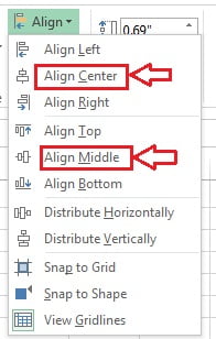
- Take the horizontal alignment as center.
- Take the vertical alignment as middle.
- Take the shape fill as No fill.
- Take shape outline as No outline.
- Font Name as “Impact“
- Font size as “35“
- Font color as “Red” because Service Level value is below 70%.
- Insert the two more text boxes and link them with cell “J4” and “J5“
- Take the same formatting for new text boxes.
- Change the color of text box as Amber which is connect with cell “J4“.
- Change the color of text box as Green which is connect with cell “J5“.
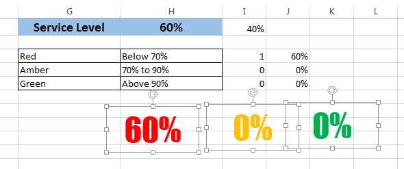
- Select the all of three text boxes together.
- Go to Format tab and Align them Center and Middle.
Click to buy RAG Conditional Formatting in Progress Circle Chart
- Keep the text boxes in the middle of the doughnut.
- Change the formula “=IF(H1<70%,H1,””)” in cell “J3“.
- Change the formula “=IF(AND(H1>=70%,H1<=90%),H1,””)” in cell “J4“.
- Change the formula “=IF(H1>90%,H1,””)” in “J5“.
Click to buy RAG Conditional Formatting in Progress Circle Chart
Our Progress Circle Chart with RAG Conditional formatting is ready and It will look like below image.
Click to buy RAG Conditional Formatting in Progress Circle Chart
Visit our YouTube channel to learn step-by-step video tutorials
Watch the Video Tutorial for this chart
Click to buy RAG Conditional Formatting in Progress Circle Chart