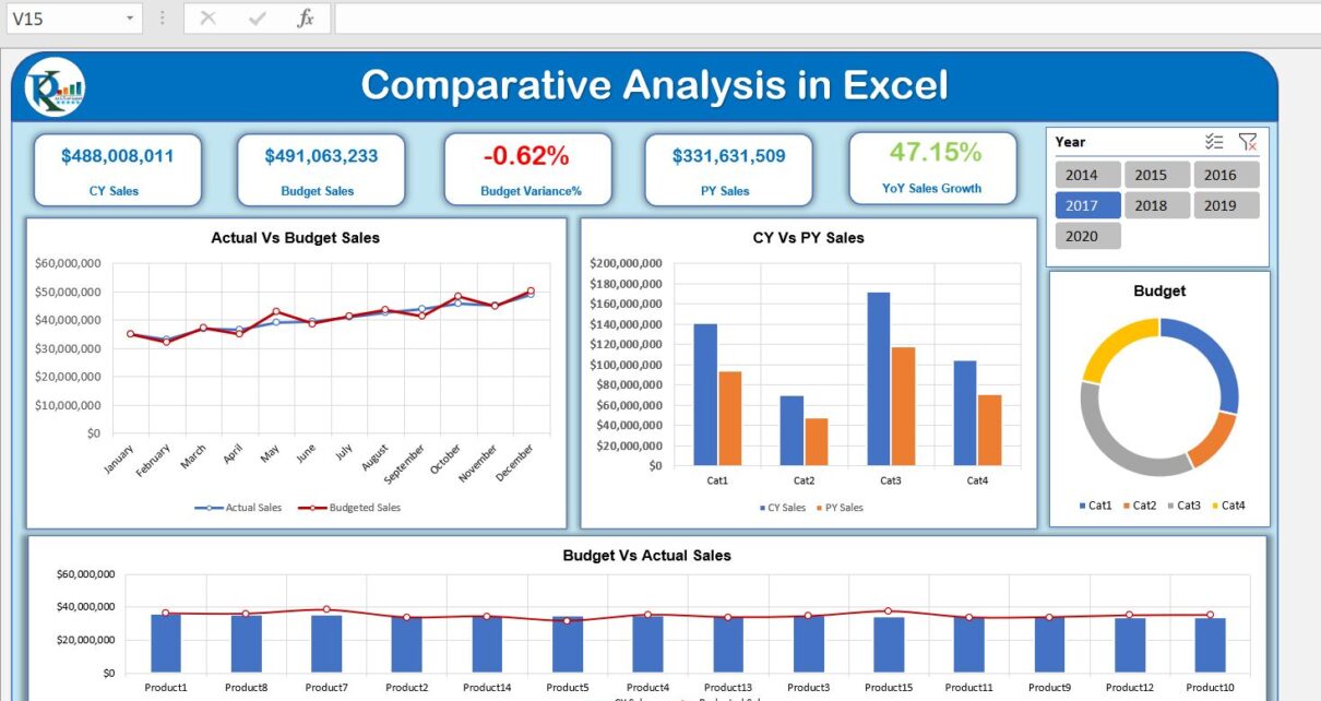
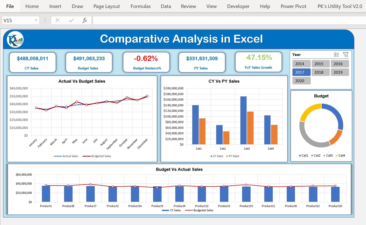
This is the Excel version of the Comparative Analysis Dashboard. We have used Power Pivot to create this dashboard.
We have used Current Year Sales Vs Previous Year Same Period Sales using the DAX functions in Power Pivot. We have also created Sales Vs Budget Variance on the dashboard.
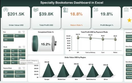
Click to buy Comparative Analysis Dashboard in Excel
Learn how to create Comparative Analysis Dashboard in Microsoft Power BI
Click to buy Comparative Analysis Dashboard in Excel
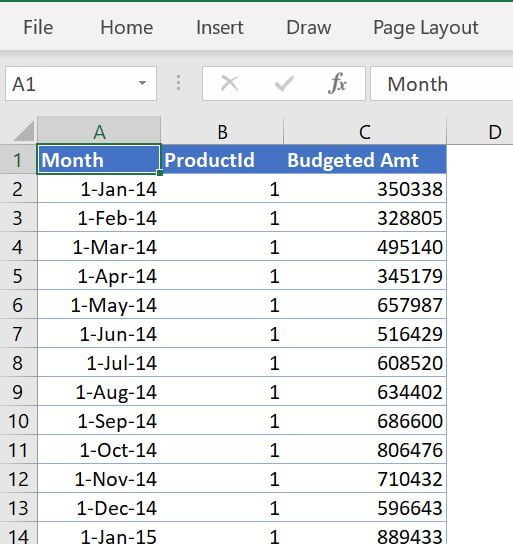
We have used 3 Excel Tables to create this dashboard using Power Pivot
1.Budget Table:
In this table, we have 3 columns – Month, ProductID, and Budgeted Amt
Click to buy Comparative Analysis Dashboard in Excel
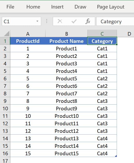
2.Product Master Table:
In the Product Master table we have 3 columns – ProductId, Product Name, and Category.
Click to buy Comparative Analysis Dashboard in Excel
3.Sales Table:
In this Table, We have 3 columns – Date, ProductId, and Sale Amount

Click to buy Comparative Analysis Dashboard in Excel
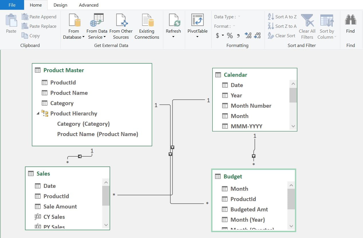
Below is the Data Model diagram for this dashboard:
Click to buy Comparative Analysis Dashboard in Excel
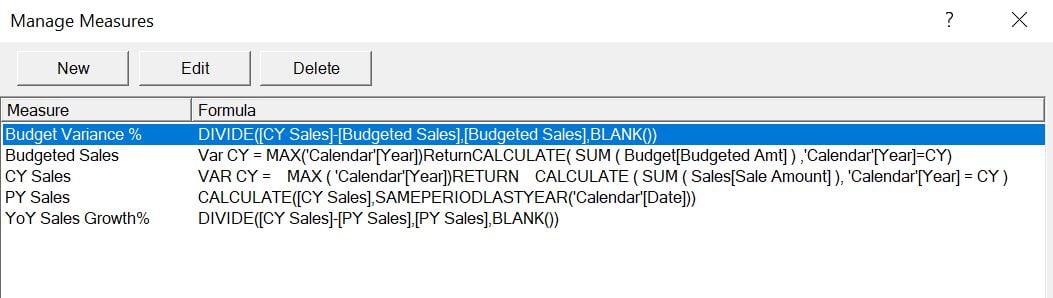
We have used the below 5 measures for this dashboard using DAX.
Click to buy Comparative Analysis Dashboard in Excel
Visit our YouTube channel to learn step-by-step video tutorials
Watch the step by step video tutorial:
Click to buy Comparative Analysis Dashboard in Excel