Home>Blogs>Charts and Visualization>Dynamic Comparison in Butterfly Chart
Dynamic Comparison in Butterfly Chart
Charts and Visualization

Dynamic Comparison in Butterfly Chart

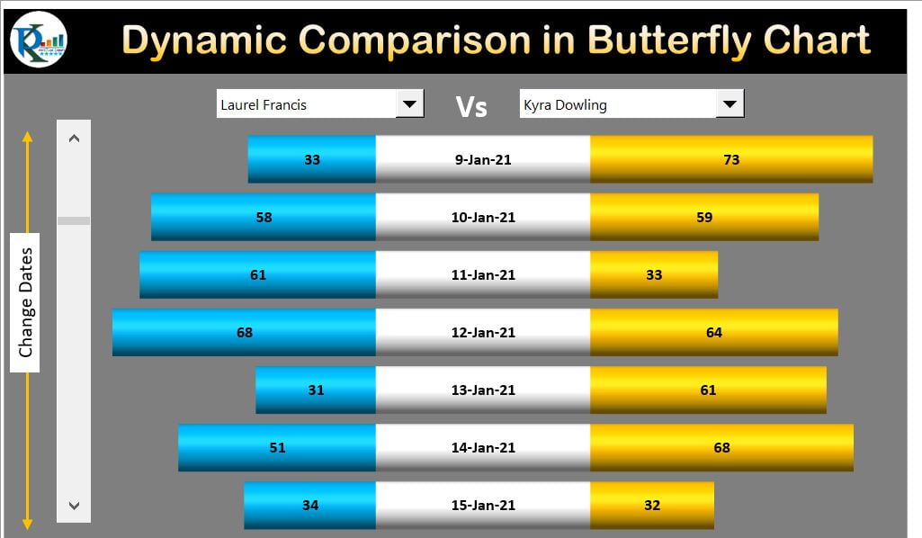
Dynamic Comparison in Butterfly Chart is useful when you want to compare the Sales or any other parameter for two employees or two Teams for multiple dates. We have used Form Control Combo boxes to select the Employee name to compare the Sales. To make the dynamic and rolling dates, we have used Form Control Scroll Bar.

Learn Comparative Analysis Dashboard in Excel

Learn Sales Dashboard in Excel

Below is the beautiful Dynamic Comparison in Butterfly Chart

Dynamic Comparison in Butterfly Chart


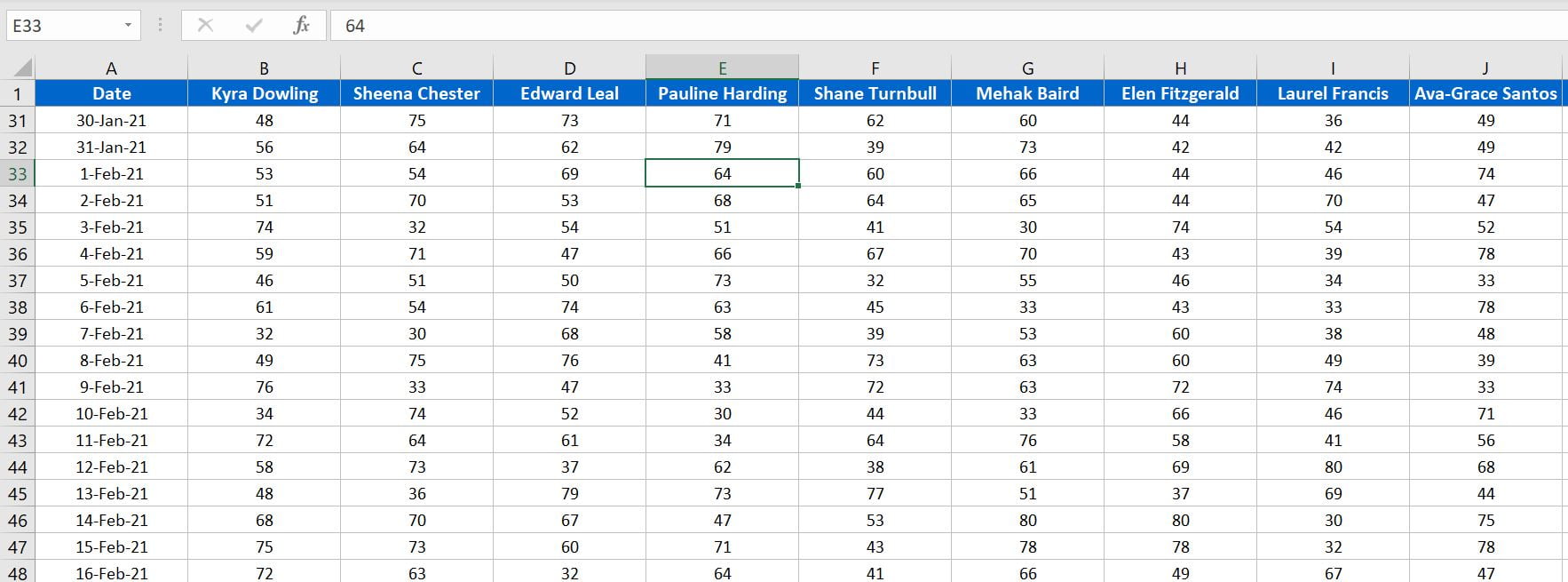
Below is the Sales data by employee and by dates which we have used to create this chart-


Sales Data by Employee and by dates

Watch the step by step video tutorial:

Click here to download the practice file.

PK
Meet PK, the founder of PK-AnExcelExpert.com! With over 15 years of experience in Data Visualization, Excel Automation, and dashboard creation. PK is a Microsoft Certified Professional who has a passion for all things in Excel. PK loves to explore new and innovative ways to use Excel and is always eager to share his knowledge with others. With an eye for detail and a commitment to excellence, PK has become a go-to expert in the world of Excel. Whether you're looking to create stunning visualizations or streamline your workflow with automation, PK has the skills and expertise to help you succeed. Join the many satisfied clients who have benefited from PK's services and see how he can take your Excel skills to the next level!
https://www.pk-anexcelexpert.com