Excel is a powerful tool that provides a wide range of features to help you analyze and present data effectively. One of the most key features in Excel is the charting tool, which allows you to create charts that help you visualize your data in a clear and concise manner. cross-filter functionality, which can make your charts even more powerful and useful. In this blog, we will explore the cross-filter functionality in Excel charts and show you how to use it to your advantage.
What is Cross Filter Functionality in Excel Charts?
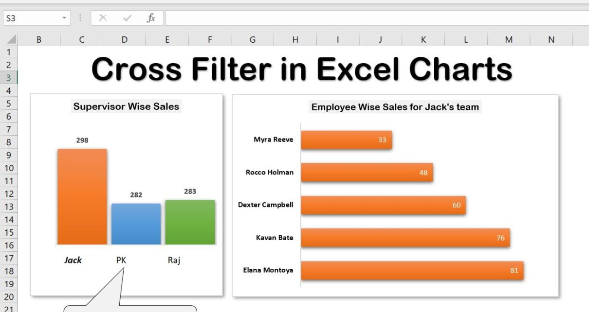
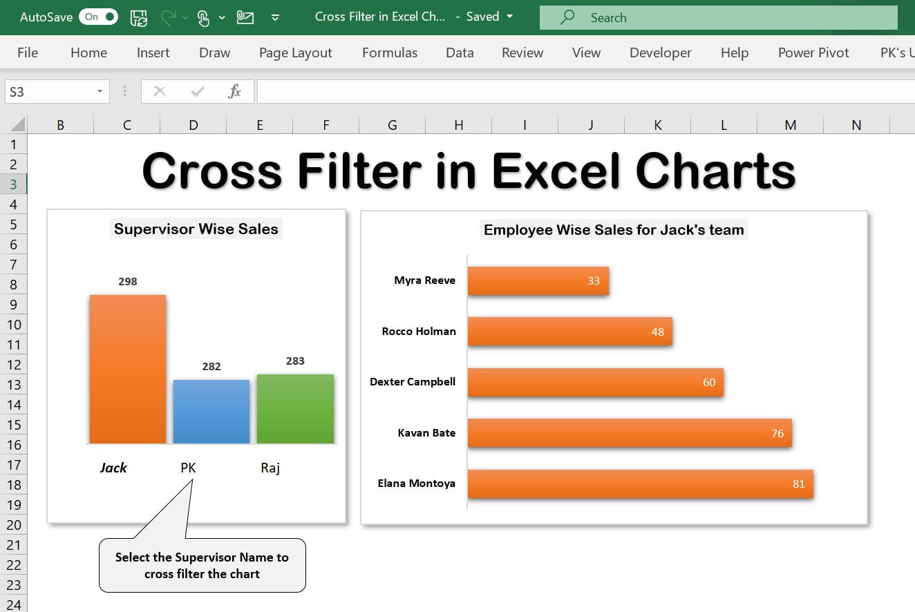
Cross-filter in Excel charts links two or more charts, allowing filtered data in one chart to filter the other. This helps understand the relationship between data in different charts. When multiple charts show various aspects of the same data, it is extremely useful.
Click to buy Cross Filter Functionality in Excel Chart
How to Use Cross Filter Functionality in Excel Charts?
we have used a slicer trick to use the cross-filter functionality of Excel Charts. We have created 2 Pivot Charts – one is Supervisor Wise Sales another is Employee Wise Sales.
We have used Slicer with Custom Style in place of the horizontal axis of the Supervisor-wise Sales chart.
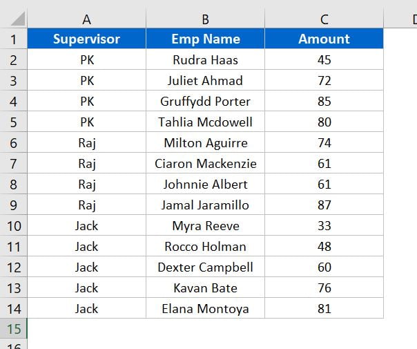
Below is the data which we have used to create this chart-
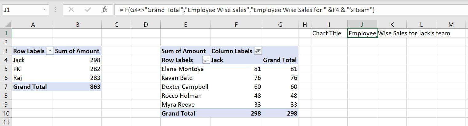
Below is the Support sheet wherein we have created Pivot Tables and Dynamic Chart Title.
Visit our YouTube channel to learn step-by-step video tutorials
Please watch the below given step by step video tutorial to learn it-
Click to buy Cross Filter Functionality in Excel Chart