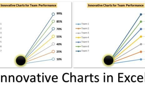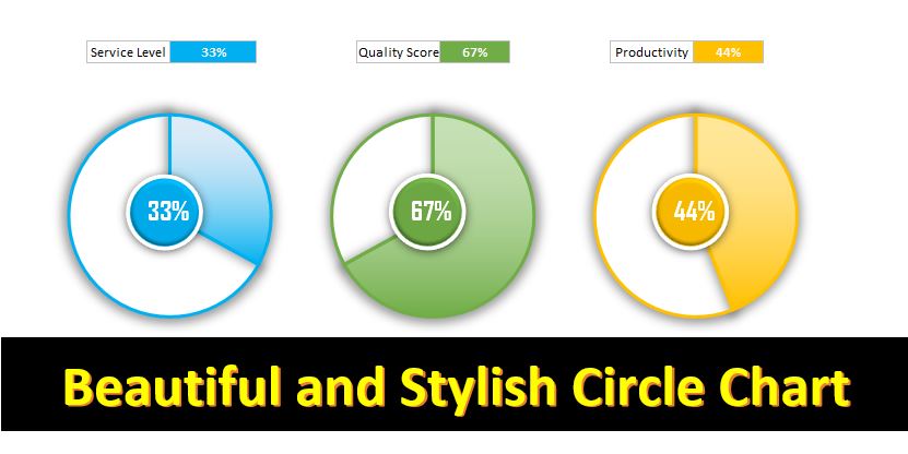
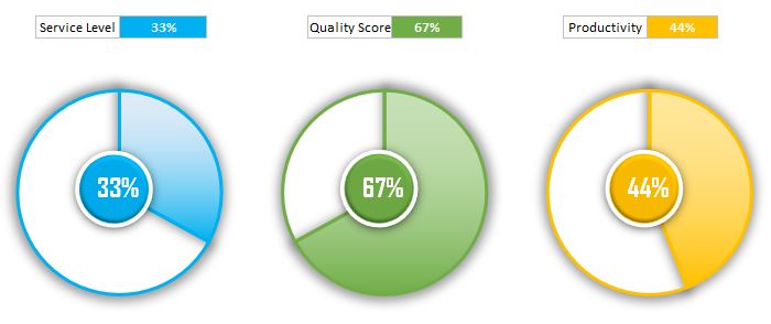
In today’s data-driven world, visualization of data is an essential aspect of decision-making. Excel is a powerful tool which can help you to create beautiful and effective visualizations for your data. One of the most popular chart types is a Pie chart and Doughnut Chart, which is used to show the proportion of different categories in a dataset. In this article, we will talk about how to create a beautiful and stylish Circle Chart in Excel that can display KPI metrics such as Service Level, Quality Score or Productivity.
Data Points:
Before we get started with creating the Circle Chart, we need to understand the data points required to create it. There are two data points needed:
Service Level Value:
The Service Level Value is the percentage value that we want to display on the chart. For example, if the Service Level Value is 75%, then we want to show 75% of the chart filled with a color that represents this value.
Blank Value:
The Blank Value is the remainder of the chart that is not filled with the Service Level Value. In our example, the Blank Value will be (100%-75%) = 25%.
Creating the Pie Chart:
The first step in creating a Circle Chart is to create a Pie Chart.
Below are the steps –
- Select the data range which includes both the Service Level Value and the Blank Value.
- Go to the Insert tab on the Excel ribbon, select the Pie Chart option from the Charts group.
- The Pie Chart will appear on your worksheet. Right click on this chart and click the Format Data Series.
- In the Format Data Series pane, select the Fill & Line option. Under Fill, select the Gradient Fill option.
- Choose a color for the gradient fill which represents the Service Level Value. You can take any color according to your requirements.
- For the Blank Value, select No Fill under the Fill option.
Creating the Oval:
Finally, we have created the Pie Chart. Now, we need to create an Oval shape to make it look like a Circle Chart.
Below are the steps to adding the Oval shape over the chart-
- Go to the Insert tab on the Excel ribbon, select the Shapes option from the Illustrations group.
- Select the Oval shape from the Basic Shapes section.
- Draw the Oval shape over the Doughnut Chart.
- Select the Oval shape and go to the Format tab on the Excel ribbon. Take the Shape Fill option and choose No Fill.
- Select the Shape Outline option and choose a color that represents your theme. We suggest using blue color for the outline.
Adding Small Oval for Data Label:
The ultimate step in creating the Circle Chart is to add a small Oval shape for the Data Label.
Below are the steps-
- Go to the Insert tab on the Excel ribbon, select the Shapes option from the Illustrations group.
- Select the Oval shape from the Basic Shapes section.
- Draw a small Oval shape near the center of the Doughnut Chart.
- Select the small Oval shape and go to the Format tab on the Excel ribbon. Select the Shape Fill option and choose the same color that you used for the gradient fill in the Doughnut Chart.
- Add a text box to the small Oval shape by going to the Insert tab on the Excel ribbon and selecting the Text Box option from the Text group.
- Type in the Service Level Value in the text box. You can connect the text box with the Service Level Value by referencing in the formula bar “=A1”. We are assuming that Service Level Value is on the cell A1.
Advantages of Stylish Circle Chart in Excel:
The Stylish Circle Chart is an effective way to display KPI metrics such as Service Level, Quality Score or Productivity.
Below are the few advantages of using a Circle Chart in Excel-
Attractive Visualization:
The Circle Chart is a visually appealing way to display data. By using colors and shapes, you can make your data more engaging and easier to understand.
Easy to Create:
The Circle Chart is easy to create in Excel. You can follow the steps as given above in this article to create a Circle Chart in just a few minutes.
Efficient Use of Space:
The Circle Chart is a great way to display data in a small space. By using a Doughnut Chart and an Oval shape, you can create a Circle Chart that takes up less space than other chart types.
Focus on Key Metrics:
The Circle Chart is an effective way to focus on key metrics such as Service Level, Quality Score or Productivity. By using the Circle Chart, you can highlight the most important metrics and make it easier for your audience to understand the data.
Customizable:
The Circle Chart is highly customizable in Excel. You can choose colors, fonts, and sizes that fit your brand or presentation theme. You can also add labels, titles, and other elements to make your chart more informative and visually appealing.
Conclusion:
The Circle Chart is a great way to display KPI metrics such as Service Level, Quality Score or Productivity in a visually appealing way. By using a Doughnut Chart and an Oval shape, you can create a Circle Chart that is easy to create, efficient in space usage, and highly customizable. With these advantages, the Circle Chart is a great addition to any dashboard or presentation that requires data visualization. Follow the steps given above in this article to create your own Stylish Circle Chart in Excel and elevate your data visualization game.
Click to buy Beautiful and Stylish Circle Chart in Excel
Visit our YouTube channel to learn step-by-step video tutorials
Watch the step-by-step video tutorial:
Click to buy Beautiful and Stylish Circle Chart in Excel