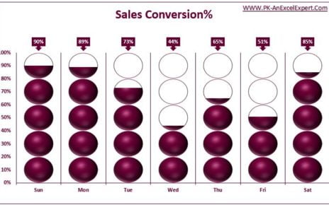
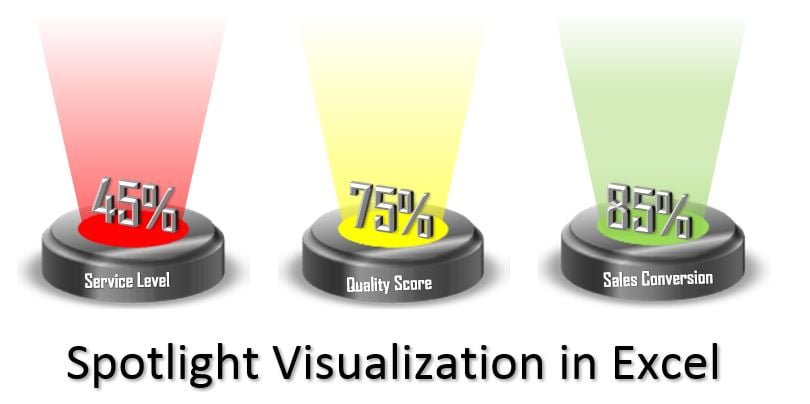
This is the first part of Spotlight visualization. Here we have used RAG (Red, Amber and Green) color code to display metric performance like – Service Level, Quality Score and Sales conversion. To create these stoplights, we have used Excel shapes and to change the color dynamically we have used Name Manager and Linked Picture here.
Spotlight Visualization in Excel (Part-1)
19
Jun 2019
12103Comments Off on Spotlight Visualization in Excel (Part-1)
PK
Meet PK, the founder of PK-AnExcelExpert.com! With over 15 years of experience in Data Visualization, Excel Automation, and dashboard creation. PK is a Microsoft Certified Professional who has a passion for all things in Excel. PK loves to explore new and innovative ways to use Excel and is always eager to share his knowledge with others. With an eye for detail and a commitment to excellence, PK has become a go-to expert in the world of Excel. Whether you're looking to create stunning visualizations or streamline your workflow with automation, PK has the skills and expertise to help you succeed. Join the many satisfied clients who have benefited from PK's services and see how he can take your Excel skills to the next level!
https://www.pk-anexcelexpert.com
Related Articles
Road and Flag infographics chart in Excel
Introduction 🌟 Welcome to our fun and informative corner! 🌟 Today, we're going to unravel the magic behind creating a
Stylish Pivot Chart with Slicer in Excel
We are back with one more stylish chart but this time we have used a pivot chart and connected it
Smart Chart with Laptop Shape in Excel
In this article, we have created a beautiful and smart chart with Conditional formatting in Microsoft Excel. We have create