Are you ready to unleash the full potential of Excel’s data analysis and visualization capabilities? Hold on tight, because we’re diving into the mysterious realm of creating a fully Fully dynamic chart in Excel with Scroll bar and Spin button.
A dynamic chart, you ask? Think of it as a chart that updates with each twist and turn of the data, keeping you one step ahead without having to manually adjust every time. But how do we make this magic happen? By harnessing the power of two deceptively simple tools: the scroll bar and spin button.
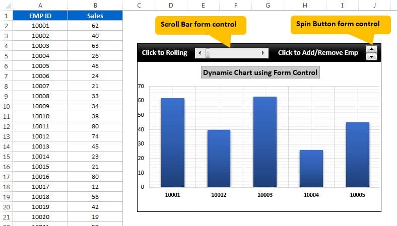
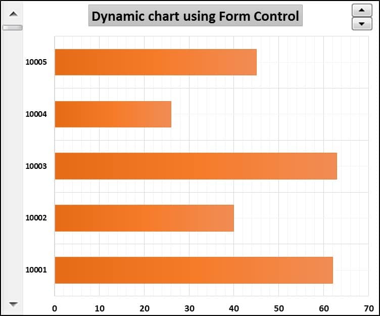
Scroll Bar
The scroll bar, a graphical wonder, gives you the ability to select a value from a range of options by sliding your thumb along a track. And in Excel, it’s used to control the range of data displayed in a chart.
Spin Button
But wait, there’s more! The spin button, another graphical gem, allows you to select a value from a range by clicking on the up or down arrows. And in Excel, it can be used to control a specific data point in the chart.
So, are you ready to create a fully dynamic chart in Excel that seamlessly integrates the scroll bar and spin button? Follow these steps and behold the magic unfold!
Fully dynamic chart in Excel with Scroll bar and Spin button
Click to buy Fully dynamic chart in Excel with Scroll bar and Spin button
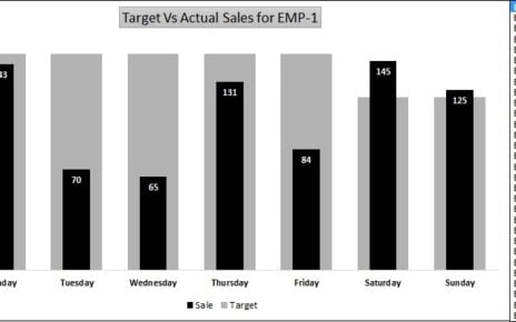
We have used this trick for Bar chart also.
Click to buy Fully dynamic chart in Excel with Scroll bar and Spin button
Visit our YouTube channel to learn step-by-step video tutorials
Watch the step-by-step video tutorial to learn it:
And so, we reach the finale of our journey into the mystical world of dynamic chart creation in Excel! By combining the intricate scroll bar and the spunky spin button, we have unlocked a formidable tool that brings data analysis and visualization to a whole new level.
Gone are the days of manual updates and tedious chart adjustments. With this technique, you now have the ability to effortlessly create charts that dynamically adapt and update with each fluctuation in your data. Imagine, with just a few clicks, you can now gain deeper insights and a clearer understanding of your data, all while saving time and streamlining your analysis process.
So, don’t hesitate, embrace the power of dynamic charts in Excel and witness the transformative effects it can have on your data analysis and visualization endeavors!
Click to buy Fully dynamic chart in Excel with Scroll bar and Spin button