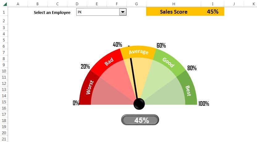
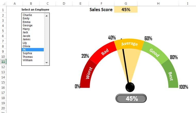
In this article, we have created a dynamic sales score meter chart. In this chart we have displayed the sales core on a speedometer chart. We have displayed the sales rating also as Worst, Bad, Average, Good and Best. To create this chart, we have used Pie and Doughnut chart combination.
Dynamic Sales Score Meter Chart
We have create two different version of this chart. In the first chart we have used a form control combo box to select the employee name. In the chart we have displayed all 5 rating colors.
Click to buy Dynamic Sales Score Meter Chart
In the second chart, we have displayed a form control listbox to select the employee name. In the chart we have displayed only related rating slide.
Click to buy Dynamic Sales Score Meter Chart
Visit our YouTube channel to learn step-by-step video tutorials
Watch the step by step video tutorial:
Click to buy Dynamic Sales Score Meter Chart