In today’s data-driven world, visualizing data through interactive dashboards has become increasingly important. Power BI is a powerful tool that allows users to create stunning dashboards for easy analysis and decision-making. In this article, we will walk you through the process of creating an elegant dashboard using the Northwind database and OData feed in Power BI. We will also discuss how to create background images for your Power BI dashboard using Microsoft PowerPoint and how to design a page navigation bar on the left side. Furthermore, we will explore the advantages of using this dashboard, frequently asked questions, and more.
Note: This dashboard has been created with the March 2020 update of Power BI.
Below is the link for Northwind Database:
https://services.odata.org/Northwind/Northwind.svc
Dashboard Pages
To begin with, we have crafted three distinct pages within the dashboard, each focusing on a different aspect of the data:
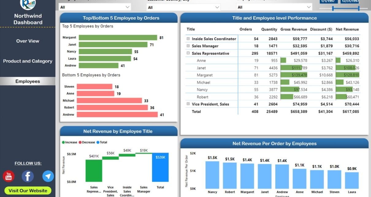
Overview Page
The Overview Page provides a snapshot of key performance indicators (KPIs) related to your business. Here, we have displayed Gross Revenue, Discount ($), Net Revenue, Orders, Quantity, and Average Days to Ship. By presenting these essential metrics at a glance, decision-makers can quickly assess the overall health of the organization.
Product and Category Page
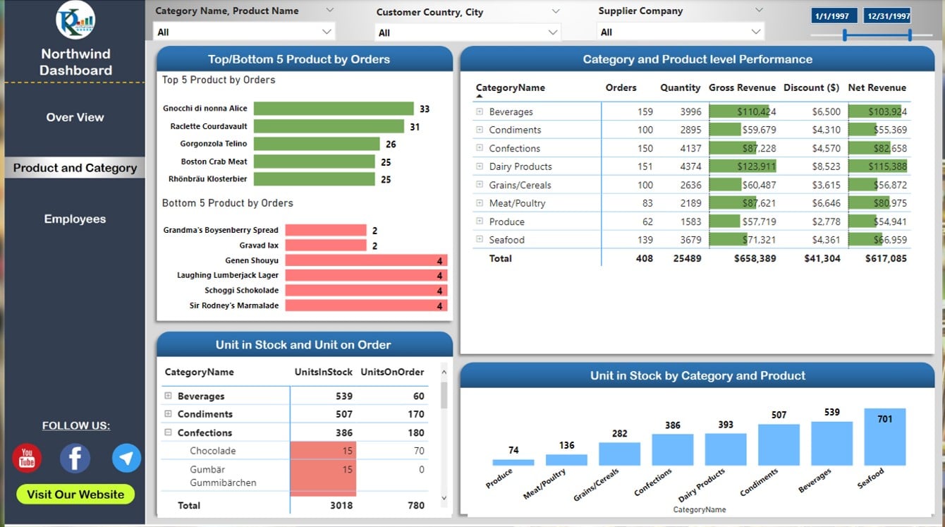
The Product and Category Page delves deeper into the performance of individual products and categories. This section showcases data on Units in Stock and Units on Order by Product and Category. By providing a more granular view, users can identify trends and patterns, which can help inform strategic decisions related to inventory management, pricing, and promotions.
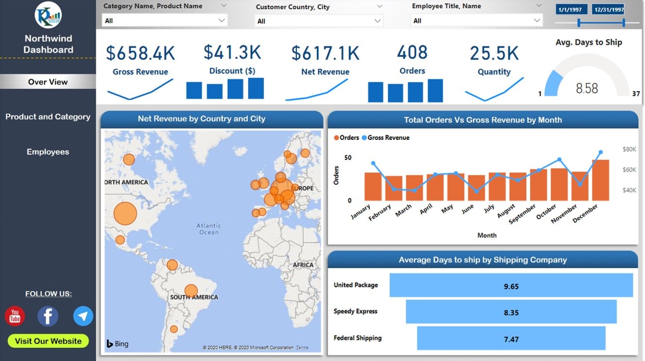
Employees Page
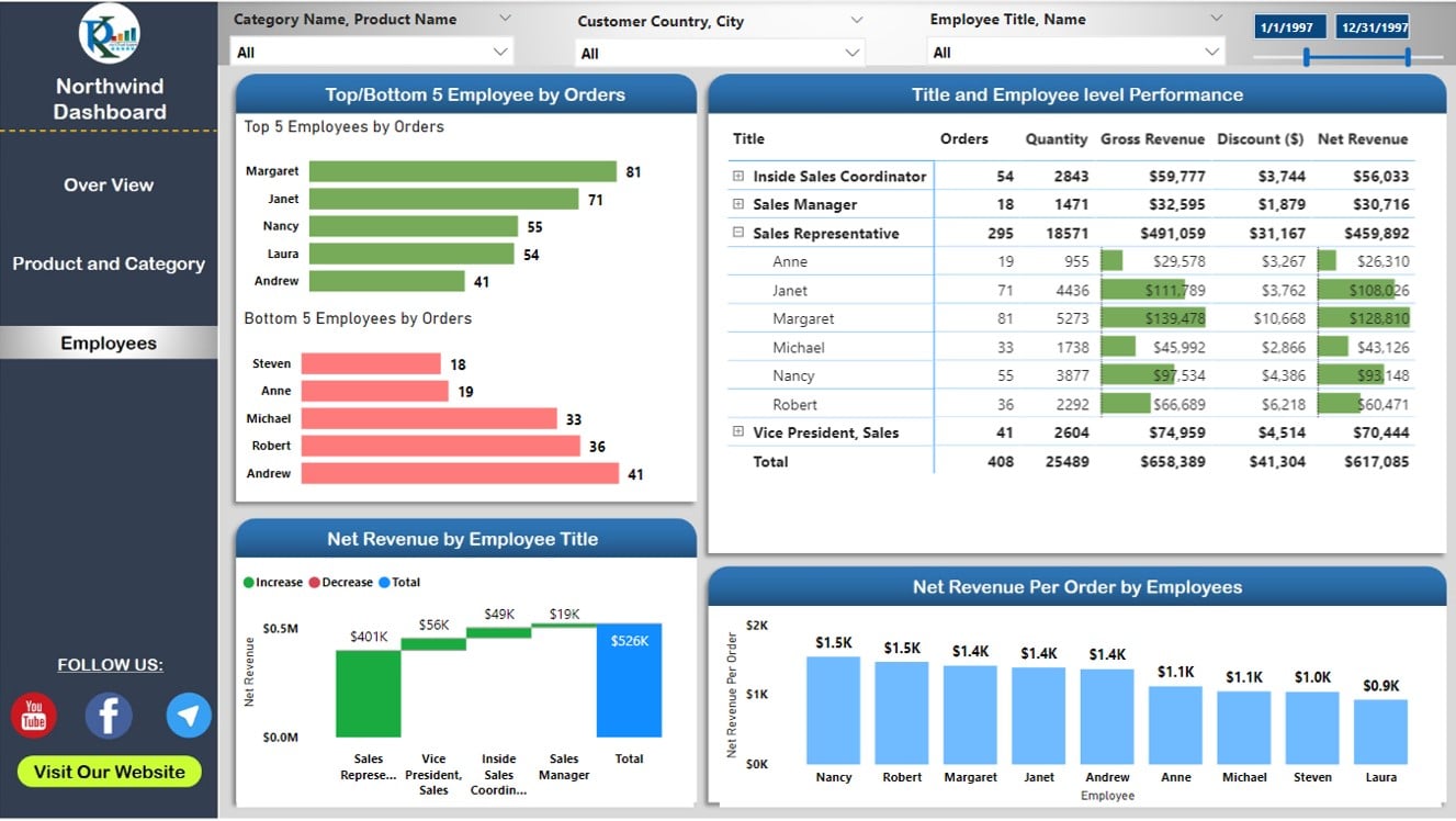
Lastly, the Employees Page offers insights into the performance of your team. Metrics are displayed by Employee Title and Employee Name, allowing you to evaluate the contributions of each staff member to the organization’s success. This data can be invaluable for managing your workforce, identifying top performers, and allocating resources effectively.
Experience the live Dashboard:
Advantages of the Power BI Dashboard with Northwind Database
The Power BI Dashboard with Northwind Database offers a range of benefits for businesses and organizations looking to harness the power of data visualization and analysis. By utilizing this powerful tool, you can gain valuable insights, improve decision-making, and drive performance. Here are some key advantages to consider:
1. Easy Data Integration:
- Seamlessly connect to the Northwind Database: One of the standout features of this Power BI dashboard is its ability to effortlessly connect to the Northwind Database using the OData feed. Consequently, you can easily access and analyze your organization’s data, saving time and effort.
- Flexible data source integration: In addition to the Northwind Database, the dashboard can be customized to connect with other data sources, ensuring adaptability and versatility for different business needs.
2. Comprehensive Data Visualization:
- Multiple pages for in-depth analysis: The Power BI dashboard features three distinct pages—Overview, Product and Category, and Employees—each designed to provide a comprehensive view of your organization’s performance metrics.
- Visually appealing design: The dashboard’s striking design, created using Microsoft PowerPoint, not only captures the attention of users but also enhances the overall user experience.
3. Customizability and Scalability:
- Personalized dashboard: The Power BI dashboard can be tailored to suit your organization’s specific requirements, allowing you to modify the layout, visualizations, and data sources as needed.
- Scalable solution: As your organization grows, the dashboard can easily accommodate an expanding dataset, ensuring that your data visualization and analysis capabilities remain relevant and useful over time.
4. Enhanced Decision-Making:
- Data-driven insights: With its range of visualizations and metrics, the Power BI dashboard always empowers users to make informed decisions based on real-time data analysis.
- Easy identification of trends and patterns: The dashboard’s intuitive design allows users to quickly spot trends, patterns, and anomalies in their data, which in turn enables swift identification of areas for improvement or optimization.
5. Improved Collaboration and Data Sharing:
- Accessible to multiple users: The Power BI dashboard can be shared with team members and supervisors, fostering collaboration and transparency across the organization.
- Platform compatibility: The dashboard can be accessed on various devices and platforms, ensuring that users can view and interact with the data at their convenience.
6. Cost-Effective Solution:
- Budget-friendly alternative: Compared to other data visualization and analysis tools, the Power BI is a more affordable option for organizations looking to optimize their data management processes without breaking the bank. We are providing this dashboard as free of cost.
7. Time-Saving and Efficient:
- Automated data refresh: The Power BI dashboard automatically refresh the data after putting the Schedule Refresh in your dashboard.
- Streamlined data analysis: The dashboard’s user-friendly interface and efficient design enable users to quickly analyze their data, saving time and effort while enhancing productivity.
Tips for Enhancing Dashboard Readability and User Experience
To further improve the readability and user experience of your Power BI dashboard, consider the following tips:
- Use clear and descriptive titles for each visualization, making it easy for users to understand the purpose and context of the displayed data.
- Opt for visually distinct colors to differentiate between data points, ensuring that the dashboard is both attractive and informative.
- Implement a consistent layout and design throughout the dashboard to create a cohesive and professional appearance.
- Leverage tooltips to provide additional context or explanations for specific data points, enhancing user understanding and interaction.
Final Thoughts
By following this comprehensive guide, you should now be equipped to create a beautiful and functional Power BI dashboard using the Northwind Database. Harness the power of data visualization to drive better decision-making, streamline processes, and ultimately enhance your organization’s performance. With its customizable design, user-friendly interface, and advanced data analysis capabilities, the Beautiful Power BI Dashboard with Northwind Database is an invaluable tool for any data-driven organization.
Frequently Asked Questions
In this section, we will address common questions which users may have while working with the Beautiful Power BI Dashboard with Northwind Database.
Q: Can I customize the dashboard to include additional KPIs or metrics?
A: Certainly, the Power BI dashboard can be easily modified to incorporate additional data points, depending on your organization’s requirements.
Q: Can I connect the dashboard to other databases or data sources?
A: Absolutely! Power BI supports a wide range of data sources, including SQL databases, Excel files, and web APIs. You can easily connect the dashboard to other data sources to expand its functionality.
Q: Can multiple users access and edit the dashboard simultaneously?
A: Yes, Power BI offers collaboration features which enable multiple users to access and edit the dashboard concurrently. This allows for real-time updates and greater collaboration among team members.
Q: Is it possible to share the dashboard with external stakeholders?
A: Yes, Power BI dashboards can be securely shared with external users through emails or embedding in a website.
Conclusion
In conclusion, the Beautiful Power BI Dashboard with Northwind Database delivers a visually stunning, user-friendly visualization and analysis. Showcasing crucial metrics on separate pages, it provides insights into various business facets, including overall, product, category, and employee performance. Thanks to its customizable nature and compatibility with other data sources, this dashboard caters effortlessly to any organization’s needs.
Visit our YouTube channel to learn step-by-step video tutorials