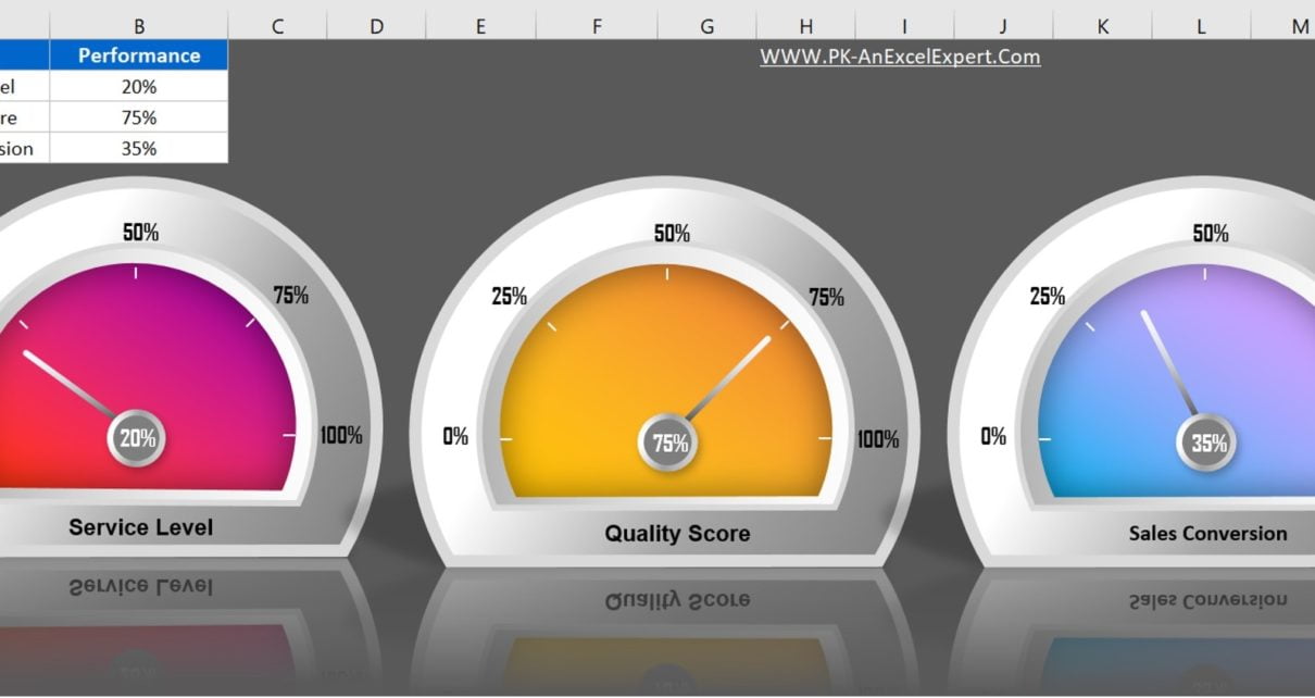
In this article, we have created beautiful 3D Gauge Chart in Excel. We have used Excel shapes and Pie Chart to create this beautiful visualization. You can use this chart in your business dashboard or presentation.
Data visualization is a crucial aspect of analyzing data in today’s data-driven world. Excel is one of the most widely used tools for data analysis and visualization. One of the types of charts that can be created in Excel is a 3D Gauge Chart. In this article, we will guide you through the process of creating a 3D Gauge Chart in Excel.
Click to buy 3D Gauge Chart in Excel
Benefits of 3D Gauge charts
Click to buy 3D Gauge Chart in Excel
Effective Data Visualization:
3D Gauge charts provide a clear and concise representation of data.
Easy to Understand:
Gauge charts are simple to read and understand, even for non-technical users. These charts are very eye catching and to use in presentations and reports.
Better Comparisons:
With a 3D Gauge chart, users can compare multiple data sets at a glance, allowing for better analysis and decision-making.
Customizable:
You can customize this gauge charts to suit specific data sets and design requirements.
Interactive:
3D Gauge charts can be interactive, allowing users to drill down into specific data points and gain a deeper understanding of the underlying data.
Prepare your data
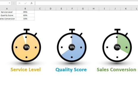
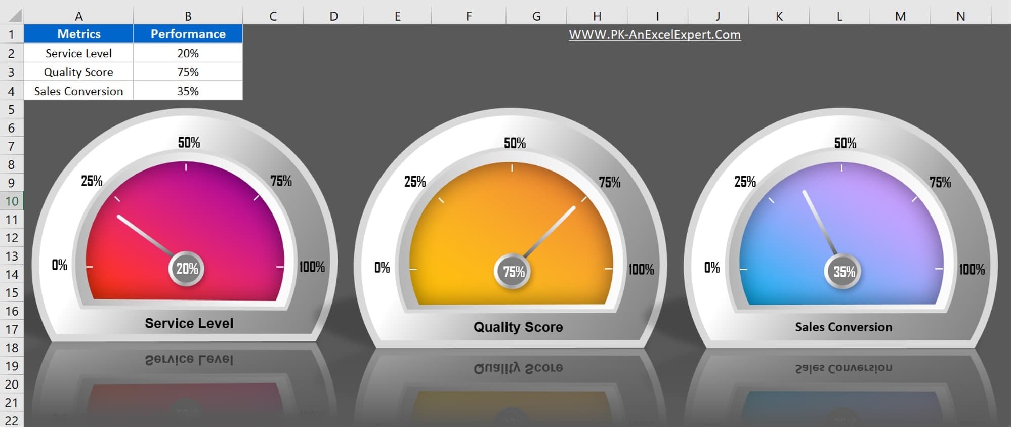
The first step in creating any chart in Excel is to prepare your data. For this 3D Gauge Chart, we will need two pieces of data: the value we want to display and the maximum value. In our example, we will use the maximum value of 100%. We are taking 3 KPI to show on three different 3D gauge charts – Service Level, Quality Score and Sales Conversion.
Create 3D Gauge Chart in Excel:
Visit our YouTube channel to learn step-by-step video tutorials
Watch the below given step by step video tutorial:
Click to buy 3D Gauge Chart in Excel