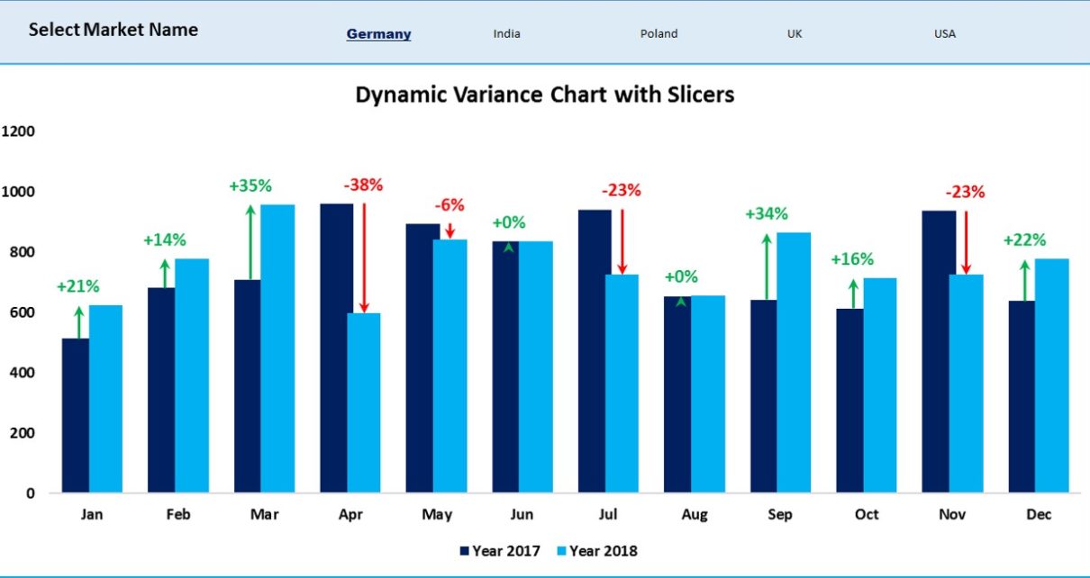
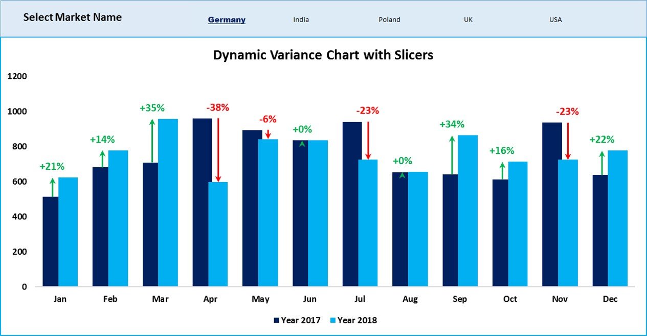
In the previous article we create a Dynamic Chart with Variance Arrows using multiple check boxes. In this article, we have created the similar Dynamic Variance Arrows Chart with Slicers. This is quite useful chart to display the Sales variance in compare of previous year. We have used green and red arrow to display the percentage change. You can select multiple market in slicers using Ctrl + Click.
Dynamic Variance Arrows Chart with Slicers
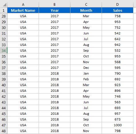
Below is the data for which we have created this informative chart-
Below is the Dynamic Variance Arrow Chart with Slicer –
Click to buy Dynamic Variance Arrows Chart with Slicers
Visit our YouTube channel to learn step-by-step video tutorials
Watch the step by step video tutorial:
Click to buy Dynamic Variance Arrows Chart with Slicers