Data analysis is an essential aspect of any business. It helps to make informed decisions based on evidence and trends. One of the ways to present data is through charts, which provide a visual representation of information. In this blog post, we will discuss the creation of a dynamic chart with a slicer for employee count by age group.
Dynamic Chart with Slicer for Employees Count by Age group
Click to buy Dynamic Chart with Slicer for Employees Count by Age group
Understanding the Data
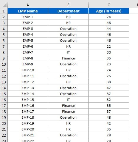
To create a chart, we first need to have the data. In this case, we will be using the number of employees in an organization and their respective ages. It is crucial to have accurate data for creating charts as even a small mistake in the data can lead to incorrect conclusions.
Click to buy Dynamic Chart with Slicer for Employees Count by Age group
Setting up the Dynamic Chart
Visit our YouTube channel to learn step-by-step video tutorials
Once we have the data, the next step is to create the chart. We will be using Excel to create the chart. To create a dynamic chart, Follow the steps given in below video tutorial:
Interpreting the Results
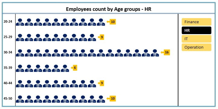
The chart presents a vivid illustration of the employee count stratified by age groups. The Y-axis displays the age groups while the y-axis displays the number of employees belonging to each age group. By utilizing the slicer feature, we can selectively filter the data and display specific age groups, making data analysis and interpretation a breeze.
Conclusion
Dynamic charts with slicers are an exceptional tool for data analysis and provide a dynamic representation of the data that is both visually appealing and intuitive to interpret. With the creation of a dynamic chart with a slicer for employee count by age group, it becomes effortless to discern the distribution of employees across different age groups, thereby aiding in informed decision-making for staffing and employee development strategies, among other significant business operations.
In this blog post, we delved into the process of creating a dynamic chart with a slicer for employee count by age group. We trust that this information will be of immense value in your data analysis pursuits.
Click to buy Dynamic Chart with Slicer for Employees Count by Age group