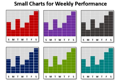
While creating a dashboard, many times it happens when you don’t have sufficient space to place your multiple charts. However, there is a solution that is small charts. By using small charts to display your weekly performance data, you can save space while still presenting the information in a clear and readable format. In this article, we will explain step-by-step process of how to create small charts for weekly performance in Excel. You will also learn the benefits of such charts.
Step-by-Step Guide to Creating Small Charts for Weekly Performance
Click to buy Small Charts for Weekly Performance
To create small charts for weekly performance in Excel, follow the steps below:
Step 1: Enter Your Data Set
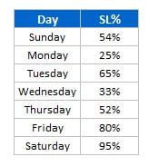
The first step is to enter your data set into Excel. This data set should include the values for each day of the week and the corresponding performance percentage. We will add a new column as 100% after the metric value and in the starting column we will put the first letter of the day.
Click to buy Small Charts for Weekly Performance
Step 2: Select the Data
Once you’ve entered your data set, select it by clicking and dragging over the cells that contain the data.
Step 3: Insert the Chart
With your data set selected, go to the “Insert” tab and select “Column” from the chart options. Then choose “Clustered Column” from the drop-down menu.
Step 4: Format the Data Series
To make the columns narrower and remove the gaps between them, you’ll need to format the data series. Click on any of the columns to select the entire data series, then right-click and choose “Format Data Series” from the options.
In the “Format Data Series” menu, set the “Series Overlap” to 100% and the “Gap Width” to 0%. This will create narrower columns with no gaps between them.
Step 5: Remove the Legend, Chart Title, Gridlines, and Vertical Axis
To make the chart as small and concise as possible, you can remove the legend, chart title, gridlines, and vertical axis. To do this, select each element and press “delete” or right-click and choose “Delete” from the options.
Step 6: Modify the Horizontal Axis
You can modify the horizontal axis to show only the first letter of each day of the week. Right click on the chart and click on select data. Now, click on the edit the horizontal axis and select the range wherever you have given the first letter of the day.
Step 7: Resize the Chart
Finally, resize the chart to fit the available space on your dashboard. To do this, click and drag the edges of the chart to adjust its size.
Benefits of Small Charts for Weekly Performance
There are several benefits to using small charts for weekly performance data, including:
Space-saving:
Small charts are an excellent solution when space is limited on a dashboard. By using a small chart, you can present the information in a compact and readable format without taking up too much space.
Easy to read:
Despite their small size, these charts are easy to read and understand. The chart’s purpose is clear and straightforward, displaying the weekly performance for each day of the week.
Comparison:
Small charts allow for easy comparison between the days of the week. This helps in identifying patterns and trends in weekly performances.
Improved presentation:
Small charts can add visual interest to a dashboard and make it more visually appealing. They can also help to break up the visual monotony of a dashboard that consists primarily of tables and text.
Highlight important data:
By presenting data in a small chart format, it’s easier to highlight specific data points. For example, you might highlight any days where the performance was particularly high or low.
Quick to create:
Once you’ve created a small chart for weekly performance data, it’s easy to replicate for different data sets. This can save time in the long run when creating multiple dashboards.
Tips for Using Small Charts for Weekly Performance
Below are a few tips to help you make the most of small charts for weekly performance data:
Use color carefully:
While it’s tempting to add lots of colors to your charts, too many colors can make them hard to read. Stick to a limited color palette, and use color to highlight specific data points.
Be consistent:
If you’re creating multiple small charts for different data sets, try to be consistent in terms of formatting and layout. This will make it easier for viewers to interpret the charts quickly.
Choose the right chart type:
While clustered column charts work well for weekly performance data, there may be other chart types that are better suited for different types of data. Take some time to experiment with different chart types to see which ones work best for your data.
Keep it simple:
The key to a successful small chart is simplicity. Avoid cluttering the chart with too much information and focus on the most important data points.
Conclusion
Small charts for weekly performance data are a great way to save space on a dashboard. It still presents information in a clear and readable format. By following the step-by-step guide given above in this article, you can easily create small charts in Excel. These charts highlight the weekly performance data for each day of the week. Remember to use color sparingly, be consistent in your formatting, and keep the charts simple for the best results. You can make your dashboard more visually interesting, improve readability, and highlight important data points by incorporating small charts.
Visit our YouTube channel to learn step-by-step video tutorials
Watch the step-by-step video tutorial:
Click to buy Small Charts for Weekly Performance