Key Performance Indicators (KPIs) are metrics used to measure the success of a company or a particular project. KPIs can help businesses make informed decisions based on data, improve efficiency, and achieve their goals. While there are different ways to present KPIs, one effective way is to use Half Circle KPI Charts. This type of chart is visually appealing and easy to read, making it ideal for presenting KPIs to stakeholders, managers, and team members. In this article, we will show you how to create stunning Half Circle KPI Charts in Excel using Doughnut Charts.
Understanding the Data
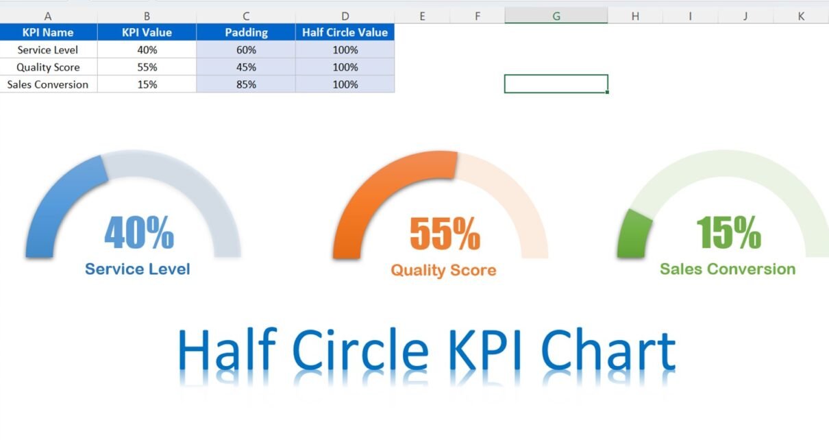
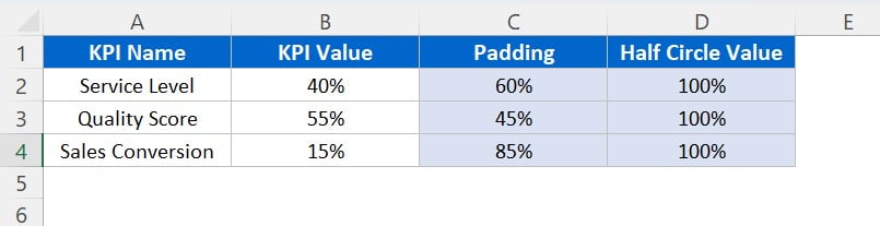
Before we start creating the Half Circle KPI Chart in Excel, let’s look at the data which we will use in this example. We have the data from A1:D4 as given below:
Click to buy Half Circle KPI Charts in Excel using Doughnut Charts
Padding is 100% minus the KPI value, which we will use to create the Half Circle KPI Chart.
Creating a Doughnut Chart for the Service Level KPI
We will start by creating a Doughnut Chart for the Service Level KPI. Below are the steps to create this chart-
- Select the range A2:D2.
- Click on the Insert tab and select Doughnut Chart from the Charts group.
- A Doughnut Chart will be created. Now, right-click on the chart and select Format Data Series.
- In the Format Data Series pane, select the Angle of first slice and change it to 270. This will make the chart start from the bottom instead of the right side.
- Next, select the Outline option and choose No Outline for all slices of the Doughnut Chart.
- Now, we will fill the bottom half circle with no fill. To do this, select the bottom slice of the Doughnut Chart and click on Fill. Select No Fill from the options.
- For the first slice, we will fill it with a dark blue color. Select the first slice and click on Fill. Choose a dark blue color from the options.
- To make the first slice stand out, we will add an outer shadow effect. Under the Effect option, select Offset and choose Bottom Right Outer Shadow.
- For the second slice, we will use the same blue color but with 75% transparency. Select the second slice and click on Fill. Choose the same blue color as the first slice but reduce the transparency to 75%.
- Click on the legend and press the delete button.
Now, we will show the KPI Value on the chart. Below are the steps to show the KPI value on the chart-
- Select the chart and go to the Insert tab.
- Insert a Textbox and draw the Textbox on the chart.
- Select the Textbox and click on the formula bar.
- Enter the cell reference of the KPI Value (in this case, B2).
- This will link the Textbox with the cell value and show the value dynamically.
- You can also change the font size and color of the textbox to make it more attractive.
Creating Half Circle KPI Charts for Other KPIs.
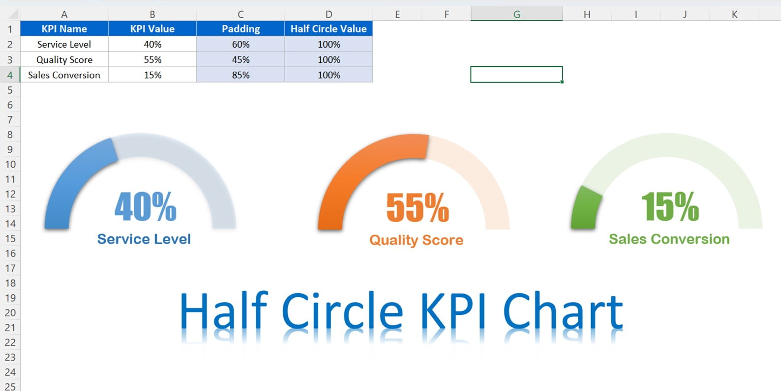
Finally, we have created a Half Circle KPI Chart for the Service Level KPI. We can use the same steps to create charts for other KPIs.
Click to buy Half Circle KPI Charts in Excel using Doughnut Charts
Customizing the Half Circle KPI Charts
Now, we have created the Half Circle KPI Charts. We can customize it further to make it more visually appealing and informative.
Below are the few ideas to do that-
Add a Title:
You can add a title to each chart by clicking on the chart and typing the title in the formula bar. This will make the purpose of the chart clear and help viewers understand the context.
Change the Colors:
You can change the colors of the slices to match your company’s branding or to create a visual hierarchy. For example, you can use green for good performance and red for poor performance.
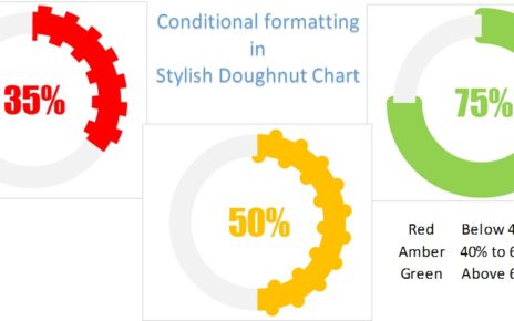
Use Conditional Formatting:
You can use conditional formatting to highlight the KPI value based on a threshold. For example, you can highlight the value in green whenever it is above 80% and in red whenever it is below 50%.
Conclusion
In this blog post, we have learned how to create Half Circle KPI Charts in Excel using Doughnut Charts. We have also seen how to customize these charts to make them more visually appealing and informative. These charts are a great way to present KPI data in a concise and easy-to-understand manner. By following the steps outlined in this post, you can create your own Half Circle KPI Charts and impress your colleagues and stakeholders with your data visualization skills.
Visit our YouTube channel to learn step-by-step video tutorials
Watch the step-by-step video tutorial:
Click to buy Half Circle KPI Charts in Excel using Doughnut Charts