Home>Blogs>Charts and Visualization>RAG Conditional Formatting in 3D Chart
RAG Conditional Formatting in 3D Chart
Charts and Visualization

RAG Conditional Formatting in 3D Chart

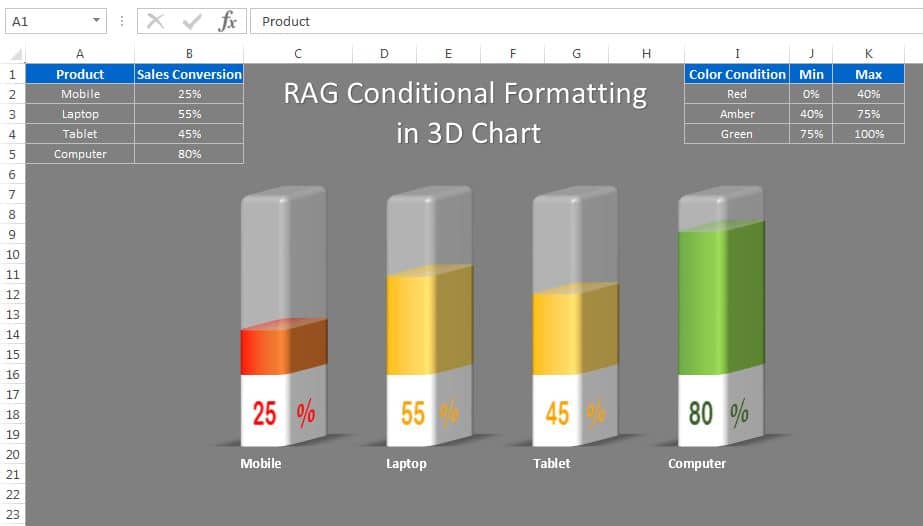
In this article, we have created a beautiful 3D chart to display the Sales conversion for different products. We have used RAG (Red, Amber and Green) Conditional Formatting in this chart. This is a dynamic conditional formatting and it is connected with the color condition table. You can change the color range from the color condition table. You can use this chart in your business dashboard or presentation.

RAG Conditional Formatting in 3D Chart

Watch the step by step video tutorial:

Click here to download this template.

PK
Meet PK, the founder of PK-AnExcelExpert.com! With over 15 years of experience in Data Visualization, Excel Automation, and dashboard creation. PK is a Microsoft Certified Professional who has a passion for all things in Excel. PK loves to explore new and innovative ways to use Excel and is always eager to share his knowledge with others. With an eye for detail and a commitment to excellence, PK has become a go-to expert in the world of Excel. Whether you're looking to create stunning visualizations or streamline your workflow with automation, PK has the skills and expertise to help you succeed. Join the many satisfied clients who have benefited from PK's services and see how he can take your Excel skills to the next level!
https://www.pk-anexcelexpert.com