The Clinical Data Management Dashboard in Power BI tracks 5 high-level KPI cards and 14+ analytical charts across 5 interactive report pages — Overview, Query Analysis, Site Performance, Safety & Compliance, and Cost & Budget. Setup takes under 10 minutes — replace the sample data, hit Refresh, and every visual updates automatically. The template is a one-time $17.99 purchase compared to $50,000–$250,000 per study for enterprise CTMS platforms like Medidata Rave or Veeva Vault.
For Clinical Data Managers (CDMs), clinical operations leads, and biotech finance partners, the reporting gap is real: data lives across EDC exports, eTMF queries, monitor spreadsheets, AE listings, and finance trackers. The Clinical Data Management Dashboard in Power BI brings all of these views into one .pbix file, with slicers that cascade across every page so a filter on Region or Study propagates everywhere.
Key Features of the Clinical Data Management Dashboard in Power BI
- 5 dedicated report pages — Overview, Query Analysis, Site Performance, Safety & Compliance, and Cost & Budget — each with its own slicers, KPIs, and charts.
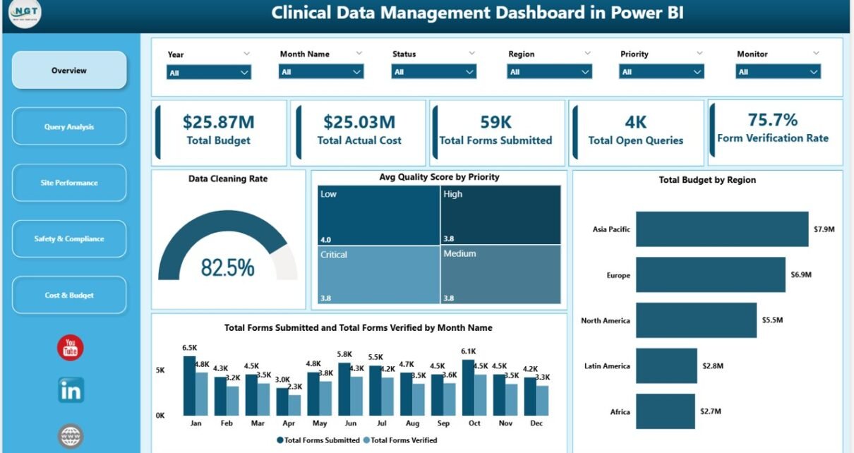
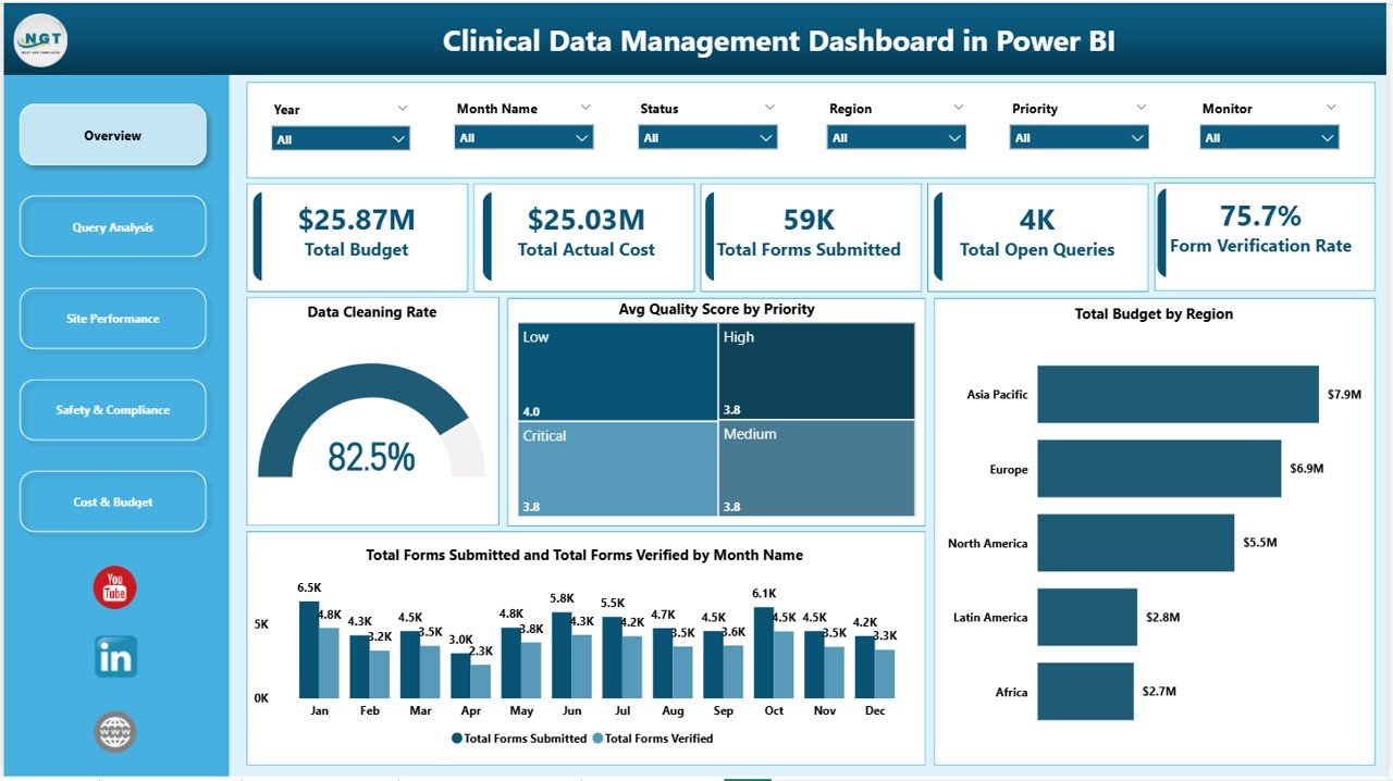
- 5 KPI cards on Overview — Total Budget, Total Actual Cost, Total Forms Submitted, Total Open Queries, and Form Verification Rate.
- 14+ pre-built analytical visuals spanning data cleaning, quality, budgets, queries, regions, monitors, adverse events, and trial phases.
- Cascading slicers — filter the entire dashboard by Region, Study ID, Priority, Therapeutic Area, or Trial Phase in one click.
- Pre-written DAX measures for Form Verification Rate, Data Cleaning Rate, and Avg Quality Score.
- Works in free Power BI Desktop — no paid Power BI license required to open or edit.
- Replaces 3+ separate trackers — eTMF query log, site performance spreadsheet, and study finance tracker — in one .pbix file.
Dashboard Pages Explanation
Page 1: Overview
The Overview page provides the executive summary. It shows 5 KPI cards (Total Budget, Total Actual Cost, Total Forms Submitted, Total Open Queries, Form Verification Rate) plus 4 charts: Data Cleaning Rate, Avg Quality Score by Priority, Total Budget by Region, and Total Forms Submitted and Total Forms Verified by Month Name. Slicers at the top of the page apply across every subsequent page.
Page 2: Query Analysis
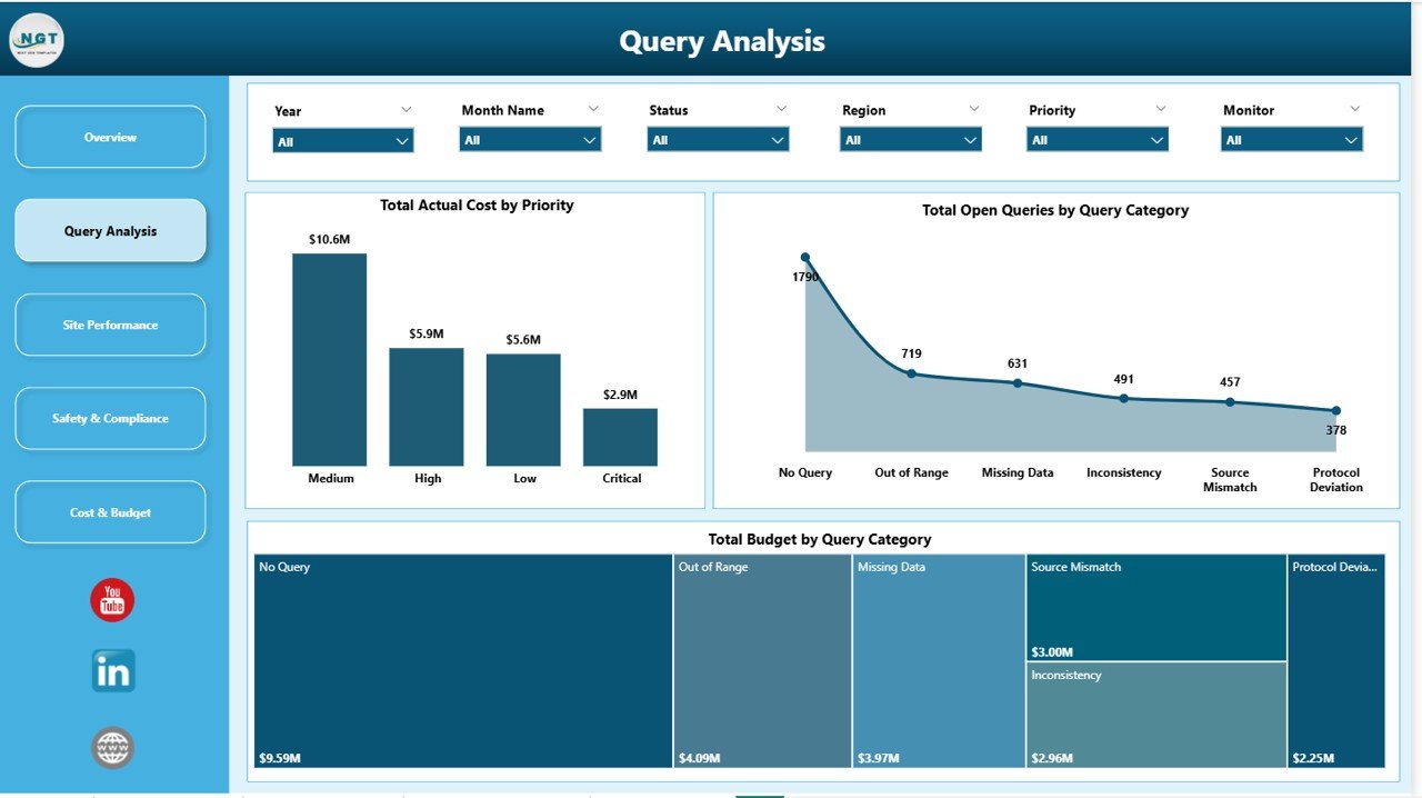
The Query Analysis page focuses on eCRF discrepancies and clarifications. It includes Total Actual Cost by Priority, Total Open Queries by Query Category, and Total Budget by Query Category — helping CDM teams see where queries concentrate, how aged they are, and which categories are draining study budget.
Page 3: Site Performance
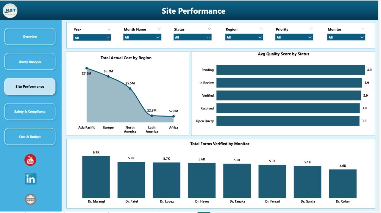
The Site Performance page benchmarks investigator sites and monitors. Visuals include Total Actual Cost by Region, Avg Quality Score by Status, and Total Forms Verified by Monitor — surfacing which monitors are clearing the most verified forms and which regions are running over plan.
Page 4: Safety & Compliance
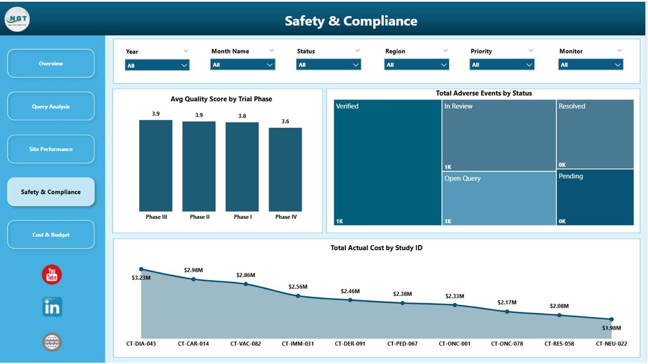
The Safety & Compliance page tracks adverse events and quality across trial phases. It shows Avg Quality Score by Trial Phase, Total Adverse Events by Status, and Total Actual Cost by Study ID — giving medical monitors and safety leads a single view of where AE volume and quality risk sit.
Page 5: Cost & Budget
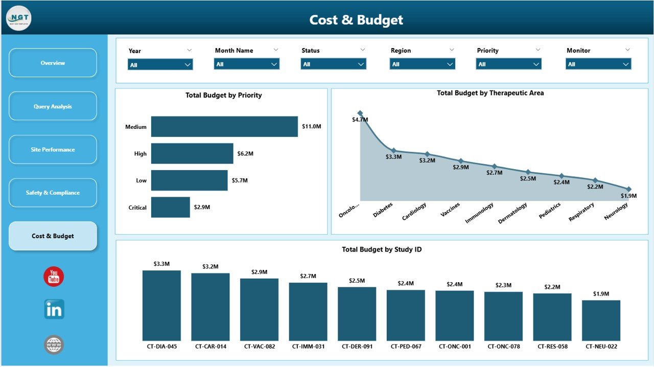
The Cost & Budget page is the finance lens. Visuals include Total Budget by Priority, Total Budget by Therapeutic Area, and Total Budget by Study ID — so trial budget owners can compare planned spend by therapeutic area and individual study, and explain variance to a CFO without leaving Power BI.
Clinical Data Management Dashboard in Power BI vs. Tableau vs. Paid CTMS — Feature Comparison
| Feature | Clinical Data Management Dashboard in Power BI | Tableau / Qlik Equivalent | Medidata Rave / Veeva Vault CTMS |
|---|---|---|---|
| Cost | $17.99 one-time | Tableau Creator $75/user/month | $50,000–$250,000 per study/year |
| Platform | Power BI Desktop (free) | Tableau / Qlik Sense | Vendor cloud platform |
| Setup time | Under 10 minutes ✅ | 2–5 days | 3–6 months |
| Pre-built clinical KPIs | ✅ Forms, queries, AEs, budget | ❌ Build from scratch | ✅ Vendor-locked |
| Slicer-based filtering | ✅ Region, study, phase, priority | ✅ | ⚠️ Pre-defined reports only |
| Year-1 cost at 5 users | $17.99 | $4,500 | $60,000+ |
| Customization | ✅ Full Power BI flexibility | ✅ | ⚠️ Limited to vendor templates |
| Vendor lock-in | None ✅ | Medium | High |
For clinical research teams that want CTMS-style visibility without the six-figure CTMS price tag, the Clinical Data Management Dashboard in Power BI sits in the sweet spot.
Who Should Use This Template
Perfect for:
- Clinical Data Managers tracking form submission, verification, and query resolution across studies
- Clinical Operations leads who need site, monitor, and region performance in one view
- CROs and small-to-mid biotech teams running 1–20 trials
- Finance partners assigned to clinical programs who need budget vs. actual by study
- Pharmacovigilance and medical monitoring leads tracking adverse events
Not a fit if:
- You need a validated 21 CFR Part 11 / GCP-certified production EDC — this is a reporting layer, not an EDC.
- Your team has no exposure to Power BI Desktop and won’t have time to learn the basics.
- You need real-time API integration with your EDC / IRT out of the box.
Real-World Use Cases
Priya is the Clinical Data Manager at a 50-person CRO running 8 oncology trials. She uses the Clinical Data Management Dashboard in Power BI to monitor Total Open Queries and Form Verification Rate weekly, identify which monitors have the most aged queries, and present a single PDF export to her Sponsor — replacing three separate Excel trackers her team used before. Her weekly review now takes 20 minutes instead of half a day.
Marco runs Clinical Operations at a mid-size biotech. Each Monday he opens the Site Performance page, slices by Region, and sees which sites are lagging on Total Forms Verified by Monitor. He uses this to triage which sites need a remote monitoring visit that week — without paying $60,000+/year for a full CTMS subscription.
Anita is the Director of Clinical Finance at a sponsor. She lives in the Cost & Budget page — Total Budget by Therapeutic Area and Total Budget by Study ID — to forecast burn and explain variances to her CFO. The same exercise used to take her two days in Excel each month; now it’s a sliced view.
Advantages of the Clinical Data Management Dashboard in Power BI
- Replaces three or more separate trackers — eTMF query log, site performance spreadsheet, and finance tracker — in one .pbix file.
- One-time $17.99 compared to thousands per year in Tableau seats or tens of thousands in CTMS fees.
- Cascading slicers mean stakeholders don’t need to be Power BI experts — they just click to filter.
- Fully editable — the data model, DAX measures, and visuals are all open. No vendor lock-in.
- Publishes to the Power BI Service — share a single live link with CDM, clinical ops, finance, and safety.
- Multi-study portfolio view built around a Study ID dimension — useful for sponsors running 5–20 trials at once.
Opportunities for Improvement
Three honest limitations worth flagging:
- Not a validated system under 21 CFR Part 11 or GCP. Use it as a management overview layer, not as your primary data source of truth.
- No native EDC/IRT API connector — data must be exported (usually as CSV or Excel) from your EDC and pasted into the data tables. Power Query can automate this on a refresh schedule, but it requires a one-time setup.
- Designed for 1–20 active trials. Sponsors running 50+ concurrent studies with hundreds of sites will benefit from a model-level redesign with calculation groups and aggregations.
Best Practices
- Match column names exactly when pasting your own data — Study ID, Region, Priority, Therapeutic Area, Trial Phase, Monitor, Status, Query Category, etc. Mismatches break the slicers.
- Refresh weekly at a fixed cadence (e.g., every Monday 9am) so every stakeholder sees the same numbers.
- Use the Power BI Service workspace for sharing — avoids emailing .pbix files around and keeps a single source of truth.
- Customize the theme to match your CRO or sponsor branding via View → Themes in Power BI Desktop.
- Bookmark recurring views — e.g., “Oncology Portfolio”, “Phase 3 Only”, “Region: EMEA” — so leadership reviews open at the right slice.
- Reference the official Microsoft Power BI documentation for DAX optimization if your data model exceeds 1 million rows.
Explore Relevant Templates
Templates that pair well with this dashboard:
- Clinical Data Management Dashboard in Power BI — the template covered in this post.
- Clinical Data Management Dashboard in Excel — same five-page structure built natively in Excel for teams without Power BI.
- Clinical Trials Management Dashboard in Power BI — enrollment, milestones, and trial timeline analytics.
- Cardiac Care Units Dashboard in Power BI — for cardiology research and clinical operations.
- Medical Practice Dashboard in Power BI — patient flow and clinic-level KPIs.
- Browse all Power BI Dashboards on NextGenTemplates.
Frequently Asked Questions
What KPIs does the Clinical Data Management Dashboard in Power BI track?
The Clinical Data Management Dashboard in Power BI tracks 5 headline KPIs — Total Budget, Total Actual Cost, Total Forms Submitted, Total Open Queries, and Form Verification Rate — plus calculated measures for Data Cleaning Rate and Avg Quality Score by priority, status, and trial phase.
Do I need a Power BI license to use this dashboard?
No. The Clinical Data Management Dashboard in Power BI opens in Power BI Desktop, which is free from Microsoft. A Power BI Pro license ($14/user/month) is only required if you want to publish and share via the Power BI Service.
How does this compare to Medidata Rave or Veeva CTMS?
This is a reporting layer, not a validated EDC or CTMS. Medidata Rave and Veeva Vault CTMS cost $50,000–$250,000 per study annually. The Clinical Data Management Dashboard in Power BI is $17.99 one-time and sits on top of your existing data export, making it ideal for CROs and biotech teams that already have an EDC but lack a reporting layer.
Can I customize the charts, KPIs, and colors?
Yes. Every visual on the Clinical Data Management Dashboard in Power BI is fully editable in Power BI Desktop. Change the theme, add or remove charts, modify DAX measures, or extend the data model with new tables. You own the .pbix file outright with no licensing restrictions.
How long does setup take?
Setup takes under 10 minutes for a CDM analyst familiar with Power BI. Open the .pbix, paste your study, form, query, AE, and budget records into the existing data tables, click Home → Refresh, and the entire dashboard updates automatically.
Does it support multiple studies in parallel?
Yes. The Clinical Data Management Dashboard in Power BI is built around a Study ID dimension. Slicers on every page let you view a single study or all studies combined. Total Budget by Study ID and Total Actual Cost by Study ID are designed specifically for portfolio views.
Is this template GCP / 21 CFR Part 11 compliant?
The Clinical Data Management Dashboard in Power BI is a reporting template and is not a validated system under 21 CFR Part 11 or GCP. It should be used as a management overview layer alongside your validated EDC and eTMF.
About the Author
Built by PK — Microsoft Certified Professional with 15+ years of Excel, Google Sheets, and Power BI experience. Founder of NextGenTemplates, reaching 300K+ subscribers across YouTube channels. Every template is hand-built and tested before release.
Conclusion
The Clinical Data Management Dashboard in Power BI gives clinical research teams the visibility they need across budget, data quality, queries, sites, monitors, adverse events, and trial phases — without the six-figure CTMS price tag. Five report pages, 5 KPI cards, 14+ analytical visuals, cascading slicers, and pre-written DAX measures — all in one .pbix file you fully own.
👉 Click here to Purchase Clinical Data Management Dashboard in Power BI
Instant download · One-time payment · No subscription · Lifetime access
🎥 For step-by-step video tutorials, visit Youtube.com/@PK-AnExcelExpert.
📅 Last updated: May 2026