A crisis mapping startup lives on two numbers that almost never sit in the same file: how much it costs to keep a platform in the field, and how much of what the field sends back is actually verified. The Crisis Mapping Startups Dashboard in Excel puts both on one screen. The sample build ships 500 deployment records that roll up to $1,120.7M of tracked funding, $381.2M of operating cost, 41.9M people reached, 104.6K locations mapped and 1.9M crisis reports at an 84.6% verified report rate – spread across 13 startups, 8 crisis types, 8 crisis regions and 6 mapping platform types. Five report pages, 20 charts, four slicers, and not a single line of VBA.
This walkthrough covers what is on each page, where the template is strong, where it is not, and how to load your own data without breaking anything.
Key Features of the Crisis Mapping Startups Dashboard in Excel
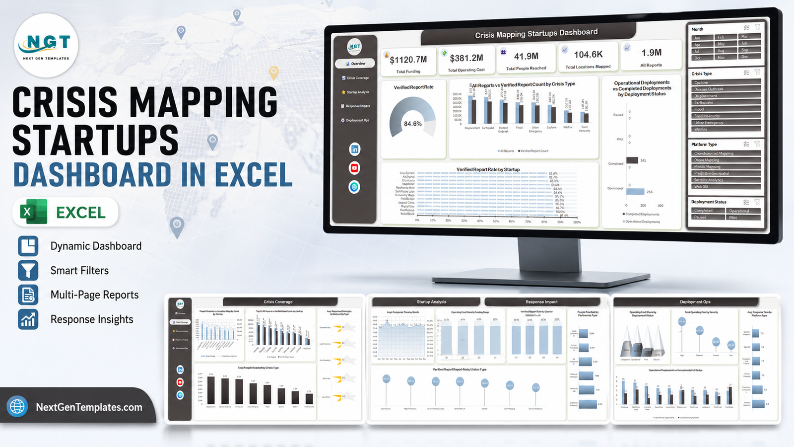
- Five linked report pages – Overview, Crisis Coverage, Startup Analysis, Response Impact and Deployment Ops, with a left-rail navigator on every page.
- Four synced slicers – Month, Crisis Type, Platform Type and Deployment Status. Click one and all five pages respond.
- 20 charts across the five pages, plus five KPI cards on the Overview.
- A 500-row Data sheet with 22 fields plus Month, Year and Quarter helper columns.
- A Support sheet holding the aggregation tables that feed each chart, so you can see exactly where a number comes from.
- Plain .xlsx – no macros, no add-ins, no external connection. Excel 2016, 2019, 2021 and Microsoft 365, Windows and Mac. Crisis Mapping Startups Dashboard in Excel
Dashboard Pages Explanation
Page 1 – Overview
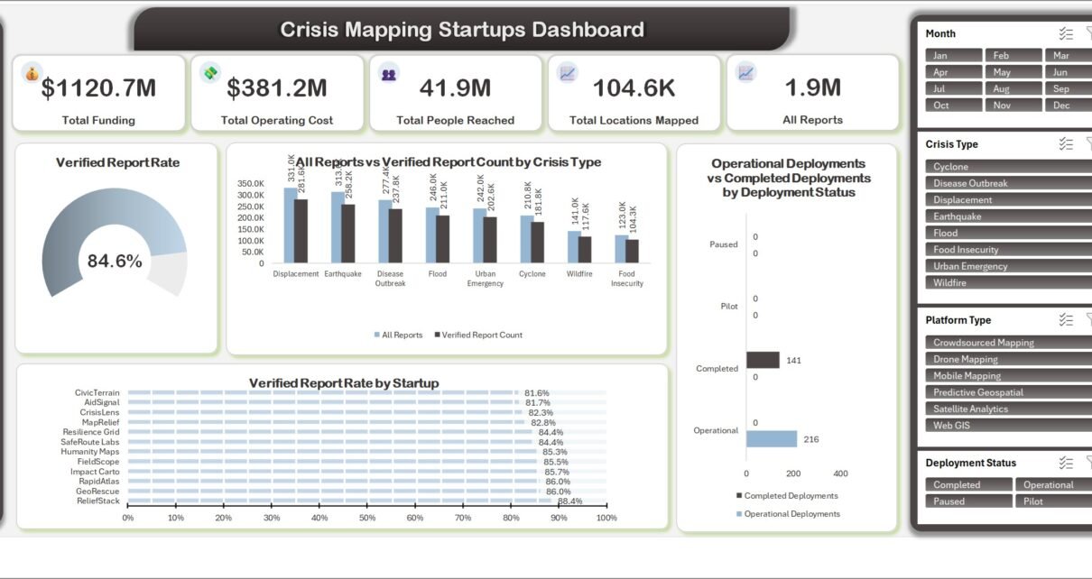
Five KPI cards run across the top: Total Funding ($1,120.7M), Total Operating Cost ($381.2M), Total People Reached (41.9M), Total Locations Mapped (104.6K) and All Reports (1.9M). Beneath them a donut gauge reads the Verified Report Rate at 84.6%. All Reports vs Verified Report Count by Crisis Type ranks the eight crisis types, Displacement first at 331.0K reports and 281.6K verified, Food Insecurity last at 123.0K and 104.3K. Operational Deployments vs Completed Deployments by Deployment Status splits the 216 operational and 141 completed deployments, and Verified Report Rate by Startup ranks all thirteen sample startups from CivicTerrain at 81.6% to ReliefStack at 88.4%. Crisis Mapping Startups Dashboard in Excel
Page 2 – Crisis Coverage
People Reached vs Locations Mapped by Crisis Region is a combo chart over eight regions, East Africa leading with 7.7M people reached against 17.3K locations mapped. Top 10 All Reports vs Verified Report Count by Country ranks Ethiopia, Jamaica, India, Turkiye, Ecuador, Myanmar, Tanzania, Yemen, Vietnam and Haiti. Avg. Response Time by Severity shows the pattern you would hope for – Critical at 3.2 hours, High 5.7, Medium 9.5, Low 14.2. Total People Reached by Crisis Type closes the page, 7.2M for Displacement down to 2.7M for Food Insecurity.
Page 3 – Startup Analysis
Total Funding vs Operating Cost by Startup puts raised capital against burn for each of the thirteen companies, SafeRoute Labs top at $125.5M funding and $43.3M operating cost. Operating Cost Share by Funding Stage compares Series A, Series B, Seed, Growth and Pre-Seed – a tight band from 34.9% down to 32.0%. Avg. Accuracy Rating by Headquarters Region uses a star-rating visual across six regions, and Total Locations Mapped by Platform Type ranks the six platform types, Mobile Mapping at 22.5K ahead of Predictive Geospatial at 20.6K and Crowdsourced Mapping at 19.0K.
Page 4 – Response Impact
Avg. Response Time by Month traces all twelve months, peaking at 8.9 hours in March and settling around 7.4. Verified Report Rate by Quarter holds remarkably steady – 84.2%, 84.5%, 85.2%, 84.3%. People Reached by Partnership Type ranks Government Agency (8.6M), University Lab (7.7M), Community Network (7.5M), UN Programme (6.9M), Private Foundation and NGO Consortium (5.6M each). Verified Report Count by Data Source compares Drone Survey, NGO Field Teams, Government Open Data, Sensor Network, Satellite and Community Reports.
Page 5 – Deployment Ops
Operating Cost Share by Deployment Status uses a pyramid visual – Completed 44.5%, Operational 37.2%, Pilot 19.7%, Paused 13.5%. Total Operating Cost by Severity shows High severity absorbing $166.5M against $39.2M for Low. Avg. Response Time by Platform Type runs from Satellite Analytics at 7.3 hours to Mobile Mapping at 8.2. Operational vs Completed Deployments by Startup closes the workbook with a per-company view – CrisisLens 26 operational against 9 completed, FieldScope 14 against 16.
Crisis Mapping Startups Dashboard in Excel vs. Google Sheets vs. Paid BI SaaS – Feature Comparison
| This Excel dashboard | Google Sheets build | Paid BI / GIS SaaS | |
|---|---|---|---|
| Cost | One payment of 17.99 | One payment, similar | Commonly 10-70 per user per month |
| Platform | Excel 2016+ and Microsoft 365 | Any browser | Browser plus admin console |
| Setup time | Under 15 minutes | Under 15 minutes | Days to weeks |
| Real-time team collaboration | Through OneDrive or SharePoint | Native | Native |
| Mobile access | Excel mobile app | Browser and app | Dedicated app |
| Customizable fields | Every column and chart | Yes | Often fixed to the vendor schema |
| Share with link | Through a OneDrive share | Native | Native |
| Year-1 cost at 5 users | 17.99 once | Similar | Roughly 600 – 4,200 |
| Works offline | Yes | No | No |
| Draws maps | No – reporting only | No | Yes |
Who Should Use This Template
Founders and operations leads at crisis mapping, drone mapping and geospatial-intelligence startups who report deployment activity to a board every month. Programme officers at NGO consortiums and UN programmes who need to compare mapping vendors on response time and verification rather than on pitch decks. Accelerator and impact-fund analysts tracking a portfolio of humanitarian-tech companies. And any data analyst who wants a working five-page Excel layout to lift patterns from.
It is not the right tool if you need live map layers, geocoding or spatial joins, or if your source data must refresh automatically from an API.
Real-World Use Cases
Quarterly investor pack. Filter the Month slicer to a quarter, screenshot the Overview and Startup Analysis pages, and the funding-versus-burn story is already told.
Vendor review. An NGO consortium filters Platform Type to Drone Mapping and Satellite Analytics and compares Avg. Response Time and Verified Report Rate side by side before renewing.
Post-event debrief. Filter Crisis Type to Earthquake and read coverage, verification and response time for that event class alone.
Portfolio triage. An impact fund ranks thirteen companies on operating cost per location mapped in one pass across pages 3 and 5.
Advantages of the Crisis Mapping Startups Dashboard in Excel
- One dataset, five views. Nothing is hard-coded into a chart; every visual traces back to the Data sheet through the Support tables.
- Slicers behave like a BI filter pane without a BI licence or a per-seat cost.
- Charts are named by metric and dimension – “Avg. Response Time by Severity”, not “Bar Chart 3” – so a reader knows what they are looking at.
- It opens offline, which matters more than it sounds for teams working from field offices.
- Nothing is protected. Recolour, retitle, delete a chart, add a column – it is your workbook.
Opportunities for Improvement
Three cosmetic things are worth knowing before you buy, because we would rather tell you than have you find them:
- On the two clustered-column charts (page 1’s crisis-type chart and page 2’s top-10 country chart) the chart title sits close enough to the top data labels that they visually touch at some window sizes. Nudging the plot area down fixes it in seconds.
- A few long category names wrap mid-word on the horizontal bar charts – “Governme nt Agency” on page 4, “Crowdsou rced Mapping” on page 5. Widening the category axis or shortening the label clears it.
- Avg. Accuracy Rating by Headquarters Region on page 3 reads 4.5 for all six regions. That is genuine sample data, not a broken formula – the underlying averages run from 4.489 to 4.518 and the label rounds to one decimal. Add a decimal place to the label if you want the regions to separate.
Beyond cosmetics, the natural next steps are your own: a per-1,000-people cost measure, and a target line on the verified-rate charts.
Best Practices
- Keep the headers. Replace rows, never rename columns – the Support sheet formulas key off the header text.
- Fill Month, Year and Quarter for every row, or the trend and quarter charts under-report.
- Refresh with Ctrl + Alt + F5 after a data load. Microsoft documents the refresh options in its own Excel refresh guide.
- Clear every slicer before you screenshot. A filtered page that looks like a total is the most common reporting mistake with slicer dashboards.
- Keep one clean master copy of the workbook before your first data load, so you can always start over.
Explore Relevant Templates
- Crisis Mapping Startups Dashboard in Excel – the template this article walks through.
- Crisis Mapping Startups Dashboard in Power BI – the same five subject areas as a Power BI report.
- Crisis Management Firms Dashboard in Excel – the consultancy side of the same market.
- Emergency Rescue Services Dashboard in Excel – field response rather than mapping.
- Satellite Imaging KPI Dashboard in Excel – the imagery layer behind geospatial work.
- Disaster Relief KPI Dashboard in Google Sheets – a browser-based alternative for field teams.
Frequently Asked Questions
Does the dashboard show an actual map?
No. It reports on mapping activity – locations mapped, reports verified, response times, coverage by region and country – with standard Excel charts. There is no map layer and no geocoding.
Do I need macros enabled?
No. The file is a plain .xlsx with no VBA and no external data connection.
How many records can it hold?
The sample is 500 rows, and the Data table extends as far as you need. Very large loads are more comfortable if you convert the Data range to a formal Excel Table first.
Is the sample data real?
No. Startup names, funding figures and report counts are generated demo data so the charts render on first open. Replace them before sharing anything externally.
Can I use this for donor or compliance reporting?
No. It makes no claim of conformance with any humanitarian standard, donor framework or audit requirement, and it does not validate the accuracy of anything you enter.
Will it work in Excel for the web?
The sheets display, but slicer behaviour is limited. Use a desktop version of Excel for the full experience.
About the Author
Built by PK – Microsoft Certified Professional with 15+ years of Excel, Google Sheets, and Power BI experience. Founder of NextGenTemplates, reaching 300K+ subscribers across YouTube channels. Every template is hand-built and tested before release.
Conclusion
The Crisis Mapping Startups Dashboard in Excel answers the questions a crisis mapping company gets asked every quarter – where did we work, how much did it cost, how fast did we respond, and how much of it was verified – without a BI subscription and without a single macro. Load your own 22 columns, press refresh, and the five pages are yours.
Get the Crisis Mapping Startups Dashboard in Excel – instant download, lifetime access, free updates.
For step-by-step Excel dashboard tutorials, subscribe to youtube.com/@PKAnExcelExpert.