We can enhance your understanding of your sales process using our latest Sales funnel infographic chart in Excel. In this article we will guide you through the steps of transforming e-commerce sales data into a visually appealing sales funnel infographic chart in Excel. You can use this chart in your Sales Dashboard or Business Presentation. This is totally dynamic chart, you just need to change the data, chart will be updated automatically.
Understanding the Sales Funnel
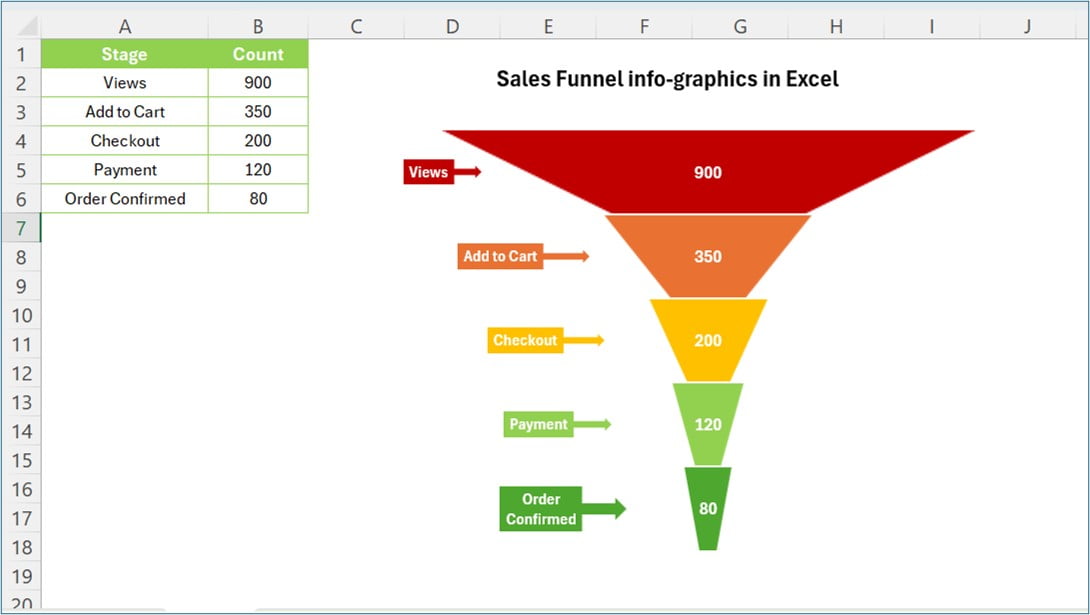
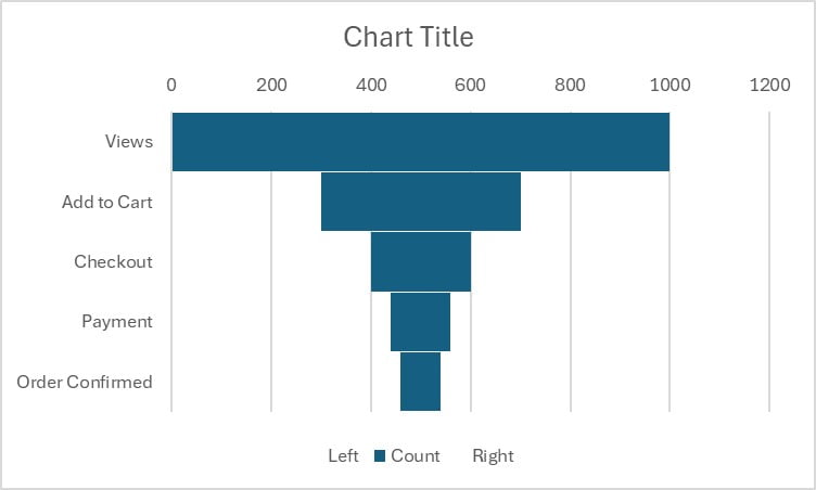
Let’s understand first what is Sales Funnel? And why it’s crucial for your business? A sales funnel represents the customer journey from the initial stage of awareness (views) to the final purchase decision (order confirmed). By visualizing this process, businesses can identify bottlenecks and optimize their sales strategies accordingly.
E-commerce Sales Data Example
For this tutorial, we’ll use a simple e-commerce sales data set as an example:
Click to buy Sales funnel infographic chart in Excel
This data represents the number of customers at each stage of the sales funnel, from viewing products to confirming their orders. These are dummy numbers, you can put your original data here.
Step-by-Step Guide to Creating a Sales Funnel Infographic in Excel
Preparing Your Data
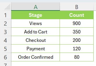
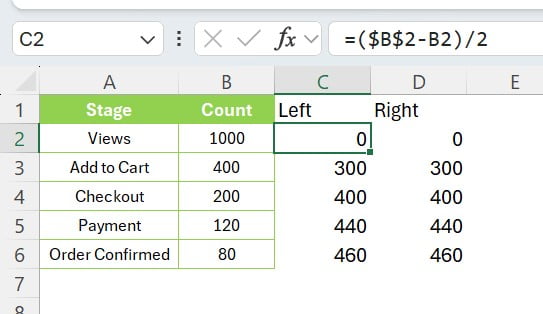
First, organize your sales data in Excel as follows:
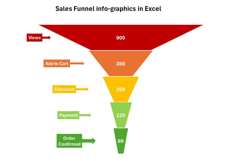
- Column A: Sales Stages (Views, Add to Cart, Checkout, Payment, Order Confirmed)
- Column B: Count (900, 350, 200, 120, 80)
Adding Support Columns for the Funnel Visualization
To create a funnel effect, we will add two support columns: Left and Right.
- Left Column Formula: Enter the formula =($B$2-B2)/2 in cell C3. This formula calculates the left spacing needed to create the funnel shape.
- Right Column Formula: Enter =C3 in cell D3. This formula ensures the right side mirrors the left, maintaining the funnel’s symmetry.
Copy these formulas down the respective columns for each stage in your sales process.
Click to buy Sales funnel infographic chart in Excel
Crafting Your Sales Funnel Chart
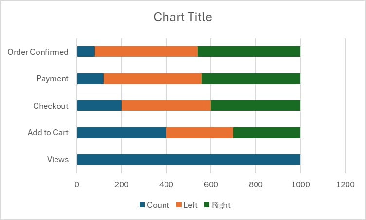
With your data and support columns ready, it’s time to visualize the sales funnel:
- Select Your Data: Select the data range , including the support columns.
- Insert a Chart: Go to the Insert tab, select ‘Bar Chart,’ and choose ‘Stacked Bar Chart.’
Click to buy Sales funnel infographic chart in Excel
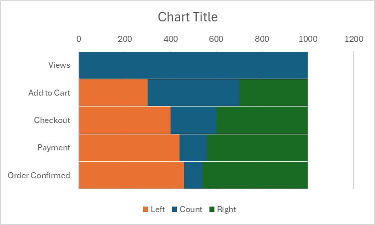
Category in Reverse order:
Right click on the vertical axis and click on the Format Axis. In the Format Axis pane, click on the Category in the reverse order.
Change the Gap Width:
Right click on the chart and click on the Format Data Series. In the format data series pane, take the Gap width as 2%.
Click to buy Sales funnel infographic chart in Excel
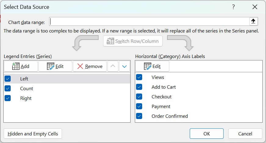
Move the Left before the count:
Right click on the chart and click on the Select data. Change Data Source window will be popped up. In the Legend Entry (Series), move the Left on the top. Keep Count in the middle and Right at the bottom using Up and Down arrow.
Click to buy Sales funnel infographic chart in Excel
Change the colors:
Select the Left and Right slices on the bar chart and change the color as no fill.
Click to buy Sales funnel infographic chart in Excel
Customize Your Chart: Adjust the chart elements to emphasize the funnel shape. Remove the legend, add a title, and format the series to create a narrowing effect from top to bottom.
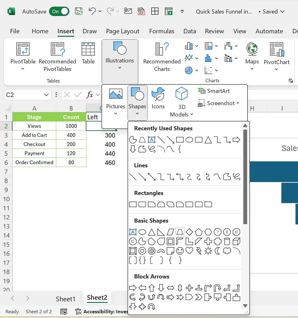
Insert the Shape:
Insert a Trapezoid shape from the Insert tab. Select the shape and go to Shape Format tab in the excel ribbon. Go to rotate and select the Flip Vertical.
Put the shape in the chart:
Change the color of the shape as Dark red and remove the outline. Now, copy the shape and select the first bar of the chart using double click. Just paste the shape using Ctrl+V shortcut key.
Click to buy Sales funnel infographic chart in Excel
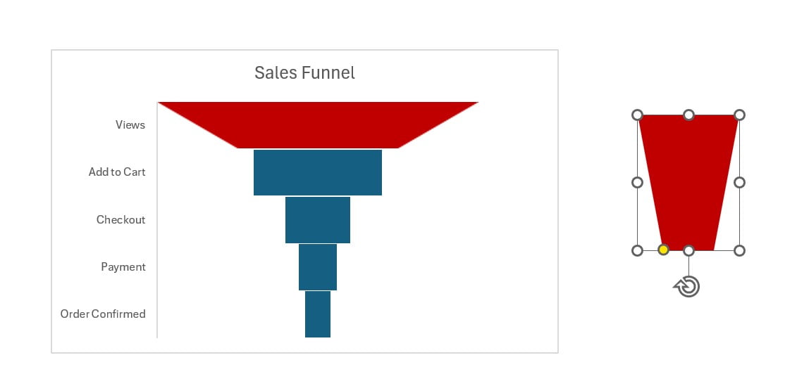
Similarly, Add the shapes for other bars also after change the color.
Final Touches
Now add the data labels to the chart. We can also add the data labels to the “Left”” series. Now, we can show the name of the category in place of value. To do so, just right click on the int eh Left series data labels and click on the format data labels. In the format data labels pane just check the Category name and uncheck the Value and Show leader line. Also, change the data labels shapes doing right click on the data label and change data label shape and select the “Callout: Right Arrow”. Now change the color the data shapes as per the bar color.
Click to buy Sales funnel infographic chart in Excel
Why Visualize Your Sales Data?
Visualizing your sales data with a funnel infographic in Excel not only makes complex data easier to digest but also uncovers insights into customer behavior and sales process efficiency. By identifying where potential customers drop off, you can implement targeted strategies to improve conversion rates and ultimately boost sales.
Engage and Learn
We’ve created a detailed tutorial video that walks you through each step of creating a sales funnel chart in Excel. Watching this video will equip you with practical tips and tricks to make the most out of your sales data.
Transforming your sales data into a visually engaging infographic is not just about making it look good; it’s about unlocking the full potential of your sales strategy. With the guide provided in this blog post and our tutorial video, you’re well on your way to creating powerful sales funnel infographics that drive strategic insights and actions.
Visit our YouTube channel to learn step-by-step video tutorials
Watch the step-by-step video tutorial:
Click to buy Sales funnel infographic chart in Excel