Data visualization is important part of data analysis. It enables us to better understand the data, identify trends, and make informed decisions. There are several types of charts and graphs which we can use to present the data. Waffle chart is one of them. In this article, we will explain to you how to create a Waffle chart with Football Icon in Excel.
What is a Waffle chart with Football Icon?
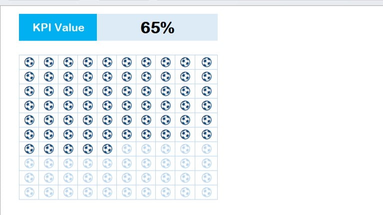
A waffle chart is also known as a square pie chart or matrix chart. It is a type of chart which displays progress towards a KPI value. It is a grid type of chart wherein each square represents a certain percentage of the total. For example, if the KPI value is 20%, each square in the waffle chart represents 1% of the total KPI value.
Click to buy Waffle chart with Football Icon in Excel
Formula to create the waffle chart
To create a waffle chart in Excel, we can use the following formula:
=(COLUMN(A1)+(ROW(A1)-1)*10)/100
This formula will return the value from 1% till 100%. We can fill this formula in the range B4:K13 to create the waffle chart. It is recommended to change the column width to 3 pt to make the squares in the chart small and clear.
Use the windows Emoji
To add a football icon in the waffle chart, we can use the windows emoji. We can press the Window+Period(.) shortcut key to open the emoji window. Then, we can search for the football icon and click on it to insert it in a cell.
Use Format Cells window
Click to buy Waffle chart with Football Icon in Excel
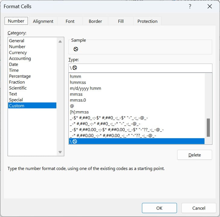
- To customize the waffle chart, we can use the Format Cells window. Below are the steps-
- Select the range B4:K13 and open the Format Cells window using the Alt+O+E shortcut key.
- Go to the Number tab and select the Custom tab.
- In the box, we can put the “\⚽” to add the football icon in the chart.
- Go to the Font tab and select the light blue font color.
- Select the Border tab and select the light blue color and click on Outline and Inside border.
- Finally, we can click on ok to apply the changes.
Use the conditional formatting
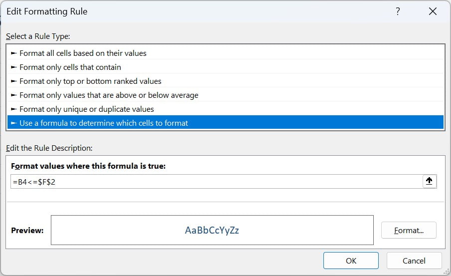
To highlight the progress towards the KPI value in the waffle chart, we can use the conditional formatting. Follow the below steps-
Click to buy Waffle chart with Football Icon in Excel
- Select the range B4:K13.
- Press Alt+O+D to open the conditional formatting Rule Manager.
- Click on New Rule.
- Go to the use a formula to determine which cell to format.
- Put the formula “”=B4<=$F$2” (we have the KPI value at F2 cell)
- Go to the Format and change the font color to dark blue color.
- Click on OK and apply this.
Benefits of a Waffle Chart
There are a lot of benefits of a waffle chart. We have explained few of them below-
Easy to understand:
A waffle chart is quite simple and easy to understand. The grid format and the use of squares to represent percentages make it easy to understand.
Visual impact:
Another benefit of this chart is it has a high visual impact, which makes it more useful for presentations and reports. The use of color and the ability to add icons to the chart make it more visually appealing.
Versatility:
You can use this chart to represent several types of data, such as sales, revenue, and customer satisfaction. It is a very versatile chart which can be used in different industries.
Highlighting progress:
We can use this to show any type of process like – Project completion status etc. The ability to fill the squares with color or add icons makes it easy to see how much progress has been made towards the goal.
Compact size:
This is a compact chart. We can easily insert this in our report or business presentation. The small squares make it easy to fit everywhere. You can simply copy it as a picture this chart from excel and can insert your PPT slide.
Customizable:
The waffle chart is highly customizable. We can change the color of the squares, add icons, and use conditional formatting to highlight progress towards a goal.
Customizable:
This chart is highly customizable. We can change the color of the squares, add icons, and use conditional formatting to highlight progress towards a goal.
Conclusion
In conclusion, the waffle chart is a simple and effective chart which can be used to represent progress towards a goal or target. With the use of Excel formulas, windows emoji, the Format Cells window, and conditional formatting, we can create a customized waffle chart with a football icon. There are several benefits of the waffle chart like- easy understanding, high visual impact, versatility, highlighting progress, compact size, and customizability. It is extremely useful for your business report or presentation.
Visit our YouTube channel to learn step-by-step video tutorials
Watch the step-by-step video tutorial:
Click to buy Waffle chart with Football Icon in Excel
