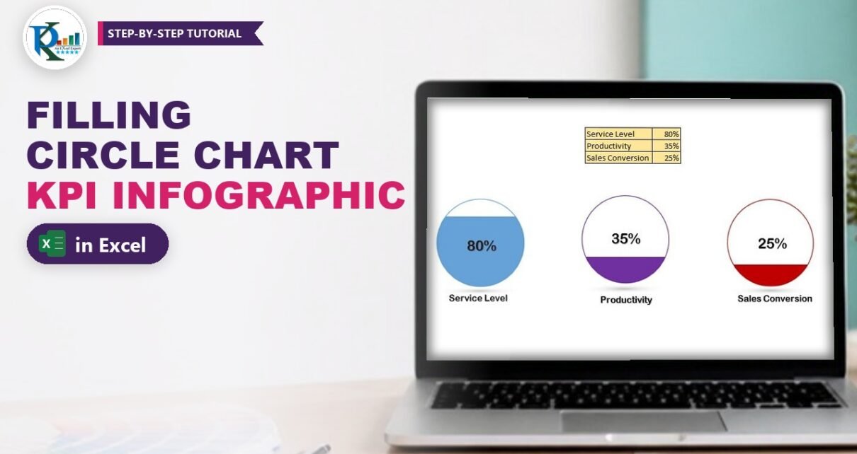
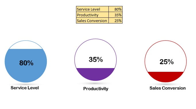
A filling circle chart in Excel shows a KPI as a circle that fills up like a glass of water: 25% fills a quarter, 100% fills the whole circle. It is perfect for metrics such as Service Level, Productivity, Quality Score or Sales Conversion. In this tutorial you build it with a normal column chart and one custom shape made in PowerPoint, with no VBA at all. Because the chart reads a cell, the fill updates the moment the number in your table changes.
Watch the Video Tutorial
In the video PK builds the Service Level circle from scratch: a gap-free column chart with a fixed 0 to 100% axis, a rectangle with a round hole made in PowerPoint, a soft shadow and a linked value label.
What You Will Build
- A KPI circle that fills from the bottom in proportion to a percentage cell.
- A column chart with a fixed 0 to 100% axis, so 100% always fills the circle exactly.
- A white mask with a round hole (a merged shape) that turns the square column into a circle.
- A soft shadow under the circle made with a path gradient.
- A live value label linked to the cell, plus a metric name, all grouped into one object you can move anywhere.
How the Filling Circle Chart Works
The trick is simple. A single column in a column chart rises from 0 to the KPI value. On top of the chart you place a white shape that covers everything except a circle in the middle. Through that hole you only see the part of the column inside the circle, so it looks as if the circle is filling with colour. Because the chart axis is locked from 0 to 1 (0% to 100%), the column height always matches the percentage.
The data used in the video is a small table on the sheet:
- B2:B4 – the metric names: Service Level, Productivity and Sales Conversion%.
- C2:C4 – the values as percentages, for example 25%, 85% and 65%.
Part 1 – Build the Column Chart
Step 1: Insert a clustered column chart
Select only the Service Level value (C2). Go to Insert > Charts > Insert Column Chart and choose 2-D Clustered Column. You get a chart with a single column.
Step 2: Fix the vertical axis from 0 to 100%
Right-click the vertical axis and choose Format Axis. Under Bounds set Minimum to 0 and Maximum to 1. The value 1 means 100%.
This is the most important setting. If you leave the axis on Auto, Excel rescales it to the value (for 25% it might stop at 30%), and the column would look almost full even at a low value.
Step 3: Remove every chart element
Click the + (Chart Elements) button and untick everything: axes, chart title and gridlines. Only the column should be left. Resize the chart to roughly a square.
Step 4: Set the gap width to 0
Right-click the column, choose Format Data Series and set Gap Width to 0%. The column now fills the full width of the plot area. Test it: type 100% in C2 and the whole plot area should turn blue.
Part 2 – Make the Circle Mask in PowerPoint
Step 5: Draw a rectangle and a circle
Open a blank PowerPoint presentation. Go to Insert > Shapes and draw a Rectangle. Then insert an Oval from Basic Shapes and hold Shift while you drag so it becomes a perfect circle. Place the circle in the middle of the rectangle.
Step 6: Combine the two shapes
Select both shapes (click one, then Shift+click or Ctrl+click the other). On the Shape Format tab open Merge Shapes and click Combine. The result is one shape: a rectangle with an empty, transparent hole where the circle was. This hole is the window through which the column will show.
Step 7: Copy the shape to Excel
Copy the merged shape and paste it into your Excel sheet. Paste one more copy to the side and keep it as a spare, because you will need a fresh mask for each additional circle.
Part 3 – Line Up the Mask and the Chart
Step 8: Make the mask see-through while you align
Right-click the mask, choose Format Shape and raise the fill Transparency (the video uses about 61%) so you can see the chart behind it.
Step 9: Match the chart to the circle
With C2 at 100%, move the mask so the bottom of the circle sits on the bottom of the column. Then resize the chart, holding Shift, until the top of the full column touches the top of the circle and the bottom still touches the bottom. When you resize the mask, also hold Shift so the hole stays perfectly round.
Why this matters: the circle must cover exactly the 0% to 100% range of the column. If the column is taller than the circle, 100% would not look full; if it is shorter, the circle would look full before 100%.
Step 10: Turn the mask white
Set the mask transparency back to 0% and choose Solid fill in white. Turn off gridlines in View > Show > Gridlines so the white mask blends into the sheet. Now type 20% or 50% in C2: the circle fills to that level.
Step 11: Replace the shape with a cropped picture
The merged shape still shows a rectangle outline around the outside. To get rid of it, copy the mask and use Paste Special > Picture. A picture, unlike a shape, can be cropped: select it, go to Picture Format > Crop and trim just the outer edge. Move the picture to exactly the position of the original shape, then click the shape and press Delete. The hole in the picture stays transparent, so the column still shows through and the circle keeps filling when the value changes.
Step 12: Group the chart and the mask
Click one object and press Ctrl+A to select every shape, picture and chart on the sheet. Ctrl+click the spare mask to deselect it, then right-click and choose Group. Now the chart and the mask move together as one object.
Part 4 – Shadow and Labels
Step 13: Add a soft shadow
Insert a small, flat Oval and place it just under the circle. In Format Shape choose Gradient fill and set Type to Path. Keep only two gradient stops: make the first one grey and the second one white, and give the white stop 100% transparency. Set Line to No line. The result is a soft shadow that fades out at the edges.
Step 14: Link a text box to the value
Insert a Text Box on the circle. With the text box selected, click in the formula bar, type =, click cell C2 and press Enter. The formula bar shows:
=$C$2The text box now displays the live value, for example 25%. Set No fill and No outline, pick a WordArt style or a bold font, and set the size and colour you like.
Step 15: Add the metric name and group everything
Copy the text box, place it under the circle and type the metric name (Service Level), or link it to B2 the same way. Finally press Ctrl+A, Ctrl+click the spare mask to leave it out, right-click and Group. Your first filling circle is done.
Step 16: Build the other circles in different colours
Repeat the steps for Productivity (C3) and Sales Conversion (C4). Before you use the spare mask, give its Shape Outline the colour of the new circle (for example violet), so the ring around the circle matches the fill. Change the column colour of each chart in Format Data Series > Fill.
Common Errors and Fixes
The circle looks full even at a small value
The vertical axis is still on Auto. Set Minimum to 0 and Maximum to 1 in Format Axis, then hide the axis again.
Colour shows outside the circle or a gap appears at the top
The chart and the mask are not aligned. Ungroup, set the value to 100%, make the mask semi-transparent and resize the chart until the column exactly touches the top and bottom of the hole.
The text box shows the text =$C$2 instead of the value
You typed the formula inside the text box. Select the text box border (not the text), click in the formula bar and type the formula there.
The fill goes beyond the circle above 100%
With the axis maximum fixed at 1, values above 100% are cut off at the top of the plot area, so the circle just looks full. If your KPI can go above 100% and you want to be safe, point the chart at a helper cell such as =MIN(C2,1) and keep the real value in the label. (This helper is an extra tip, not part of the video.)
Tips
- Swap the metrics for any percentage KPI you track, such as Quality Score or NPS, by retyping the names in column B.
- After grouping, you can copy the whole circle to a dashboard sheet; the chart still reads its source cell.
- Microsoft explains every Merge Shapes option (Union, Combine, Fragment, Intersect, Subtract) in Draw a picture by combining and merging shapes.
Want It Ready-Made?
If you would rather start with the finished workbook, the Filling Circle Chart template on NextGenTemplates.com has all three KPI circles ready to link to your own numbers. For another circle-style KPI visual, see the Dynamic Circle Chart in Excel, and you can browse more Excel charts and visualization templates. To learn charts, infographics and full dashboards step by step, join the course Excel Pivot Tables & Dashboards: Basic to Advanced on NextGenTemplates Academy.
Related Tutorials
- Ring Chart in Excel
- 3D Progress Circle in Excel
- Thermometer Chart in Excel
- 5 KPI Cylinder Chart in Excel
- Candle Infographic Chart in Excel
Frequently Asked Questions
Do I need VBA to make a filling circle chart in Excel?
No. The chart is a normal column chart behind a white shape with a round hole. It updates through the chart link to the cell, so no macro is needed.
Why do I need PowerPoint for this chart?
PowerPoint has the Merge Shapes command, which combines a rectangle and a circle into one shape with a transparent hole. You make the mask there once and paste it into Excel.
Why must the axis maximum be 1?
Percentages are stored as fractions, so 100% equals 1. Fixing the axis from 0 to 1 makes the column height match the percentage, and 100% fills the circle exactly.
Why paste the mask as a picture?
A picture can be cropped and a shape cannot. Pasting the mask as a picture lets you crop away the outer outline of the rectangle while the round hole stays transparent.
Can I use it for more than three KPIs?
Yes. Each circle is its own chart linked to one cell, so build as many as you need with a spare mask and a different colour for each.
About the Author
PK is a Microsoft Excel expert and trainer and the founder of PK: An Excel Expert and NextGenTemplates.com. He has been teaching Excel, Power Query and Power BI since 2016 on his YouTube channel.
Conclusion
A filling circle chart in Excel is just a column chart with a fixed 0 to 100% axis, seen through a white mask with a round hole. Lock the axis, remove the gap, align the mask, crop away its outline and group everything with a linked label. Build it once and you can reuse the same idea for every KPI on your dashboard.