Home>Blogs>Charts and Visualization>Timer Chart Visualization in Excel
Timer Chart Visualization
Charts and Visualization

Timer Chart Visualization in Excel

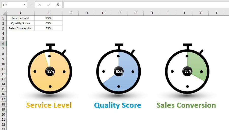
In this article, we have created a beautiful data driven Timer Chart visualization. You can use this chart to display KPI metrics like Service Level, Quality Score, Sales conversion etc. We have created this stunning visual using Excel Shapes and Pie Chart.

Timer Chart Visualization


Click here to download practice file-


Watch the step by step video tutorial:

PK
Meet PK, the founder of PK-AnExcelExpert.com! With over 15 years of experience in Data Visualization, Excel Automation, and dashboard creation. PK is a Microsoft Certified Professional who has a passion for all things in Excel. PK loves to explore new and innovative ways to use Excel and is always eager to share his knowledge with others. With an eye for detail and a commitment to excellence, PK has become a go-to expert in the world of Excel. Whether you're looking to create stunning visualizations or streamline your workflow with automation, PK has the skills and expertise to help you succeed. Join the many satisfied clients who have benefited from PK's services and see how he can take your Excel skills to the next level!
https://www.pk-anexcelexpert.com